Overview
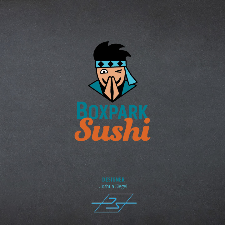
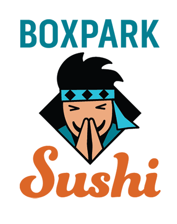
Multi-platform Delivery, the ninth course in the Media Design MFA program from Full Sail University, continued the development of a brand identity for a fictional client: Boxpark Sushi, located in East Side Milwaukee.
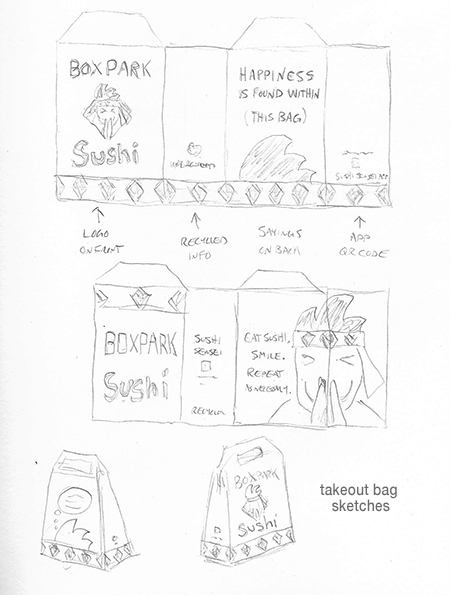
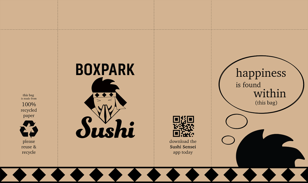
My classmates and I used the design briefs and media delivery plans that we developed in the previous course to create final logos and media assets for the brand. Finally, we collected all the brand details and visual assets into a comprehensive brand guide.
Connecting / Synthesizing / Transforming
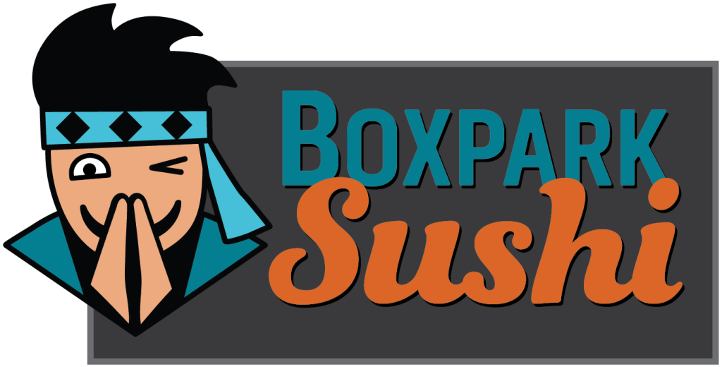
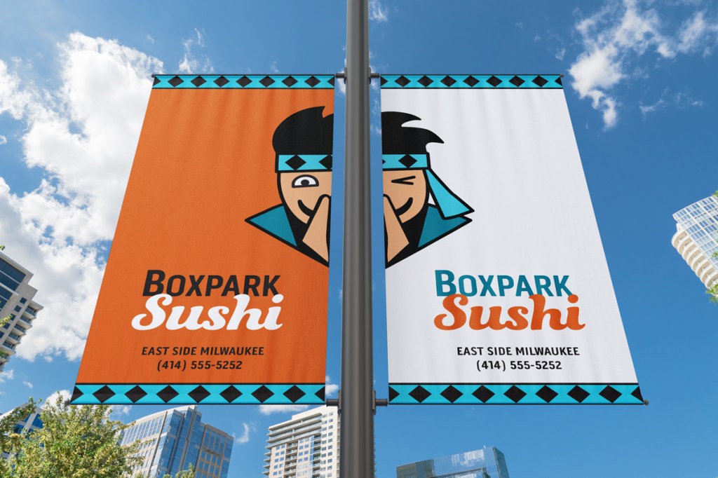
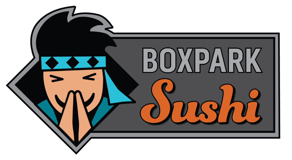
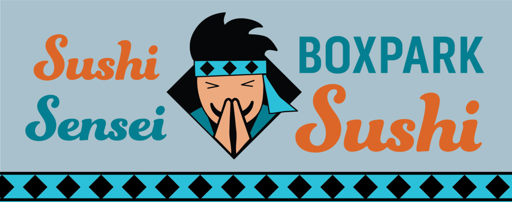
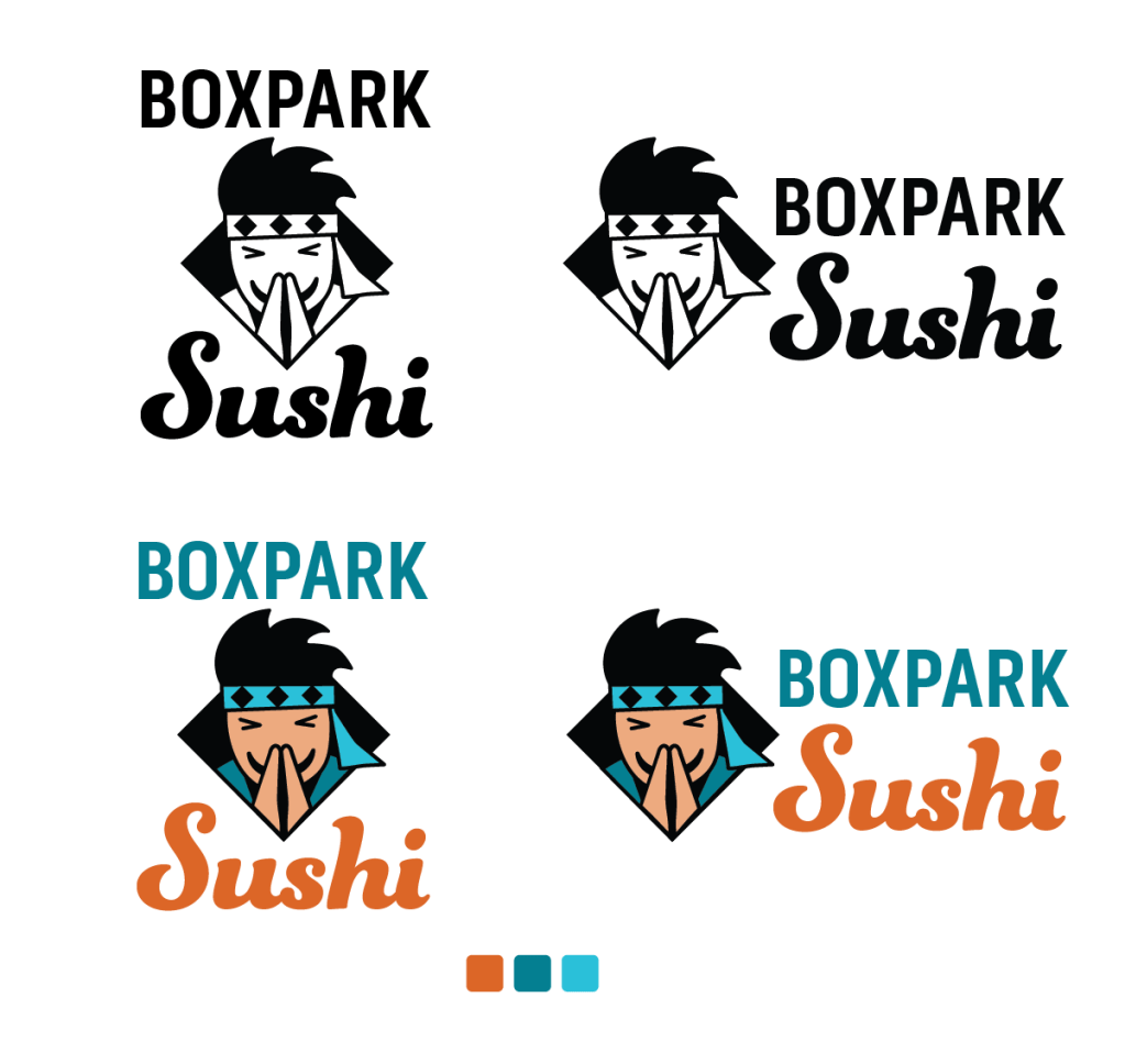
This month I was reminded of the importance of proximity and space in graphic design. In an early draft of the Boxpark Sushi logo, the logotype suffered because it was three degrees away from stasis. In other words, the Boxpark and Sushi type were separated by distance as well as font and color differences.
To better understand the design principles of proximity and space, I read an article by Matt Smith on graphic design education website Edgee.net and chapters from the book The Elements of Graphic Design: Space, Unity, Page Architecture, and Type by Alex White.
As noted by Smith (2014), close proximity of design elements indicates a relationship or connection between the elements. Things that are unrelated are not grouped together. White (2011) agrees that the proximity of related elements adds unity to a design.
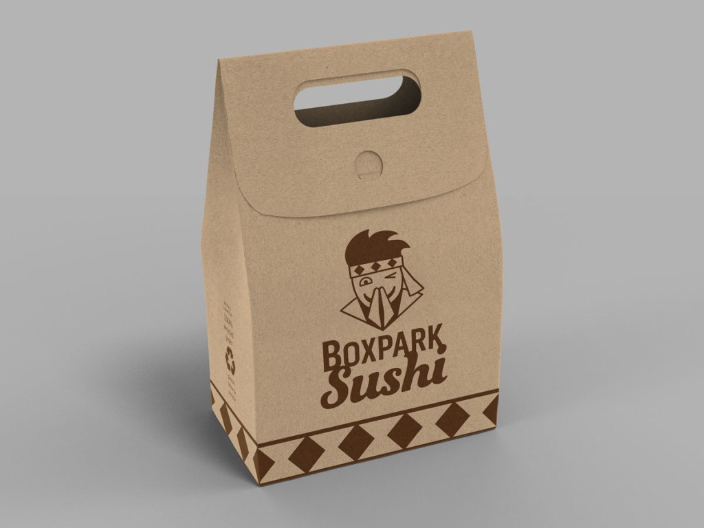
I applied this knowledge to revise the Boxpark Sushi logo. Although the fonts and colors are still different, I shortened the x-height of the Sushi type and overlapped the Boxpark type. Joining the type in this way strengthened the connection between the two elements to form an effective logotype.
Problem Solving
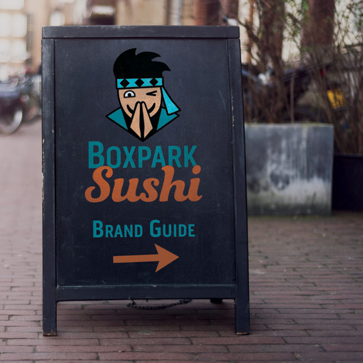
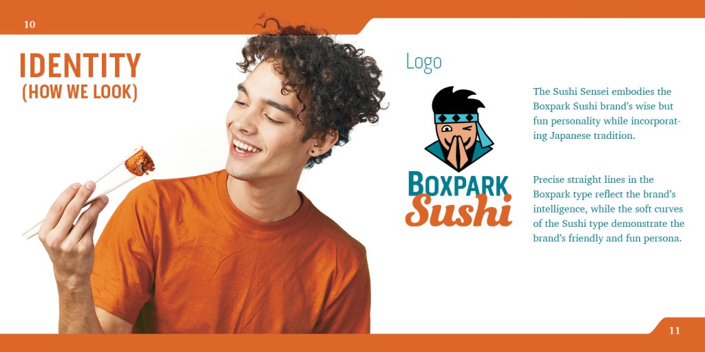
Creating a logo that stood out from other sushi brands was a daunting design problem. Sushi rolls and chopsticks are ubiquitous in the category, so differentiation required thinking of other elements that visually represent the characteristics of Boxpark Sushi.
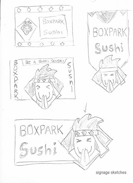
Having established the Sushi Sensei as the personality of the brand, I sketched many logo concepts based on Japanese martial arts or philosophy, such as the Yin-Yang symbol. I also sketched many versions of the Sushi Sensei as a brand mascot.
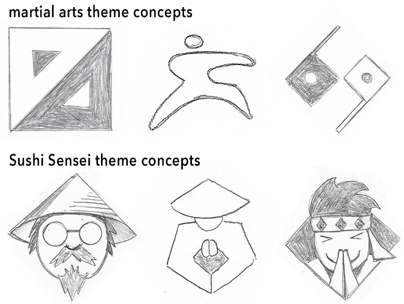
The solutions featuring a simplified Sushi Sensei were more successful because they literally put a face on the brand while also expressing the brand’s characteristics (Yalanska, 2019).
Innovative Thinking
Restaurant mascots have become less illustrative over the years as designers recognize the importance of simplicity in logo design.
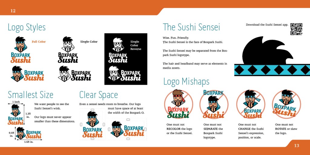
My own work on the Sushi Sensei mascot followed a similar arc as the design evolved from illustrative concept sketches to an iconified design where every shape serves a communicative purpose.
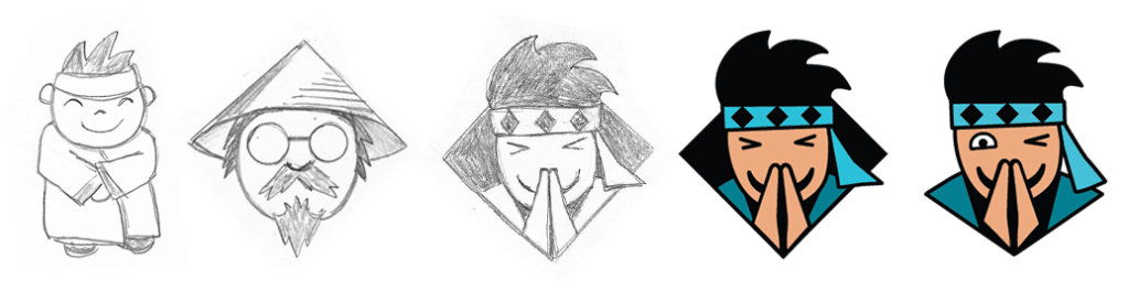
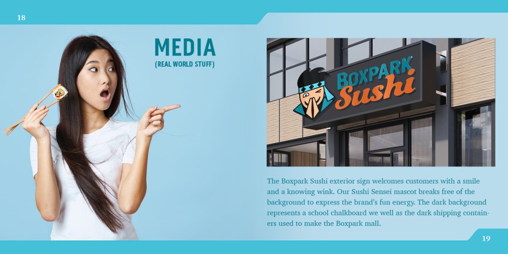
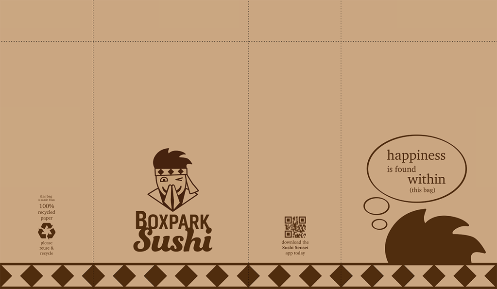
For example, the first rendered draft of the logo featured the sensei within a diamond shape that mirrored the headband diamonds. However, this design element was decorative rather than communicative, so it was removed. The bottom edge of the design now resembles an open book that reveals the sensei, expressing the brand’s educational aspect. The bowing expression with closed eyes was also changed to a friendly wink, expressing the brand’s fun side.
The final Sushi Sensei logo demonstrates innovative thinking by evolving quickly during the design process rather changing after years of public exposure. The simplified mascot also uses cool colors appropriate to sushi and wisdom rather that the bright red hues used by fast food brands to stimulate hunger.
Acquiring Competencies
The following are concepts, skills, or new resources learned in the Multi-platform Delivery course. They are categorized as Academic (pertaining to schoolwork) or Occupational (pertaining to work in the Media Design field), and Technical (pertaining to software or other design skills) or Conceptual (new terminology, procedures, or ideas).
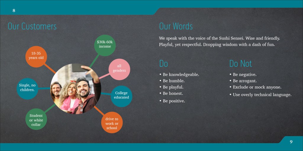
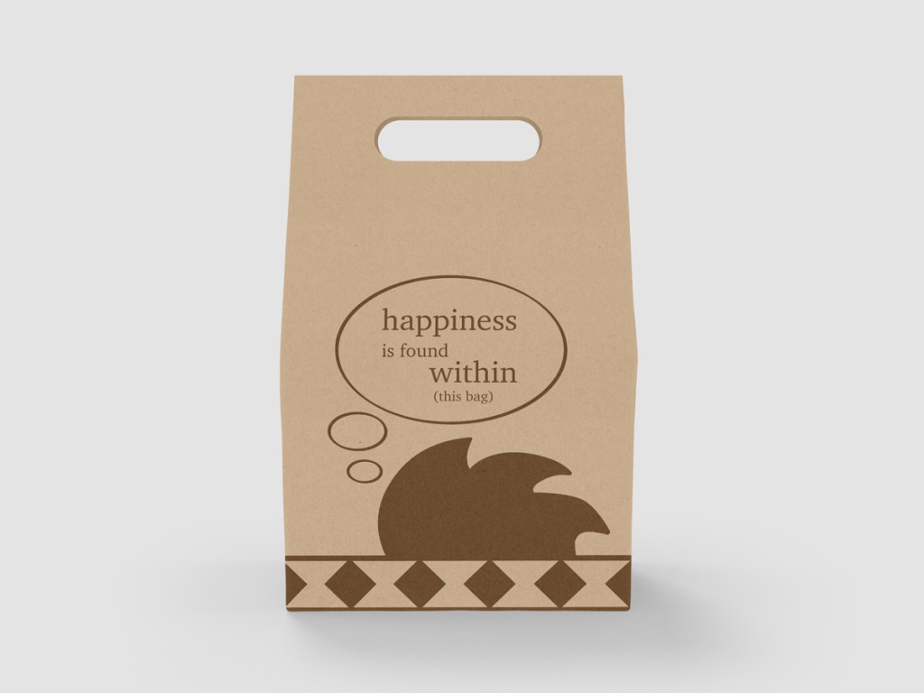
Brand mascots are a powerful way to connect with a target audience. Mascots provide emotional triggers while supporting the voice of the brand. [occupational, conceptual]
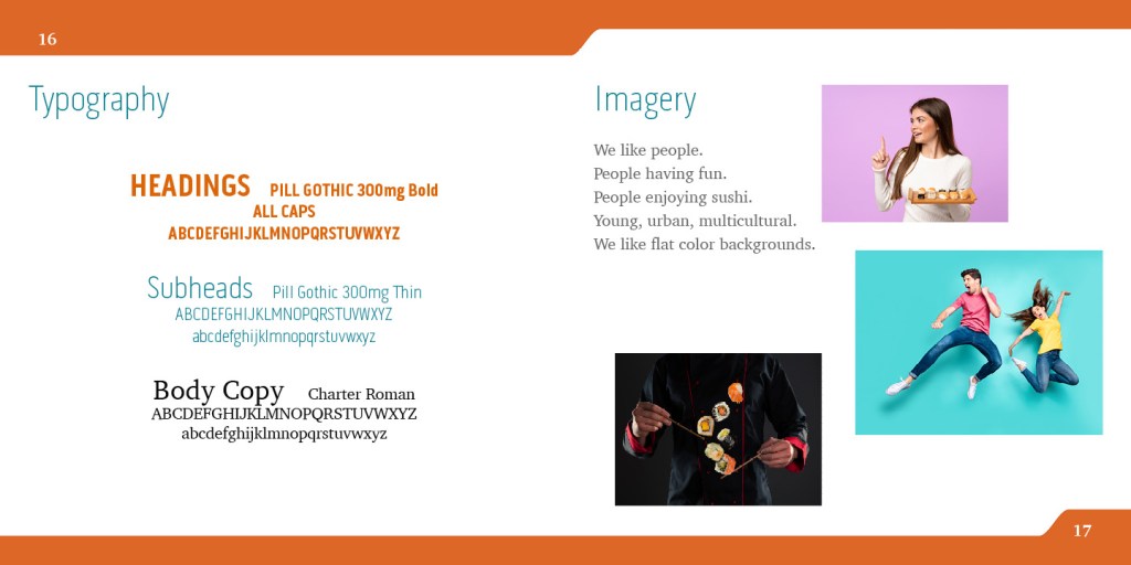
Designers must consider font personality when developing a brand’s typography. The shape, weight, and angles of letterforms all have psychological associations with characteristics like strength or compassion. [academic, conceptual]
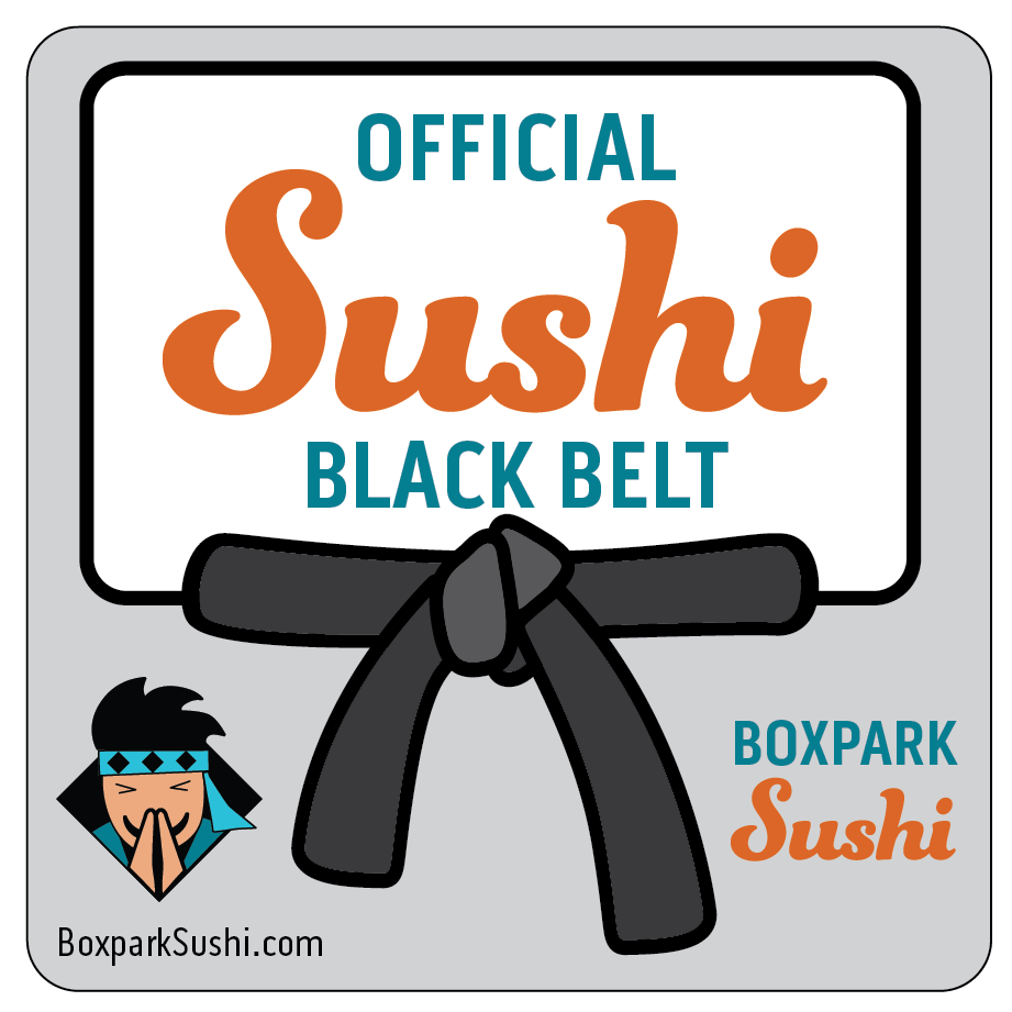
A logomark is a simplified symbol that represents a brand but does not include the brand name or other written words. [occupational, conceptual]
A logotype (or word mark) is a brand name that has been visually styled to reflect the brand identity. [occupational, conceptual]
To deconstruct a design means to analyze its separate components in order to understand how it helps communicate a message. [academic, conceptual]
Visual space is used to connect and separate elements in a design. Space also creates hierarchy and improves legibility while conveying a variety of meanings. [occupational, conceptual]
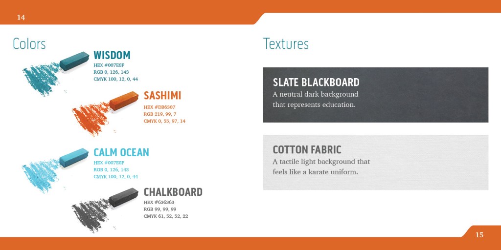
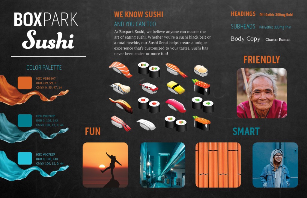
Colors and other design elements have different cultural associations and meanings. When choosing design elements, it is important to research the target market and make appropriate cultural considerations. [occupational, conceptual]
Close proximity of design elements indicates a relationship or connection between the elements. Unrelated elements are space farther apart. [occupational, conceptual]
Carefully organized project file management makes it easier for designers to locate important files and maintain a catalogue of past work. [occupational, technical]
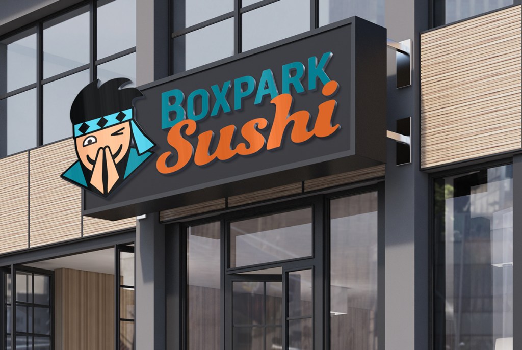
When using design mockups, it is important to consider transparency with clients, appropriateness and inclusivity of the image, and the usage rights. [occupational, conceptual]
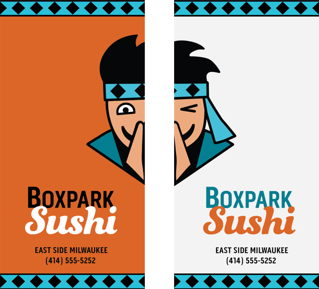
Clear space, also called free space or white space, is the minimum amount of space that a logo must have on each side. Without these guidelines, logo usage will be inconsistent and far less effective. [occupational, conceptual]
Adobe InDesign master pages keep layouts consistent across many pages in a publication. [occupational, technical]
A brand guide ensure that the successful brand identity solution continues to be used effectively and consistently in all all future designs and brand media. [occupational, conceptual]
References:
Smith, M. (2014, September 15). The Principles of Graphic Design: How to Use Proximity Effectively. https://www.edgee.net/the-principles-of-graphic-design-how-to-use-proximity-effectively/
White, A. W. (2011). The Elements of Graphic Design: Space, Unity, Page Architecture, and Type. Allworth Press.
Yalanska, M. (2019, March 13). Design Me Live: The Power of Mascots in UI and Branding. https://blog.tubikstudio.com/design-me-live-the-power-of-mascots-in-ui-and-branding/