
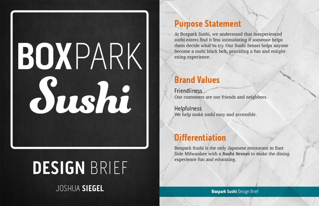
Design Integration, the eighth course in the Media Design MFA program from Full Sail University, expanded on the skills and knowledge gained in previous courses. Throughout the month, my classmates and I continued developing our design strategies for a fictional client: Boxpark Sushi, located in East Side Milwaukee.
Voice and Tone
In the first week, we read three chapters from George Felton’s Advertising: Concept and Copy and several articles about developing a brand’s voice and tone. Felton (2013) describes a brand’s voice as its personality. In contrast, the tone is the way a message is expressed. While a brand’s voice should be consistent across all media, its tone changes depending on a number of factors. In a YouTube video from Stukent (2018), Liza Dunning says that tone is determined by who you are addressing, the situation (or emotional state) the viewer is in, and the topic of your content.
The personality of Boxpark Sushi is that of a friendly teacher who is wise but not aloof or condescending, embodied by the “Sushi Sensei” persona. This wide, friendly voice speaks directly to the young professionals and college students of East Side Milwaukee. Once the brand personality and characteristics were established, we created a Brand Voice Chart as suggested by Heald (2018). This chart helped illustrate how to use the brand’s voice consistently in written content.
Brand Voice Chart
| Characteristic | Description | Do | Don’t |
| Smart | We know sushi, and we love sharing our knowledge. | Be knowledgeable. Be humble. | Be arrogant or condescending. Use overly technical words and phrases. |
| Friendly | Our customers are our friends and neighbors. | Use casual language. Be positive. | Be overly personal. |
| Helpful | We help make sushi easy and accessible. | Be open and inquisitive. Be honest. | Be annoying by pushing help on those who don’t need or want it. |
| Fun | Our definition of fun is sharing good food and laughter with friends. | Be playful. Emphasize the social aspect of Boxpark Sushi. | Exclude or mock anyone. Use derogatory language. |
Static Vision Board
Explaining design strategies to clients without visuals can be challenging. Vision boards, also called mood boards or inspiration boards, help communicate ideas when words aren’t enough. WDD Staff (2008) notes that vision boards demonstrate the thinking behind your design ideas and help clients feel involved with the process. This leads to less “I’ll know it when I see it,” and fewer design changes based on personal preferences like a favorite color.
Color and typography choices were instead guided by the brand characteristics and studies into the psychology of colors and fonts. A reddish orange was selected as a primary color because it communicates the brand’s warm, fun energy (Kolenda, 2016). Przybyla (n.d.) also notes that warm reds and oranges can increase one’s appetite. The secondary teal blue color denotes intelligence and competence (Kolenda, 2016) as well as being complementary to the primary orange.
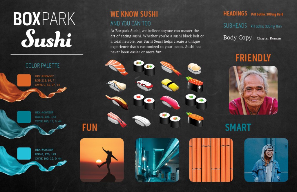
Pill Gothic 300mg was chosen as a header font because it is both strong and condensed. According to Kolenda (2016), condensed fonts convey tightness and precision, traits that are valued in sushi preparation. Funkydori, a thick script font, was also used to represent the organic nature of sushi. The vision board has no photos of raw fish that may turn off consumers who are new to sushi. Instead, the product is presented as vector illustrations that are realistic enough to be identified by sushi eaters yet cute to sushi newcomers.
Several days after submitting our static vision boards, classmate Jose Caceres and I conducted our first video critique to discuss the project. Feedback from Caceres and Dr. Adam Baldowski informed the next project, dynamic vision boards for Boxpark Sushi.
Dynamic Vision Board
While a static vision board helps communicate a brand identity’s voice and tone, adding sound and motion creates new ways to express the brand’s characteristics. A dynamic vision board for Boxpark Sushi was created in Adobe After Effects using royalty-free stock video clips. The music bed was selected because of its upbeat tempo and fun energy. The musical frequencies of the piece were also considered, as midrange to high frequencies can convey happiness and forward thinking (Gillespie, 2019). These qualities help convey the brand’s fun and friendly personality.
The video’s transitions are smooth and organic with no hard cuts, and the motion is energetic yet fluid like a martial art. These traits are reflective of the Sushi Sensei persona who represents the Boxpark Sushi brand. Selected video clips show fun and playful imagery and sushi illustrations but no clips of sushi being prepared or eaten. This decision was made in order to make the dynamic vision board feel more like a demonstration of the brand’s personality and less like a commercial promoting the brand’s product.
Media Plan and Final Design Brief
In the fourth and final week of Design Integration, we developed a media plan and utilized it to create a final design brief for our brand identity. In order to determine the best way to reach Boxpark Sushi’s audience, a media matrix was used to consider the pros and cons of advertising in four categories of media: print, environmental, on-air, and online (Stone, 2010). Boxpark Sushi will utilize each of the categories except on-air due to the high costs and diminishing audience of television advertising. Reporting for Ad Age, Crupi (2019) notes that 27% of 18 to 49-year-old viewers stopped watching broadcast television in 2016 to 2017, tuning in to streaming services or social media instead. This means that the advertising budget for Boxpark Sushi is better spent on social media campaigns and content to engage the target audience of college students and young professionals.
The final design brief for Boxpark Sushi integrated all the previous research and strategies related to the brand’s identity including color palette and typographical considerations, voice and tone samples, and media strategies. This brief will serve as a blueprint when designing media assets and content for the brand in future classes.
References:
Crupi, A. (2019, January 28). Ratings Bombshell: In Two Years, Network TV Demos Plummeted 27 Percent. Ad Age. https://adage.com/article/media/c3/316390
Gillespie, C. (2019). Background Music for Video: How to Pick the Perfect Track. https://www.vidyard.com/blog/background-music-for-video/
Heald, E. (2018). 5 Steps to Find Your Brand Voice. https://contentmarketinginstitute.com/2018/04/find-brand-voice/
Kolenda, N. (2016). The Psychology of Color. https://www.nickkolenda.com/color-psychology/
Kolenda, N. (2016). The Psychology of Fonts. https://www.nickkolenda.com/font-psychology/
Przybyla, D. (n.d.). How Color Affects Appetite in Marketing. https://www.colorpsychology.org/color-appetite/
Stone, L.T. (2010, July 01). Managing the Design Process-Concept Development: An Essential Manual for the Working Designer. Rockport Publishers.
Stukent, Inc. (2018). Developing Your Brand Voice – Liza Dunning. https://www.youtube.com/watch?v=z9KRWgGYD8E
