For this video critique project, I teamed up with Jose Caceres. Jose and I have been classmates for the past eight months, and I am consistently impressed by his work and honesty. During the first video meeting, we discussed the Static Vision Board projects and critiqued each other’s work.
Giving a live critique felt far more personal and interactive than a written critique. Conducting the critique over live video chat made it feel slightly less personal than a face to face meeting. However, a video critique is the best form of communication when you are separated by three time zones, as Jose and I happen to be.
Vision boards don’t have to be printed to effectively demonstrate textures and colors. By sharing screens during the meeting, Jose and I were able to display the vision board being discussed. In addition, working together on previous projects made it easier for me to give candid, honest feedback without worrying about Jose’s reactions.
Honestly, I could have prepared more for the first critique. I had already viewed Jose’s static vision board, but I did not read his rationale in advance. Reading and understanding his rationale would have given me an opportunity to find sources that support or contradict his decisions. However, Jose made a strong presentation prior to my critique.
Receiving Critique
In the first video meeting, Jose and I each made a verbal presentation explaining our vision board before receiving a critique. As we have different concepts of the Boxpark Sushi brand, these presentations served to introduce the brand beyond the visuals shown in the vision boards. We each talked about our brand’s differentiation, target audience, voice and tone. Color and typography choices were also explained.
Our choice to present before critiquing made it easier to introduce our brand concepts but limited the scope of critiques as many issues were already covered during the presentations. For the most part, my work was received in that way I intended. However, Jose had several helpful insights and suggestions. One of these suggestions was the idea of using the Sushi Sensei as a brand mascot.
I was prepared to answer questions about my work, and Jose and I agreed on most of the design choices. Jose’s critique did not prompt any major changes to the vision board. However, his observations shed light on refinements that could improve my work for this brand and on future vision board designs.
Dynamic Vision Board Critique with Jose Caceres
February 26, 2020
Giving Critique
One week after discussing our static vision boards, Jose and I had another video meeting to critique our dynamic vision boards. This time, we decided to offer critiques immediately after watching each other’s projects without an introduction or explanation. This helped make the critiques more like discussions in which we could answer each other’s questions.
I was more prepared for this week’s critique after viewing Jose’s dynamic vision board in advance and reading his rationale for the project. I was also already familiar with his brand concept, the target audience, and other brand details that we had previously discussed. This helped focus the critique on the motion elements and stylistic choices used in the dynamic vision boards.
The technical issue of not being able to hear audio from videos played on the other person’s computer made our meeting less than ideal, but Jose and I were still able to analyze each video shot by shot. Although I understood and appreciated Jose’s design choices, I offered a few suggestions that I hope will help him move forward with his designs for Boxpark Sushi. For example, his logotype could be more legible when set against a solid background instead of a pattern.
Receiving Critique
The majority of the motion elements in my dynamic vision board were received in the way I intended. However, Jose felt that the peppy music bed did not match his previous conception of the brand and its educational aspect.
I intentionally chose an upbeat, high-energy piece of music that would emphasize the fun aspect of the brand. A teacher, even a karate sensei, does not necessarily have to be serious. The Sushi Sensei and Boxpark Sushi brand as a whole should have the image of a smart, funny friend rather than a stodgy know-it-all.
Jose’s questions and comments helped me reexamine the way I will present my version of the Boxpark Sushi brand in the coming months. The video critique helped boost my confidence that the project is headed in a strong direction and is based on a sensible design strategy. It also provided valuable experience in presenting and defending my ideas.
The video critique was also an opportunity to share ideas and techniques with a peer in the design field, something I often lack in my daily life. Designing in a bubble can be a lonely and lead to monotony. I look forward to more opportunities to interact with my fellow designers in the Media Design MFA program.
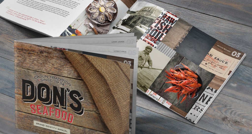
In 2017, design agency MESH re-branded local Cajun restaurant Don’s Seafood. Their challenge was to “visually and verbally capture the tastes and taste buds of the guests who love Don’s Seafood and the guests who have yet to realize what they’re missing” (MESH, n.d.). In order to do so, they first identified the brand’s values and the attributes that make it unique. This helped the MESH designers create a brand definition based on family.
Only after defining the brand identity did the designers create a new logo, tagline, and look for Don’s Seafood. The media strategy included a mix of print and environmental advertising in the form of print ads, kiosks, and billboards. A new online identity was also created with a redesigned website and updated social media presence.
Don’s Seafood brand identity manual by MESH
On-air advertising was not included in the media plan. The most probably reasons for this exclusion are the high production costs for television commercials and the fact that younger audiences no longer watch television (Stone, 2010). The advertising budget for Don’s Seafood is better spent on localized environmental advertising like billboards and social media campaigns for a wider reach.
The Purpose of Creative Briefs and Design Briefs
Designers and design agencies use tools or concepts with very similar names, like vision boards and mood boards. In a similar way, the terms “Creative Brief” and “Design Brief” are used interchangeable by some designers. However, there are important differences to keep in mind.
The purpose of a Creative Brief is to define a singular message that sets the objective of the project. The creative brief is a blueprint that helps you “shape the overall strategy and goals for the project” (Bruun, 2019). No matter how long or short the creative brief, Felton (2013) recommends that it answers the following three questions:
What benefit are you promising?
Who are you making it to?
Why should they believe you?
In contrast, a Design Brief includes the objective and strategies defined in the creative brief but also adds additional information (Frenson, 2015). This can include color palette and typographical considerations, voice and tone samples, and media strategies.
Using a Media Matrix
There are many ways to market a brand, but budgets and time limit the number of outlets a brand can utilize. Therefore, it is important to consider the benefits and drawbacks of each media outlet (Stone, 2010). A Media Matrix is a graphical media planner that explains the pros and cons of advertising in four categories of media: print, environmental, on-air, and online.
A well-researched media matrix demonstrates why a client should spend their budget on one form of media over another. Stone (2010) explains many of those pros and cons in a sample media matrix, but this should only be used as a guideline when designing a media plan. Every client and brand has different needs. A media matrix can explain why particular outlets are more suitable for the client’s message and target audience. For example, a fashion brand can benefit from print magazine ads as well as social media sharing to reach their target audience of young women (Chen, 2020).
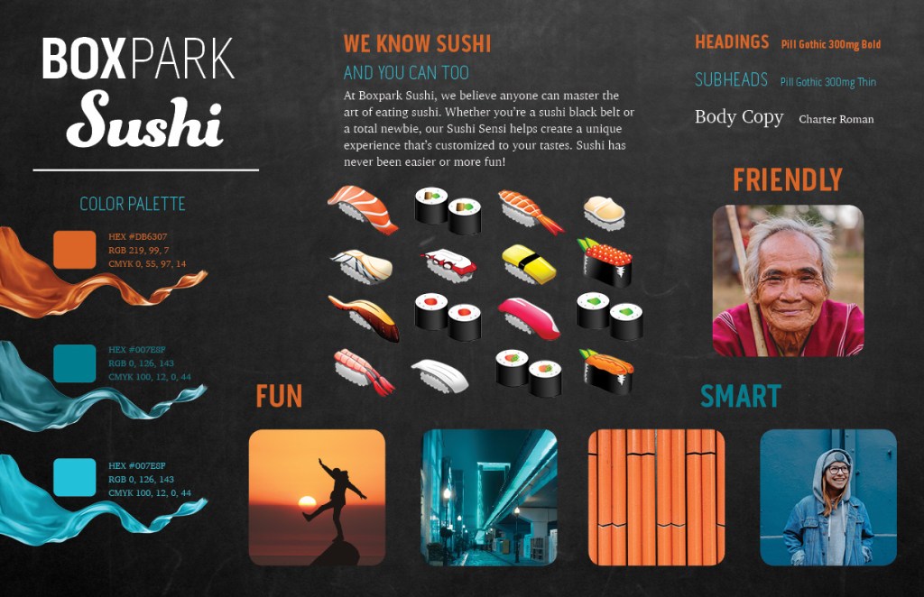
Previous development of the fictional Boxpark Sushi brand determined that the brand voice is wise and friendly, and the tone is playful. These traits are demonstrated in the dynamic vision board, a motion design video created in Adobe After Effects. Typography, primary colors, and directive words were established in the brand’s static vision board but adjusted after critiques from Jose Caceres and Dr. Adam Baldowski.
Motion
Attribution free stock video clips were selected from Pixababy and Pexels after searching general terms like “fun” and “laughter” to find inspiring images with orange and blue colors similar to the brand color palette established in the static vision board. Also, specific search terms like “sensei” and “water drop” helped find desired clips.
The motions and editing are energetic yet fluid like a martial art. Transitions are smooth and organic with no hard cuts. These traits reflect the fun yet wise brand personality, the Mr. Miyagi-esque “sushi sensei” who represents the Boxpark Sushi brand. Many visual elements are introduced by scaling up from small to large, utilizing the concept of “looming motion” to capture attention. Looming motion occurs when visual stimuli get larger or closer, capturing more attention than receding motion because “…looming objects are more likely than receding
objects to require an immediate reaction…” (Franconeri & Simons, 2005). In other words, the human brain is hard-wired to recognize potential threats such as an approaching predator. This human instinct is frequently called upon in motion design to draw attention to specific visual elements.
Sound
The music bed “Yellow Rose of Berkeley” by Rondo Brothers was selected from the Youtube Audio Library because of its upbeat tempo and fun energy. The musical frequencies of the piece were also considered, as midrange to high frequencies can convey happiness and forward thinking (Gillespie, 2019).
The claps in the beat provided edit points to pop in the vector sushi elements and final logo. Because the original music was almost two minutes long, a shorter thirty second version was edited in Adobe Audition. Chalkboard scratches, laughter, and other sound effects were also added from Adobe free sound effects to add depth to the animation.
Colors and Textures
Boxpark Sushi’s primary and secondary colors are orange and light blue, reflecting the energy and wisdom of the brand. These colors are displayed in the video clips and graphic elements of the dynamic vision board. The two complementary colors are balanced between warm and cool, providing a harmony that balances the energy of the motions.
The blackboard background texture used in the brand’s static vision board is carried over to the dynamic vision board. This texture represents the educational nature of Boxpark Sushi and the sushi sensei while providing an organic neutral background for graphics and text.
References:
Franconeri, S., & Simons, D. (2005). The dynamic events that capture visual attention: A reply to Abrams and Christ (2005). Perception & Psychophysics, 67(6), 962.
Marketing is all about introducing a brand, a concept, or a product to a specific audience in a way that captures and holds attention. Writing for Inkbot Design, Gordon (2017) describes five steps to connect with a target audience.
1. Identify the unique selling points of the brand. Neumeier (2007) suggests that finding a brand’s “zag”, or primary differentiation from competitors, is essential to stand out in a crowded marketplace.
2. Define the target audience by researching and developing target personas.
3. List the benefits of the service or product and how it addresses consumer needs.
4. Describe the positioning of the brand in the marketplace and how it compares to the competition.
5. Identify the advertising methods that are most appropriate for the message and target audience.
The Role of Advertising in Marketing
The terms “advertising” and “marketing” are often used interchangeably. However, there are important differences to consider. Advertising is just one piece of a marketing campaign. Gordon (2017) defines advertising as “the paid, non-personal distribution of a persuasive message with the purpose of promoting products or services to current or potential customers.” The advertising process includes ad placement, the frequent display of ads, and tracking ad results. An effective ad strategy involves using media that targets the primary audience and repeatedly exposes that target demographic to a persuasive message that keeps the featured brand visible.
Becoming a Better Motion Graphics Artist
Internet tutorials and readily available software have made it easy for just about anyone to create a motion graphic. However, simply learning the software is not enough. Good motion designers must learn the principles of animation and graphic design techniques (Korenman, 2017). They must understand visual storytelling as well as color theory, typography, and sound mixing. Motion graphics design is a complex art form that is constantly evolving, so great motion graphics artists must always be learning and growing.
References:
Felton, G. (2013). Advertising: Concept and Copy (Third). W.W. Norton.
This vision board was created for the fictional Boxpark Sushi brand as an assignment for the Design Integration course.
Boxpark Sushi vision Board
Static Vision Board rationale
NOTE: Many design choices for this project follow the advice of psychologist Nick Kolenda, who compiled information from hundreds of academic studies into easy to read marketing guides about the psychology of colors, fonts, and more.
Typography
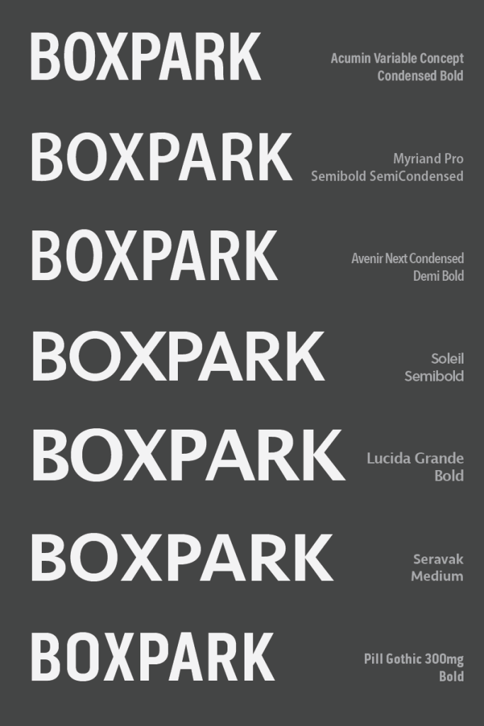
Boxpark Sushi’s primary font is Pill Gothic 300mg using a combination of the Bold and Thin font weights. This strong, modern typeface was selected from a group of sans-serif fonts available with Adobe Creative Cloud.
typography test
Pill Gothic 300mg was chosen because it is both strong and condensed. According to Kolenda (2016), condensed fonts convey tightness and precision, traits that are valued in sushi preparation. The combination of the font’s bold and thin weights implies a balance of power and sophistication.
Charter Roman is used for body copy because it is a highly legible serif font that has an academic feel.
Textures
The smart, educated personality is also reflected in the black chalkboard background and orange pencils pattern. The dark slate provides contrast to light text and the brand’s primary colors. The colors are presented as swatches and as blowing waves of fabric that have fun energy and a satin texture.
Color Palette
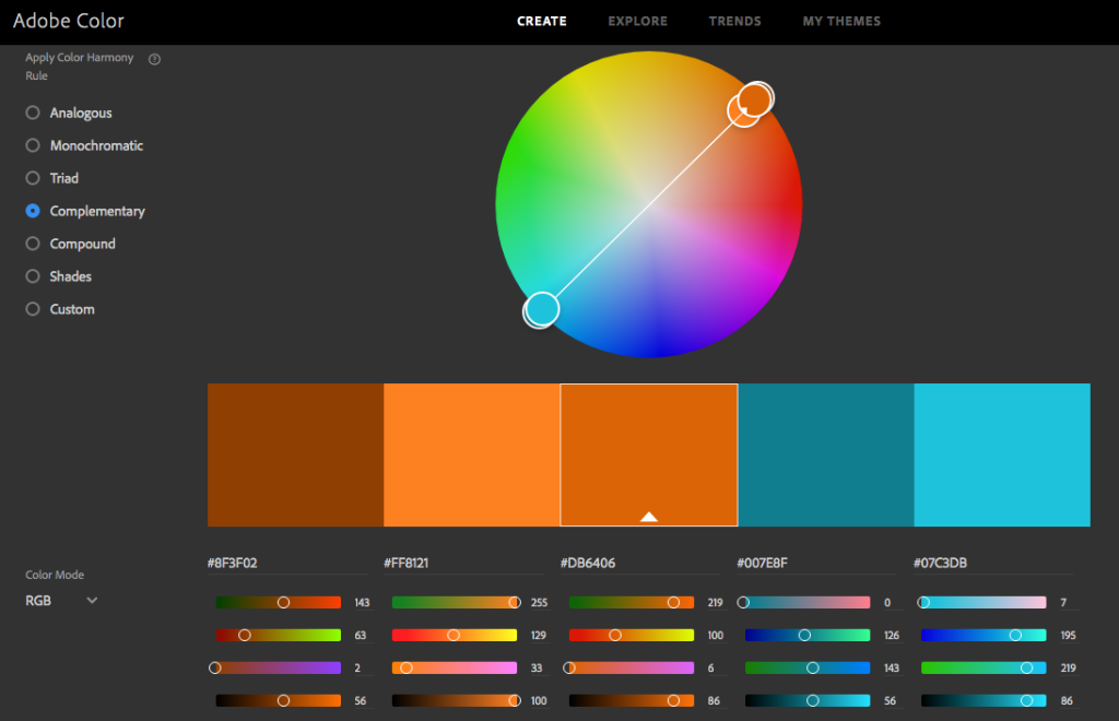
The brand’s primary color, a reddish orange, was selected because it shares that warm, fun energy. Przybyla (n.d.) also notes that warm reds and oranges can increase one’s appetite. The secondary teal blue color denotes intelligence and competence (Kolenda, 2016) as well as being complementary to the primary orange.’
complementary colors in Adobe Color
Photos and Illustrations
Photos are either very warm or very cool colored to match the contrast of the brand’s primary color palette. Photos include a geometric pattern (orange pencils), an urban environment (blue cityscape), and happy people who express the brand personality traits of fun, smart, and friendly.
There are no photos of raw fish that may turn off consumers who are new to sushi. Instead, the product is presented as cute illustrations that are realistic enough to be identified by sushi eaters.
Millennial consumers are the primary audience for many of today’s advertising campaigns, so I sought out case studies of designs that successfully targeted this market segment.
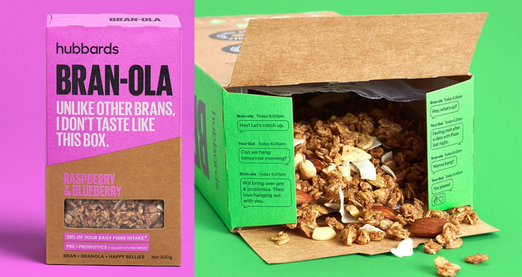
Onfire Design created packaging and advertising for Hubbards cereal brand’s Bran-ola product, using bright colors and a distinctive voice to differentiate from competing bran products (Sanchez, 2019). Copy like “This ain’t your grandma’s bran,” and “They made me wear this box,” gives the brand a sassy personality. The gut health benefits of bran are explained with a whimsical exchange that reads like a text message with a friend. The bright neon colors of the packaging and ads stand out in a category dominated by earth tones.
Bran-ola packaging
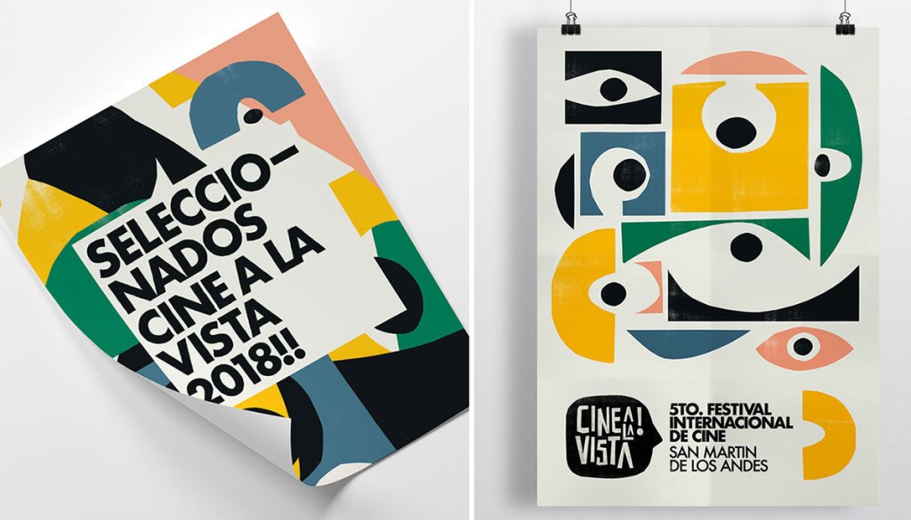
Designer Leo Franchi oversaw the brand designs and animation for the Cine a la Vista international film festival in Argentina. All elements of the designs were cut out from papers of different colors and thicknesses. Franchi used this process to find “the beauty of the texture imperfections in the only way the analog process can provide” (Airey, n.d.).
Cine a la Vista posters
Graphic design is usually displayed on flat, smooth surfaces like screens and paper. However, designs can create the illusion of texture. Even if there is no physical tactile sensation from touching an object, the human brain still reacts and creates meaning from visual textures. Real life textures make a design feel more natural and organic. Textures can be used to create contrast in a design, drawing the eyes to important elements. Theodor (n.d.) notes that textures can also add depth to a design.
The Purpose of Vision Boards
Designers often struggle when trying to describe their ideas and concepts to clients. WDD Staff (2008) notes that “visuals communicate things that words cannot,” and vision boards can help do just that. Vision boards, also called mood boards or inspiration boards, serve several important purposes in the design process:
Faster mockup production: Time is money, and a few hours spent developing the look and feel of a project in a vision board can save many hours later. The visual prototyping process becomes smoother as there a no surprises when presenting design mockups based on previously approved vision boards.
Smoother client buy-in: Vision boards demonstrate the thinking behind your design ideas. Clients feel involved with the process and are less likely to suggest design changes based on personal preferences like a favorite color.
Less frustration, more fun: Vision boards are a creative way to explore design concepts and styles with fewer limitations.
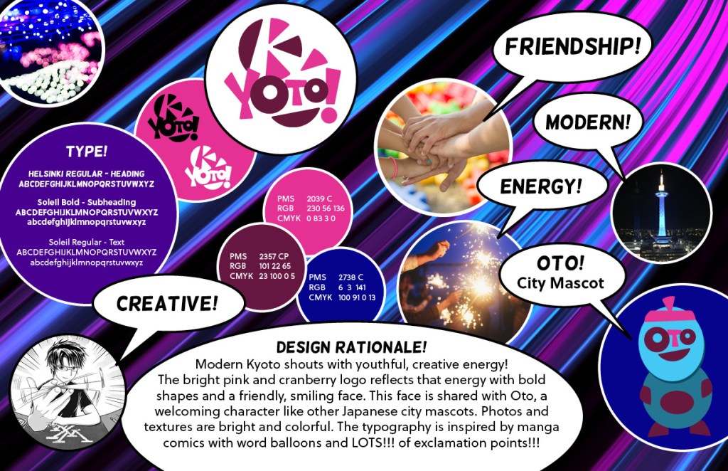
Modern Kyoto brand vision board by Joshua Siegel
Designing Visual Hierarchy
Artists of all visual media use many techniques to draw attention and move the viewer’s eyes through a design. According to Lundgren (n.d.), “Visual hierarchy is the ordering of content in a composition so that you effectively communicate information and create meaning.” This is especially important in marketing and advertising design, where viewer attention is a precious commodity. We can use the following principles of design to create visual hierarchy:
Proportion (or Scale) is the size relationship of the design elements to each other and the entire design. The largest elements, like headlines, are usually the most important.
Position is where the elements are located within the design. The Gutenberg Principle describes the general movement of the eyes when looking at a design in which elements are evenly distributed (Lundgren, n.d.). The principle states that viewer attention generally starts at the upper left of a design and moves toward the lower right.
Direction. If most elements, like type, are in the horizontal direction, vertical or diagonal elements will be noticed first.
Contrast between light and dark colors makes visual elements stand out and improves readability.
The personality of Boxpark Sushi is that of a friendly teacher who is wise but not aloof or condescending. Good sushi requires a skilled chef, and that professional expertise is reflected in the brand personality. Educating customers and the public about the joys of sushi is a large part of Boxpark Sushi’s mission. The brand’s educated, friendly voice speaks directly to the young professionals and college students of East Side Milwaukee. Statistics from East Side Milwaukee Demographics (n.d.) show that 67% of East Side residents are college educated and 92.27% are white collar employees compared to 7.73% blue collar employees.
Boxpark Sushi’s wise and caring personality also addresses the human need for succorance, the need to receive help from others as described by Settle & Alreck’s “Shopping List of Needs” (Felton, 2013). According to a survey by Pei Wei (Shelby, 2015), 30 percent of first-time sushi eaters had someone help them order. Usually, this is a friend or family member who is already a sushi aficionado. At Boxpark Sushi, this role is filled by an in-store “sushi sensei” who explains the various processes and ingredients to make sushi less intimidating. Boxpark Sushi uses the wise sensei personality across the entire brand. The tagline “Master sushi with the Sushi Sensei” empowers customers while also offering support.
There are other sushi restaurants in East Side Milwaukee, but the Boxpark Sushi bar is a place for Boxpark shoppers to hang out with their friends enjoying good food and drinks. Sushi bars let customers order directly from the chef rather than wait staff. The sushi is prepared in front of customers, providing a personalized interactive experience (Grabianowski, 2005). This is very similar to the way street food is enjoyed across the world. The sushi bar model also fits in well with other small and personable eateries in Boxpark shopping centers. Boxpark Sushi speaks like a friendly neighborhood bartender who happens to know everything about sushi.
Brand Voice Chart
Characteristic
Description
Do
Don’t
Smart
We know sushi, and we love sharing our knowledge.
Be knowledgeable. Be humble.
Be arrogant or condescending. Use overly technical words and phrases.
Friendly
Our customers are our friends and neighbors.
Use casual language. Be positive.
Be overly personal.
Helpful
We help make sushi easy and accessible.
Be open and inquisitive. Be honest.
Be annoying by pushing help on those who don’t need or want it.
Fun
Our definition of fun is sharing good food and laughter with friends.
Be playful. Emphasize the social aspect of Boxpark Sushi.
Exclude or mock anyone. Use derogatory language.
Brand Voice Chart
Tagline
Master sushi with the Sushi Sensei.
Mission Statement
To create fresh, healthy foods with the highest quality ingredients.
To educate our customers and the public about the joys of sushi.
To provide exceptional, personal service that elevates the dining experience.
To serve our friends and neighbors in East Side Milwaukee.
Introductory Paragraph (tone sample)
At Boxpark Sushi, we believe anyone can master the art of eating sushi. Whether you’re a sushi black belt or a total newbie, our Sushi Sensi helps create a unique experience that’s customized to your tastes. Sushi has never been easier or more fun!
Voice and Tone
The Boxpark Sushi voice is educated but friendly, and the tone is playful.
Brands are personalities. Just as people have unique voices, so should a brand. This distinctive brand voice establishes bonds with consumers, developing recognition and trust. Felton (2013) notes that “Consumers are never just buying a product; they’re buying an ethos, too.” Do they like this person and their sensibilities? Speaking to customers in a relatable voice with the appropriate tone can be a powerful form of persuasion.
What is the difference between voice and tone? Voice is consistent, while tone changes with the message. According to Kenny (2017), a brand’s voice is determined by a distinctive personality, vocabulary, and rhythm and pace. In a YouTube video from Stukent (2018) Liza Dunning says that tone is determined by a number of factors including who you are addressing, the situation (or emotional state) the viewer is in, and the topic of your content.
Developing Brand Voice
Dunning also explains her method of developing a brand’s voice (Stukent, 2018).
5 D’s of Developing a Brand Voice
Define your why: Why you exist, why you matter. Why should people care?
Differentiate from the crowd: find brand keywords to use frequently, then find words and phrases you would never use.
Decide who your people are: Understand your audience and how they communicate. Creating a target persona can help.
Develop your personality: Who are you and what do you bring to the table? Create a “this not that” list. For example, “Fun but not childish.”
Dedicate your content’s mission: Your mission is based on your why. Create stories that find information to reinforce that mission.
Translating Strategy to Design
In a YouTube video from The Futur (2014), designers Chris Do and Jose Caballer share their processes of translating design strategy into visual design. Abstract ideas become concrete by using words, so it’s important to make strong word choices. Make a list of visual words and find images that match. Those images can be used for a mood board, or “stylescape”, that communicates your ideas to the client. This is an effective way of scaffolding, the process of showing and collaborating on the design strategy with the client so there are no surprises or uncertainty.
Being a partner with the client during all stages of creative strategy raises your value as a designer. Rosebrook (2017) reaffirms this, noting that “giving insights on how you can solve a business problem with a creative solution will ultimately help you position yourself as more than a pixel pusher.” These problem-solving and communication skills are what separate designers from production artists.
References:
Felton, G. (2013). Advertising: Concept and Copy (Third). New York: W.W. Norton.
The critical first step in creating an effective advertising campaign is understanding the brand. In the Design Strategies and Motivation course, we took this a step farther by developing a brand based on our research.
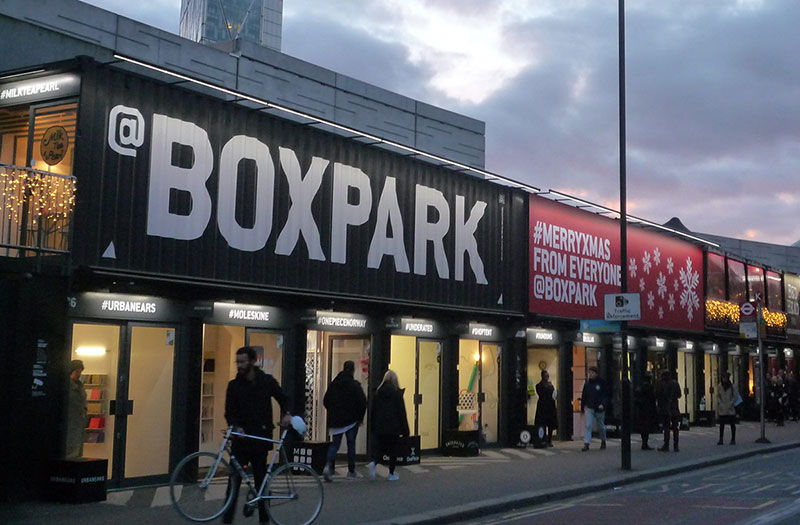
The fictional client is a sushi restaurant located in an imaginary Boxpark container mall in East Side Milwaukee. Boxpark is a food, retail, and entertainment park made of repurposed shipping containers. Roger Wade conceived Boxpark as a “pop up mall,” launching the first park in Shoreditch, England in 2011 (Fry, 2017). Our primary assignment for the class was a Strategic Development project that utilized in-depth research to develop a brand message for Boxpark Sushi and ways to differentiate the brand from competitors.
Boxpark Pop-up Mall photo by Hans Dinkelberg
The combination of primary and secondary research in week one provided several insights about the client’s product, consumer thoughts, and brand category:
Sushi quality depends largely on the chef and ingredients, not where it was made.
East Side Milwaukee has a young, educated population that may be more accepting of sushi than the average American.
Boxpark and other container markets combine modern brands and traditional street food.
Negative perceptions of sushi are mainly focused on the raw fish aspect due to health concerns and personal taste.
Maki rolls are more popular with Americans than other types of sushi.
Sushi bars provide a personal, interactive experience for diners.
This information provided a broad overview of the product and category but needed to be “funneled down” with other data to find a distinctive message for the brand.
Connecting / Synthesizing / Transforming
During the week two live session, we shared our findings and identified several potential obstacles to people who haven’t tried sushi, including unfamiliar ingredients like octopus or the challenge of eating with chopsticks. We also talked about how most people are introduced to sushi by a friend or family member who is already an aficionado. Professor Argo used the term “sushi sensei” for someone who makes a sushi eater’s first time less intimidating by explaining various processes and ingredients to the newcomer. This term stuck with me as I researched ways to overcome the identified obstacles.
I discovered a 2015 survey conducted by strategy consulting firm Kelton Global that examined Americans’ sushi eating attitudes and behaviors (Shelby, 2015). Although the survey was used as a marketing tool for the fast-casual Asian-inspired restaurant Pei Wei, it also provided insight that narrowed my focus for the Boxpark Sushi brand.
Survey Finding Highlights:
More than three in five (62 percent) who haven’t tried sushi are willing to try it and 43 percent of these folks would start eating sushi if they were able to take baby steps, such as by not eating raw fish right away.
Ninety-four percent of those willing to try sushi would steer clear of raw fish.
Sushi newbies felt more comfortable starting with non-raw rolls, and then branched out and tried others. In fact, nearly one-quarter (22 percent) took baby steps when they first sampled rolls and nearly one-third (30 percent) had someone help them order.
This information, combined with the obstacles we discussed in the previous live session, made me realize that sushi could be much more accessible if combined with personalized customer service. At a traditional sushi bar, the chef might have suggestions regarding what is in season or what he thinks you might enjoy (Grabianowski, 2005). However, he or she seldom has the time to find out a customer’s personal tastes and experience with sushi.
I transformed this knowledge into the Sushi Sensei concept, the idea of training Boxpark sushi chefs to make recommendation to customers based on questions like, “Do you prefer salty or sweet?” By sharing knowledge and taking a moment to learn about diners’ tastes, the Sushi Sensei elevates the service level and makes eating at Boxpark Sushi a fun learning experience.
Problem Solving
To stand out from competitors, Boxpark Sushi needs a strong point of differentiation. Why should consumers eat here instead of other nearby sushi restaurants? My research of the primary competition revealed that they served traditional sushi but not modern fusion items like sushi burritos (Gabriele, 2019) or waffle breakfast sushi (Tom, n.d.). Boxpark Sushi could stand out from both primary and secondary competitors by promoting this style of modern sushi.
Another point of differentiation is that competitors have waiters and/or self-serve buffets, but not a casual sushi bar. Sushi bars let customers order directly from the chef rather than wait staff. The sushi is prepared in front of customers, providing a personalized interactive experience (Grabianowski, 2005). Traditional sushi bars can be quite formal, and the chef is more focused on preparing the food than making recommendations based on the customer’s tastes. Having a friendly, casual Sushi Sensei to guide diners is another way to differentiate Boxpark Sushi.
Considering both points of differentiation, I looked at a number of factors. My primary research entailed visits to Chico, California restaurants and supermarkets that serve sushi. Sushi Burrito King offers modern fusion sushi, but during my visit there were very few customers and the food looked and smelled unappetizing. In contrast, the sushi at Raley’s supermarket was being prepared in clear view by a friendly chef who offered to make whatever I liked. This personal experience helped me realize that a quality product and good customer service are more appealing than a novelty product.
I also looked at how each point of differentiation addresses the human needs explained by Maslow’s “hierarchy of needs” and its level in the hierarchy. The highest possible need that modern sushi achieves is Esteem, by making diners feel more sophisticated for trying something new. The Sushi Sensei concept achieves the highest level in the hierarchy, Self-actualization, by comparing the Boxpark Sushi experience to a peaceful form of martial arts. These considerations drove my decision to make the Sushi Sensei the driving “zag” of the Boxpark Sushi creative brief rather than modern sushi, which can still be part of the menu but not the primary point of differentiation.
Innovative Thinking
Many restaurants emphasize their product as a key selling point. Flavor, freshness, and variety of menu items are promoted in order to address the basic human need for good food.
Rather than taking this product-based approach, I decided that a service-based approach would better address the needs of Boxpark Sushi’s customers. Many restaurants offer good food, so elevated service can be an effective way to stand out. Sushi bars are not exclusive to Boxpark Sushi, but the concept of modernizing the sushi chef into a friendly, casual Sushi Sensei specifically addresses the young, urban consumers who shop at Boxpark mall.
Sus Hi Eatstation, a central Florida restaurant chain, has a similar martial arts theme that encourages customers to “be a ninja” by building their own sushi rolls, bowls, and burritos(Sus Hi Eatstation). However, Boxpark Sushi’s sensei theme is targeted toward East Side Milwaukee’s students and young professionals whereas Sus Hi Eatstation’s ninja theme is targeted toward families in Central Florida.
Acquiring Competencies
The following are concepts, skills, or new resources learned in the Design Strategies and Motivation course. They are categorized as Academic (pertaining to schoolwork) or Occupational (pertaining to work in the Media Design field), and Technical (pertaining to software or other design skills) or Conceptual (new terminology, procedures, or ideas).
Academic
Conceptual
Technical
Abstract Thinking: Literal thinking can lead to unoriginal, ineffective designs. Abstract thinking helps us find metaphors that define the essence of a problem in order to solve it in original ways.
Strategic Design: Creative problem-solving skills separate designers from production artists. By understanding how a brand’s message can connect with consumers, we add value to ourselves as designers.
Synthesis Writing: Combining information from multiple sources can shine new light on a topic and help you examine an issue from a different perspective.
Academic Competencies
Occupational
Conceptual
Technical
Maslow’s Hierarchy of Needs: Psychologist Abraham Maslow described a “hierarchy of needs” in human beings that start with low level physiological needs like hunger that must be met first before ascending to higher-level psychological needs like love and esteem.
Settle and Alreck’s Shopping List of Needs: an unranked list of fifteen human needs than can be addressed in a target audience, from achievement to understanding.
Demographics: Quantitative data about your target audience including gender, age, income, and location.
Psychographics: Qualitative data about what people think and why, including their personality and habits. Buying Behavior: the when, what, and why people are buying a product.
Direct competitors: brands with similar products that are likely to be used if your client’s product did not exist.
Indirect competitors: brand with similar products but a strong differentiation from your client or in another market segment.
Replacement competitors: brands with very different products that are competing for the same customer’s time and money.
Unique Selling Proposition: sells a benefit unique to the brand. “You should buy a ____ because it’s the only one that _____.” If consumers want this feature or benefit, the only place they can get it is from your brand.
Emotional Selling Proposition: Instead of looking for the logical benefits of a product, the ESP finds the emotional selling points of the product. How does it make the use feel happier or more attractive?
Attitude Advertising: a brand’s personality, or attitude, can differentiate a brand in very wide categories like smart phones or athletic shoes. When the actual differences from the competition are slight, attitude is everything.
Brand Image: To stand out from competitors, a brand image should be recognizable and relatable to the target audience, like an old friend they want to spend time with.
Rhythm in Design: Repeating rhythms create a pattern that the human eye recognizes. Any irregularity stands out, drawing the eye to that element.
Random Rhythm: Elements repeat with irregular intervals or spacing.
Regular Rhythm: Elements repeat with the same spacing or intervals. Alternating Rhythm: Two or more elements repeat in a regular pattern.
Flowing Rhythm: Repeated elements follow curves or undulations like those found in nature.
Progressive Rhythm: Repeated elements change slightly with each repetition.
Occupational Competencies
References:
Felton, G. (2013). Advertising: Concept and Copy (Third). New York: W.W. Norton.
Design Strategies and Motivation, the seventh course in the Media Design MFA program, expanded on the skills and knowledge gained in month five’s Design Research course. Throughout the month we developed a Strategic Development project for a fictional client: a Boxpark sushi shop in East Side Milwaukee. Professor Bartley Argo encouraged us to dive deep into our research of sushi, the East Side Milwaukee neighborhood, and container park malls in order to create a distinctive brand.
In the first week, we read several articles about Design Strategy and two chapters from George Felton’s Advertising: Concept and Copy. Felton (2013) points out the difference between Strategy and Execution in ad campaigns. Strategy is what you’re saying, and execution is how you’re saying it. Before you can plan the execution of a campaign, the strategy must be discovered through research and synthesis of the resulting information. Strategic development is important for discovering insights about the brand and consumer behavior. Those insights help focus your message and develop a narrative that connects with consumers.
The first part of the Strategic Development project was learning about the client’s product. Step one was primary research in the form of firsthand use. I visited two restaurants in Chico, California that serve sushi. I also sampled sushi from two supermarkets, one budget and the other high-end. This primary research resulted in the insight that sushi quality depends largely on the chef and ingredients, not where it was made.
Sushi at Raleys Supermarket
Step two was secondary research of sushi, East Side Milwaukee, and Boxpark malls. Through online searches, I learned that American creations like the California roll helped sushi gain acceptance in American, as ingredients like crab and avocado were considered more palatable to white Americans than raw fish (Bhabha, 2013). Also, statistics from East Side Milwaukee Demographics (n.d.) suggest that East Side Milwaukee residents may be more open to cuisine from non-American cultures than residents of other Midwestern areas. The neighborhood is a good fit for Boxpark Sushi, as many Boxpark restaurants are inspired by regional street food.
The next step was collecting consumer thoughts. I conducted primary research by interviewing personal acquaintances and by collecting social media responses to the question “Do you like sushi? Why or why not?” There was a wide array of responses, but one important insight was that negative perceptions of sushi are mainly focused on the raw fish aspect.
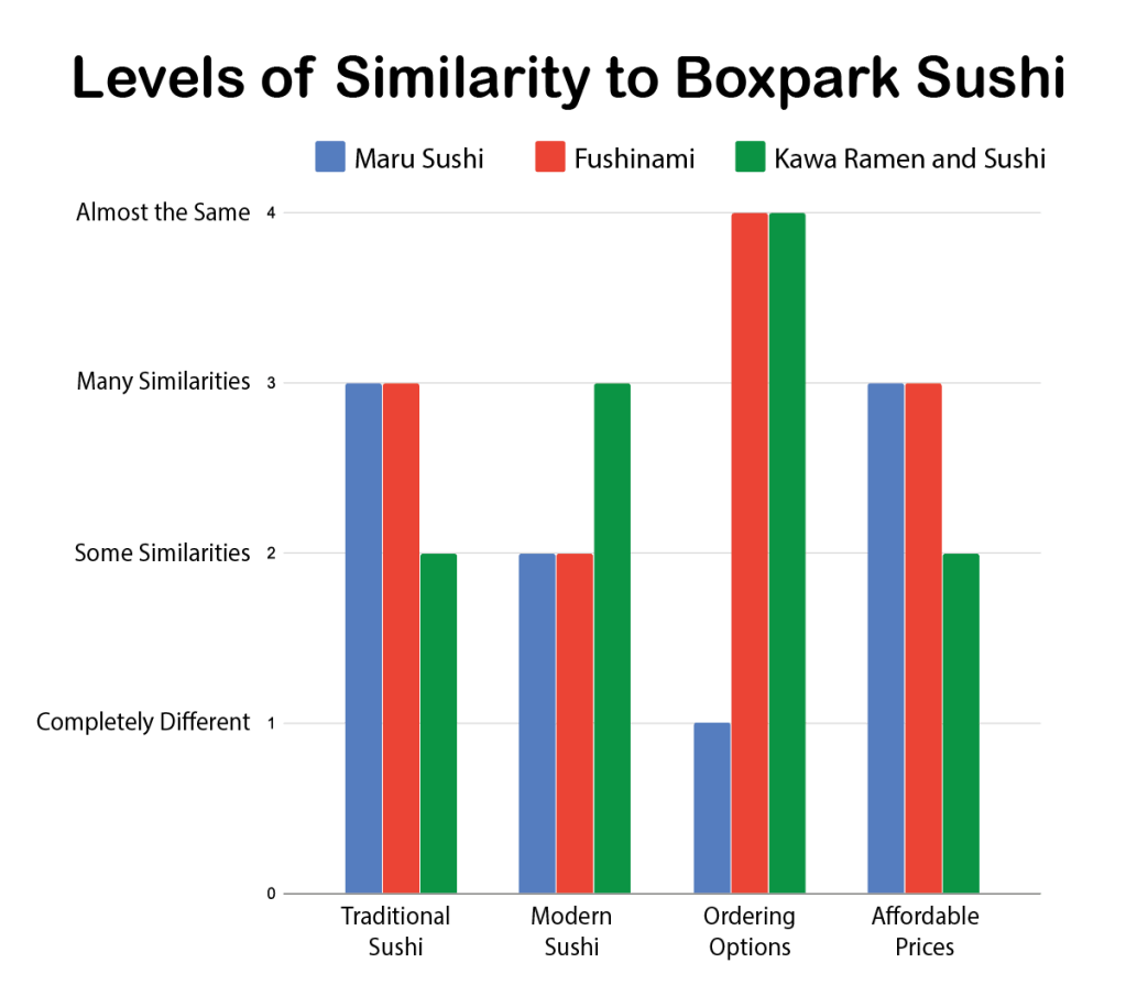
Part two of the Strategic Development project was learning about the competition. I researched the direct competitors, East Side Milwaukee restaurants that served sushi, as well as indirect competitors, nearby Asian restaurants offering something besides sushi. A primary reason for researching a brand’s competition is to find ways to differentiate from competitors, so I created the chart below to represent levels of similarity to Boxpark Sushi for three of the direct competitors. It revealed that serving modern sushi is a good way to differentiate from these competitors.
Levels of Similarity to Boxpark Sushi chart
Competitors chart
Next, I examined consumer behavior to better understand the marketplace for sushi. A good product can solve multiple problems if we understand the human needs that must be addressed. Considering Maslow’s “Hierarchy of Needs,” I found that self-actualization, the need to understand new things and realize one’s inner potential, could be achieved by comparing the Boxpark Sushi experience to a form of martial arts, albeit one that is easily achievable.
Settle & Alreck’s “Shopping List of Needs” were considered next. I found that succorance, the need to receive help from others, could be addressed by guiding customers through their sushi experience. According to a survey by Pei Wei (Shelby, 2015), 30 percent of first-time sushi eaters had someone help them order. Usually, this is a friend or family member who is already a sushi aficionado. But I realized that this role could be filled by an in-store “sushi sensei” who explains the various processes and ingredients to make sushi less intimidating.
Next, I analyzed the marketplace for audience segmentation. I examined the demographics, psychographics, and buying behavior of sushi eaters in East Side Milwaukee. One key point I discovered is that over 55 percent of East Side Milwaukee residents have never married (Point2Homes). This helped narrow the audience segment to younger, single consumers.
The final step of the Strategic Development project was writing a Creative Brief for Boxpark Sushi. A key insight of the project was that inexperienced sushi eaters find it less intimidating if someone helps them decide what to try. Boxpark Sushi can offer high quality, delicious sushi that is freshly prepared by a personal Sushi Sensei. The brand image is a hip, modern sushi bar that makes eating a fun learning experience.
Moving forward, having a focused message for the Boxpark Sushi brand will help me create stronger, more effective designs and copy for the brand.