When designing brand logos and media assets, it is important to consider the role of proximity in graphic design. As noted by Smith (2014), close proximity of design elements indicates a relationship or connection between the elements. Things that are unrelated are not grouped together.
The principle of Proximity in design is based on human psychological associations. For instance, if two people are walking down the street with distance between them, their relationship is unclear. If they are walking side by side holding hands, they obviously have a close personal connection (Williams, 2015, p. 33). For that reason, it is important to visually organize elements and information based on their relationship.
Project File Management
Modern media designers work with a massive number of digital files, so it is important to establish an organization system to manage those files. Vukovic (2013) lists several benefits of a good filing system. Searching for a file takes time and leads to frustration. However, knowing where everything is provides a feeling of control. High levels of organization can also help resolve client issues like “proving the amount of work that was put into a project or when a design was first created” (Hembree, 2006, p. 61). In the system recommended by Vukovic (2013), each client has its own folder with sub-folders for each project. For every project there are file folders:
Assets: photos, vectors, and other design elements used in the project.
Business: estimates, schedules, contracts, and other business files related to the project.
Client input: notes, documents, and other files received from the client.
Design: design files like Photoshop or InDesign documents with each version saved as a separate file.
Production: final delivery files for the client including PDFs and prepress files.
This kind of project file management makes it easier to locate important files and maintain a catalogue of past work.
Considerations for Using Mockups
Mockups are an important tool to help clients see what a design will look like in a real-world context. However, there are certain considerations to keep in mind when using design mockups. Ellison (2015) recommends that you always be clear with clients, letting them know which part of the mockup is the design as well as showing the actual deliverable design files separately.
If the mockup contains images of places or people, it is also important to consider the appropriateness and inclusivity of the image. For example, if all your mockups depict only one type of user such as a young white male, they can send a message that the brand is only for certain types of people and can make others feel excluded (Saucier & Shariat, 2017). Lastly, when using mockup templates created by other designers it is important to check the licensing and terms of use to be sure you can legally use the file for commercial projects.
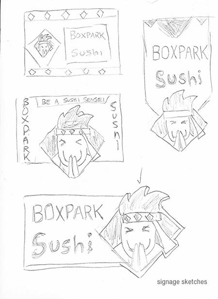
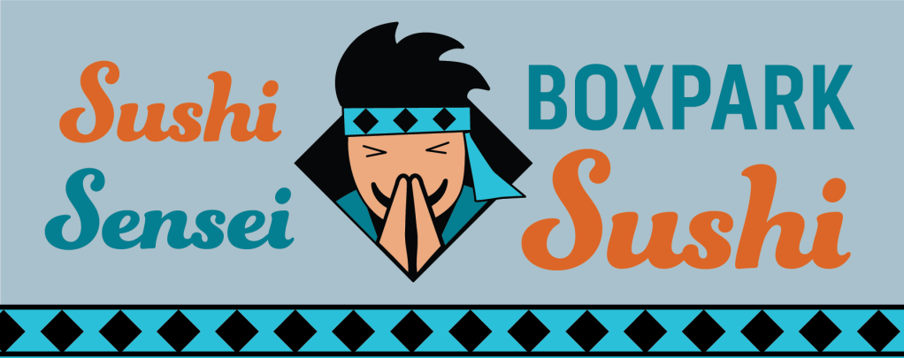
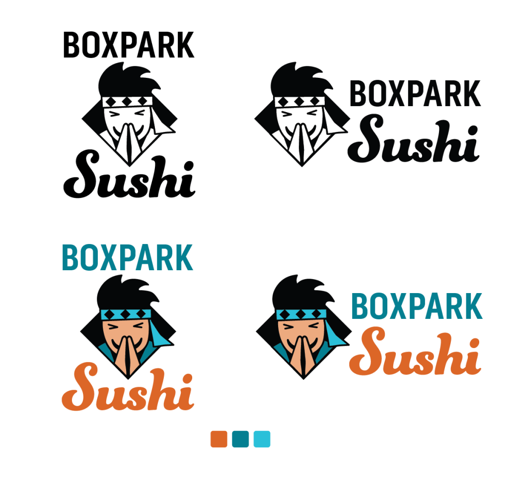
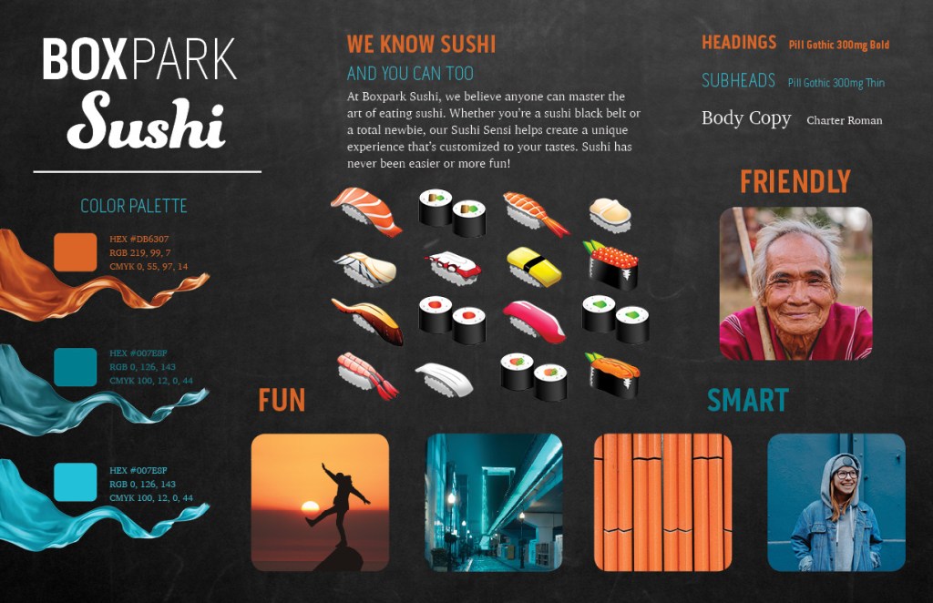
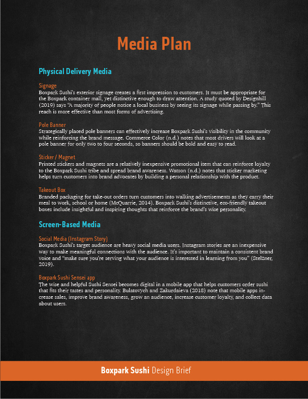
Boxpark Sushi’s exterior signage is appropriate for the Boxpark container mall, yet distinctive enough to draw the attention of busy shoppers. The Sushi Sensei mascot logo welcomes people with a friendly smile. The orange color of the sushi text communicates the brand’s warm, fun energy and the secondary teal blue color of the sensei headband denotes intelligence and competence (Kolenda, 2016).
This asset utilizes more grays than the brand logo for several reasons. The neutral gray background and Boxpark text are reminiscent of a chalkboard, representing the brand’s intelligent aspect as well as tying with the dark container architecture of the Boxpark mall. The border and neutral background also help the brand colors stand out.
A study quoted by Designhill (2019) says “A majority of people notice a local business by seeing its signage while passing by.” Therefore, the strategic purpose of the sign is to capture the attention of shoppers and visually explain the brand. Because Boxpark shoppers already know where they are, the Boxpark text is not as important on the sign as the bright orange Sushi text that tells them what the restaurant serves.
Pole Banners
pole banners draft
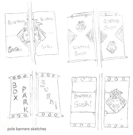
Strategically placed pole banners can effectively increase Boxpark Sushi’s visibility in the community. However, Commerce Color (n.d.) notes that most drivers will look at a pole banner for only two to four seconds. For that reason, the Boxpark Sushi banners are bold and easy to read with no unnecessary elements. Depending on where the banners are located, additional information like an address or website can be added.
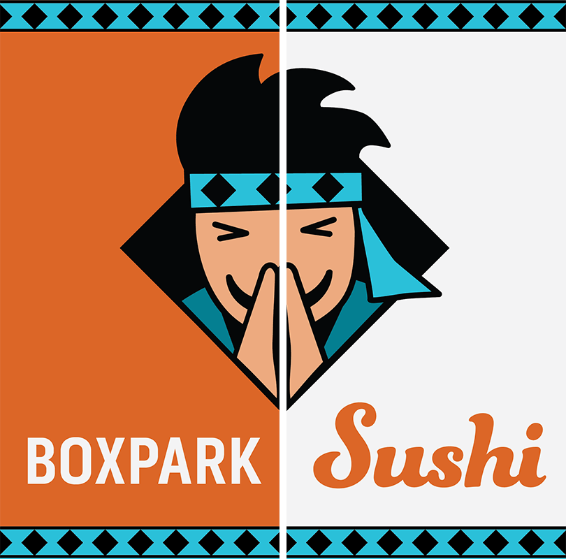
The two banners are meant to be paired side by side, providing more visual space and openness to the design. Spreading the Sushi Sensei mascot logo across both banners adds cohesion to the design, as do the repeated headband pattern borders on the top and bottom.
To capture the brief attention of drivers, the banners are brighter and lighter than the Boxpark Sushi signage while remaining consistent in the use of brand colors. The orange color stands out against the sky and other urban backgrounds as well as representing the brand’s association with “energy, ambition, and enthusiasm” (Cousins, 2012).
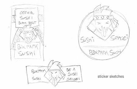
Sticker / Magnet
sushi sensei stickersushi black belt magnet
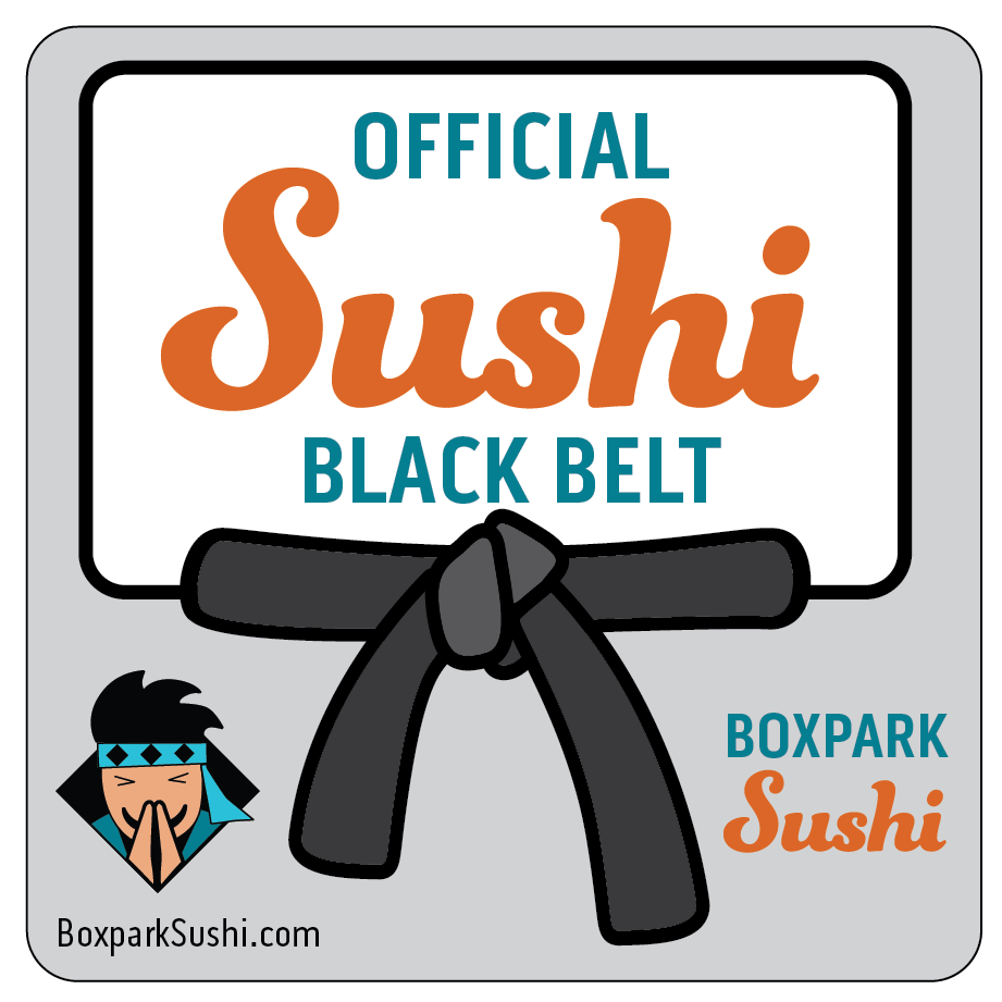
Printed stickers and magnets are relatively inexpensive promotional items that can reinforce loyalty to the Boxpark Sushi tribe and spread brand awareness. Watson (n.d.) notes that sticker marketing helps turn customers into brand advocates by building a personal relationship with the product. The “Official Sushi Black Belt” magnet is a reward for loyal customers, promoting a sense of accomplishment and addressing self-actualization needs.
Felton (2013, p. 22) lists self-actualization as the highest level in Maslow’s hierarchy of needs. This helps the brand rise above competitors who only address the lower needs. Other sticker designs were considered (see above), but a slightly higher cost magnet that is exclusive to frequent Boxpark Sushi diners adds the higher level of prestige.
In addition, magnets last longer than stickers and are often placed on a refrigerator. Zee (2017) refers to a Purdue University study which found that people open their refrigerators an average of ten to twelve times per day. Numerous visual impressions with a hungry audience can lead to more sushi orders.
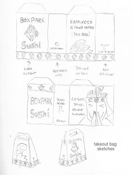
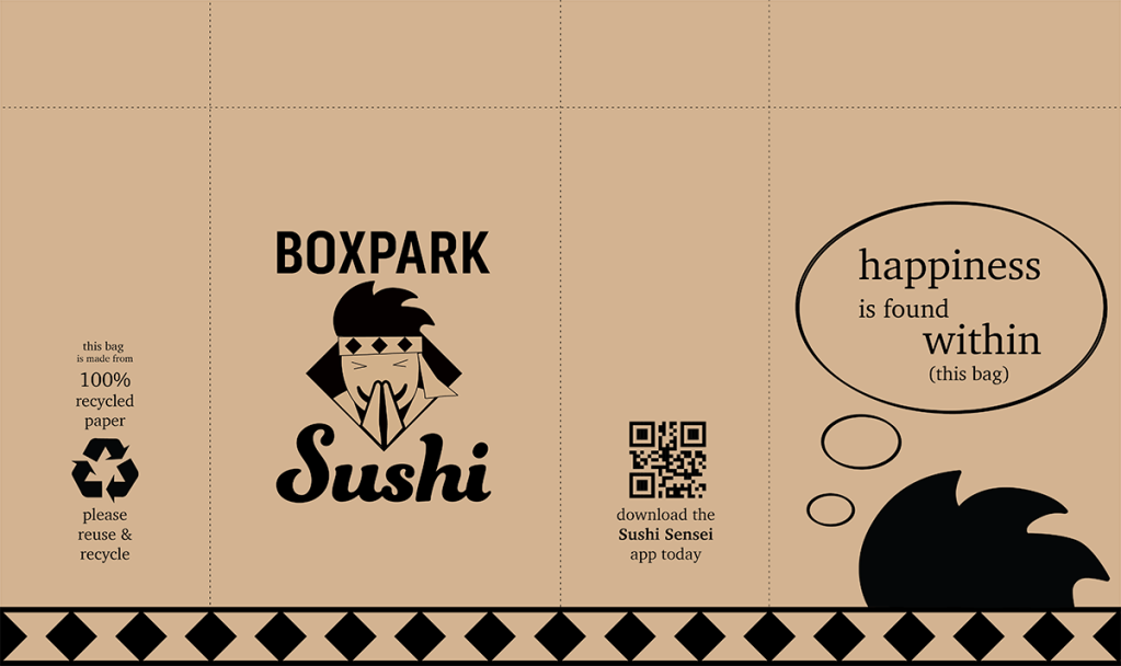
Takeout Bag
takeout bag draft
All restaurants need take-out packaging, so it only makes sense to use that packaging as a media asset. Branded packaging for take-out orders turn customers into walking advertisements as they carry their meal to work, school or home (McQuarrie, 2014). Boxpark Sushi’s distinctive, eco-friendly takeout bags include inspiring thoughts that are laced with humor. The quotes on the back of the bag reinforce the brand’s wise but fun personality.
Plant-based ink on recycled unbleached paper give the packaging an organic feel while supporting the brand’s wise and conscientious nature. Multiple logo elements, like the diamond headband pattern, provide brand cohesion despite the lack of color.
In addition to being a cost effective way of marketing, the Boxpark Sushi takeout bag design contains space to promote social media accounts, the Sushi Sensei app, and other ways of staying connected with customers. Instead of a plain white box or blank paper bag, Boxpark Sushi’s take-out bag is a novel way to connect with customers and a fun introduction to the brand for the customer’s co-workers and friends.
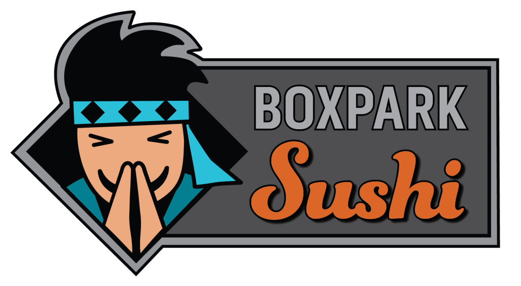
The Sushi Sensei embodies the Boxpark Sushi brand’s wise but fun personality while incorporating Japanese tradition. The simplified mascot in the logo is friendly and hip but not gender specific. Its skin color is a lighter tint of the sushi orange, and the headband’s light blue color helps it stand out against the black background and hair. Its smile and bowing pose demonstrate both friendliness and respect for our customers.
Precise straight lines and sharp corners in the Boxpark type and diamond shapes reflect the brand’s intelligence, while the soft curves of the Sushi type demonstrate the brand’s friendly and fun sides. The type’s curves and rounded corners are repeated in face, hands, and hair of the sushi sensei. Together, the mark and type convey the Boxpark Sushi’s fun, friendly, and wise personality.
Media Asset Production Plan
WEEK 2
Wednesday, March 11 Signage sketches Pole Banner sketches Magnet sketches Takeout Box sketches
Friday, March 13 Signage drafts Pole Banner drafts Magnet drafts Takeout drafts
Sunday, March 15 Signage drafts submission Pole Banner drafts submission Magnet drafts submission Takeout Box drafts submission
WEEK 3
Wednesday, March 18 Review of Peer work
Friday, March 20 Signage final version Pole Banner final version Magnet final version Takeout Box final version
Sunday, March 22 Signage final version submission Pole Banner final version submission Magnet final version submission Takeout Box final version submission
Media design is about communicating a message, and this is especially true for brand logos. Research by Foroudi et al. (2017) examines how the shapes, color, and type choices of corporate logos all impact the way consumers view the brand and respond to its message. Understanding how these components work together is an important part of logo design, and much can be learned by deconstructing popular logos.
To deconstruct a design means to analyze its separate components in order to understand how it helps communicate a message. An article from The Logo Company (n.d.) does this by deconstructing the logos of several successful brand. The process examines logo colors, shapes, and font choices while analyzing how each component influences viewers. Designers can utilize the same deconstruction process to advance their knowledge and find new inspirations. When deconstructing a logo, it’s important to look at the brand’s history and previous versions of the logo. This helps designers understand how logos evolve with the brand to better reflect its values and message.
The Role of Space in Design
Designers “reveal the meaning of their messages by using type, imagery, and space” (White, 2011, p. 9). It’s important that all three work together to send a cohesive message. Space is used to connect and separate elements in a design. Space also creates hierarchy and improves legibility while conveying a variety of meanings (Bradley, 2010).
White (2011) notes that an abundance of empty space in a layout will express vastness in the design and a smallness or quiet aspect to the type or graphic that the space surrounds. When type or graphics fill the space, it feels loud or claustrophobic. The use of space should directly relate to the design’s message. For example, a design that utilizes wide, regular margins of empty space and light type denotes comfortable, open characteristics. Conversely, a design with heavy text that fills the layout is more appropriate for a bold in-your-face message.
Cultural Considerations in Creating Meaning
Designers create effective messages by carefully considering the meaning behind each word, shape, and color. However, designers should also “consider the role the audience themselves play in the construction of meaning within the context of visual communication” (Noble & Bestley, 2011, p. 134). It’s important to remember that colors and other design elements have different cultural associations and meanings.
For instance, most Western cultures associate the color orange with warmth and energy. However, orange is associated with mourning and loss in much of the Middle East (Cousins, 2012). For that reason, a restaurant serving Middle Eastern cuisine might find another color more appropriate for their logo. Before choosing colors and other design elements, it is important to research the target market and make appropriate cultural considerations.
Foroudi, P., Melewar, T. C., & Gupta, S. (2017). Corporate Logo: History, Definition, and Components. International Studies of Management & Organization, 47(2), 176.
Noble, I., & Bestley, R. (2011). Visual Research : An Introduction to Research Methodologies in Graphic Design: Vol. 2nd ed. AVA Publishing.
The top three concept sketches for the fictional Boxpark Sushi brand were developed into vector graphics in Adobe Illustrator.
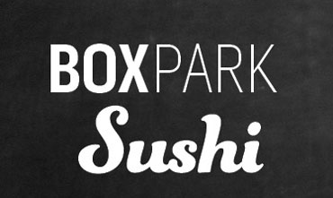
Concept 2: Chalkboard Contrast
The Boxpark Sushi brand is educational but fun, with the personality of a wise and friendly Sushi Sensei. Logo concept sketch 2 is based on a logotype developed previously for the Boxpark Sushi static vision board. The Pill Gothic 300mg typeface was chosen for the “Boxpark” type because it is both strong and condensed. According to Kolenda (2016), condensed fonts convey tightness and precision, traits that are valued in sushi preparation. The combination of the font’s bold and thin weights implies a balance of power and sophistication.
The idea of balance in continued by using the script typeface Funkydori for the word “Sushi”. The gentle curves of this font reflect the organic nature of the product and provide a feminine balance to the straight lines and hard angles of Pill Gothic 300mg. This logo concept uses the idea of an old-fashioned school blackboard to frame the Boxpark type, representing the brand’s wise characteristic as well as recalling the rectangular shapes of Boxpark shipping containers and providing visual contrast to the logo.
This solution is the simplest of the three presented logos. As noted by Airey (2014), the simplest solution is often the most effective because it helps meet other requirements of iconic design like “think small” and “focus on one thing”. However, this logo is also the least distinctive of the three solutions.
Concept 3: Squared Yin-Yang
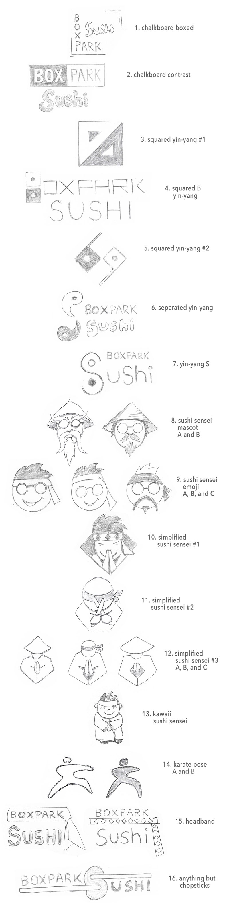
Research of other sushi brand logos confirmed that the most overused logo elements are chopsticks, sushi rolls, and Asian script fonts. Therefore, none of my concept sketches contains those elements. Instead, I focused on imagery inspired by Karate, a Japanese martial art whose teachers are called “sensei”. Several of the concept sketches were in inspired by the yin-yang symbol, which represents the balance of light and dark or feminine and masculine.
This solution is the simplest of yin-yang inspired concepts. The squared yin-yang logo is a fun, modern take on the traditionally round symbol. It visually represents the box aspect of Boxpark as well as the wisdom and balance associated with the symbol. The squared yin-yang can also be utilized for brand patterns used in marketing, merchandise, and in-store decoration.
The squared yin-yang solution incorporates tradition in a simple yet distinctive logomark that is easy to commit to memory and works even at small sizes. For these reasons, the logo meets many of the elements for iconic design (Airey, 2014). This solution is also more innovative and distinctive than the simple logotype of Concept 2. A Google image search for “square yin yang symbol” revealed nothing too similar, which means other brands are probably not using the same design.
Concept 10: Simplified Sushi Sensei Mascot
The Boxpark Sushi brand is built around the concept of a friendly Sushi Sensei who helps customers become a “sushi black belt”. This persona helped shape the fun and wise characteristics of the brand and was the inspiration for many Mascot style logo concepts.
Mascots are a strong way to transfer and support a brand’s voice and tone (Yalanska, 2019). Custom characters like the Sushi Sensei reflect the brand qualities while adding emotional appeal and more personalized interaction with customers. Mascots can be simple like the Twitter blue bird or more complex cartoon characters like Tony the Tiger, a mascot designed for Kellog’s Frosted Flakes in 1952.
Many variations of the Sushi Sensei mascot were sketched, including sensei-inspired emoji and more detailed renderings. Several simplified sensei were sketched, but the first stood out because it best captured the fun aspect of the brand. The character is smiling, and the visual balance of light and dark in the logo is reminiscent of the yin and yang symbolism.
Curves in the mascot’s hair mimic the sushi type, while the black diamond framing and headband elements represent the box part of Boxpark. Although this logo is the least simple of the three solutions, it still works at small sizes and is very distinctive.
References:
Airey, D. (2014, August 20). Logo Design Love, Annotated and Expanded Edition, Second Edition. Peachpit Press.
A study by Malik and Guptha (2014) indicates that brand mascots can represent a brand as efficiently as a celebrity with the added benefit of being more cost efficient and loyal to the brand. Mascots also have higher recall value and consistently represent the brand’s values. Furthermore, the study deduces that the attributes of a brand mascot that most influence a customer are:
Emotional touch
Attractiveness
Trustworthiness
Friendliness
Uniqueness
Yalanska (2019) agrees that emotional touch and appeal are large parts of the consumer decision-making process, and a mascot is a powerful method of providing emotional triggers and feedback to users. In addition, mascots are “a strong way to transfer and support the general tone and voice” of the brand (Yalanska, 2019).
Whether it is human-based, animal, or other, a mascot provides a human touch to a brand. It makes the brand more user-centered while presenting multiple avenues for visual marketing in branded merchandise and other media assets.
Font Psychology in Logo Design
Fonts have personalities, and it is important to consider the psychology behind that personality when using type for a brand logo. Does the typeface accurately represent the brand’s personality and voice? Fonts display certain characteristics because the human mind makes visual associations.
Oosterhout (2013) examined the perceptual characteristics of letter forms and the personality characteristics associated with them by study participants. The study found that uppercase letters are effective for brands that “convey qualities related to energy, courageousness, and focus”. Conversely, lowercase letters are appropriate for brands that promote compassion and altruism.
Fonts can also have associations with specific tastes. A study by the University of Oxford reports that soft, rounded typefaces are associated with sweet foods while angular typefaces are associated with bitter, salty, or sour foods (Velasco et al., 2015). These associations are especially useful when choosing fonts for food brands.
Combining Logomark and Logotype
Words and imagery can work hand-in-hand to communicate a brand identity. This is especially true with logos. A logomark is a simplified symbol that represents a brand but does not include the brand name or other written words. Logomarks can create a strong visual identity but usually work best for established brands (Murray, 2017).
A logotype (or word mark) is a brand name that has been visually styled to reflect the brand identity. Murray (2017) notes that a strong logotype helps new businesses introduce themselves to the public by putting the brand name out front. Osterer (2015) agrees that unique letterforms combined with bold colors create wordmarks that are memorable and soon become associated with the brand.
Combination marks use both a logomark and logotype to represent a brand, offering the best of both worlds. They offer an opportunity to establish the brand name in the public consciousness while allowing for the freedom to drop the logotype in the future once the brand identity is well established.
Oosterhout, L. (2013) Word marks: a helpful tool to express your identity: an empirical study regarding fonts of word marks as a tool for transmitting an archetypal identity. http://purl.utwente.nl/essays/64348
Osterer, I. (2015). Logos and Wordmarks. Arts & Activities, 157(2), 23.
The first project for the Multi-Platform Delivery course are rough logo concept sketches for Boxpark Sushi, a fictional brand developed in previous courses of the Media Design MFA program.
BRAND ATTRIBUTES
KEYWORDS or PHRASE
KEY VALUES
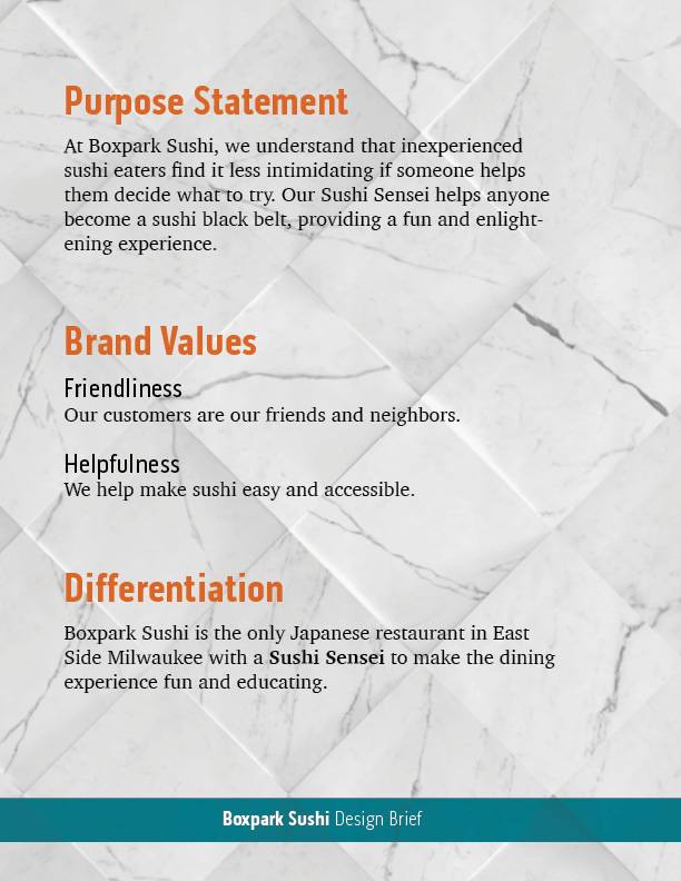
FriendlinessHelpfulness
KEY CHARACTERISTICS
WiseFun
DIFFERENTIATION
The only Japanese restaurant with a Sushi Sensei.
EXPERIENCE
Makes the dining experience fun and educational.
PURPOSE
The Sushi Sensei helps anyone become a sushi black belt.
brand attributes chart
In what ways did your research inform this ideation process?
The Boxpark Sushi brand is built around the idea of a friendly, helpful Sushi Sensei. Therefore, most of the concept sketches are karate inspired in order to stand out in a market where logos featuring chopsticks, rolls, or fish are ubiquitous. To find inspiration, I researched symbols that are visually associated with karate and other Japanese martial arts.
Like karate, the yin-yang symbol originated in China (Yang, n.d.) but became part of Japanese culture. The symbol represents the balance of light and dark, and it has become associated with wisdom and chi (internal energy). Several of my concept sketches use the yin-yang symbol as inspiration but change it to something new and modern rather than incorporating the traditional symbol into a letterform.
I also researched visual inspiration for the Sushi Sensei mascot and simplified versions of the character. A sketch based on kung-fu character Pai Mei seemed too harsh for the fun aspect of the brand, but a second version based on Mr. Miyagi from The Karate Kid seemed more fun and cooler.
In what ways can you be confident that the selected logos will effectively communicate the brand identity?
Because the word “sushi” is included in the brand name, there is no need to visually represent the product. Words and pictures should be used together achieve synergy, not redundancy (Felton, 2013, p. 81). For that reason, the logo sketches tried to add the “sensei” aspect of the brand to the name, which already tells consumers where it is and what it serves.
Logos using the sensei character are more brand specific than the concepts based on the yin-yang symbol or a simplified karate pose. Although the less specific designs could be used for other types of brands like a karate team, they can create synergy when paired with the Boxpark Sushi logotype (below).
Boxpark Sushi logotype
In what ways are your solutions unique, or innovative, by comparison to existing logos found through research that represent near and competing locations?
In the Design Strategies and Motivation course, three of Boxpark Sushi’s direct competitors in East Side Milwaukee were identified.
Maru sushi logo
The logo for Maru Sushi is a simple, thin logotype with a pinkish red color filling in the letter a, presumably to resemble a maki roll.
Fushinami logo
The logo for Fushinami is an Asian inspired script font that is crimson red.
Kawa logo
Kawa Ramen and Sushi has a logo that incorporates chopsticks, a Japanese kanji (letter), and a wave-like form that also resembles a maki roll.
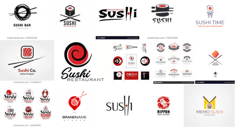
This research and a Google image search of sushi restaurant logos confirmed that the most overused logo elements are chopsticks, rolls, the color red, and Asian script fonts. Therefore, none of my solutions contain those elements.
sushi logos
Side note: The lines in the 16th design are not meant to represent chopsticks. Anything but chopsticks.
What difficulties did you encounter within this concept sketching process?
The biggest difficulty I encountered was overcoming my tendency to over-illustrate. I struggled to keep things simple as recommended by Airey (2014), spending too much time on details of certain sketches before loosening up my style and letting ideas flow more organically.
Several of the logos are mascot-style images of the Sushi Sensei. This style may be too illustrative for a simple effective logo, but the drawings inspired simplified and iconified versions of the character. Mr. Peanut and the Michelin Man are two examples of characters that are incorporated into brand logos.
Another difficulty is judging my own work. It can sometimes be hard to tell if I like a concept because it effectively presents the brand attributes or because it just “feels right” or “looks cool”. An outside perspective in the form of critiques will be very helpful in deciding which concepts deserve further development.
References:
Airey, D. (2014, August 20). Logo Design Love, Annotated and Expanded Edition, Second Edition. Peachpit Press.
Felton, G. (2013). Advertising: Concept and Copy (Third). W.W. Norton.
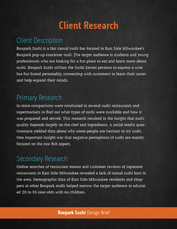
Design Integration, the eighth course in the Media Design MFA program from Full Sail University, expanded on the skills and knowledge gained in previous courses. Throughout the month, my classmates and I continued developing our design strategies for a fictional client: Boxpark Sushi, located in East Side Milwaukee.
Voice and Tone
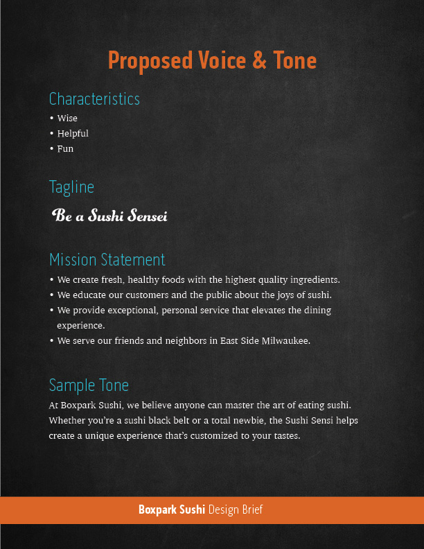
In the first week, we read three chapters from George Felton’s Advertising: Concept and Copy and several articles about developing a brand’s voice and tone. Felton (2013) describes a brand’s voice as its personality. In contrast, the tone is the way a message is expressed. While a brand’s voice should be consistent across all media, its tone changes depending on a number of factors. In a YouTube video from Stukent (2018), Liza Dunning says that tone is determined by who you are addressing, the situation (or emotional state) the viewer is in, and the topic of your content.
The personality of Boxpark Sushi is that of a friendly teacher who is wise but not aloof or condescending, embodied by the “Sushi Sensei” persona. This wide, friendly voice speaks directly to the young professionals and college students of East Side Milwaukee. Once the brand personality and characteristics were established, we created a Brand Voice Chart as suggested by Heald (2018). This chart helped illustrate how to use the brand’s voice consistently in written content.
Brand Voice Chart
Characteristic
Description
Do
Don’t
Smart
We know sushi, and we love sharing our knowledge.
Be knowledgeable. Be humble.
Be arrogant or condescending. Use overly technical words and phrases.
Friendly
Our customers are our friends and neighbors.
Use casual language. Be positive.
Be overly personal.
Helpful
We help make sushi easy and accessible.
Be open and inquisitive. Be honest.
Be annoying by pushing help on those who don’t need or want it.
Fun
Our definition of fun is sharing good food and laughter with friends.
Be playful. Emphasize the social aspect of Boxpark Sushi.
Exclude or mock anyone. Use derogatory language.
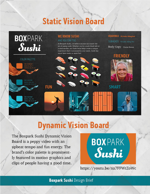
Static Vision Board
Explaining design strategies to clients without visuals can be challenging. Vision boards, also called mood boards or inspiration boards, help communicate ideas when words aren’t enough. WDD Staff (2008) notes that vision boards demonstrate the thinking behind your design ideas and help clients feel involved with the process. This leads to less “I’ll know it when I see it,” and fewer design changes based on personal preferences like a favorite color.
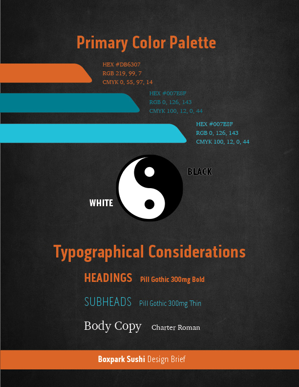
Color and typography choices were instead guided by the brand characteristics and studies into the psychology of colors and fonts. A reddish orange was selected as a primary color because it communicates the brand’s warm, fun energy (Kolenda, 2016). Przybyla (n.d.) also notes that warm reds and oranges can increase one’s appetite. The secondary teal blue color denotes intelligence and competence (Kolenda, 2016) as well as being complementary to the primary orange.
Boxpark Sushi static vision board by Joshua Siegel
Pill Gothic 300mg was chosen as a header font because it is both strong and condensed. According to Kolenda (2016), condensed fonts convey tightness and precision, traits that are valued in sushi preparation. Funkydori, a thick script font, was also used to represent the organic nature of sushi. The vision board has no photos of raw fish that may turn off consumers who are new to sushi. Instead, the product is presented as vector illustrations that are realistic enough to be identified by sushi eaters yet cute to sushi newcomers.
Several days after submitting our static vision boards, classmate Jose Caceres and I conducted our first video critique to discuss the project. Feedback from Caceres and Dr. Adam Baldowski informed the next project, dynamic vision boards for Boxpark Sushi.
Dynamic Vision Board
While a static vision board helps communicate a brand identity’s voice and tone, adding sound and motion creates new ways to express the brand’s characteristics. A dynamic vision board for Boxpark Sushi was created in Adobe After Effects using royalty-free stock video clips. The music bed was selected because of its upbeat tempo and fun energy. The musical frequencies of the piece were also considered, as midrange to high frequencies can convey happiness and forward thinking (Gillespie, 2019). These qualities help convey the brand’s fun and friendly personality.
The video’s transitions are smooth and organic with no hard cuts, and the motion is energetic yet fluid like a martial art. These traits are reflective of the Sushi Sensei persona who represents the Boxpark Sushi brand. Selected video clips show fun and playful imagery and sushi illustrations but no clips of sushi being prepared or eaten. This decision was made in order to make the dynamic vision board feel more like a demonstration of the brand’s personality and less like a commercial promoting the brand’s product.
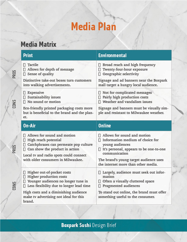
In the fourth and final week of Design Integration, we developed a media plan and utilized it to create a final design brief for our brand identity. In order to determine the best way to reach Boxpark Sushi’s audience, a media matrix was used to consider the pros and cons of advertising in four categories of media: print, environmental, on-air, and online (Stone, 2010). Boxpark Sushi will utilize each of the categories except on-air due to the high costs and diminishing audience of television advertising. Reporting for Ad Age, Crupi (2019) notes that 27% of 18 to 49-year-old viewers stopped watching broadcast television in 2016 to 2017, tuning in to streaming services or social media instead. This means that the advertising budget for Boxpark Sushi is better spent on social media campaigns and content to engage the target audience of college students and young professionals.
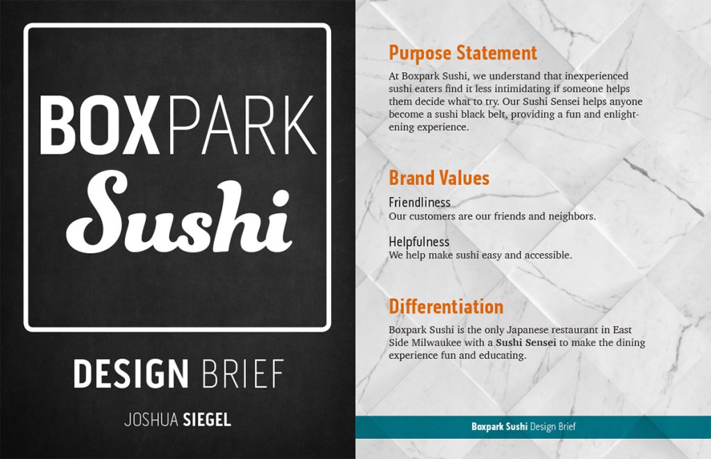
Boxpark Sushi design brief by Joshua Siegel
The final design brief for Boxpark Sushi integrated all the previous research and strategies related to the brand’s identity including color palette and typographical considerations, voice and tone samples, and media strategies. This brief will serve as a blueprint when designing media assets and content for the brand in future classes.
Over the past month, the Boxpark Sushi brand has been more clearly defined by research and critiques that support many design strategies but question other previous choices. The research also informed the creation of a media delivery plan which describes the best ways to connect with a target audience (Stone, 2010). The final design brief is an overview of the key information regarding this design project, including the media delivery plan.
Previous design research and strategies for Boxpark Sushi determined that the brand voice is wise and friendly, and the tone is playful. These adjectives, along with the brand’s fun and helpful personality traits, provided directive words used to find appropriate images, colors, and typography for the brand. Many of these design choices and directive words were established in the brand’s static vision board but were adjusted after critiques from Jose Caceres and Dr. Adam Baldowski. For example, the word “smart” was changed to “wise” to project a softer and kinder image rather than an arrogant or condescending form of intelligence.
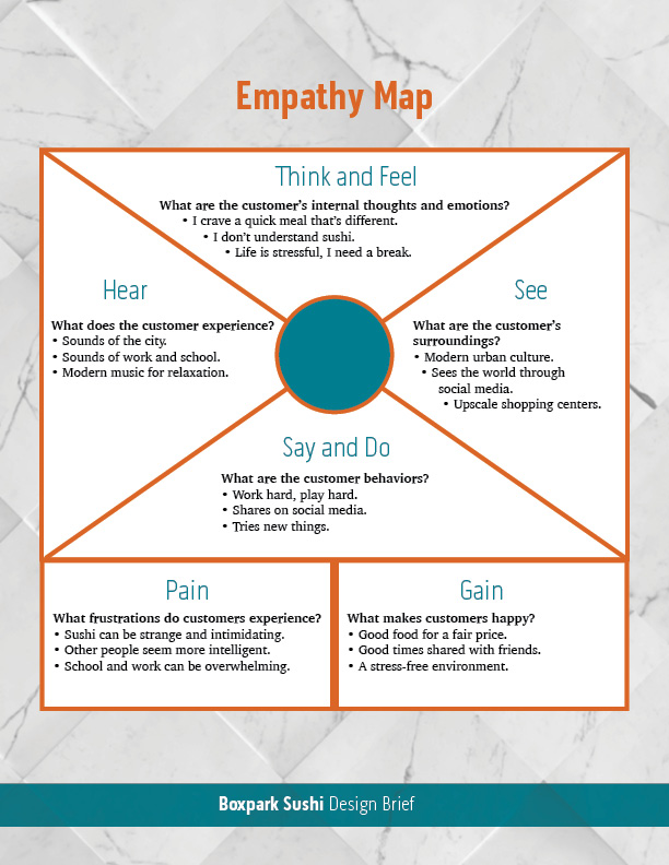
The brand narrative is based on the concept of a “Sushi Sensei” helping customers decide what to order with the ultimate goal of helping them become masters in the art of sushi eating. This narrative and the Sushi Sensei persona are designed to appeal to the primary target audience of East Side Milwaukee college students and young professionals who are educated and aspire to learn more.
An effective ad strategy involves using media that targets the primary audience and repeatedly exposes that target demographic to a persuasive message that keeps the featured brand visible (Gordon, 2017). In order to determine the best way to reach Boxpark Sushi’s audience, a media matrix was used to consider the benefits and drawbacks of each media outlet. A media matrix is a graphical media planner that explains the pros and cons of advertising in four categories of media: print, environmental, on-air, and online (Stone, 2010). Boxpark Sushi will utilize each of the categories except on-air. The high production costs for television commercials make this medium cost prohibitive for a small, local brand. Broadcast television is also a fading medium. Reporting for Ad Age, Crupi (2019) notes that 27% of 18 to 49-year-old broadcast television viewers stopped watching over a period of just two years (2016-2017), tuning in to streaming services or social media instead.
The Boxpark Sushi media delivery plan describes six media assets and explains the strategic purpose of each. Three of the media assets were class requirements, but the other three were developed from the brand’s media matrix. All six of the assets utilized research to explain the proposed application and determine its strategic purpose. For example, research of pole banners revealed that although drivers will look at a pole banner for only two to four seconds, effective banners can reinforce your brand message by repeatedly exposing it to a localized audience (Commerce Color, n.d.). Boxpark Sushi can clearly benefit from this type of physical delivery media advertising near the Boxpark shopping center in East Side Milwaukee.
In terms of screen-based media, a Sushi Sensei app is one way for the brand to stand out in an already cluttered online environment. A mobile app can help customers order sushi that fits their tastes and personality, even if they are not eating at Boxpark. This provides a useful benefit to users while also helping Boxpark Sushi increase sales, improve brand awareness, grow the audience, increase customer loyalty, and collect data (Bulatovych & Zakurdaieva, 2018). The app can also be used in-store to help staff fill the Sushi Sensei role.
Learning to develop a media delivery plan was a new and valuable lesson. Vision boards and creative briefs were created for previous classes, but the final design brief for the Boxpark Sushi brand integrated all the strategies and creative decisions that were developed in the past few months. Brand differentiation, user behaviors, and advertising strategies all came into play while developing the media delivery plan and design brief. In the coming months, the knowledge acquired in this project will inform further design of the Boxpark Sushi brand logo and media assets.
Design Integration, the eighth course in the Media Design MFA program from Full Sail University, continued the development of a brand identity for a fictional client: Boxpark Sushi, located in East Side Milwaukee.
My classmates and I learned how to express the brand’s personality and voice through static vision boards, then added motion and sound to create dynamic vision boards. We also developed a media delivery plan to strategize the best media outlets and assets to reach the brand’s target audience. Finally, we integrated all the previous research and strategies into a design brief for the brand identity.
Connecting / Synthesizing / Transforming
The Voice and Tone assignment established the Boxpark Sushi voice as fun but wise, like an old friend who happens to know everything about sushi. Before work could begin on the brand’s static vision board, research was conducted to find an appropriate color palette. One of the resources recommended by Professor Argo was a Design Shack article by Carrie Cousins. Many positive color associations were listed in the article, including the association of “energy, ambition, and enthusiasm” with the color orange (Cousins, n.d.).
Further research uncovered the work of psychologist Nick Kolenda, who compiled information from numerous academic studies into easy to read marketing guides about the psychology of colors. Discussing color meanings and associations, Kolenda (2016) lists “fun, happiness, and abundance” as a few words associated with the color orange. However, it is also noted that these associations emphasize hue, but neglect the color’s value (brightness) and chroma (saturation).
Cousins (n.d.) addressed the associates of color value, noting that a darker shade of any color gives it a more negative association, while brighter tints create a more positive feel. On the Color Psychology website, Przybyla (n.d.) also notes that warm reds and oranges can increase one’s appetite. This is an important physiological response for food brands like Boxpark Sushi.
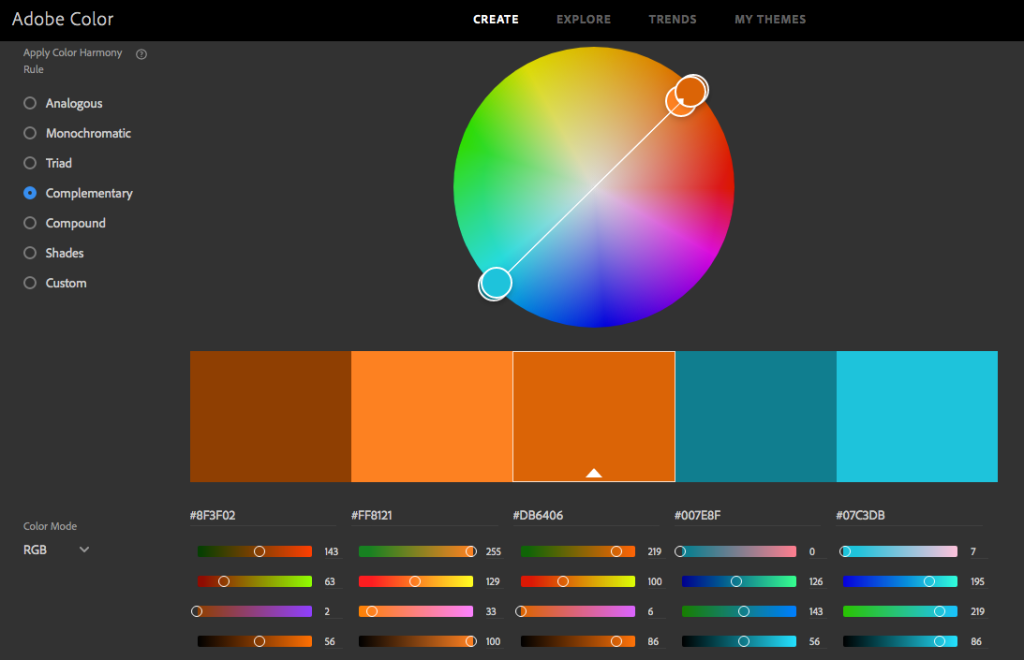
For these reasons a light orange was selected as the starting point for Boxpark Sushi’s primary color. The Adobe Color website was utilized to find an appropriate tint of the color orange. A complementary color harmony rule was used to find a secondary color. The teal blue color denotes intelligence and competence (Kolenda, 2016) as well as being visually complementary to the primary orange.
Adobe Color color wheel
Problem Solving
Boxpark Sushi is a service-based brand, not product-based. The dynamic vision board needed to feel like a demonstration of the brand’s personality, not a commercial promoting the brand’s product. For that reason, the video included no clips of sushi being prepared or eaten. While sushi illustrations do pop up in the video, they are decorative and secondary to the imagery denoting the brand’s fun but wise personality.
Searches for royalty-free and attribution-free video clips were conducted on Pixababy and Pexels using search terms like “fun” and “laughter” to find inspiring images with orange and blue colors similar to the brand color palette established in the static vision board. Color adjustments were made in Adobe After Effects to closer match the brand colors.
Innovative Thinking
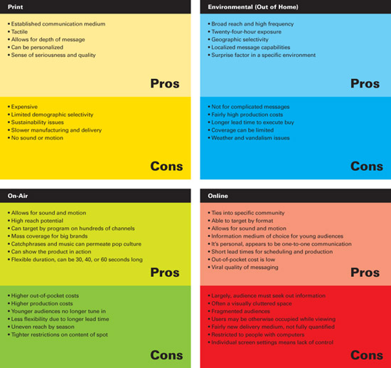
A Media Matrix is a graphical media planner that explains the pros and cons of advertising in four categories of delivery media: print, environmental, on-air, and online (Stone, 2010). Stone listed many of these advantages and disadvantages in the media matrix below.
Media Matrix
This matrix was used as a starting point while customizing a plan appropriate for Boxpark Sushi. The updated plan (below) was included in the final design brief and used to define which media assets would best serve the brand.
Media Matrix
Print
Environmental
PROS
• Tactile • Allows for depth of message • Sense of quality Distinctive take-out boxes turn customers into walking advertisements.
• Broad reach and high frequency • Twenty-four-hour exposure • Geographic selectivity Signage and ad banners near the Boxpark mall target a hungry local audience.
CONS
• Expensive • Sustainability issues • No sound or motion Eco-friendly printed packaging costs more but is beneficial to the brand and the planet.
• Not for complicated messages • Fairly high production costs • Weather and vandalism issues Signage and banners must be visually simple and resistant to Milwaukee weather.
On-Air
Online
PROS
• Allows for sound and motion • High reach potential • Catchphrases can permeate pop culture • Can show the product in action Local tv and radio spots could connect with older consumers in Milwaukee.
• Allows for sound and motion • Information medium of choice for young audiences • It’s personal, appears to be one-to-one communication The brand’s young target audience uses the internet more than other media.
CONS
• Higher out-of-pocket costs • Higher production costs • Younger audiences no longer tune in • Less flexibility due to longer lead time High costs and a diminishing audience make tv advertising not ideal for this brand.
• Largely, audience must seek out information • Often a visually cluttered space • Fragmented audiences To stand out online, the brand must offer something useful to the consumer.
Boxpark Sushi media matrix
Future media delivery strategies will look back at Stone’s original matrix for inspiration but seek further supporting details for each category’s pros and cons.
Acquiring Competencies
The following are concepts, skills, or new resources learned in the Design Integration course. They are categorized as Academic (pertaining to schoolwork) or Occupational (pertaining to work in the Media Design field), and Technical (pertaining to software or other design skills) or Conceptual (new terminology, procedures, or ideas).
Advertising is “the paid, non-personal distribution of a persuasive message with the purpose of promoting products or services to current or potential customers “(Gordon, 2017). Advertising is just one piece of a marketing campaign. [Occupational, Conceptual]
A Design Brief includes the objective and strategies defined in the creative brief but also adds additional information (Frenson, 2015). This can include color palette and typographical considerations, voice and tone samples, and media strategies. [Occupational, Conceptual]
A Media Matrix is a graphical media planner that explains the pros and cons of advertising in four categories of media: print, environmental, on-air, and online. [Occupational, Conceptual]
Looming motion occurs when visual stimuli get larger or closer, capturing more attention than receding motion because “…looming objects are more likely than receding objects to require an immediate reaction…” (Franconeri & Simons, 2005). [Academic, Conceptual]
Vision boards, also called mood boards or inspiration boards, help communicate ideas when words aren’t enough. WDD Staff (2008) notes that vision boards demonstrate the thinking behind your design ideas and help clients feel involved with the process. [Occupational, Conceptual]
A Mission Statement is a brief description of a brand’s fundamental purpose (Ward, 2019). It explains who the brand is to people in the organization and the public. [Occupational, Technical]
Brand Voice is determined by a distinctive personality, vocabulary, and rhythm and pace (Kenny, 2017). Brand voice is consistent, but the brand tone changes with the message. [Academic, Conceptual]
Brand Tone is determined by a number of factors including who you are addressing, the situation (or emotional state) the viewer is in, and the topic of your content (Stukent, 2018). [Academic, Conceptual]
Scaffolding is the process of showing and collaborating on the design strategy with the client so there are no surprises or uncertainty (The Futur, 2014). Vision boards are useful for scaffolding design projects. [Occupational, Conceptual]
Words and pictures should be used together achieve synergy, not redundancy (Felton, 2013, p. 81). Try to create some tension between word and image so that their combination achieves an effect greater than their individual sums. [Academic, Conceptual]
Visual Hierarchy is the ordering of content in a composition so that you effectively communicate information and create meaning by directing the viewers’ eyes to the most important information first (Lundgren, n.d.). [Occupational, Conceptual]
References:
Franconeri, S., & Simons, D. (2005). The dynamic events that capture visual attention: A reply to Abrams and Christ (2005). Perception & Psychophysics, 67(6), 962.