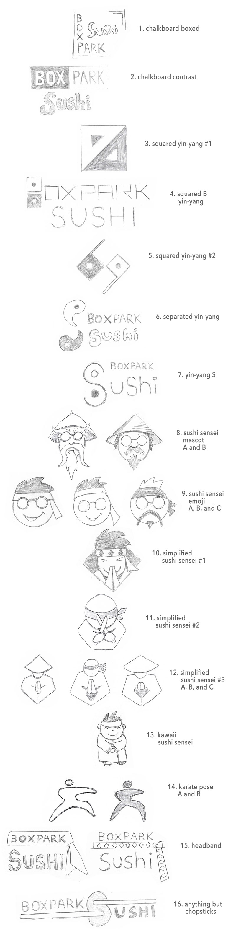
The first project for the Multi-Platform Delivery course are rough logo concept sketches for Boxpark Sushi, a fictional brand developed in previous courses of the Media Design MFA program.
| BRAND ATTRIBUTES | KEYWORDS or PHRASE |
| KEY VALUES | FriendlinessHelpfulness |
| KEY CHARACTERISTICS | WiseFun |
| DIFFERENTIATION | The only Japanese restaurant with a Sushi Sensei. |
| EXPERIENCE | Makes the dining experience fun and educational. |
| PURPOSE | The Sushi Sensei helps anyone become a sushi black belt. |
In what ways did your research inform this ideation process?
The Boxpark Sushi brand is built around the idea of a friendly, helpful Sushi Sensei. Therefore, most of the concept sketches are karate inspired in order to stand out in a market where logos featuring chopsticks, rolls, or fish are ubiquitous. To find inspiration, I researched symbols that are visually associated with karate and other Japanese martial arts.
Like karate, the yin-yang symbol originated in China (Yang, n.d.) but became part of Japanese culture. The symbol represents the balance of light and dark, and it has become associated with wisdom and chi (internal energy). Several of my concept sketches use the yin-yang symbol as inspiration but change it to something new and modern rather than incorporating the traditional symbol into a letterform.
I also researched visual inspiration for the Sushi Sensei mascot and simplified versions of the character. A sketch based on kung-fu character Pai Mei seemed too harsh for the fun aspect of the brand, but a second version based on Mr. Miyagi from The Karate Kid seemed more fun and cooler.
In what ways can you be confident that the selected logos will effectively communicate the brand identity?
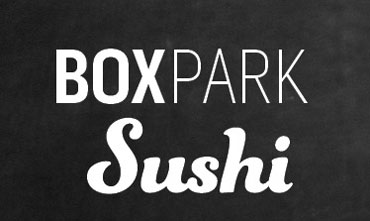
Because the word “sushi” is included in the brand name, there is no need to visually represent the product. Words and pictures should be used together achieve synergy, not redundancy (Felton, 2013, p. 81). For that reason, the logo sketches tried to add the “sensei” aspect of the brand to the name, which already tells consumers where it is and what it serves.
Logos using the sensei character are more brand specific than the concepts based on the yin-yang symbol or a simplified karate pose. Although the less specific designs could be used for other types of brands like a karate team, they can create synergy when paired with the Boxpark Sushi logotype (below).
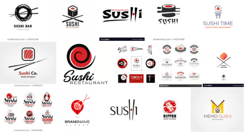
In what ways are your solutions unique, or innovative, by comparison to existing logos found through research that represent near and competing locations?
In the Design Strategies and Motivation course, three of Boxpark Sushi’s direct competitors in East Side Milwaukee were identified.
The logo for Maru Sushi is a simple, thin logotype with a pinkish red color filling in the letter a, presumably to resemble a maki roll.
The logo for Fushinami is an Asian inspired script font that is crimson red.
Kawa Ramen and Sushi has a logo that incorporates chopsticks, a Japanese kanji (letter), and a wave-like form that also resembles a maki roll.
This research and a Google image search of sushi restaurant logos confirmed that the most overused logo elements are chopsticks, rolls, the color red, and Asian script fonts. Therefore, none of my solutions contain those elements.
Side note: The lines in the 16th design are not meant to represent chopsticks. Anything but chopsticks.
What difficulties did you encounter within this concept sketching process?
The biggest difficulty I encountered was overcoming my tendency to over-illustrate. I struggled to keep things simple as recommended by Airey (2014), spending too much time on details of certain sketches before loosening up my style and letting ideas flow more organically.
Several of the logos are mascot-style images of the Sushi Sensei. This style may be too illustrative for a simple effective logo, but the drawings inspired simplified and iconified versions of the character. Mr. Peanut and the Michelin Man are two examples of characters that are incorporated into brand logos.
Another difficulty is judging my own work. It can sometimes be hard to tell if I like a concept because it effectively presents the brand attributes or because it just “feels right” or “looks cool”. An outside perspective in the form of critiques will be very helpful in deciding which concepts deserve further development.
References:
Airey, D. (2014, August 20). Logo Design Love, Annotated and Expanded Edition, Second Edition. Peachpit Press.
Felton, G. (2013). Advertising: Concept and Copy (Third). W.W. Norton.
Yang, R. (n.d.) Yinyang (Yin-yang). The Internet Encyclopedia of Philosophy. https://www.iep.utm.edu/yinyang/
