Measuring Design Effectiveness – Mastery Reflection

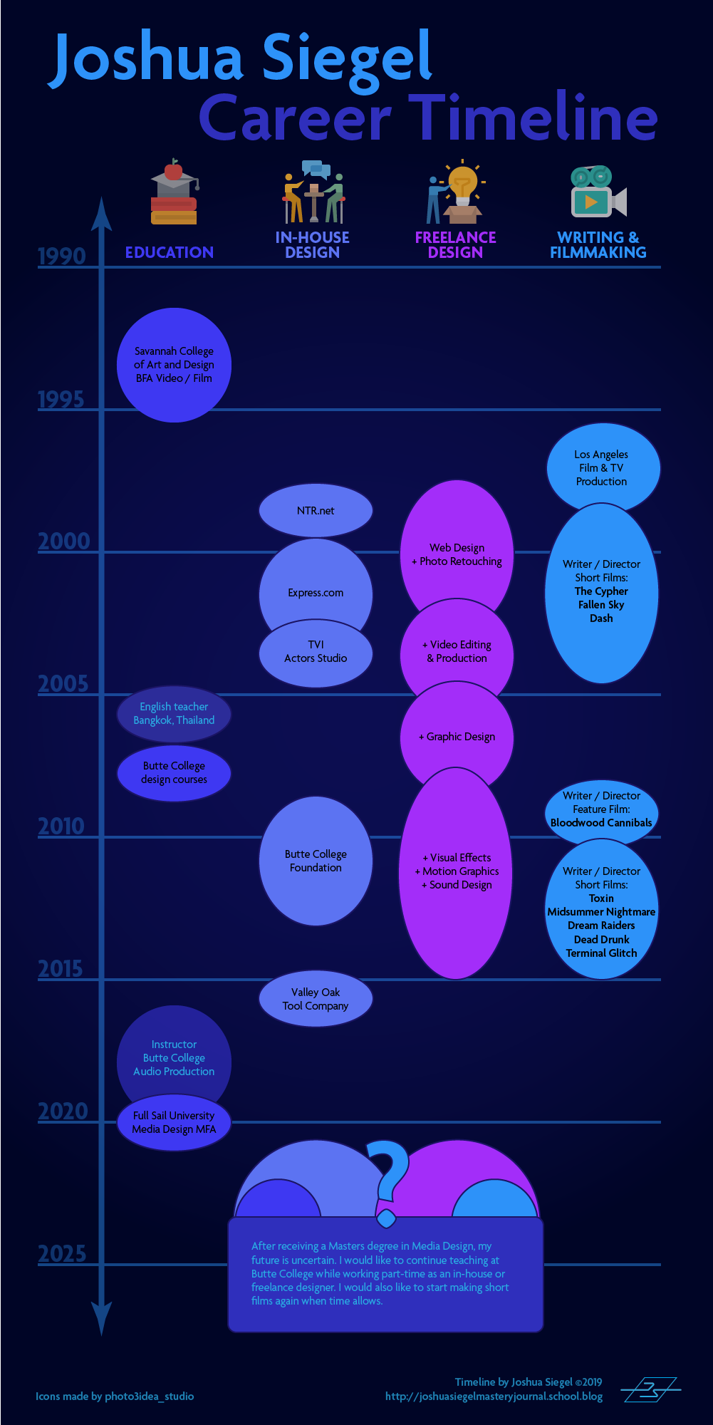
Connecting / Synthesizing / Transforming

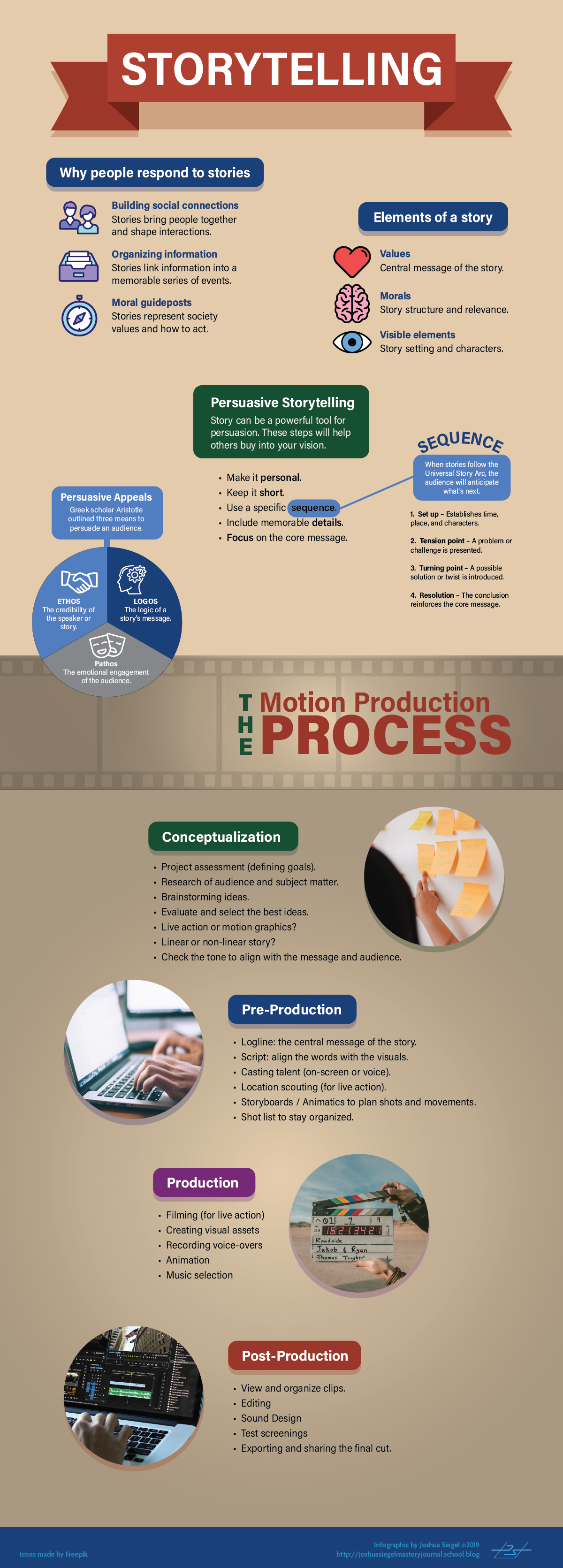
Design is about communication. In the information age, vast amounts of data are available but not easily understood. Therefore, designers must find ways of communicating abstract ideas and data through visuals that connect with the target audience. This connection is stronger when storytelling is used to engage the audience.

Crooks, et al. (2012) note that infographics are used to communicate a specific message using data visualization. Telling a story makes the visualization more interesting and engaging. Durcevic (2018) adds that a well-told story makes data easier for the audience to understand.

I connected this information to what I already knew about storytelling as a writer and filmmaker. Many stories follow a familiar dramatic structure known as Freytag’s pyramid. Nineteenth century German author Gustav Freytag described the dramatic structure of a story as a pyramid shape containing five dramatic elements: exposition (introduction), rising action that often begins with an inciting incident, the climax, falling action, and resolution.

Freytag's Pyramid
Freytag’s Pyramid

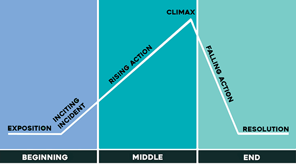
Every story arc has a beginning, middle, and end. For a data visualization like an infographic, the story arc could take the form of a presented design problem (the conflict or inciting incident), responses to possible solutions (rising action), and the final conclusion that led to a design solution (the resolution).

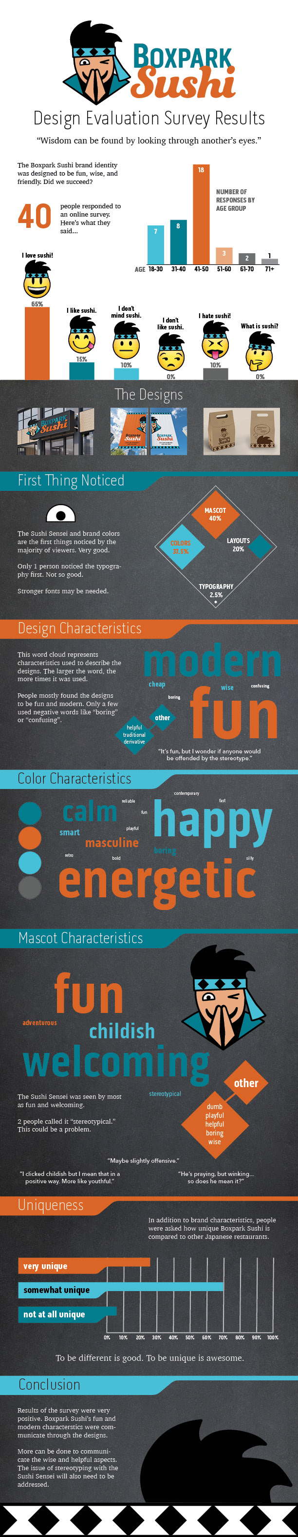
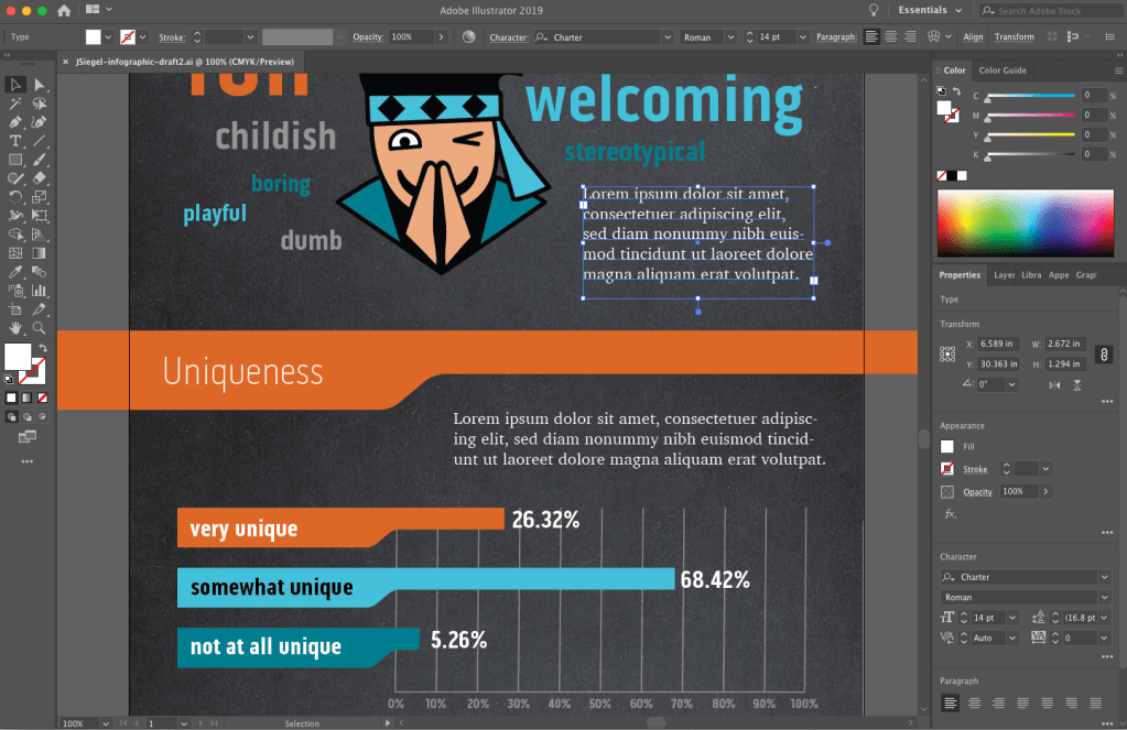
I applied this knowledge when developing my survey results infographic. The introduction sets up the design problem. Do the Boxpark Media assets communicate the brand’s characteristics and values? Each section of the infographic adds information in the brand voice (see below) with rising action. The climax, while not very exciting as stories go, identifies a potential stereotypes issue that is addressed in the conclusion.

Mascot Characteristics infographic

Problem Solving

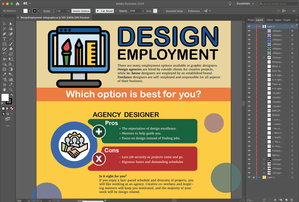
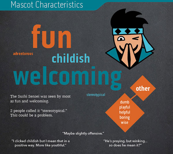
To tell the story of how survey respondents described Boxpark Sushi, I needed to utilize the brand voice and visual elements of the brand, including the Sushi Sensei, in the infographic. A chalkboard background helped communicate the brand’s educational characteristic. However, communicating the brand’s fun side was an enlightening design problem.

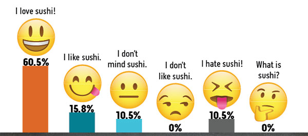
The infographic first draft utilized vector emojis downloaded from Adobe stock to demonstrate respondent opinions of sushi. A peer review of the infographic draft noted that the emojis are witty and fun, but they are a concept that is not used in other brand designs. This creates a disconnect from the overall brand.

infographic emojis first draft

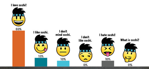
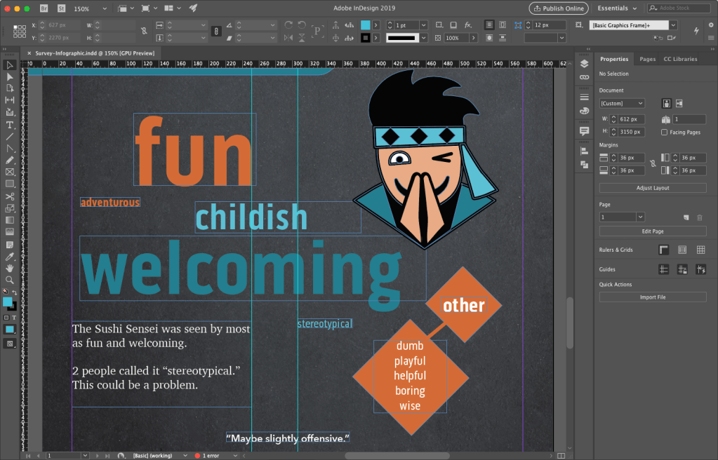
To correct this issue, the second solution modified the emojis by adding the Sushi Sensei headband and hair. This customized visual styling makes a closer connection to the brand while reinforcing the fun aspect. It also adds to the storytelling by tying the Sushi Sensei voice to the visual style.

infographic emojis final draft

Innovative Thinking

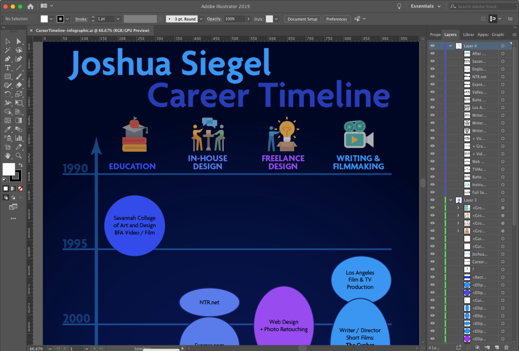
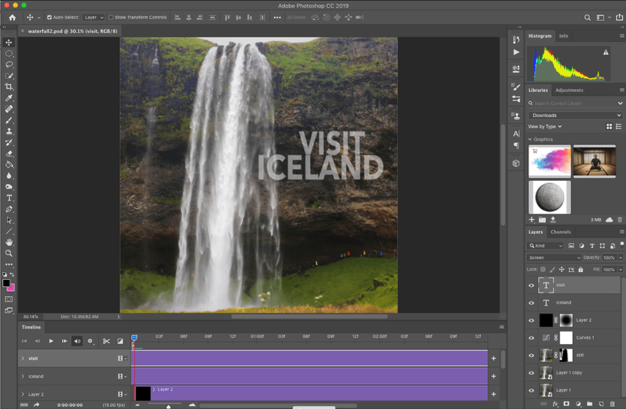
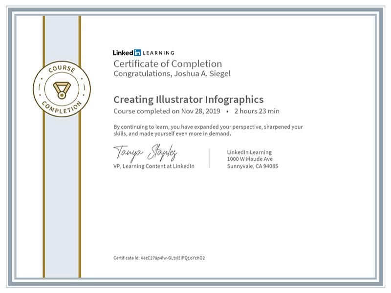
Adobe Illustrator is a powerful tool for designing vector graphic. I have used Illustrator to create infographics for previous assignments, and it appears to be the preferred tool for most infographic designers. For example, a search for “infographics” on LinkedIn Learning showed many courses focused on Illustrator as the primary software used. Although Illustrator is powerful and easy to use, I discovered its limitations when designing the Boxpark Sushi survey results infographic.

Normally, Illustrator files are small and load quickly. But the first draft of the infographic had a very large file size (110 MB) and look several seconds to save or open. The most likely reason for this was the chalkboard background which was a bitmap image rather than a vector graphic. I also found placing images and text to be more difficult than necessary.

As a result, I decided to use Adobe InDesign to create the infographic final draft. While InDesign is more commonly used to design multi-page documents, I found it to be the perfect tool for laying out this infographic. Most of the design elements like the charts and brand assets were already created in Illustrator and Photoshop, so they only needed to be placed and arranged with InDesign. The result was a small file size (only 4 MB) that saved and loaded quickly. InDesign is also better than Illustrator for adding and controlling text.

This project helped me discover a more effective workflow for designing infographics:

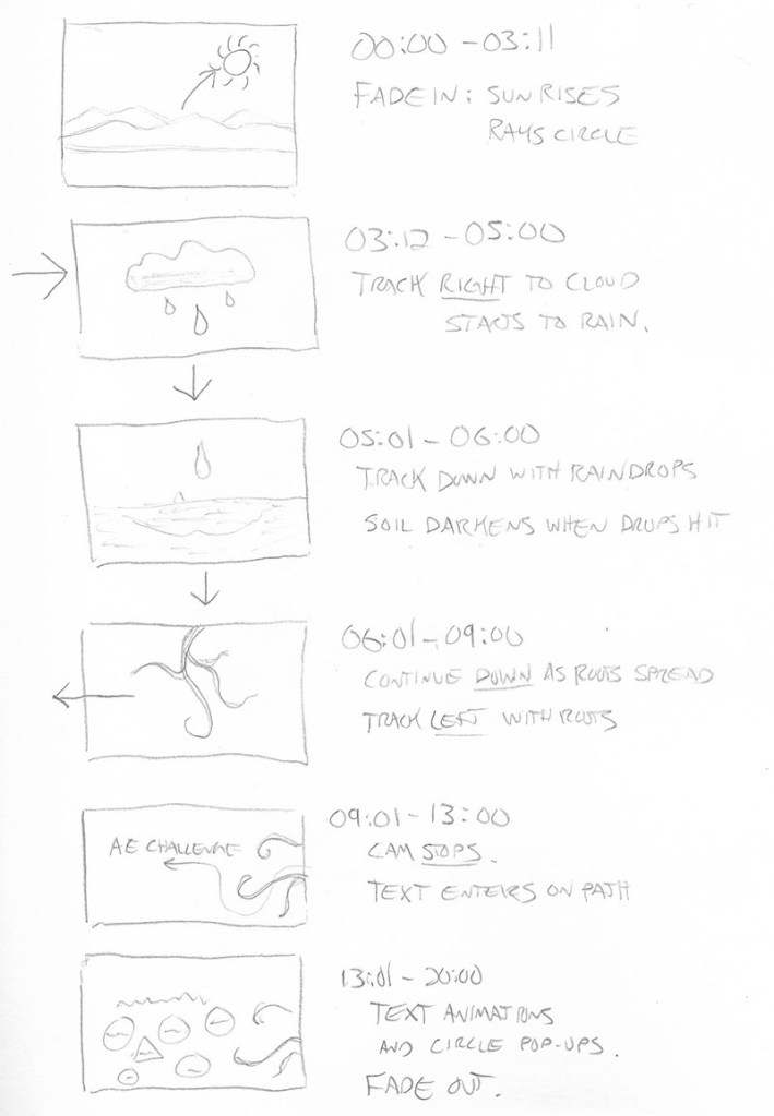
  1. Analyze the data and determine the story you want to tell.
  2. Sketch out possible layouts and choose the most effective design.
  3. Wireframe the layout with placeholder text using InDesign.
  4. Create vector assets in Illustrator and bitmap assets in Photoshop.
  5. Place visual assets and final copy into InDesign.
designing the infographic draft 1 in Adobe Illustrator
designing the infographic draft 2 in Adobe InDesign

Acquiring Competencies

Hard value includes measurable data such as production costs or the number of website visitors. Soft value is less measurable and more subjective. (Occupational, Conceptual)

The Design Staircase™ model, also called the “design ladder,” was developed by the Danish Design Centre (DDC) to evaluate how businesses use design and directly correlate that information to financial gains.

  • Stage One: No Design. Design is not used systematically.
  • Stage Two: Design as Styling. Design is only used as superficial decoration.
  • Stage Three: Design as Process. Design is an integral part of the innovation process.
  • Stage Four: Design as Strategy. Design is an integral part of the business strategy.(Occupational, Conceptual)

In the book Universal Principles of Design, Lidwell, Holden, and Butler (2009) introduced a hierarchy of user needs based on Maslow’s hierarchy of needs. The model describes user needs in terms of design functions. (Academic, Conceptual)

Evaluative research on a design ensures that visual elements like colors and fonts not only create a usable experience, but also express complex brand traits like friendliness. (Occupational, Conceptual)

An evaluation matrix measures levels of success for each criterion of a design, such as an idea’s potential impact and its expected shareholders. This provides deeper insight than pass-fail (yes or no) evaluations.

Modern designers are no longer just hired to create artifacts like posters. Today, they create ideas and develop novel ways to communicate a message. (Occupational, Conceptual)

Data Visualization communicates data through visuals that connect with the target audience. (Occupational, Conceptual)

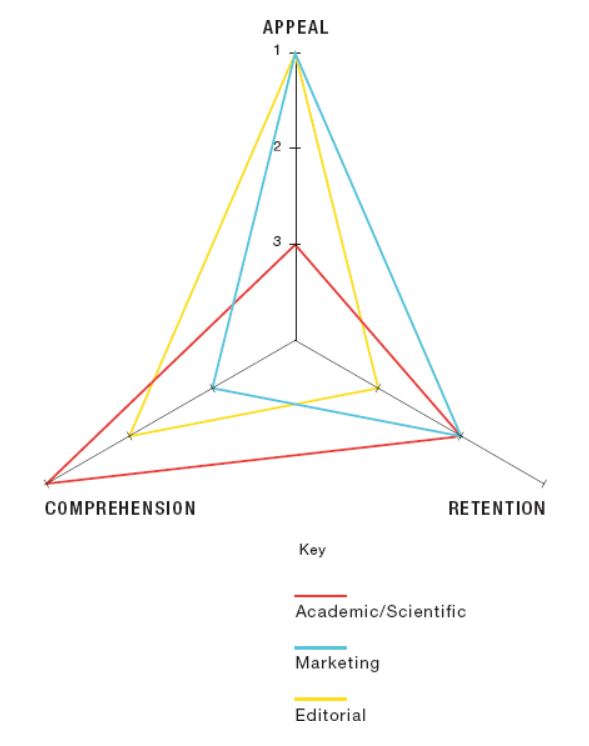
The objectives of an infographic (academic/scientific, marketing, or editorial) decide if the designer should emphasize appeal, comprehension, or mental retention. (Occupational, Conceptual)

Data visualization can be organized and presented as a story arc with conflict, rising action, and resolution. (Occupational, Conceptual)

Chart Legends should be avoided because they require the reader to work harder to interpret the chart. Instead, the same information can be more effectively presented by labelling data sets directly on the chart. (Occupational, Technical)

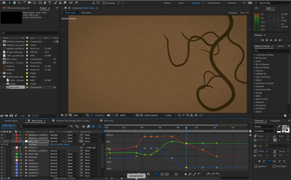
Motion Infographics elevate data visualization in four ways:

  1. Movement attracts the viewer’s eye.
  2. Animation engages the audience.
  3. Sound and imagery communicate the intended message.
  4. Music and voiceovers connect with viewers on an emotional level.
    (Occupational, Conceptual)

Infographic Sizes for online publication are typically 800 pixels wide and as long as necessary to tell the story. (Occupational, Technical)

Infographics are an effective visualization tool used to communicate a message to an intended audience. (Occupational, Conceptual)


References:

Crooks, R., Ritchie, J., & Lankow, J. (2012). Infographics: The Power of Visual Storytelling. John Wiley & Sons.

Durcevic, S. (2018, October 8). 10 Essential Data Visualization Techniques, Concepts & Methods To Improve Your Business – Fast. https://www.datapine.com/blog/data-visualization-techniques-concepts-and-methods/

Measuring Design Effectiveness Week 3 Live Session

Infographics as a Visualization Tool

Data is the results of research. Raw data in the form of numbers and hard figures can be difficult to mentally process, so it is important to present some sort of visual representations of the data. Effective data visualization should be informative, efficient, appealing, and in some cases interactive and predictive (Pittenturf, n.d.). Automatically generated charts and graphs may be informative, efficient, and in some cases interactive but they are not necessarily appealing.

An infographic is a simplified visual communication device. Most utilize text to explain the graphics and data visualizations like graphs and charts, helping the human brain process and retain the information. Krum (2013) notes that creating an infographic is not about making data visualizations look good. It’s about telling a story that includes data. Therefore, infographics are an effective way to visually communicate a message to an intended audience.

Telling a Story with Data Visualization

Media Design and Data Visualization are ways of communicating abstract ideas or data through visuals that connect with the target audience. Wilke (2019) notes that data visualization conveys insight about a dataset to the audience. Telling a story makes the visualization more interesting and engaging. Durcevic (2018) adds that a well-told story makes data easier to understand. Information can be organized and presented as a story arc with conflict, rising action, and resolution. For a data visualization like an infographic, the story arc could take the form of a presented design problem (the conflict), responses to possible solutions (rising action), and the final conclusion that led to a design solution (the resolution).

Audience and Objectives for Infographics

When designing an infographic, it is important to consider the intended audience. Is it intended for business minded executives or the general public? Understanding the audience needs can guide effective design choices. Sheikh (n.d.) notes that knowing your audience also helps you find the right tone when writing compelling copy for your infographic.

Knowing your audience ties closely with knowing your objectives. The diagram below from Crooks, et al. (2012) illustrates the priorities of an infographic by application. For example, an infographic intended for a marketing campaign should emphasize appeal before comprehension and retention. In contrast, an infographic used in an academic paper places comprehension before retention and appeal.

infographics priorities diagram
Image via Infographics: The Power of Visual Storytelling

References:

Crooks, R., Ritchie, J., & Lankow, J. (2012). Infographics: The Power of Visual Storytelling. John Wiley & Sons.

Durcevic, S. (2018, October 8). 10 Essential Data Visualization Techniques, Concepts & Methods To Improve Your Business – Fast. https://www.datapine.com/blog/data-visualization-techniques-concepts-and-methods/

Krum, R. (2013). Cool Infographics: Effective Communication with Data Visualization and Design. John Wiley & Sons.

Pittenturf, C. (N.D.). What is Data Visualization and Why is it Important? https://data-visualization.cioreview.com/cxoinsight/what-is-data-visualization-and-why-is-it-important-nid-11806-cid-163.html

Sheikh, M. (N.D.). What is an Infographic? (Examples, Tips and Templates). https://visme.co/blog/what-is-an-infographic/

Wilke, C. (2019). Fundamentals of Data Visualization. O’Reilly Media, Inc.

Organizational Structures Mastery Journal

Reflection

The Organizational Structures course provided deep knowledge about the structures of motion, storytelling, and design employment. New skills were developed for both academic and occupational applications. This paper examines each assignment and the resources used to complete the assignment.

Week one began with research into the structure of motion. Krasner (2013) provided a brief history of motion graphics, examples of motion graphics in public spaces, and the basic concepts of motion literacy including the principles of animation. The first assignment for the week’s mastery journal was to create an infographic based on what we learned from the readings. Tutorial videos by Harmer (2019) demonstrated how to create vector infographics with Adobe Illustrator.

Screenshot of creating an infographic in Adobe Illustrator.

Also in week one, we were assigned groups for a video discussion. Although this discussion would not take place until later in the month, our group connected by email to discuss availability for an online meeting. The purpose of this meeting was to meet our peers and share what we learned in the class.

In week two we researched the structure of storytelling in design. Krasner (2013) described conceptualization in motion design. Huber (2017) supported Krasner’s ideas for creative inspiration and using previsualization techniques like concept sketches and storyboards to develop story ideas. She also provided insight on storytelling with video, from preproduction to post-production. The assignment for this week’s mastery journal was to create another infographic based on what we learned from the readings.

Screenshot of creating an infographic in Adobe Illustrator.

Week two also contained an After Effects Design Challenge to demonstrate our motion graphics skills. Video tutorials from Robinson (2019) imparted new knowledge and skills within Adobe After Effects like using the Graph Editor to make keyframed movements smoother and more natural.

Screenshot of creating a motion design in Adobe After Effects

In week three we researched the structure of design employment. Articles by Flavin (2017), Castillo (n.d.), and others described the pros and cons of working in-house, with a design agency, and freelance. This information was used to create another infographic for the mastery journal. In addition to this infographic outlining what we learned about design employment, we created a visual timeline of our employment in the different employment sectors.

Screenshot of creating an infographic in Adobe Illustrator.
Screenshot of creating a timeline infographic in Adobe Illustrator.

Also in week three, we completed a Premiere Pro design challenge. The “Going Home” video used by Jago (2017) as an example in the Adobe tutorials was a good demonstration of Premiere’s tools. I edited a forty second video using the music, voiceover, and footage provided in the tutorial sample files.

Screenshot of editing video in Adobe Premiere Pro.

For week four’s design challenge, students were given the choice of creating a Kinetic Typography animation, three Cinemagraphs, moving Parallax Images, or a Motion Poster. I created the cinemagraphs in Photoshop, following tutorials from Duggan (2016).

Screenshot of creating a cinemagraph in Adobe Photoshop.

Week four imparted the academic knowledge and practice of creating an annotated bibliography. We learned that the annotated bibliography is not a summary. Instead, it is an analysis of the central theme and scope of the article or book. The six sources of motion and storyboarding information researched for this assignment are useful resources for future courses.

The video discussion arranged in the first week took place on Thursday, December 19. Our group discussed the assignments and learning materials, as well as sharing examples of motion design storytelling in real-world applications like motion posters for films. The meeting effectively wrapped up our experience in Organizational Structures by sharing with our peers.

Video discussion screenshot.

Connecting/Synthesizing/Transforming

This month’s research and assignments imparted a great deal of information, both conceptual and technical. Krasner (2013) provided a wide perspective on the history, concept, and techniques of motion design. He emphasized that storyboards are a valuable tool for conceptualization and ideation, in addition to outlining a story in the preproduction stage. Huber (2017) supported the importance of developing stories with previsualization tools like concept sketches and storyboards.

For the After Effects design challenge, I used storyboards to plan, plot, and time my motion graphic.

I transformed this knowledge into a 20-second animation that follows the movements of nature (a rising sun, falling rain, and growing roots) to illustrate the Principles of Animation created by Disney animators and explained by Krasner (2013). While creating the motion graphic, I consulted LinkedIn Learning tutorials by Robinson (2019) for technical ways to make animations follow the principles more closely. This research revealed how to use easy ease key-framing and the graph editor to make movements smoother and more organic.

Problem Solving

One design problem I resolved this month was the pacing of the Premiere Pro design challenge video. The “Going Home” promo video edited by Jago (2017) as an example in the Adobe tutorials was a good demonstration of Premiere’s tools, but the pace of the 60-second edit felt very slow and plodding compared to the upbeat music and imagery. I first created a 30-second edit that was too fast-paced, so I tried another 40-second cut. This edit contained all the information of the example video, but with a pace and run-time more appropriate for the short attention spans of social media.

Innovative Thinking

This month I created my first infographics and cinemagraphs. Although I am proud of my first efforts, they do not yet compare to the work of professional designers. Much more practice and experimentation are needed to get to that level. My video editing and motion design skills are more developed, but still need much improvement.

Creating my first cinemagraphs required going outside my comfort zone to work with video in Photoshop. The first two were relatively straight forward, but the Hawaii postcard cinemagraph was more challenging because there was no easy way to make the video loop. Instead, I used time remapping to make the video bounce back and forth in time. While not very realistic, this “ping-pong” type motion is used in many animated GIFs that are shared on social media.

Acquired Competencies

The following are concepts, skills, or new resources learned in the Organizational Structures course. They are categorized as Academic (pertaining to school work) or Occupational (pertaining to work in the Media Design field), and Technical (pertaining to software or other design skills) or Conceptual (new terminology, procedures, or ideas).

Academic

TechnicalConceptual
A story’s theme is its underlying message.

A story’s tone should align with its audience, its values, and its message.

Story Elements: Values: central message of the story. Morals: story structure and relevance. Visible elements: story setting and characters.

Logline: a one sentence summary that conveys the central message of the story.

A creative portfolio is not about showing 20 decent pieces, it’s about showing 5 great pieces.

Motion Graphics in Public Spaces: LED technology makes large public displays more interactive and purpose driven.

Motion Graphics in Film, Television, and Interactive Media: Animation can entertain, inform, and drive audience participation by combining traditional graphic design with the visual language of film.

BENSOUND is an excellent resource to find royalty-free music for motion graphics and video presentations.

AIGA: the professional association for design offers resources for students and professional designers.
Precursors of Animation: Multiple optical devices used the persistence of vision phenomenon to achieve early forms of animation.

Early Cinematic Inventions: Animation evolved with motion pictures in many forms including stop-motion and cell animation.

Experimental Animation and Innovators: Animators create new techniques for motion design and pure artistic expression.

Aristotle’s Three Persuasive Appeals: Ethos – The credibility of the speaker or story. Logos – The logic of a story’s message. Pathos – The emotional engagement of the audience.

Synaesthesia: a merging of senses (ie: hearing colors).

Causal Reasoning: the process of identifying relationships between a cause and a corresponding event.

Designs can be “hacked” by repurposing existing images and ideas.

Communication skills and availability are essential for freelancers.

Mentors can often be found at design agencies.

Occupational

TechnicalConceptual
Principles of Animation: The basic language of how objects move was established by Disney animators and described in the book The Illusion of Life by Frank Thomas and Ollie Johnston (1995).

Materials: real-world textures, materials, and found objects can provide inspiration and add authenticity to design.

Audience Segmentation:  analyzes audience characteristics including demographics, psychographics (i.e., personality), and firmographics (or business setting).

Affective Primer: the process of manipulating the emotions of an audience before the message is delivered. 

Creating Adobe Illustrator Infographics: Adobe Illustrator, Microsoft Excel, and other programs provide many tools for creating data-driven illustrations.

Adobe After Effects Graph Editor adjusts motion keyframes for more realistic, organic animations.

Lumetri Color panel allows for easy color grading within Adobe Premiere.

Essential Sound panel lets you improve sound quality within Adobe Premiere.

Cinemagraphs are still photographs that contains a small moving element.
Universal Sequence or story arc:
Set up – Establishes time, place, and characters.
Tension point – A problem or challenge is presented.
Turning point – A possible solution or twist is introduced.
Resolution – The conclusion reinforces the core message.

Pictorial Continuity: cohesion in content and style of visuals.

Sequential Continuity: logical flow of events between frames.

Primary (Object) Motion: Animation of an element’s spatial properties and how it moves over time and across space.

Secondary (Camera) Motion: Movement of the camera and how it frames the content.

Temporal Considerations: Linear movements mimic mechanical devices, while non-linear movements are more natural. Techniques such as slow motion and reverse playback can alter the sense of time.

In-house designers must be proactive, otherwise they are just following orders.

The primary role of in-house designers is explaining the brand to consumers.

Freelance designers can often pick up jobs from overloaded design agencies.

It’s important to be aware of current design trends and knowledgeable of graphic design from the past.  

References:

Castillo, R. (n.d.). In-house, agency, or freelance—what’s right for me? Retrieved from https://www.aiga.org/aiga/content/inspiration/in-house-agency-or-freelancewhats-right-for-me/

Duggan, S. (2016, April 6). Creating a Cinemagraph in Photoshop. LinkedIn Learning. Retrieved from https://www.lynda.com/Photoshop-tutorials/Create-Cinemagraph-Photoshop/471669-2.html?org=fullsail.edu

Flavin, B. (2017, July 24). Where Do Graphic Designers Work? In-House vs. Agency vs. Freelance. Retrieved from https://www.rasmussen.edu/degrees/design/blog/where-do-graphic-designers-work/

Harmer, T. (2019, July 19). Illustrator Infographics. LinkedIn Learning. Retrieved from https://www.linkedin.com/learning/creating-illustrator-infographics/illustrator-infographics?u=50813145

Huber, A. (2017). Telling the Design Story. Focal Press. Retrieved from https://learning.oreilly.com/library/view/telling-the-design/9781351849210/

Jago, M. (2017, September 20). Create a project and import a clip. Retrieved from https://helpx.adobe.com/premiere-pro/how-to/create-project-import-media.html

Krasner, J. (2013). Motion graphic design. Applied history and aesthetics. 3rd, rev. ed. Oxford: Focal Press. Retrieved from https://learning.oreilly.com/library/view/motion-graphic-design/9780240821139/

Robinson, I. (2019). After Effects: Principles of Motion Graphics. LinkedIn Learning. Retrieved from https://www.linkedin.com/learning/after-effects-principles-of-motion-graphics-2/custom-speed-changes?u=50813145

Thomas, F., & Johnston, O. (1995). The illusion of life: Disney animation. New York: Hyperion.

Design Employment infographic

There are many employment options available to graphic designers. Design agencies are hired by outside clients for creative projects, while in-house designers are employed by an established organization or brand. Freelance graphic designers are self-employed and responsible for all aspects of their business.

Which option is best for you? This infographic can help you decide.

Overview

Information in the Design Employment infographic was gleaned from learning materials presented in week three of the Organizational Structures course. This week we learned about the different employment options for designers, from freelance to in-house and agency work. Flavin (2017) discussed the benefits and drawbacks of each option, noting that it’s important for a designer to “find the perfect work environment to cultivate your creativity”.

In-house designers know a brand intimately by working with it day after day and enjoy a steady paycheck. However, this can lead to monotony and creative stagnation. Most of my experience is with in-house design, often as a one-man team responsible for everything from copy writing to web design. Depending on the employer and how closely you align with their values, working in-house can be a joy or a nightmare. Björk (2010) notes many ins (upsides) and outs (downsides) of working in-house. The most important to me is the stability of a regular paycheck, especially now that I have a wife and child.

Working at a design agency is a great way to learn and gain experience with other design professionals. The fast-paced and demanding schedule drives creativity, but there is less job security as clients come and go. Working with other creative thinkers is one of my favorite aspects of film production, and I would love to work at an established design agency.

Freelance designers enjoy the freedom to work when and where they please but have added responsibility of managing a business, from bookkeeping to office supplies. It’s important to have enough clients and financial stability before trying to go freelance. There are many downsides to freelancing: constantly looking for work, no co-workers for critiques, and unreliable pay just to name a few. Offering freelance services to a design agency can be an ideal situation. Rassom (2011) lists five things an agency looks for when hiring freelancers:

  1. Creativity that goes beyond technical skills.
  2. Experience that shows you’re reliable.
  3. Time to finish a project on schedule.
  4. Rates that reflect what you’re worth.
  5. Communication skills and availability.

Since graduating from the Savannah College of Art and Design, I’ve worked in a wide variety of design and entertainment jobs. The timeline below demonstrates just how long a journey it has been.

Acquired Competencies

The following are concepts, skills, or new resources learned in the third week of the Organizational Structures course. They are categorized as Academic (pertaining to school work) or Occupational (pertaining to work in the Media Design field), and Technical (pertaining to software or other design skills) or Conceptual (new terminology, procedures, or ideas).

Academic

TechnicalConceptual
A creative portfolio is not about showing 20 decent pieces, it’s about showing 5 great pieces.

BENSOUND is an excellent resource to find royalty-free music for motion graphics and video presentations.

AIGA: the professional association for design offers resources for students and professional designers.
Designs can be “hacked” by repurposing existing images and ideas.

Communication skills and availability are essential for freelancers.

Mentors can often be found at design agencies.

Occupational

TechnicalConceptual
It’s important to be aware of current design trends and knowledgeable of graphic design from the past.

Lumetri Color panel allows for easy color grading within Adobe Premiere.

Essential Sound panel lets you improve sound quality within Adobe Premiere.  
In-house designers must be proactive, otherwise they are just following orders.

The primary role of in-house designers is explaining the brand to consumers.

Freelance designers can often pick up jobs from overloaded design agencies.    

References:

Björk, J. (2010, March 12). The Ins and Outs of Working In-house. AIGA. Retrieved from https://www.aiga.org/ins-and-outs-of-working-inhouse

Flavin, B. (2017, July 24)/ Where Do Graphic Designers Work? In-House vs. Agency vs. Freelance. Retrieved from https://www.rasmussen.edu/degrees/design/blog/where-do-graphic-designers-work/

Rassom, B. (2011, July 18). 5 Things a Design Agency Looks for when Hiring Freelancers. Retrieved from https://millo.co/design-agency-looking-to-hire-freelance-designer

Storytelling Infographic

Outcomes and Knowledge

In the second week of the Organizational Structures course, we researched the Structure of Storytelling in Design. The title of this course finally made sense to me through the readings about developing effective stories that are structured in a specific, mindful way. Like the research and copywriting skills learned in previous courses, storytelling is an important tool for a master designer. Huber (2017) remarks “Being able to understand your client, garner their attention, and leave them with a message that is clear, purposeful, and inspiring has never been more critical.” Strong knowledge of storytelling concepts and processes will help me develop more effective design solutions.

The first project this week was an After Effects Challenge to review our motion design technical skills. After watching tutorials from Adobe and LinkedIn Learning, I created a short animation that demonstrated the basic concepts and features of After Effects CC. This project took more time that it should have, but I picked up several new skills and learned more about motion design. Robinson (2019) describes how the After Effects graph editor allows designers to “take true ownership” of animation by customizing the speed between keyframes. This creates more natural, organic movements than linear keyframes.

The second project was an Infographic outlining what I learned this week (see above). Infographics are another Organizational Structure for communicating with an audience. This project helped me sort through many pages of notes, organize what I learned, and translate it into a visual design. Even though I have produced videos for over twenty years, this week’s lessons provided new insights into the conceptualization stage of production. Krasner (2013) notes “Regardless of tools and delivery format, concept development is critical to all forms of graphic communication.” Ideas must be formulated, evaluated, and refined at a very early stage. This reinforces what we learned in last month’s Design Research course.

Acquired Competencies

The following are concepts or skills learned in the second week of the Organizational Structures course. They are categorized as Academic (pertaining to school work) or Occupational (pertaining to work in the Media Design field), and Technical (pertaining to software or other design skills) or Conceptual (new terminology, procedures, or ideas).

Academic

TechnicalConceptual
A story’s theme is its underlying message.

A story’s tone should align with its audience, its values, and its message.

Story Elements:
Values: central message of the story.
Morals: story structure and relevance.
Visible elements: story setting and characters.

Logline: a one sentence summary that conveys the central message of the story.
Aristotle’s Three Persuasive Appeals:
Ethos – The credibility of the speaker or story.
Logos – The logic of a story’s message.
Pathos – The emotional engagement of the audience.

Synaesthesia: a merging of senses
(ie: hearing colors).

Causal Reasoning: the process of identifying relationships between a cause and a corresponding event.  

Occupational

TechnicalConceptual
Materials: real-world textures, materials, and found objects can provide inspiration and add authenticity to design.

Audience Segmentation:  analyzes audience characteristics including demographics, psychographics (i.e., personality), and firmographics (or business setting).

Affective Primer: the process of manipulating the emotions of an audience before the message is delivered.    
Universal Sequence or story arc:
Set up – Establishes time, place, and characters.
Tension point – A problem or challenge is presented.
Turning point – A possible solution or twist is introduced.
Resolution – The conclusion reinforces the core message.

Pictorial Continuity: cohesion in content and style of visuals.

 Sequential Continuity: logical flow of events between frames.  

References:

Huber, A. (2017). Telling The Design Story. Focal Press. Retrieved from https://learning.oreilly.com/library/view/telling-the-design/9781351849210/

Krasner, J. (2013). Motion graphic design. Applied history and aesthetics. 3rd, rev. ed. Oxford: Focal Press. Retrieved from https://learning.oreilly.com/library/view/motion-graphic-design/9780240821139/

Robinson, I. (2019). After Effects: Principles of Motion Graphics. LinkedIn Learning. Retrieved from https://www.linkedin.com/learning/after-effects-principles-of-motion-graphics-2/custom-speed-changes?u=50813145

Motion Graphics Infographic

The infographic below was created in Adobe Illustrator using information from the book Motion Graphic Design, 3rd Edition by Jon Krasner.

The History and Principles of Motion Graphics infographic by Joshua Siegel

The Structure of Motion in Design
Its history, theory, and application

Overview

The majority of this week’s information comes from the book Motion Graphic Design, 3rd Edition by Jon Krasner (2013). Krasner provides a brief but thorough review of the history, inventions, and innovators of Motion Graphics. He describes the many applications of Motion Design in film, television, interactive media, and public spaces.

Furthermore, Krasner explains the basic theories and principles of animation. These principles were established by Disney animators and described in the book The Illusion of Life by Frank Thomas and Ollie Johnston (1995). The online article “Understand Disney’s 12 Principles of Animation” by Tammy Coron (2019) summarizes the book and provides sample animations for each principle.

The concepts learned from these books and articles were displayed in an infographic created in Adobe Illustrator. Prior to creating the infographic, I completed the LinkedIn Learning course “Illustrator Infographics” by Tony Harmer (2019).

Certificate – Creating Illustrator Infographics

Acquired Competencies

The following are concepts or skills learned in the first week of the Organizational Structures course. They are categorized as Academic (pertaining to school work) or Occupational (pertaining to work in the Media Design field), and Technical (pertaining to software or other design skills) or Conceptual (new terminology, procedures, or ideas).

History of Motion Graphics (academic, conceptual)

Precursors of Animation: Multiple optical devices used the persistence of vision phenomenon to achieve early forms of animation.

Early Cinematic Inventions: Animation evolved with motion pictures in many forms including stop-motion and cell animation.

Experimental Animation and Innovators: Animators create new techniques for motion design and pure artistic expression.

Motion Literacy (occupational, technical)

Primary (Object) Motion: Animation of an element’s spatial properties and how it moves over time and across space.

Secondary (Camera) Motion: Movement of the camera and how it frames the content.

Temporal Considerations: Linear movements mimic mechanical devices, while non-linear movements are more natural. Techniques such as slow motion and reverse playback can alter the sense of time.

Principles of Animation: The basic language of how objects move was established by Disney animators and described in the book The Illusion of Life by Frank Thomas and Ollie Johnston (1995).

Motion Graphics Applications (academic, conceptual)

Motion Graphics in Public Spaces: LED technology makes large public displays more interactive and purpose driven.

Motion Graphics in Film, Television, and Interactive Media: Animation can entertain, inform, and drive audience participation by combining traditional graphic design with the visual language of film.

Infographics Design (occupational, technical)

Creating Adobe Illustrator Infographics: Adobe Illustrator, Microsoft Excel, and other programs provide many tools for creating data-driven illustrations.


References:

Coron, T. (2019, June 17). Understand Disney’s 12 principles of animation. Retrieved from https://www.creativebloq.com/advice/understand-the-12-principles-of-animation

Harmer, T. (2019, July 19). Illustrator Infographics. Retrieved from https://www.linkedin.com/learning/creating-illustrator-infographics/illustrator-infographics?u=50813145

Krasner, J. (2013). Motion graphic design. Applied history and aesthetics. 3rd, rev. ed. Oxford: Focal Press. Retrieved from https://learning.oreilly.com/library/view/motion-graphic-design/9780240821139/

Thomas, F., & Johnston, O. (1995). The illusion of life: Disney animation. New York: Hyperion.