If color is the strongest and most proprietary part of a visual system, how can you use it to differentiate the brand identity for the city represented by your logo from the brand identities of other cities?
Sean Adams recommends doing a color study of the competition. Find the primary colors that dominate the field, then go the opposite direction to differentiate your brand from competitors (Adams, 2015).
I researched the brand identities of Japan and other Asian countries. Red was the primary color used most often. I saved four swatches of red sampled from the logos and brought that image into Adobe Color.
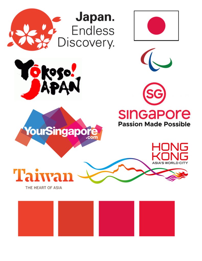
The color wheel helped me find a hue of green that is opposite the competition’s red color. I then used that green as a starting point for my city logo color studies.
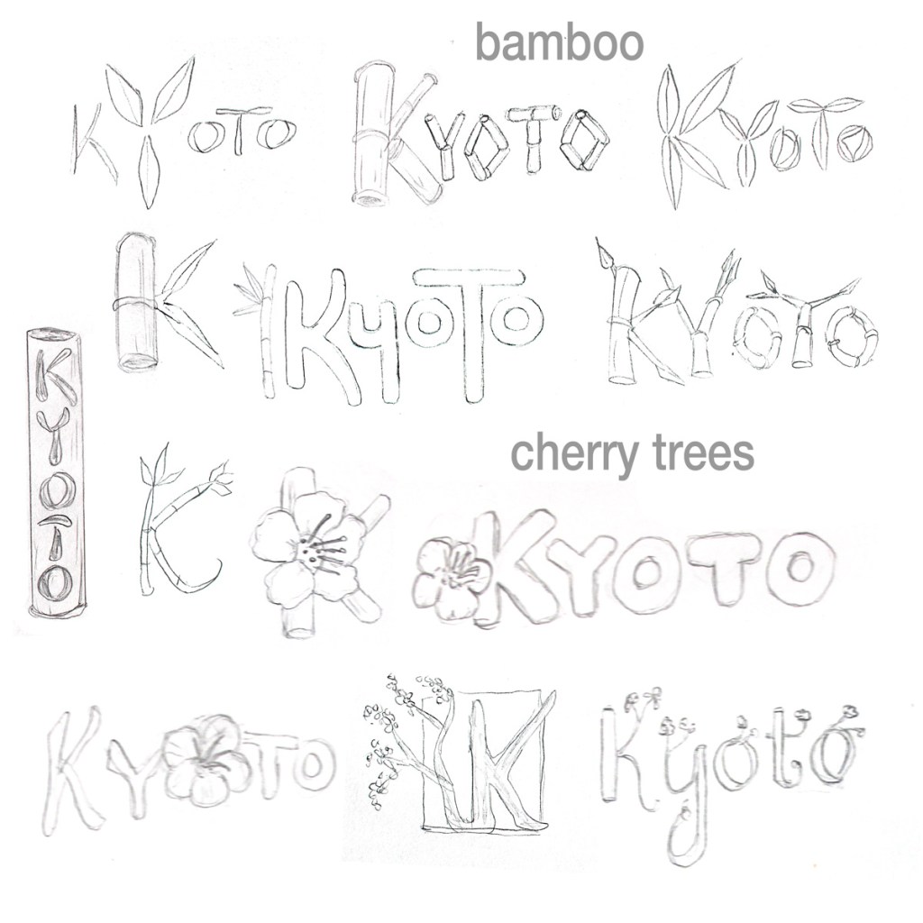
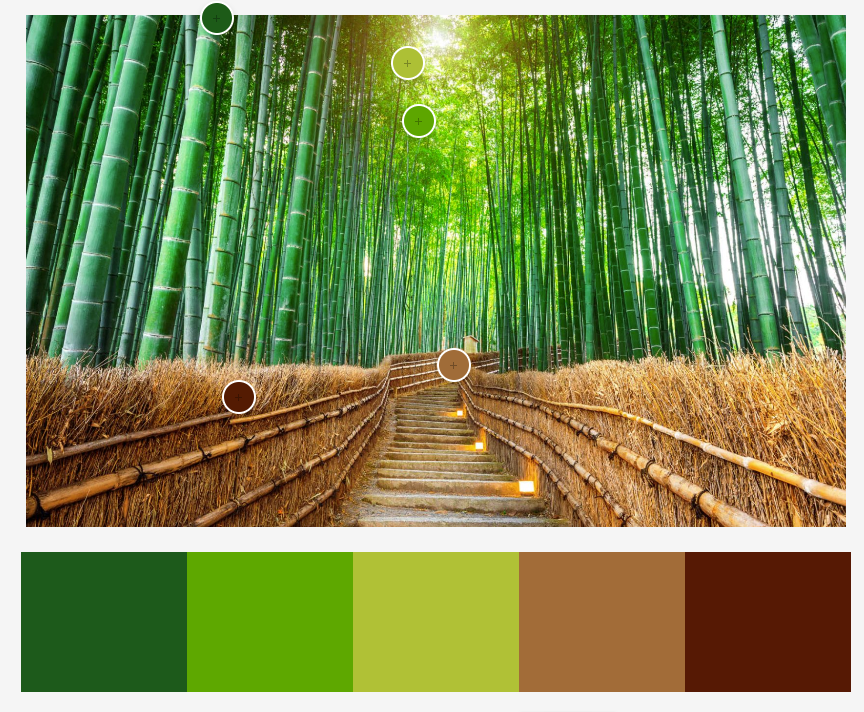
I collected mood photos for each of the three brand identities. For Geography, I used Adobe Color to sample colors from a photo of Arashiyama bamboo forest in Kyoto. The colors in this photo are natural and adventurous according to Steve Douglas, fitting the values and characteristics of the brand (Douglas, n.d.).
Harajuku fashion is a fun, creative representation of modern Japan that originated in Tokyo but is popular in Kyoto, so I sampled some of the most common colors to match the Modern Culture brand definition. After experimentation with different unique colors, a magenta pink best captured the friendly, creative spirit of Kyoto without being overtly feminine (Cross, n.d.).
I repeated the process for the Traditions brand identity, seeking colors that represent the spiritual sophistication of historic Kyoto. Again, I consciously avoided bright red to differentiate the brand. Although the color purple has be overused to represent royalty, it is still effective for expressing elegance and harmony (Douglas, n.d.).
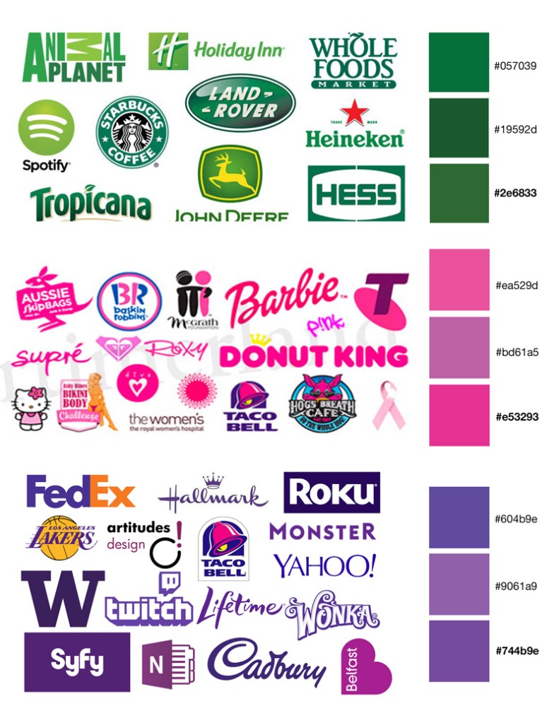
After picking a main color for each of the three brand identities, I made variations to compare with the colors of popular logos. This helped me find unique colors that weren’t immediately identified with another brand.
After finding the best variation of each main color, I used Adobe Color to create secondary palettes using the analogous, complementary, split-complementary, and triadic color harmony rules. I labeled the main colors with the hex code, Pantone number, CMYK, and RBG values.
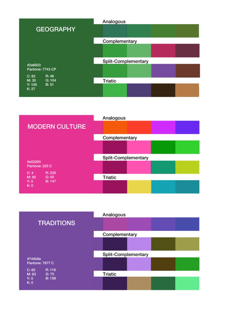
Using those color tests, I selected a secondary palette for each brand identity based on the values and characteristics of each brand. Then I started color tests with the previously designed logos.
Color Choice Rationale
Geography:
Steve Douglas describes green as a serene and peaceful color that represents
health and growth to many people (Douglas, n.d.). The green is complemented by
a dark magenta and earth tones that are adventurous yet simple and comforting
(Cross, n.d). The top right logo is currently the strongest, but much more
exploration is needed.
Modern Culture:
The color choices for this palette are fun and modern without being too
feminine or using overly bright colors that may be difficult to read or
reproduce (Adams, 2015). After exploration in both horizontal and vertical
layouts, the color combinations still don’t feel natural. I will have to
reconsider the two green colors in further development. Although visually
complementary to the pink, green is a peaceful, serene color (Douglas, n.d).
That does not fit with the youthful energy of this brand identity.
Traditions:
The purple, its darker shade, and dark blue express the elegant history (Douglas, n.d), but the complementary greens are more appropriate to a nature inspired design (Cross, n.d.). In my efforts to find distinction from competitors, I’ve avoided bright red. However, a deep shade of red may be appropriate as a secondary color in this palette.
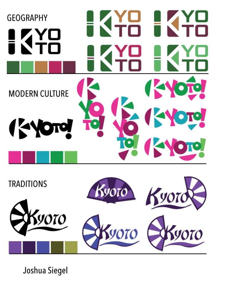
Color Logo Revisions
This week I received peer feedback from Krystal Awai, Jorge Cainas, and Misty Francis. All three gave excellent suggestions on how the city logo designs and color choices could be improved.
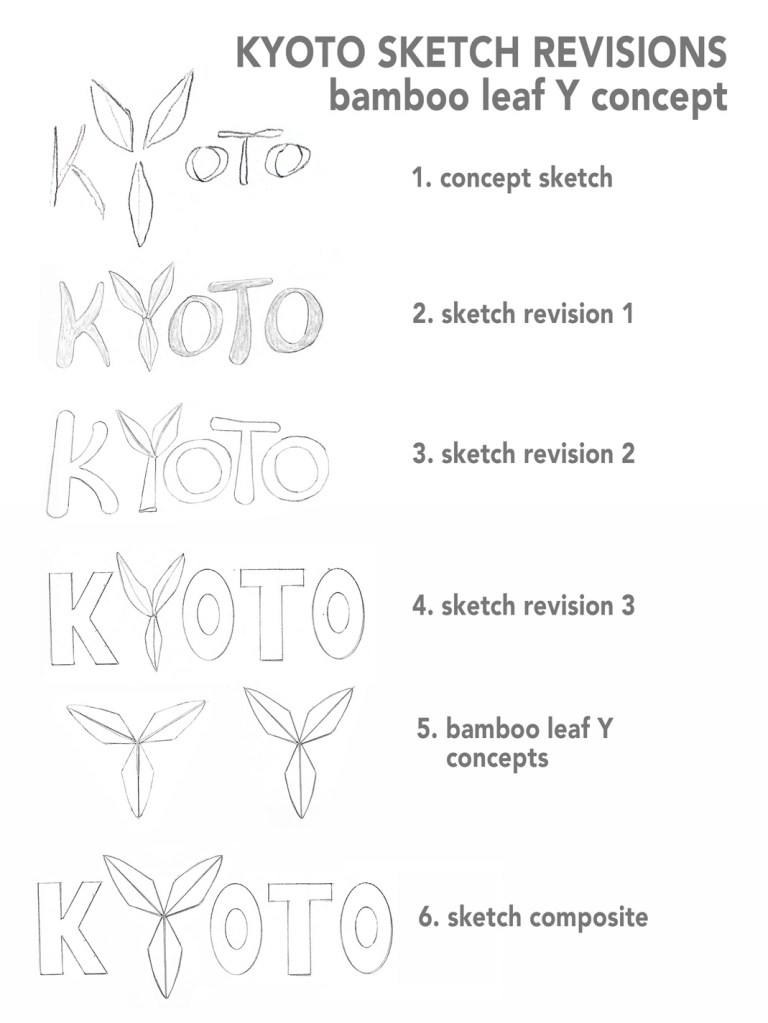
Kyoto geography
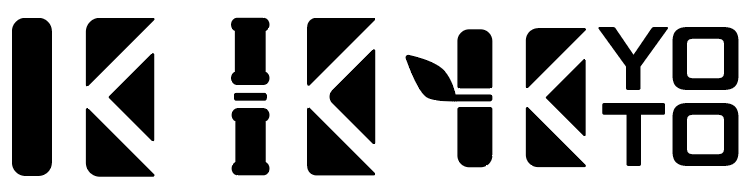
Cainas suggested adding a small detail to the geography logo to make the bamboo icon more recognizable. After trying variations on the bamboo stalk, I found that adding a single leaf was effective way to make the design more distinctive while keeping it simple. The leaf also makes the boxy shaped logo more natural and freer from constraints, keeping with the brand definition.
Geography Brand Definition
Key Value 1: reverence for nature
Key Value 2: independence
Key Characteristic 1: adventurous
Key Characteristic 2: natural
Its Differentiation: historic temples surrounded by natural beauty
Experience / Emotional connection: collecting shared memories and photos
For the colors, I kept only the primary green and two strongest earth tones.
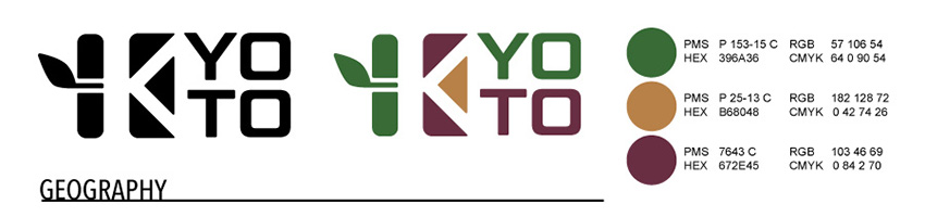
Primary Color:
Dark Green
PMS P 153-15 C RGB 57 106 54
HEX 396A36 CMYK 64 0 90 54
Secondary Colors:
Golden Brown
PMS P 25-13 C RGB 182 128 72
HEX B68048 CMYK 0 42 74 26
Dark Magenta
PMS 7643 C RGB 103 46 69
HEX 672E45 CMYK 0 84 2 70
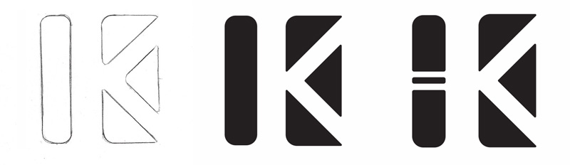
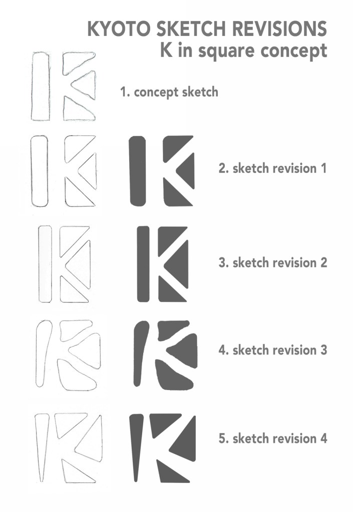
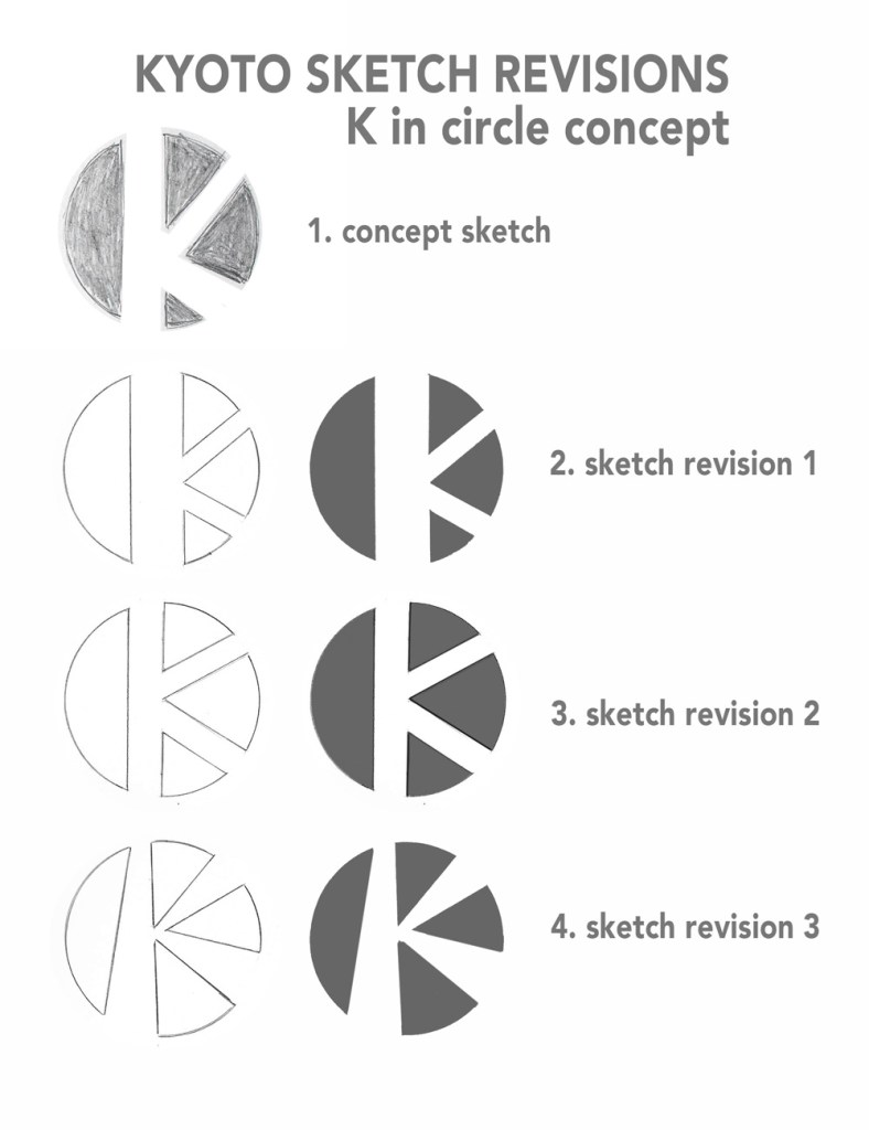
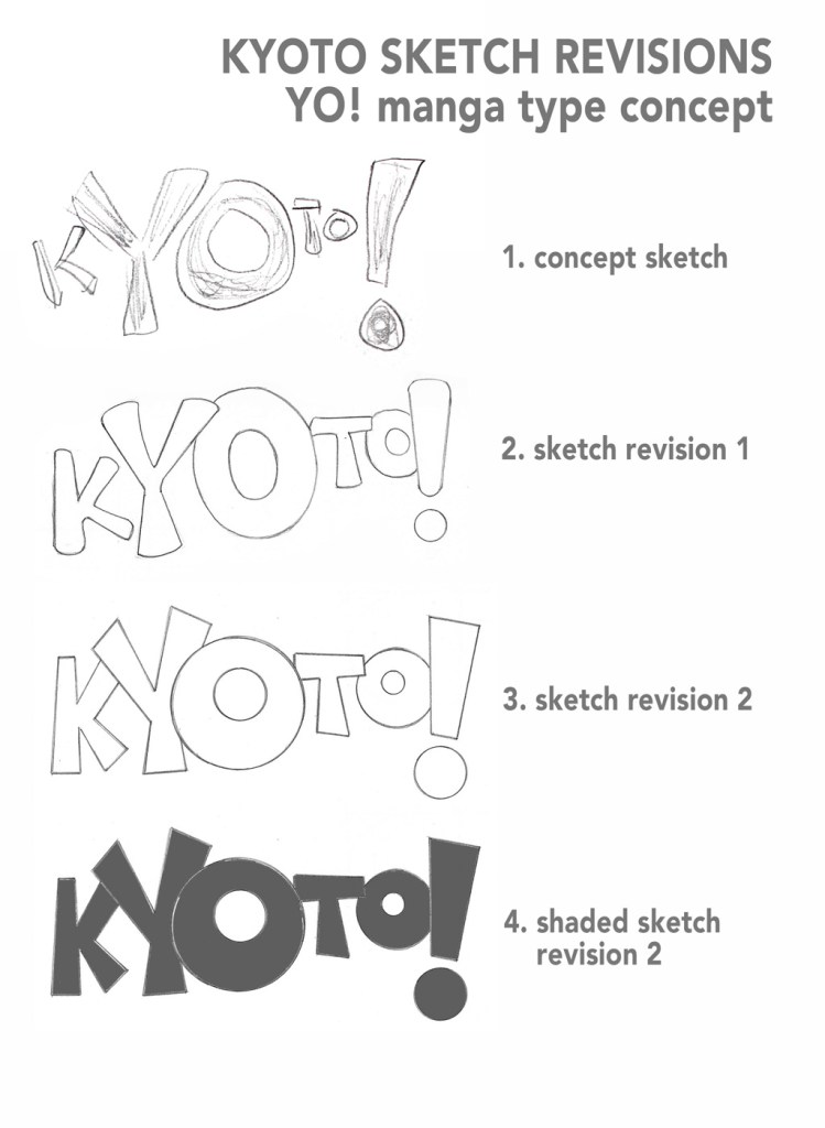
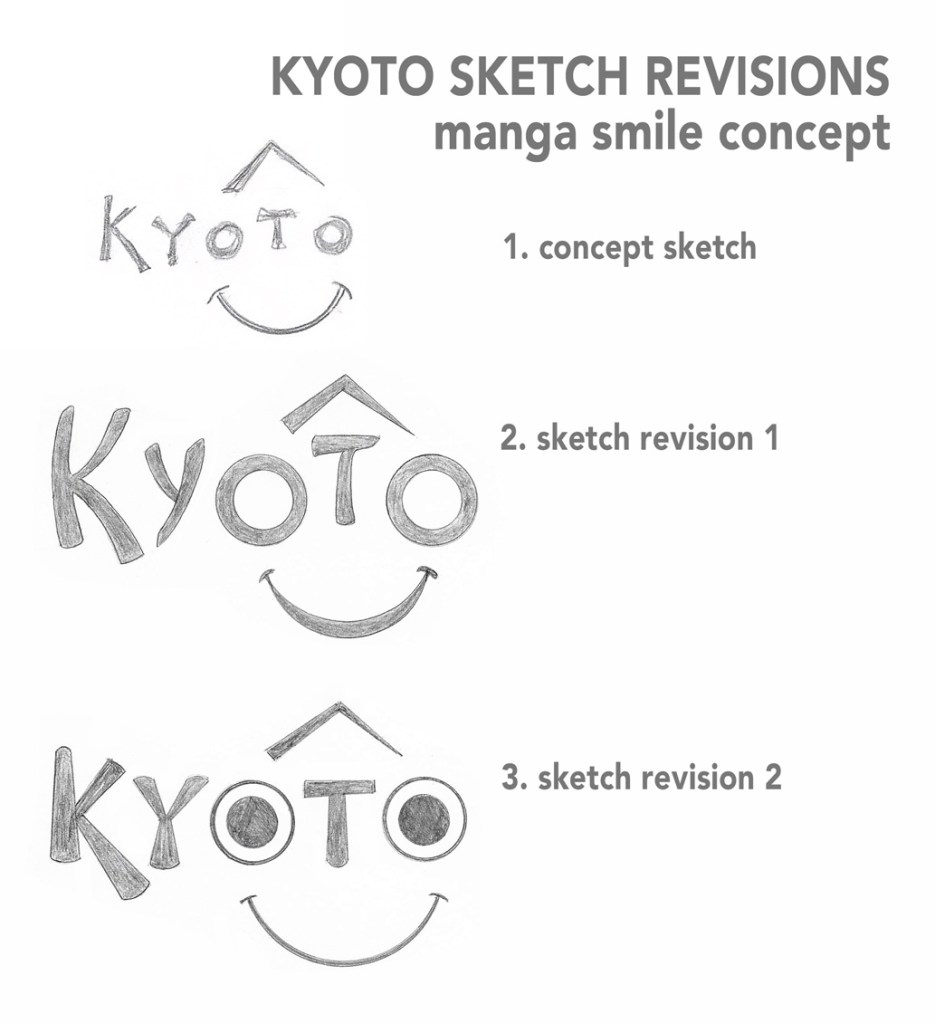
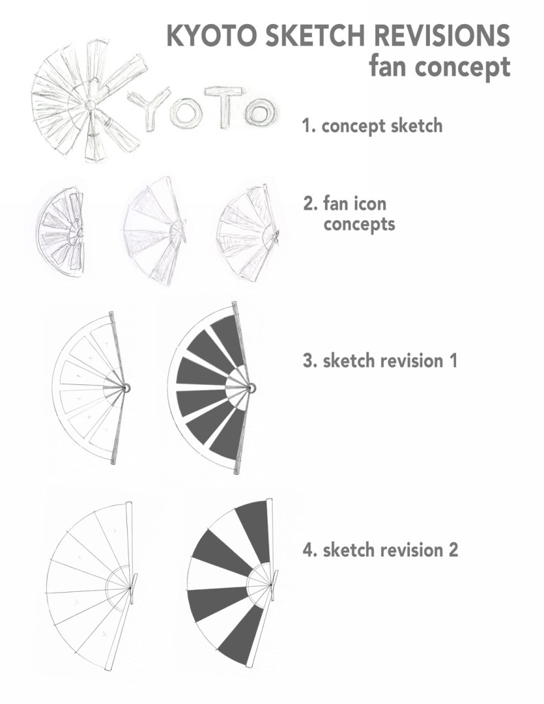
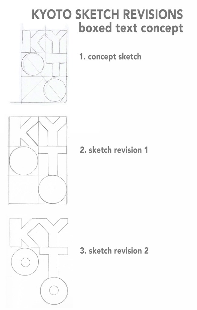
Kyoto modern culture
The modern culture logo and color palette both needed improvements based on feedback from Cainas and Francis. Multiple colors led to color pollution, so I simplified the palette to two colors. Milano Kate Valihura notes that ninety-five percent of brands use no more than two colors in their logos (Valihura, 2018).
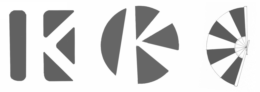
When rearranging the logo, I used the wedges and circle segment that form the negative space K as accents to the wordmark. Cainas found the logo more engaging with the newly formed face.
Modern Culture Brand Definition
Key Value 1: creativity
Key Value 2: individuality
Key Characteristic 1: fun
Key Characteristic 2: friendly
Its Differentiation: modern but historic
Experience / Emotional connection: fun with friends
The bright pink sampled from modern Japanese fashion is a strong fit for the brand, but I chose a slightly different shade that had an exact Pantone match. The dark purple secondary color is more gender-neutral than pink and provides strong contrast.
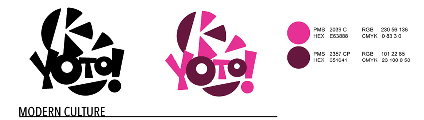
Primary Color:
Bright Pink
PMS 2039 C RGB 230 56 136
HEX E63888 CMYK 0 83 3 0
Secondary Color:
Dark Burgundy
PMS 2357 CP RGB 101 22 65
HEX 651641 CMYK 23 100 0 58
Kyoto Traditions
The traditions brand palette needed more development, so I looked to the traditional Japanese color chart for inspiration. Based on suggestions by Awai, I sampled a dark red from a photo of Romon gate in Kyoto. I then followed Sean Adams’s advice and compared that red to competitor logos, making it slightly more crimson to differentiate (Adams, 2015).
Traditions Brand Definition
Key Value 1: respect
Key Value 2: harmony
Key Characteristic 1: spiritual
Key Characteristic 2: sophisticated
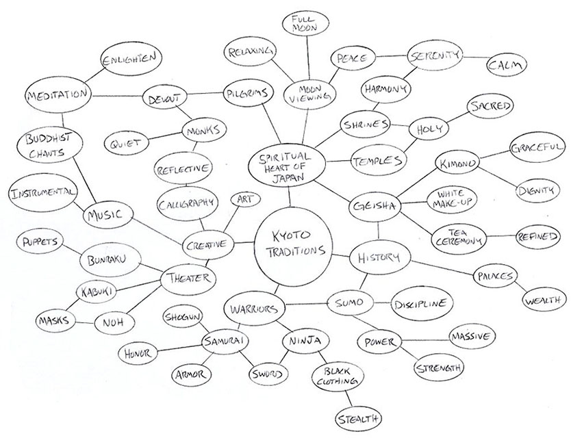
Its Differentiation: spiritual heart of Japan
Experience / Emotional connection: a spiritual connection to Japanese history
In traditional Japan, purple represented virtue and spirituality (Tofugu, 2013). Western society also associates purple with spirituality, royalty, and luxury (Valhura, 2018). A soft light purple fit the traditions brand, and a much darker violet added depth.
I also included the unique crimson red that evokes Kyoto’s historic shrine gates. In Japanese society, red is a symbol of power with strong connections to religion (Tofugu, 2013).
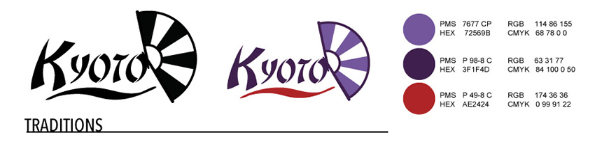
Unique Colors:
Light Purple
PMS 7677 CP RGB 114 86 155
HEX 72569B CMYK 68 78 0 0
Dark Violet
PMS P 98-8 C RGB 63 31 77
HEX 3F1F4D CMYK 84 100 0 50
Crimson
PMS P 49-8 C RGB 174 36 36
HEX AE2424 CMYK 0 99 91 22
With my logo designs now (mostly) complete, I will develop Brand Vision Boards for each of the Kyoto logos.
References:
Adams, S. (2015, March 27). Branding for Designers. Retrieved from https://www.lynda.com/Design-Color-tutorials/Foundations-Branding-Designers/363131-2.html
Cross, R. (n.d.). Color meaning and symbolism: How to use the power of color in your branding. Canva. Retrieved from https://www.canva.com/learn/color-meanings-symbolism/
Douglas, S. (n.d.). Psychology Of Color In Logo Design. TLC Blog. Retrieved from https://thelogocompany.net/blog/infographics/psychology-color-logo-design/
Shutterstock. (n.d.). Bamboo Forest in Kyoto, Japan. Retrieved from https://www.shutterstock.com/image-photo/bamboo-forest-kyoto-japan-763721149
Tofugu.com. (2013, September 12). The Traditional Colors of Japan. Retrieved from https://www.tofugu.com/japan/color-in-japan/
Valihura, M. (2018, July 24). A Cheat Sheet for Choosing the Best Logo Colors That Will Grab Your Audience’s Eye. Retrieved from https://foundr.com/best-logo-colors/