Pure (or Basic) Research looks for understanding of the theoretical aspects of a subject, relying on quantitative data for answers. Applied Research looks for knowledge to solve a specific problem. Design Research is a form of applied research that involves looking at a problem from different perspectives, often using qualitative data to understand the “why’s” of user behavior. Jon Freach notes that design research is not hard science. Instead, it “gives designers and clients a much more nuanced understanding of the people for whom they design while providing knowledge that addresses some of the most fundamental questions we face throughout the process” (Freach, 2011). In other words, design research provides insight of what users need and the best ways to address those needs.
Developing Brand Equity
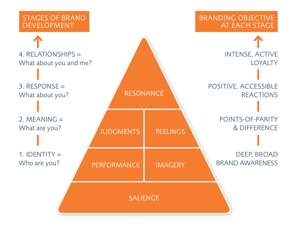
Design strategy can change with understanding of brand equity: how users perceive a brand. What makes it unique? What works and what doesn’t? Articles from Inkbot Design (2017) and Modicom (2017) both refer to the Brand Equity Pyramid described by Kevin Lane Keller in his book, Strategic Brand Management (Keller, 2013). Keller’s model, pictured below, visualizes the stages of brand development used to shape the audience perception of the brand.
Graphic from medium.com and Inkbot Design
At the base of this pyramid is Salience, or brand identity. Who is the brand and how do people recognize it? The next level, Meaning, relates to “how you communicate what your brand means and stands for” (Modicom, 2017). This includes the performance of the brand and how imagery meets psychological needs. The third level is the Response to the brand, based on both judgments and feelings of the user. The top of the pyramid is Resonance, or “how much of a connection your customers have with your brand” (Design, 2017). This highest level of brand equity promotes customer loyalty and encourages them to share the brand with others.
Defining a Design Problem
In design research, knowing the problem is the first step. Solving it comes later. Branding a district is not a design problem. Instead, you must ask a specific question. How do I change the perception of this place for the target audience? How do I communicate the affordability of housing while still speaking to an affluent audience? Answering questions like these requires knowing the four dimensions of brand equity: brand loyalty, brand awareness, brand associations, and perceived quality (Design, 2017). If there are negatives, focus on the positives. By asking the right questions, you can find effective ways to build brand equity.
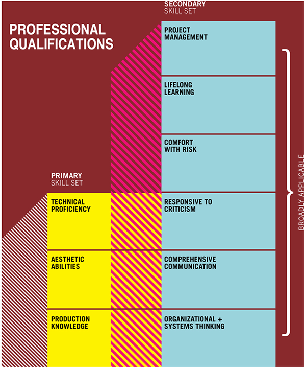
The first live session of Design Research reviewed the month’s projects and how to apply learning from previous courses. Professor Argo’s comments helped me realize the importance of revisiting personal / career goals to determine an education strategy. After losing everything in the Camp Fire last November, I decided to pursue a Master’s degree to help me get more work as a teacher. Now five months into the Media Design MFA program, I understand that I can also redirect my career as a freelance designer / writer / storyteller. The knowledge gained from these courses adds to my professional qualifications in both the primary and secondary skill sets charted in the graph below from Design Currency (O’Grady & O’Grady, 2013).
professional qualifications graph
Active Learning
Professor Argo also encouraged the class to engage in active
learning. The Safari Books and Lynda.com subscriptions that are included in the
program have helped advance my technical proficiencies and production knowledge,
but having so much available information can sometimes feel overwhelming. I
need to take a closer look at the job market then focus my time and energy on
the specific skills needed to advance my career. Each class in the Media Design
MFA program has built on the last, developing my research and strategy skills
while I independently develop my technical expertise in vector graphics and
design with online courses like Logo Design: Illustrating Logo Marks
(Glitschka, 2016). These secondary courses reinforce many of the lessons from
the program classes, such as the importance of distinction from competitors and
brand continuity.
The difference between art and design.
Art is a personal expression of its creator. It can be
interpreted in different ways depending on the viewer and context. Design,
however, has a purpose that is unrelated to its creator. Media Design
communicates a very specific message, a problem to be solved or a need to be
met. The key to effective design is to know what you’re communicating and who
you’re communicating to. Designs can be made more powerful by following certain
guidelines like David Airey’s “elements of iconic design” described in Logo
Design Love (Airey, 2014). Although Airey’s advice pertains to logos, other
design ingredients like headlines and colors should be also distinctive and
relevant to the message being communicated.
This month I continued advancing towards the Media Design
MFA degree with Effective Copy Writing taught by professor Elena
Rogalle. Like the previous courses, this class revealed how much thought and
research is required to create effective brand identities and ad campaigns. George
Felton states that your message “should represent the brand’s personality and
speak with the right voice” (Felton, 2013, p. 93). Copy and design should work
together with a consistent voice that connects the brand with its target
audience.
Felton’s book “Advertising: Concept and Copy” was the
primary resource for this class. The text provided guidance as we developed
advertising for a new client. This month we put aside the city brand identities
created for the previous two classes to focus on advertising for a nonprofit
organization. I chose PAWS, the Performing Animal Welfare Society, a California
based nonprofit that rescues and provides sanctuaries for exotic animals. The
first assignment for this “client” was developing Target Audience Profiles.
Target Audience Profiles
Whether advertising a product or organization, Felton recommends
looking for the “highest possible benefit” (Felton, 2013, p. 23). To determine
that highest benefit, we must first ask what the audience needs. Felton lists
fifteen basic needs that can be addressed. After researching the PAWS
organization and its mission, I identified three of the strongest needs in potential
PAWS donors:
Achievement: the need to perform difficult tasks (Felton, 2013, p. 26). Protecting animals and ending abuse are lofty goals that inspire donors to help make a positive change.
Nurturance: the need to provide care for others (Felton, 2013, p. 27). Pet owners are a good target audience for PAWS because they’ve already demonstrated a need to nurture animals.
Novelty: the need to alter routine, be surprised (Felton, 2013, p. 29). Audiences are bombarded by charities asking them to give. To attract new donors, ads should be different and memorable.
With this information I developed two Target Audience
Profiles. We were encouraged to be very specific and detailed, which wasn’t a
problem. My years as an actor, screenwriter, and roleplaying aficionado (aka
D&D nerd) provided plenty of experience developing detailed characters with
rich backgrounds.
Profile 1
Smiling senior man with eyeglasses
Persona Information Persona’s Name: Darren Harlin Geographic Location: Calabasas, California
Target Demographic Age: 67 Gender: Male Education Level: College graduate, California Institute of the Arts Income: $125,000 (Pension and savings) Occupation: Set Designer (semi-retired)
Target Attributes Family: Divorced with an adult son (Brett, 42) and daughter (Courtney, 39). Lives with a male mixed breed dog named Hitch. Social Life: Hiking, sketching, playing with Hitch. Gets together with old friends a couple times a month. Social Media: Facebook to keep in touch with his kids and showbiz friends. Cultural: Subscribes to The Hollywood Reporter and Architectural Digest. His Kindle is filled with Tolkien and Asimov stories that he’s already read. Volunteers at the Performing Arts Education Center. Political: voting Democrat Ethnicity: Caucasian Personal Values: Union man who fights for worker rights. Clubs/Tribes: A movie buff who binge watches Netflix and has a DVD collection with over 400 titles. Faith/Religious Beliefs: non-practicing Jewish
Target Persona’s Story Darren grew up in Orland California surrounded by almond orchards and cattle ranches. He attended CalArts with plans to direct commercials but soon found his niche in the art department, first in props and eventually working his way up to set designer. Darren is a proud member of the International Alliance of Theatrical Stage Employees (IATSE) who worked in film and television for over four decades before retiring last year. He made a good living and lots of friends, but he witnessed first hand the way performing animals were treated on set.
Darren’s weekend starts with half a grapefruit and rye toast while listening to National Public Radio. His left knee aches since tripping over the garden hose last month, but Hitch needs a walk. The scruffy, gray muzzled mutt pulls Darren through the neighborhood, an upscale planned community in the hills outside Los Angeles. They get home and Hitch settles on the couch while Darren writes a short grocery list. Darren drives to Trader Joe’s in the 2013 Prius and stocks up for the week. The Cocoa Truffles are a guilty pleasure. When Darren gets home, his knee is throbbing so he takes a puff on his Care By Design vape pen before relaxing on the couch with Hitch and a glass of Merlot. They get comfortable for a long afternoon of Animal Planet and Swedish films.
Profile 2
Young Asian woman with lights
Persona Information Persona’s Name: Rebecca Kim Geographic Location: Portland, Oregon
Target Demographic Age: 29 Gender: Female Education Level: Graduate of Montclair Culinary Academy, New Jersey Income: $67,000 Occupation: Vegan chef / caterer
Target Attributes Family: Single with a female roommate (Terri), a bearded dragon (Gordo), a male ginger cat (Max) and twin female Siamese cats (Shiva and Vishnu). Mom, Dad, and sister Lillian still live in Fort Lee, New Jersey. Social Life: Game night every Saturday with friends, good food, and cards or board games. Social Media: Instagram, Snapchat, sometimes Facebook for talking with Grams. Cultural: Loves 90’s Alternative Rock, Thai food, cruelty-free fashion, and urban photography. Collects elephant toys. Political: Liberal Ethnicity: Third generation Korean American Personal Values: Vegan, fights for animal rights. Clubs/Tribes: Jet Black vegan cafe, iPhone all the way. Faith/Religious Beliefs: Believes in God but doesn’t know what to call Her.
Target Persona’s Story Becca wakes to Nirvana blaring from her iPhone. Max is curled next to her head, Shiva and Vishnu by her feet. A quick shower with John Masters Organics blood orange and vanilla body wash, then she slips into her Denim Forum jeans, Susi Studio sandals, and a vintage Stone Temple Pilots tee. Out the door with a left-over blueberry muffin and Jet Black coffee in a thermos. The Uber driver is waiting by the curb. As they wind through Portland traffic, Becca skims Instagram and replies to a text from her boss at Blossoming Lotus. They don’t open until eleven, so there’s time to pick up fresh ingredients from the farmer’s market. Meatless bibimbap with marinated mushrooms and kimchi is one of Becca’s special dishes inspired by Gram’s cooking.
On the way home she stops at Guardian Games to pick up the latest Settlers of Catan expansion. She also buys a plushie Dumbo to add to her elephants collection. Why not? Her vegan catering side business “Veggie Goddess” is doing great. Booked every Sunday for months and over 2,000 Instagram followers. Becca also has ideas for a fashion line featuring animal memes. At home she feeds the kitties their Blue Freedom cat chow and lets Gordo out of his terrarium to prowl the apartment. Becca browses the web and plays games on her iPad until it’s time for bed. Another busy day tomorrow.
Testimonial Ads
The next copywriting assignment was to create six concept sketches for testimonial ads and write rationales for each concept. The ads were designed to appeal directly to the two Target Audience Profiles developed in the previous assignment.
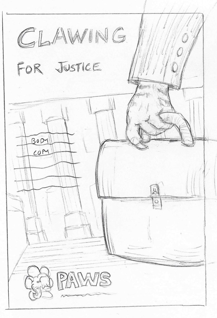
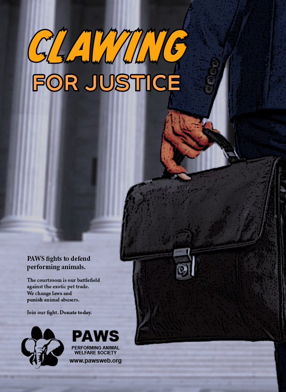
“Clawing For Justice” PAWS ad
Headline: Clawing for Justice Subhead: PAWS fights to defend performing animals. Body Copy: The courtroom is our battlefield against the exotic pet trade. We change laws and punish animal abusers. Call to Action: Join our fight. Donate today.
A lawyer goes to court, briefcase in hand… a tiger hand. This testimonial ad is voiced by the Extreme User (Felton, 2013, p. 241), an attorney who is a frequent donor and advocate for animal rights. His sharp tone and action words (fight, battle, claw) speak directly to target persona Darren Harlin’s need for Dominance (the need to exercise power over others, direct and supervise, have influence) over people who exploit performing animals (Felton, 2013, p. 26).
The “clawing” headline and tiger claw visual hooks the viewer with something unexpected, then draws them in for an explanation. Following advice from Craig Smallish (2013), the ad story was developed by free association of words like “justice” and using an online image search. A search for “lawyer briefcase” accidentally found a photo that inspired the idea of a fierce tiger lawyer going into a courthouse.
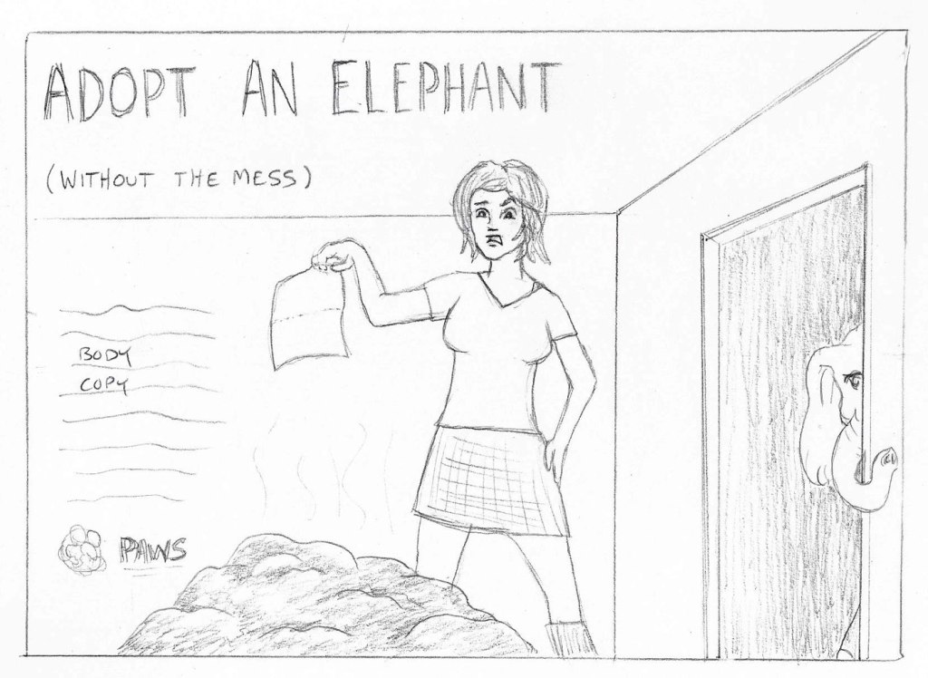
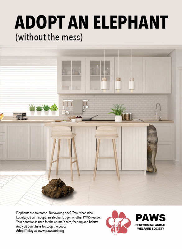
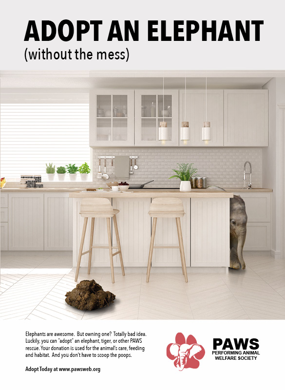
“Adopt an Elephant” PAWS ad
Headline: ADOPT AN ELEPHANT Subhead: (without the mess) Body Copy: Elephants are awesome. But owning one? Totally bad idea. Luckily, you can “adopt” an elephant, tiger, or other PAWS rescue. Your donation is used for the animal’s care, feeding and habitat. And you don’t have to scoop the poops. Call to Action: Adopt Today at http://www.pawsweb.org
A woman holds a paper towel, bewildered by a massive pile of dung on the floor. A guilty elephant peeks around the corner. This ad speaks to target persona Rebecca Kim in the friendly, modern voice of a close friend, or “just plain folk” personality (Felton, 2013, p. 246). The testimonial uses humor to point out a downside of taking care of pets and offers an alternate solution for those who desire Nurturance (the need to provide care for others, to have and protect) for exotic animals (Felton, 2013, p. 27).
The first iterations of the concept involved a man using a snow shovel to clean up elephant dung on a sidewalk. Craig Smallish recommends 180 degree thinking to develop ideas (Smallish, 2013), so I changed the setting to inside an apartment and the character to a woman with a paper towel instead of a shovel. These changes made the concept stronger and more relatable to indoor pet owners like Rebecca Kim.
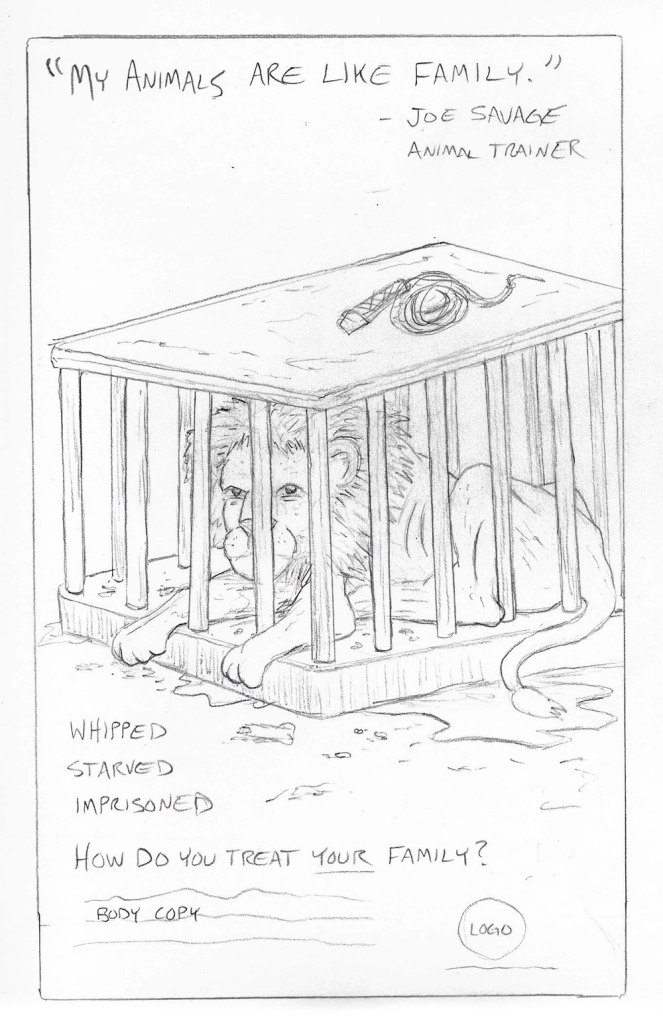
“My Animals Are Like Family” PAWS ad
Headline: “My animals are like family.” – Joe Savage, animal trainer Subhead: Whipped. Starved. Imprisoned. How do you treat YOUR family? Body Copy: PAWS rescues performing animals from “family” like Joe Savage. At our sanctuaries, we give animals the freedom, love, and care that real family deserves. Call to Action: Join our family. Donate today.
A sad, malnourished lion lies caged beneath an ironic quote from an animal trainer. This testimonial headline is from the Wrong Person (Felton, 2013, p. 243). The response is voiced by PAWS Co-founder Ed Steward or another person close to the organization. This helps personify the brand (Felton, 2013, p. 243). It appeals to target persona Darren Harlin’s need for Understanding (the need to comprehend, teach and learn, discover patterns, make connections) and Nurturance (the need to provide care for others, to have and protect) for performing animals (Felton, 2013, p. 27).
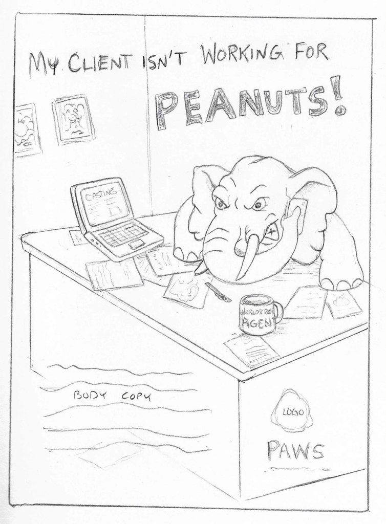
“My client isn’t working for peanuts.” PAWS ad
Headline: My client isn’t working for PEANUTS! Subhead: Your agent looks out for you. Body Copy: Animal performers aren’t so lucky. No fancy trailer. No residuals. No beach house in Malibu. PAWS protects animals long after Hollywood forgets. Call to Action: Learn more at http://www.pawsweb.org
A Hollywood agent, an angry bull elephant, negotiates a deal
for his client. He is “not the person, but something associated with the person”
according to George Felton (2013).
The headline and image are twists on several clichés. Craig Smallish recommends finding a quirky variation on a cliché to draw viewer attention (Smallish, 2013). The no-nonsense voice of an agent fighting for performer rights speaks directly to target persona Darren Harlin. The ad addresses his need for Understanding (the need to comprehend, teach and learn, discover patterns, make connections) with a visual twist that adds the Novelty (the need to alter routine, be surprised, acquire new skills, have new and different experiences) of an elephant agent (Felton, 2013, p. 29).
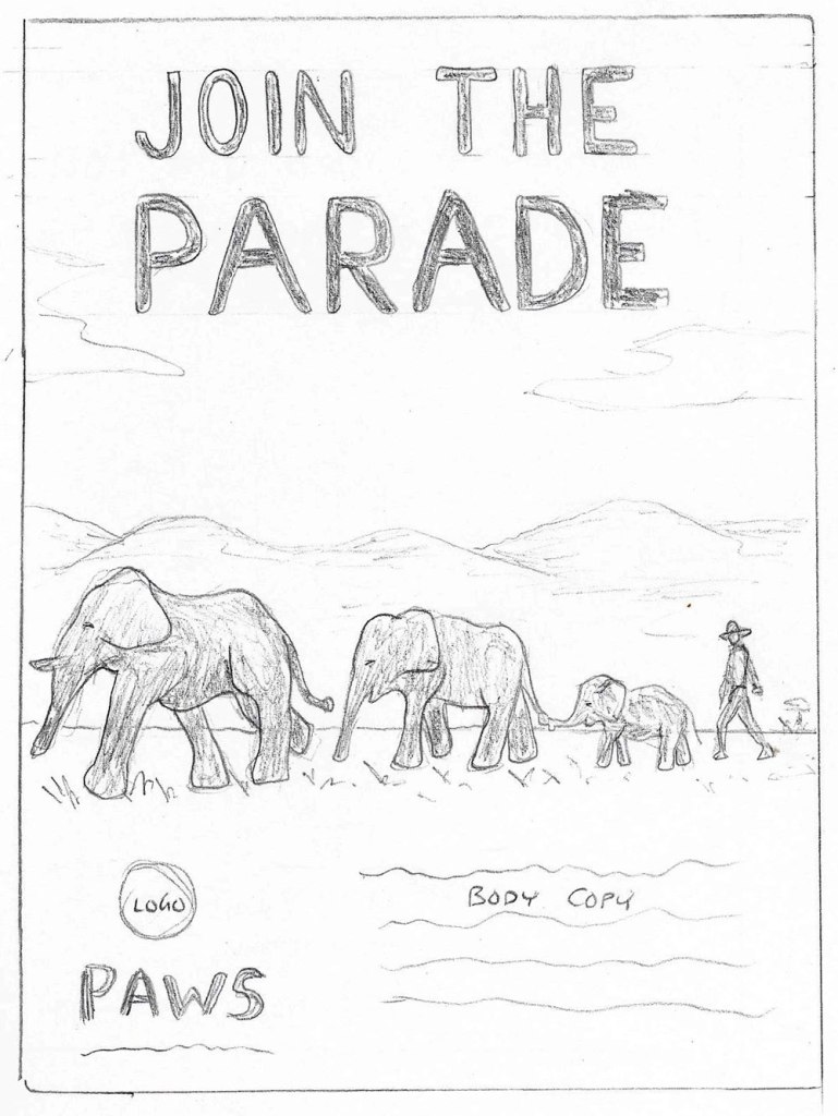
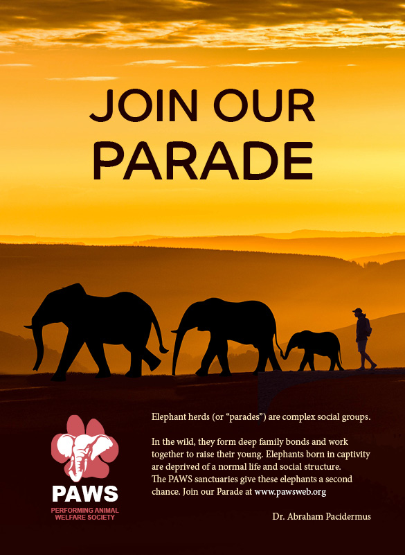
“Join the Parade” PAWS ad
Headline: JOIN THE PARADE Subhead: Elephant herds (or “parades”) are complex social groups. Body Copy: “In the wild, they form deep family bonds and work together to raise their young. Elephants born in captivity are deprived of a normal life and social structure. The PAWS sanctuaries give these elephants a second chance.” Dr. Abraham Pacidermus Call to Action: Join our Parade at http://www.pawsweb.org
A parade of elephants walks in a line, joined by a naturalist at the end. His testimonial is presented with the academic voice of an elephant Expert, someone who stands outside the brand and has the expertise to evaluate it (Felton, 2013, p. 241). His straight-forward, non-sentimental tone appeals to target persona Darren Harlin’s need for Understanding (the need to comprehend, teach and learn, discover patterns, make connections) without manipulating his emotions (Felton, 2013, p. 29). The headline and call to action address his need for Affiliation (the need to be closely associated with others, the need for relationships) with the respected naturalist and others who believe in protecting animals (Felton, 2013, p. 27).
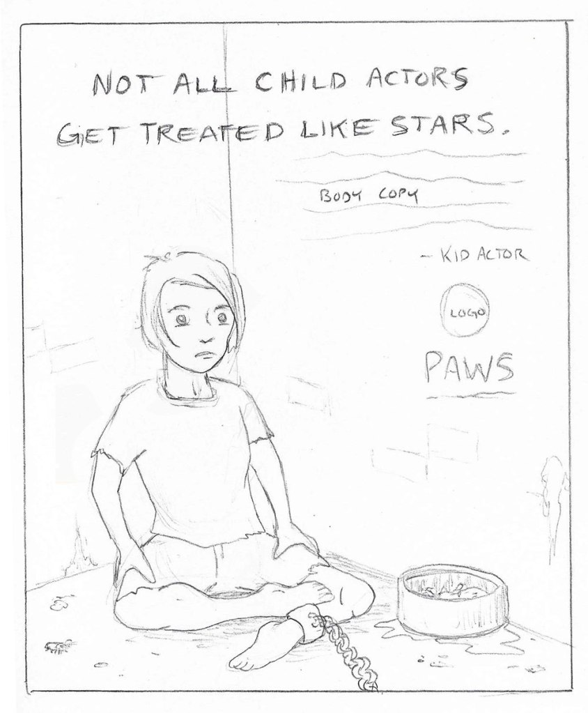
“Not all child actors get treated like stars.” PAWS ad
Headline: Not all child actors get treated like stars. Subhead: Good thing I’m human. Body Copy: “When I’m acting, my parents look after me. Performing animals aren’t so lucky. Taken away from their mother as babies. Locked in cages for days. Starved and abused. We can change that.” – Famous Child Actor Call to Action: Learn more about performing animals at http://www.pawsweb.org
A famous child actor sits chained in a filthy cell. According to Felton, celebrity endorsements need an unusual treatment to make them stand out (Felton, 2013, p. 243). The image of a young star being treated like an animal grabs attention and calls to the need for Nurturance (the need to provide care for others, to have and protect) in the target persona Rebecca Kim. The quote “We can change that,” connects with the need for Achievement (the need to perform difficult tasks, exercise one’s skills) with the goal of changing the way performing animals are treated (Felton, 2013, p. 26). Craig Smallish recommends trying different viewpoints to change the feel of the scene (Smallish, 2013). Early iterations had the child behind bars but moving the viewer into the cage with the young actor gave the image a closer emotional connection.
Ad Comps
After choosing the three most effective ad concepts, I revised the copy based on professor Rogalle’s feedback. The next step was designing comps in Adobe Photoshop and Indesign. Craig Smallish suggests that final comps should “illustrate every aspect of the concept” even though they are still at the proposal stage (Smallish, 2013). Once every element is approved, the comp will serve as a blueprint for the design team.
“Join Our Parade” ad comp
“Clawing for Justice” ad comp
“Adopt an Elephant” ad comp
Comp Revisions
The first three ad comps for PAWS were varied in style and tone. Professor Elena Rogalle advised that the “Adopt an elephant, without the mess” ad was successful because it effectively used humor to promote the organization.
Classy.org writer Ellie Burke notes that “humor can be a great way to show your audience the human side of your organization.” She also remarks that humor delights existing supporters and “can also attract new supporters of specific demographics” (Burke, 2019). This campaign targets animal lovers who also appreciate a tidy home. It uses a clean, modern layout that could be advertising upscale home furnishings, but the addition of a messy element draws attention.
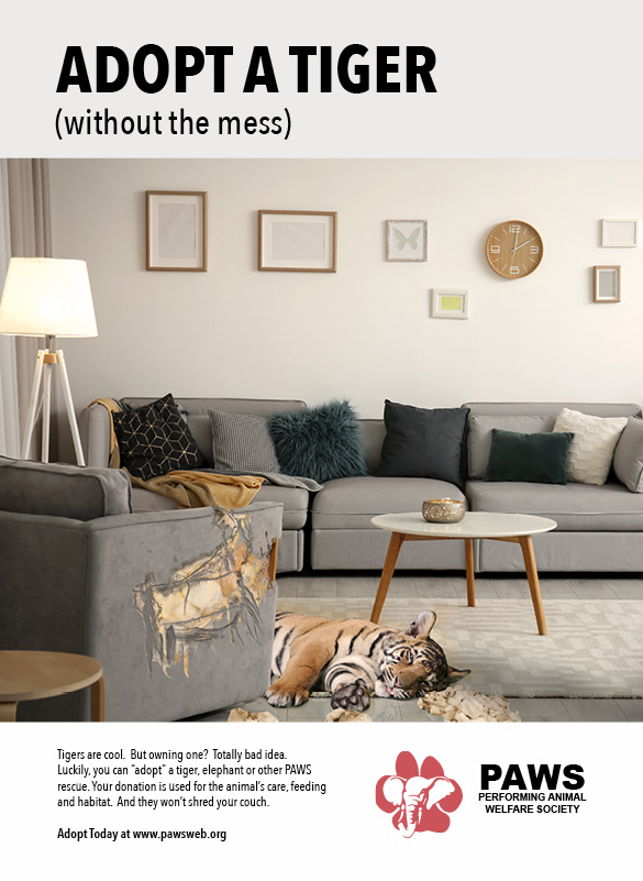
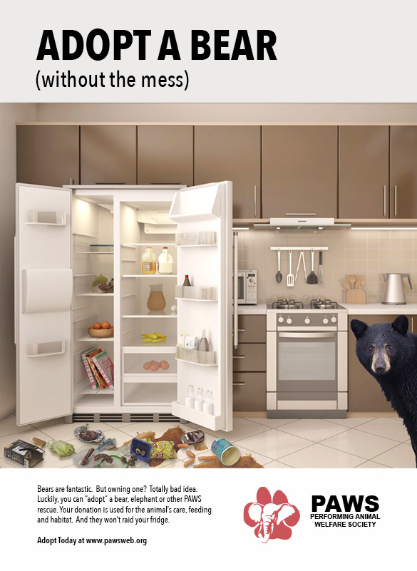
“Adopt an Elephant” PAWS ad comp
“Adopt a Tiger” PAWS ad comp
“Adopt a Bear” PAWS ad comp
My first revision step was to implement the changes
suggested by professor Rogalle. I adjusted the body copy to give it more air
after the image and make the text flow better. I then used the elephant ad as a
template for the tiger and bear ads. I considered not using photos of the
animals in the ads and letting the viewer get the story from the copy. However,
the addition of the animals gives the campaign a closer connection to the
organization’s cause with a bonus cuteness factor.
This campaign uses humor to point out a downside of exotic pets and explains the benefits of “adopting” a PAWS rescue for those who desire Nurturance (the need to provide care for others, to have and protect) for animals (Felton, 2013, p. 27). The first three ads are designed for print to reach target persona Darren Harlin, a semi-retired set designer. However, the layouts and copy can be adjusted for social media to better reach the younger target persona Rebecca Kim.
Taglines
The last copywriting assignment for my nonprofit was to create a new tagline. The current PAWS tagline, “The Nation’s First Elephant Sanctuary” describes one feature of the organization but does not communicate its “highest possible benefit” (Felton, 2013, p. 23). Today, PAWS protects many exotic animal species in three sanctuaries, so I tried to express that benefit in the ten tagline concepts and rationales presented to my classmates:
Performing kindness. Animal lovers believe in kindness. In the article “Types of Taglines,” Eric Swartz declares that “Aspirational taglines focus on an audience’s deeply cherished needs and wishes” (Swartz, n.d.). This tagline takes an adjective from the charity name “Performing Animal Welfare Society” and changes the context to an action verb. In chapter 17 of Advertising Concept & Copy, George Felton notes that Metaphor in a tagline can “change the way consumers see your client’s product” (Felton, 2006, p.224). The negative imagery of animals performing tricks is twisted into PAWS performing acts of kindness.
Where freedom is forever. In “Wag the Tagline,” Eric Swartz lists Alliteration, the recurrence of initial consonant sounds, as one rhetorical device used to amplify a tagline’s meaning and “crystallize its persuasive effect” (Swartz, 2006). Swartz also states that Functional taglines “focus on the fundamental aims and concerns that embrace a company’s mission, purpose, benefit, or competitive advantage” (Swartz, n.d.). This tagline uses the alliteration of positive f-words to focus on PAWS sanctuaries for rescued performing animals.
Real protection. Real lives. George Felton recommends trying Parallelism to think up slogans. The repetition of “real” in this tagline emphasizes the authenticity and honesty of the PAWS mission. Felton also encourages writers to sell benefits, not features (Felton, 2013, p.222). Protection from abuse and the freedom to live a normal life are the highest benefits that PAWS offers.
Captivity ends here. This tagline evokes an image of mistreated animals finally experiencing freedom in a sanctuary. Eric Swartz states that Character-Driven taglines “focus on the unique attributes that reveal a company’s core values and character” (Swartz, n.d.). Furthermore, George Felton claims that a tagline can Elevate the product if you “look for the highest possible benefit.” This tagline demonstrates PAWS dedication to ending the captivity of exotic wildlife (Performing Animal Welfare Society, n.d.)
Keeping wildlife wild. Eric Swartz lists Diacope, “the repetition of a word or phrase after an intervening word or phrase,” as another rhetorical device to make a catchy headline (Swartz, n.d.). This headline went through many iterations like “Keeping the wild in wildlife” until it was distilled into three words. George Felton suggests that writers “Look for the quick, punchy, tight version” of an idea to make a headline shorter (Felton, 2013, p. 225).
Born caged, now free. “Born free” is a phrase that is so overused that it has become a cliché. Felton notes that writers can “twist, tweak, or add to a cliché” to make an original headline (Felton, 2013, p. 223). This headline calls attention to the fact that most PAWS rescues were born in captive breeding programs. In addition, Eric Swartz asserts that Character-Driven taglines “focus on the unique attributes that reveal a company’s core values and character” (Swartz, n.d.). This headline reflects the PAWS mission to free exotic animals that were raised in captivity.
Paws up for animals. Felton remarks that Metaphor can “change the way consumers see your client’s product” (Felton, 2006, p.224). This headline uses the PAWS name in a playful way that evokes the charity’s fighting spirit.
Performers protected. Alliteration and Euphony are used to “make the slogan memorable by maximizing the way the words sound together” (Felton, 2006, p.225). This tagline succinctly states the PAWS mission with two words that sound good together.
Sanctuary not cages. George Felton recommends trying Opposition to create taglines (Felton, 2006, p.223). Furthermore, Swartz notes that “Aspirational taglines focus on an audience’s deeply cherished needs and wishes” (Swartz, n.d.). This tagline promotes the charity’s highest benefit while also stating what it opposes.
Let freedom roar. Eric Swartz remarks that taglines Aligned with a Category “focus on the alignment of a company with a recognized class or category that lends it prestige and credibility” (Swartz, n.d.). Felton agrees that “If your client’s product or brand is not well known, relate it to something that is” (Felton, 2013, p. 224). This headline aligns with American patriotism by tweaking the phrase “Let freedom ring” into a call to arms for animal rights.
Taglines Peer Feedback
These are the top three taglines according to critique from classmates:
Let freedom roar: Two peers thought this tagline was
effective and memorable. One added that the line gave a fresh twist to the cliché
phrase “hear me roar”.
Paws up for animals: Two classmates thought this
tagline provided a strong visual metaphor. A third peer agreed but noted that
not all PAWS animals have paws.
Performing Kindness: One classmate thought this
tagline was “very ownable for this particular client,” while another noted that
it was “so broad that it could be used by any non-profit.”
My personal favorite and least favorite both made the top three, and classmates often had conflicting views. This reminded me that even with strong rationales, feedback can be subjective (but still valuable).
Class Takeaways
The Copy Writing Designer Before this class, I didn’t realize that copy writing is such an important tool for today’s designers. The research practices utilized to develop effective logos and brands are also applied to create effective headlines, taglines, and copy. As a comic book writer and filmmaker, I’ve learned to tell stories with a synergy of images and words. This course has expanded my storytelling skills into the realm of advertising, a lucrative market that I’m eager to explore.
Finding a Voice Writing with a distinct, consistent voice is one of the issues I face as a writer who bounces between screenplays, magazine articles, blogs, and academic papers. Fortunately, tools like Target Audience Personas can help determine the voice and maintain brand continuity. I’ve learned to research who the message is trying to reach and find the most effective voice to connect with that audience.
The Swipe File Inspiration is all around us. Every day, I see a photo, artwork, or ad that captures my imagination. Most of the time, I make a quick mental note and move on. Creating a “swipe file” of inspiring ads for this class motivated me to start a digital collection that’s far more effective than my ever-fading memory. Right now it’s a folder on my hard drive, but soon I’ll start using Pinterest to collect my favorite graphics.
Overall, I’m extremely pleased that a copywriting class had
so much to offer for students in the design field. Special thanks to Professor
Rogalle and my classmates for the feedback and guidance they provided.
This week I completed the Branding course from Adobe Education Exchange.
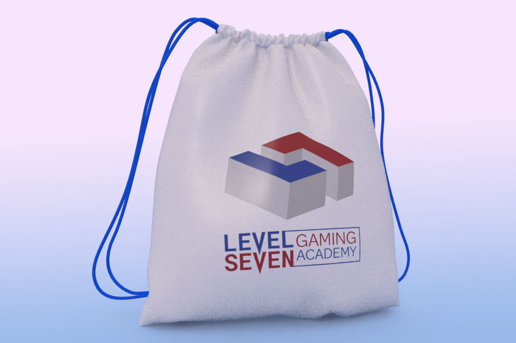
Our next assignment was to create a 3D visualization for the brand using Adobe Dimension.
This was my first time using Dimension. My previous 3D experience was in Photoshop and After Effects, mostly with the Element 3D plugin from Video Copilot.
Adobe Dimension is an easy way to create product mockups and other brand visualizations. The interface is a bit different from the Adobe apps I’m used to, but with help from the intro tutorial I created my first mockup in minutes.
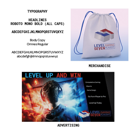
Level Seven merchandise mockup
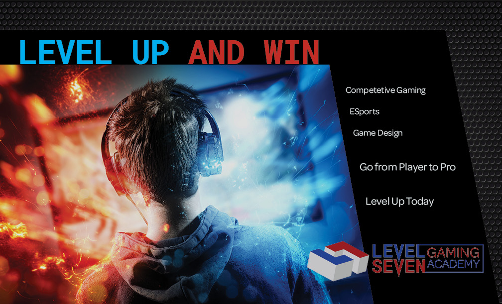
The next assignment in the Branding course is to create a print ad in Adobe InDesign. I started with the headline “Level Up and Win” and licensed an image from Adobe Stock. I adjusted the colors and curves of the image and placed it over a metal grill background that I downloaded free from Pixabay.com.
Level Seven print ad
I’ve used InDesign since 2013, so this exercise was pretty basic. However, it was fun writing headlines and body copy for an ad. It as good practice for the Copywriting class I’m taking this month as part of the Media Design MFA program at Full Sail University.
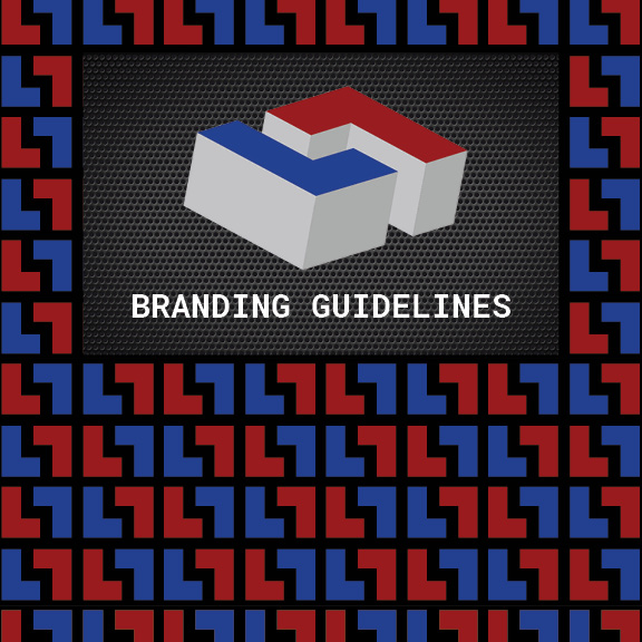
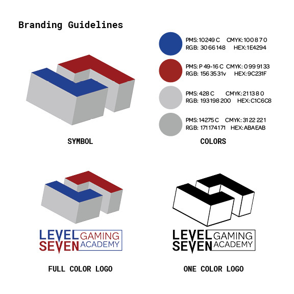
The final exercise for the Branding course is to create a basic Style Guide for our brand identity. I followed the example in Ali Blackwell’s video tutorial but added a Typography category.
Overall, this course provided a good introduction to creating a brand identity, visual assets, and a style guide to keep things consistent. I learned how to use Adobe Dimension for product visualizations and got good practice using Illustrator, Photoshop, and InDesign.
The following assignments were created for the Branding course from Adobe Education Exchange.
Workshop 1 – Creating a Logomark
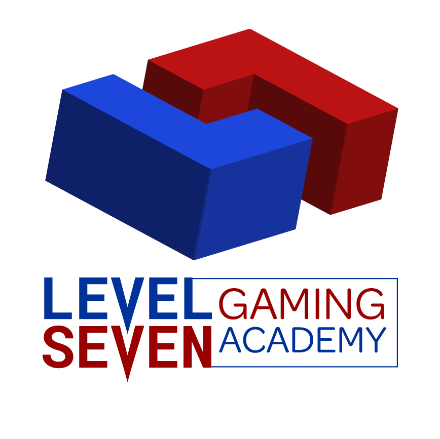
Our first assignment is to create a graphic logomark for a real or fictional school, so I invented Level Seven Gaming Academy as a place where students can learn and train to be professional electronic gamers.
I quickly sketched a few rough concepts using mirrored L and 7 characters, settling on a rectangular design. In Adobe Illustrator, I created the L shape with the rectangle tool then rotated a copy 180 degrees to make the 7.
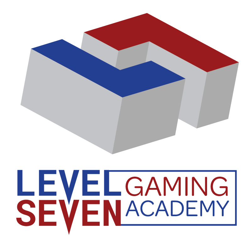
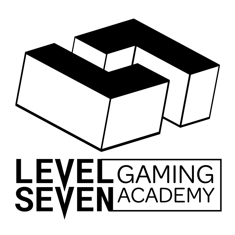
I always strive for simplicity in logo design, but this one needed more depth and energy. So I grouped the L7 layers and applied the 3D Extrude and Bevel effect on three copies with different settings.
This last iteration is the most successful because it is simple yet dynamic. I haven’t picked the logo colors at this stage because I am still defining the brand and fine-tuning the logo.
Workshop 2 – Creating a Logotype
For the next step, I experimented with typography to pair with the Level Seven logo. The fonts Roboto Mono Bold and Omnes Regular were the most successful pairing. I modified the V letters by adding a bottom point and enclosed “gaming academy” in a box to unify the design.
I’m happy with the design but not the colors. The L7 logomark doesn’t have enough contrast to be effective at small sizes. I’ll have to experiment further to find red and blue shades that more closely match the grayscale prototype, which had better contrast.
Logo Color Revision and Brand Pattern
After more experimentation, I found shades of red and blue that worked well in conjunction with grayscale solid shapes.
Level Seven Gaming Academy logo stackedLevel Seven Gaming Academy logo side by side
The simple shapes are evocative of puzzle games like Tetris, while the colors represent the “red vs blue” competition of shooter games. This new version of the logo also works well in one color and in small sizes.
Level Seven Gaming Academy logo black
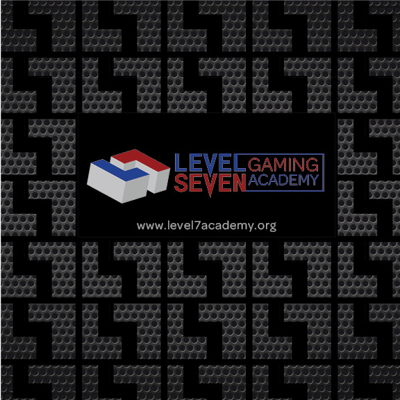
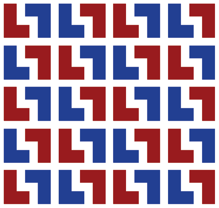
Finally, I created a brand pattern using the 2-dimensional L7 design.
Level Seven Gaming Academy brand pattern
In the next Branding workshops, we will apply the logo to a product in Adobe Dimension and create a style guide of the brand.
The second half of this week was spent revising my Kyoto brand vision boards and updating my SWOT Analysis based on peer feedback.
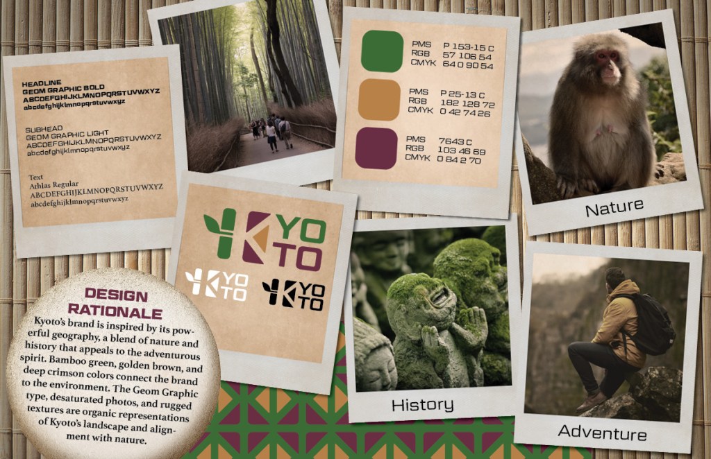
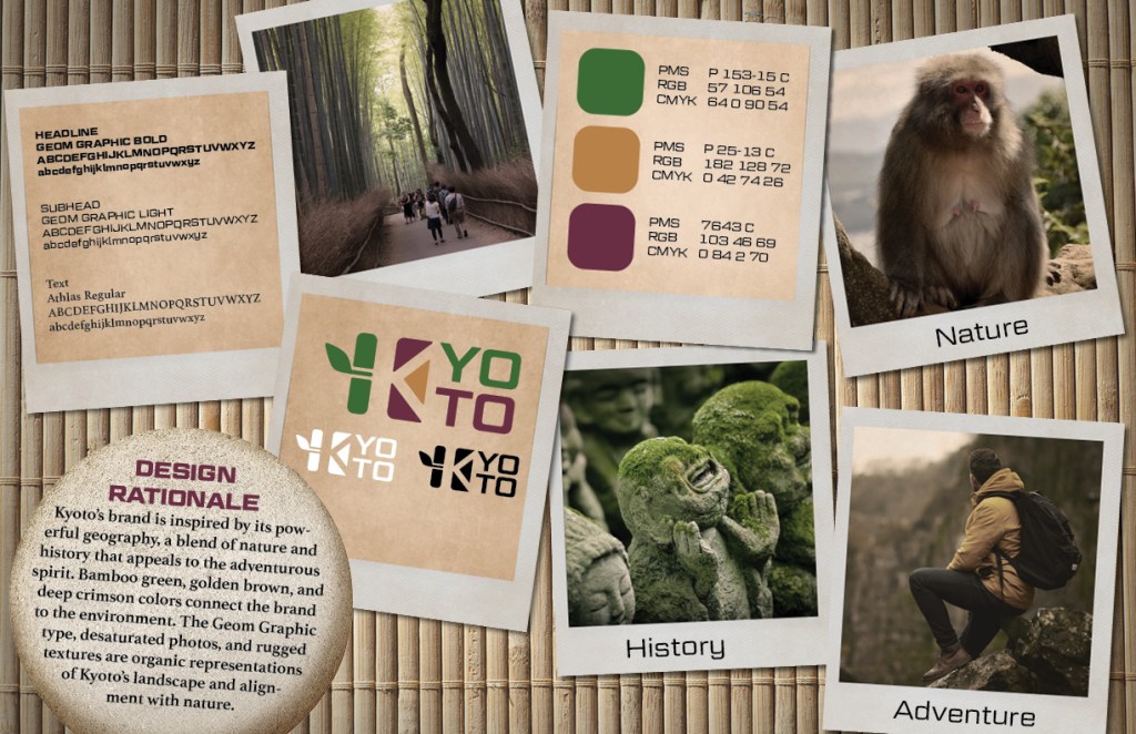
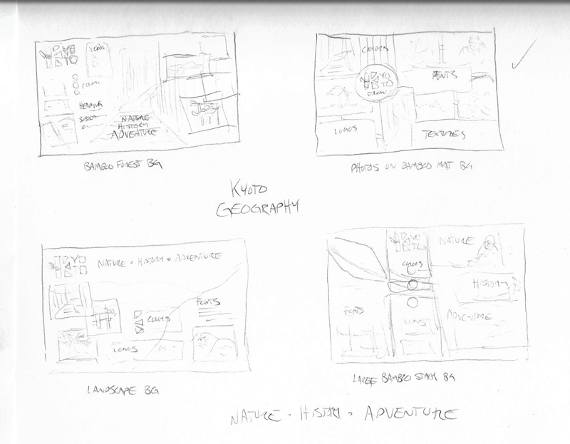
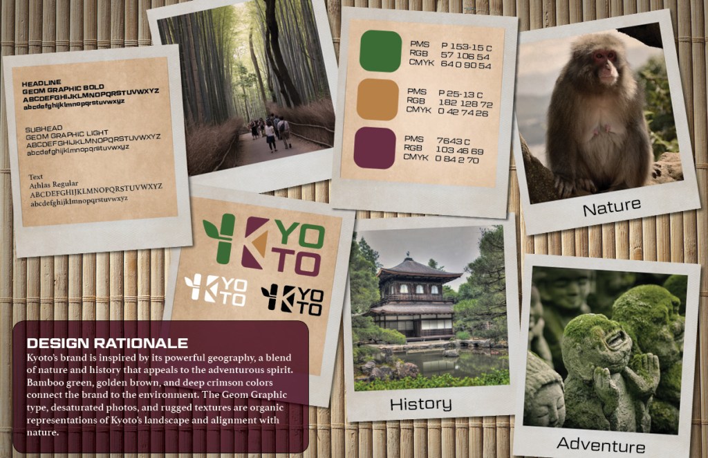
GEOGRAPHY
History – Nature – Adventure
Kyoto geography brand vision board
Design Rationale
Kyoto’s brand is inspired by its powerful geography, a blend of nature and history that appeals to the adventurous spirit. Bamboo green, golden brown, and deep crimson colors connect the brand to the environment. The Geom Graphic type, desaturated photos, and rugged textures are organic representations of Kyoto’s landscape and alignment with nature.
The first change was to lighten and smooth the rock texture behind the design rationale to help it stand out more. I also adjusted the adventure photo placement and added a brand pattern based on elements of the logo.
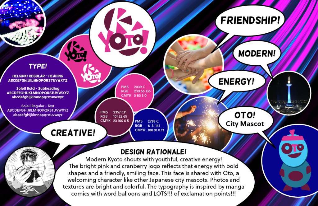
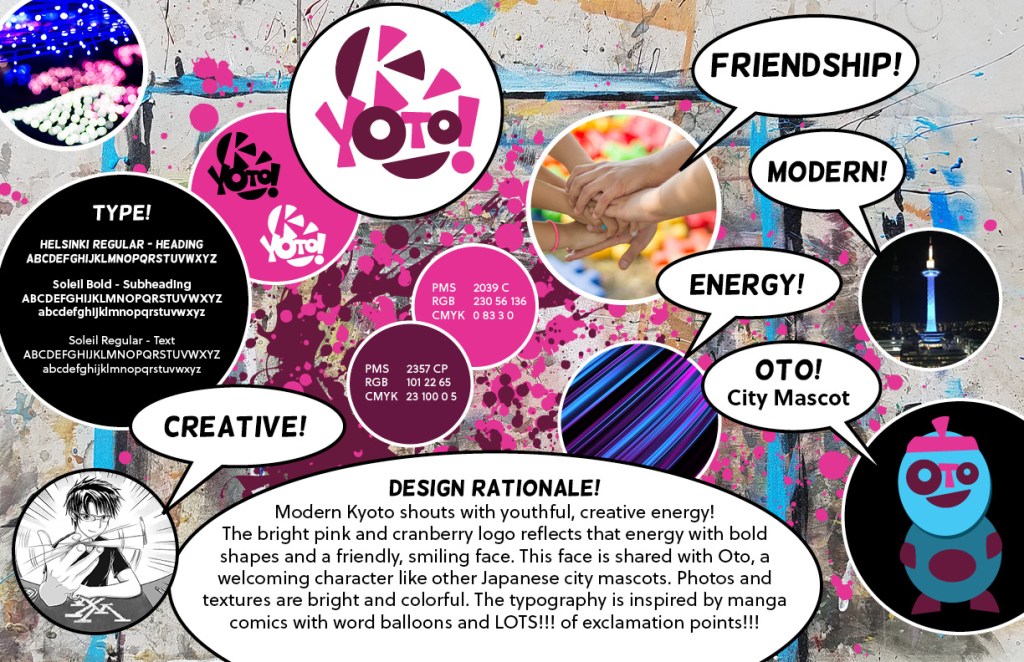
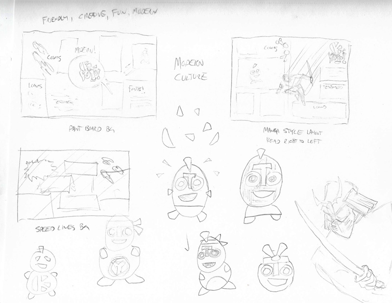
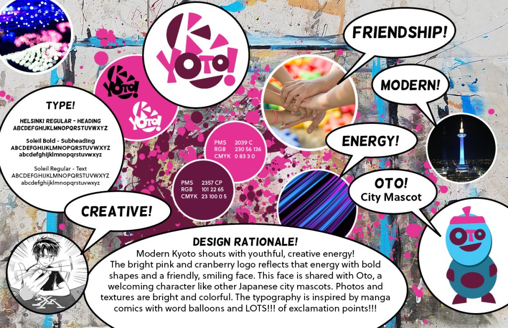
MODERN CULTURE
Creative – Friendship – Modern – Energy
Kyoto modern culture brand vision board
Design Rationale
Modern Kyoto shouts with youthful, creative energy! The bright pink and cranberry logo reflects that energy with bold shapes and a friendly, smiling face. This face is shared with Oto, a welcoming character like other Japanese city mascots. Photos and textures are bright and colorful. The typography is inspired by manga comics with word balloons and LOTS!!! of exclamation points!!!
I updated the background of this board based on peer critique, even though the feedback was based on personal tastes and not cited knowledge of the brand. The new background should have a broader appeal to older individuals and those who aren’t in tune with modern art. While not as distinctive as the first solution, it retains the energy of the brand.
A secondary color that doesn’t appear in the logo was also added to the palette. It’s currently only used as the background for the city mascot, but it can be part of brand patterns and other visual assets.
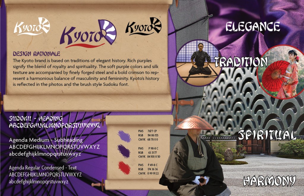
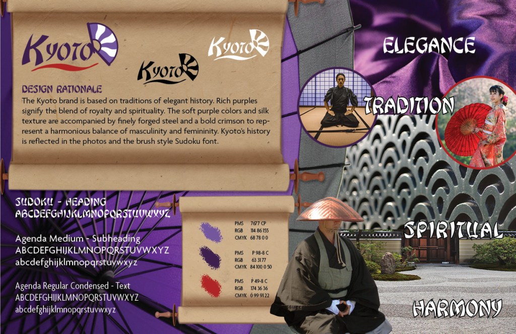
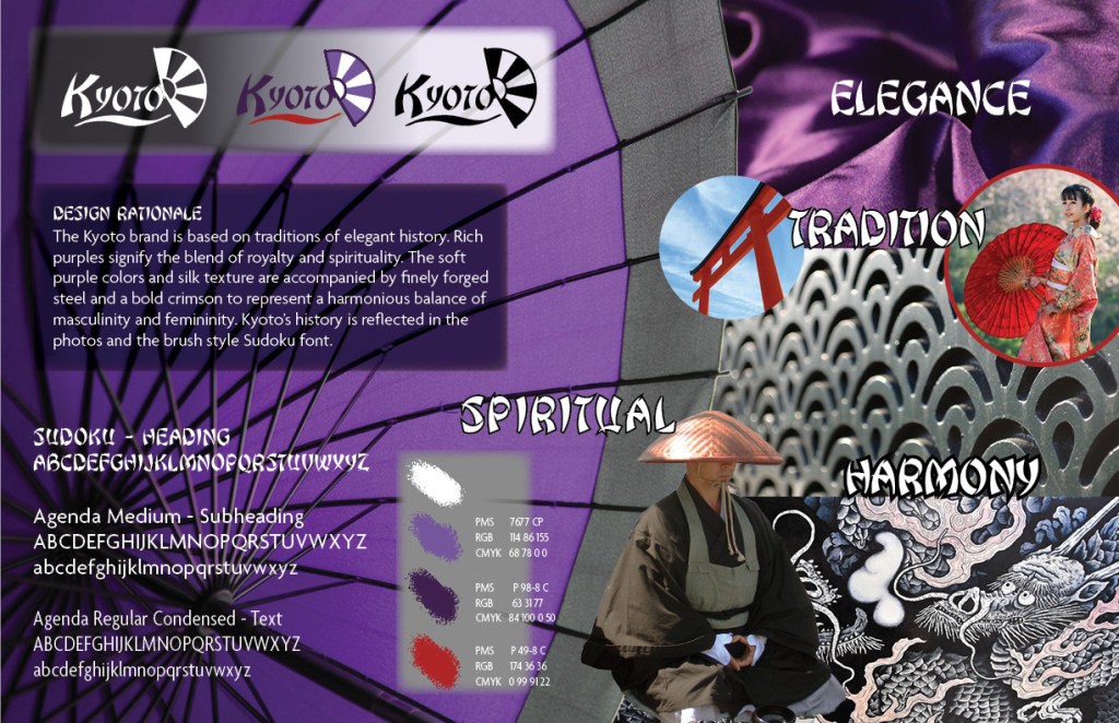
TRADITIONS
Elegance – Harmony – Spiritual
Kyoto traditions brand vision board
Design Rationale
The Kyoto brand is based on traditions of elegant history. Rich purples signify the blend of royalty and spirituality. The soft purples and silk texture are accompanied by finely forged steel and a bold crimson to represent a harmonious balance of masculinity and femininity. Kyoto’s history is reflected in the photos and the brush style Sudoku font.
The Kyoto traditions vision board needed only minor modifications. I lightened the scroll backgrounds and changed the shadows to better match the rest of the design.
Personal SWOT Analysis Update
A classmate recommended incorporating experiences related to
the Brand Development class. I found additional threats and weaknesses that I
experienced this month, as well as new strengths and opportunities discovered
along the way.
I also simplified the SWOT to concise bullet lists to keep the graphic simple. When writing my analysis, I think of it as TOWS, because I start by looking at external threats and opportunities to overcome those threats. Then I examine my internal weaknesses and find strengths to compensate. This is similar to the way Lisa Quast suggests conducting a personal SWOT analysis (Quast, 2013).
THREATS
Tight deadlines on school projects.
Distractions of non-career related side
projects.
Peers in education with graduate degrees.
Peers in design with strong portfolios and
resumes.
Not enough attention to family and personal
health.
OPPORTUNITIES
Develop my portfolio with class projects.
Learn new design and branding skills on
Lynda.com.
Connect with classmates and instructors on
social media.
Utilize the Full Sail University online library
and resources.
Complete the Full Sail University Media Design
MFA in June 2020.
WEAKNESSES
Uncomfortable with self-promotion and
networking.
Stress from juggling work, school, and family.
Working at home without peer feedback.
Easily distracted by side projects.
Taking criticism personally.
STRENGTHS
Experience in design, audio, video, and motion graphics.
Fine arts experience drawing, painting,
sculpting, etc.
This month I enrolled in the Adobe Education Exchange course Motion Graphics for Educators. I’ve been creating motion graphics for many years, but the class helped me better integrate the newest versions of Adobe Illustrator and After Effects.
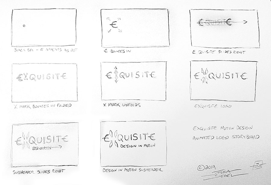
WORKSHOP 1: CREATING A STORYBOARD
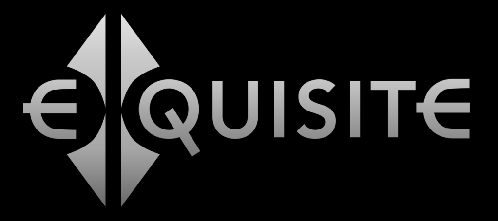
For this assignment, I chose to animate a logo that I recently created. Exquisite is a possible brand for a media design studio, and the animation can be used to promote motion graphics services.
eXquisite logoeXquisite logo animation storyboard
The entire animation will be about 6-8 seconds. As a filmmaker and motion graphics designer, I’m a big fan of storyboarding. It’s an excellent tool for planning shots and trying out ideas in rough form before you even start production.
This animation is relatively simple, but the storyboards will keep me on track when creating the vector assets and timing movements.
WORKSHOP 2 – CREATING GRAPHIC ASSETS
The Exquisite logo was already created in Adobe Illustrator, so I only had to add the assets to my Creative Cloud library and export PNGs to show on this page.
Next, we’ll be animating the graphics in Adobe After Effects.
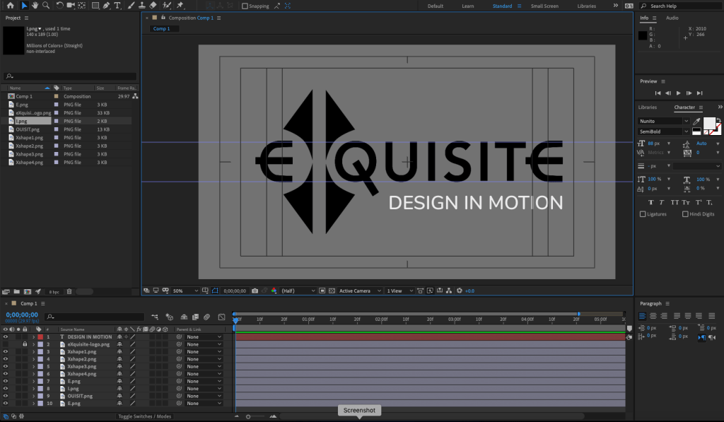
WORKSHOP 3 – SET UP A MOTION GRAPHICS PROJECT
I created a new After Effects composition and imported the graphics assets. A still of the final logo helped me line up everything for the end of the animation.
After Effects project screenshot
I set keyframes for the scale and position of all assets. Next, I will work backwards to the beginning of the animation.
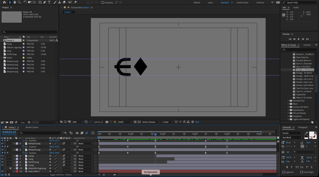
WORKSHOP 4 – MOTION AND VISUAL EFFECTS
With all the visual assets in place, I animated each part starting with the subhead text. For the text reveals, I animated a mask with light feathering. The X logo assets were animated last. After adjusting the timing, I easy-eased the keyframes to make the animation smoother. Finally, I turned on motion blur for all the layers.
After Effects project screenshot
Moving forward with this project, I will experiment with colors, textures, and audio.
WORKSHOP 5 – CREATING A FINAL CUT
After experimenting with metallic textures for the text and background, I decided to keep it simple. I changed the background to dark gray and added a gradient ramp to the main logo. Finally, I added a dark vignette on top of all the layers. Overall the gradient gives the text a 2D lighting effect. On similar projects, I would consider using 3D lighting within After Effects for a more realistic look.
The animations needed some adjustment to make everything smoother and add a little life to the movements. Precomposing the X elements made it possible to add rotation and bounce to the diamond shape before it expands into the X.
The assignment asked for a voiceover, so I tried using my own voice and computer generated speech within Adobe Audition. I experimented with pitch shifting and reverb effects, but nothing felt appropriate for the project. Instead, I mixed a musical sting and a couple whoosh fx to use as the project audio.
eXquisite logo animation
This project was both fun and educational. It was good practice for creating vector assets in Illustrator, animating them in After Effects, and mixing audio with Audition. With these skills I can start making fun explainer videos for my classes.
This week Jose Caceres and professor Andrea Kratz offered
valuable feedback to help improve my Kyoto brand vision boards. Only minor
adjustments were needed for each board, but the changes strengthened the brand
connections.
Geography
Kyoto geography brand vision board
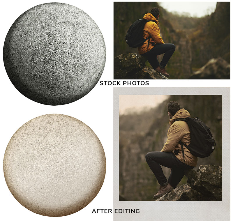
Caceres suggested adding a photo more suggestive of “adventure”, so I found a stock photo that fit the keyword then cropped it, flipped it, and adjusted the colors to more closely match the brand style. I also replaced the “history” temple photo with the moss-covered statues photo that blends both history and nature. Kratz suggested tying the Design Rationale more closely to the design, so I found a round stone image on Adobe Stock and used it as a background with minor hue and brightness adjustments.
On the Freepik.com blog, Orana Velarde offers fifteen ways to customize stock photos to better fit your brand (Velarde, 2017). The image below shows two of the stock images I used, before and after customization.
stock photo customizations
Modern Culture
Kyoto modern culture brand vision board
The modern Kyoto brand vision board needed the fewest
changes. In the Week 4 Live Session video professor Andrea Kratz suggested
changing the background color of some of the bubbles (Kratz, 2019), so I gave
Oto and the typography bubble colorful but dark backgrounds with a white stroke.
This minor change gave the design more contrast and balance.
Traditions
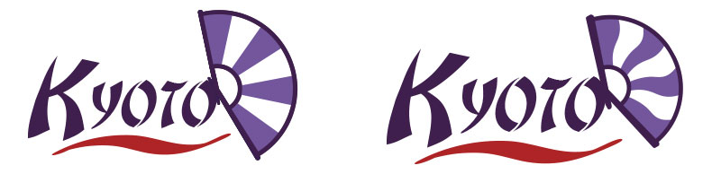
Before updating the traditions brand vision board, I revised the fan logo. The wavy lines on the fan are now more harmonious with the curviness of the wordmark.
Following Kratz’s advice to de-blockify the Design
Rationale, I created a scroll background in Photoshop using elements of clip
art and textured paper. This background worked well for the logos and
rationale, tying more closely to tradition than the previous color backgrounds.
Because it was so effective, I made a second scroll background for the color
palette. This texture can be part of the brand style guide if further
developed.
Caceres suggested adding a photo more closely connected to
“spirituality”. The design was already crowded, so I swapped out the dragons
print for a photo of a Zen garden. I also replaced ambiguous Torii gate photo
with a photo of a samurai. I added the purple background and adjusted the floor
color to match the parchment. The design now feels more cohesive and connected
to Kyoto’s history and traditions. My scroll backgrounds can be adjusted so the
shadows are more consistent with the rest of the design, but that’s a minor
change.
The Mastery journey requires periodic self-analysis of one’s internal Strengths and Weaknesses as well as external Opportunities and Threats. Lisa Quast suggest starting with Threats then identifying Opportunities to overcome those threats (Quast, 2013).
THREATS
Peers with more experience present the greatest threat when
competing for future work. Other college professors already have graduate degrees,
and other designers already have strong portfolios and resumes. Another constant
threat is distraction. Non-career related side projects are fun but do nothing
to further my career or education.
OPPORTUNITIES
I will complete the Full Sail University Media Design MFA program
in June 2020. In the meantime, I will continue to develop my portfolio with
class projects. I will also utilize the Full Sail University online library and
education resources like Lynda.com and Safari books.
STRENGTHS
My years of design and media production experience have
given me a wide range of technical skills, from motion graphics to web design.
I’m also comfortable teaching and speaking to an audience. Most importantly, I’m
learning to combine my creativity with strategic thinking.
WEAKNESSES
Working mostly from home makes it harder to get peer
feedback. It also leads to distraction by side projects that take focus from my
career and education goals. I’m uncomfortable with self-promotion and
networking, which are necessary for growth and advancement.
I began the process of creating vision boards for each of my
three Kyoto brand concepts. At first, I did not understand the difference
between a mood board, a style sheet, and a brand vision board. Fortunately,
professor Kratz defined each tool in the Week 3 Live Session. The vision board
is primarily a presentation tool to explain how you intend to visualize the
brand personality (Kratz, 2019).
My board prototypes started with rough concept sketches that helped me narrow down ideas.
Kyoto’s brand is inspired by its powerful geography, a blend
of nature and history that appeals to the adventurous spirit. Bamboo green,
golden brown, and deep crimson colors connect the brand to the environment. The
Geom Graphic type, desaturated photos, and rugged textures are organic representations
of Kyoto’s landscape and alignment with nature.
Geography Brand Definition
Key Value 1: reverence for nature
Key Value 2: independence
Key Characteristic 1: adventurous
Key Characteristic 2: natural
Its Differentiation: historic temples surrounded by natural
beauty
Experience / Emotional connection: collecting shared
memories and photos
This brand appeals to adventurous visitors who want to take photos of Kyoto’s natural side. Old Polaroid photos provide an earthy, physical connection to memories. Each frame contains a photo that has been desaturated and lightly sepia toned to match the earth tones of the palette. Other frames contain grungy paper textures displaying the logos, color palette, and typography. The photos are scattered on a natural woven bamboo mat background in a way that leads the eye down toward the design rationale.
Kyoto geography brand vision board
MODERN CULTURE
Creative Friendship Modern Energy
Design Rationale
Modern Kyoto shouts with youthful, creative energy! The
bright pink and cranberry logo reflects that energy with bold shapes and a
friendly, smiling face. This face is shared with Oto, a welcoming character
like other Japanese city mascots. Photos and textures are bright and colorful.
The typography is inspired by manga comics with word balloons and LOTS!!! of
exclamation points!!!
Modern Culture Brand Definition
Key Value 1: creativity
Key Value 2: energy
Key Characteristic 1: fun
Key Characteristic 2: friendly
Its Differentiation: International Manga Museum and other
art exhibits
Experience / Emotional connection: fun with friends
The Kyoto International Manga Museum draws many visitors
each year, and this brand appeals to those who appreciate the city’s young,
creative side (Outline of the Kyoto International Manga Museum, n.d.). I
started with a background photo of my own paint-splattered art table and added
splashes of the brand’s primary colors. The bright, colorful photos and
textures are juxtaposed with word bubbles in a way that appeals to fans of Japanese
fashion and manga.
Yuru-kyara are the cute, adorable, and sometimes creepy
little mascots for Japanese cities and organizations (Niko, n.d.). While
drawing Kyoto modern culture concept sketches, I developed a new yuru-kyara
called “Oto.” The city mascot’s face uses elements from the brand logo, raising
brand recognition and awareness while appealing to modern visitors. The
character design needs refinement, but I wanted to include Oto on the vision
board.
Kyoto modern culture brand vision board
TRADITIONS
Elegance Harmony Spiritual
Design Rationale
The Kyoto brand is based on traditions of elegant history. Rich
purples signify the blend of royalty and spirituality. The soft purples and
silk texture are accompanied by finely forged steel and a bold crimson to represent
a harmonious balance of masculinity and femininity. Kyoto’s history is
reflected in the photos and the brush style Sudoku font.
Traditions Brand Definition
Key Value 1: respect
Key Value 2: harmony
Key Characteristic 1: spiritual
Key Characteristic 2: sophisticated
Its Differentiation: spiritual heart of Japan
Experience / Emotional connection: a spiritual connection to
Japanese history
Most of my concept sketches for the Kyoto traditions were based on the folding fan motif, but while searching stock images I found a photo of a Japanese umbrella that more effectively conveyed elegance and sophistication. I changed the umbrella color from red to purple to reflect the brand color representing spirituality and royalty (Cross, n.d). The Japanese steel texture has a fan-like repeating pattern reminiscent of the fan in the brand logo, adding a refined strength that is balanced by the soft flowing silk.