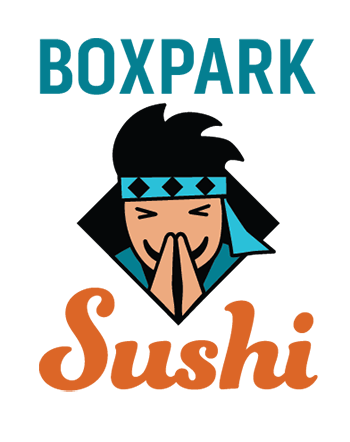
The Boxpark Sushi design evaluation survey could potentially provide insight into which aspects of the brand identity successfully communicated the brand’s characteristics. However, the extremely low of respondents between Wednesday, April 8th and Sunday, April 12th, 2020 make the data from this date range statistically invalid.
Respondents
Links to the survey were posted to Facebook, LinkedIn, and Twitter on April 8th and 10th. Links were also emailed and posted to the Full Sail project discussion. By April 12th, only eight people had completed the survey. Respondents were between the ages of 29 to 54, will only two (age 29 and 33) falling in the 18 to 35-year-old target audience. The younger of these two reported liking sushi, while the other one hates it.
Expectations
I expected more respondents, but the majority of the responses were largely as expected. Differentiation from other Japanese and Sushi restaurants was evenly split between Very Unique and Somewhat Unique. The top three words chosen to describe the designs were Fun, Modern, and Wise. It was unexpected that only one respondent chose Helpful, which is a primary characteristic that the brand is supposed to express. Also, a respondent wondered if anyone would be “offended by the stereotype” of the Sushi Sensei. I had not considered the possibility that the brand mascot might be racially or culturally insensitive.
Design Effectiveness
Responses indicate that the brand’s characteristics were largely communicated through the designs. Desired responses like Fun and Welcoming were common. Conversely, none of the respondents chose undesired responses like Childish, Cheap, or Boring. No parts of the design were deemed unnecessary or confusing in question five. However, one respondent chose Confusing to describe the designs in question two. They either checked the wrong box in question two or did not want to elaborate in question five. Respondents found the color palette to be Happy and Energetic, suggesting that the orange color is more powerful than blue in the designs.
Survey Techniques
I learned a great deal about creating a survey. However, I still have much to learn about sharing and promoting surveys. The questions were crafted to determine if the designs communicated the brand’s qualities and message, using radio buttons and checkboxes rather than open ended text fields to maximize ease of use. Respondents each completed the survey in under three minutes, so usability was not an issue. Promoting the survey was the biggest issue. I am not active on social media, so the reach of my campaign was extremely limited. I will have to research how and where other brands promote their surveys before starting another project like the Boxpark Sushi brand identity.
Design Evolution
Despite the low number of respondents, the survey provided new insights regarding design effectiveness as well as raising potential issues. Further qualitative studies with a culturally diverse testing group can find ways to ensure that the Sushi Sensei is inoffensive and welcoming to all. I will also examine whether the Boxpark Sushi logotype would be more effective using only the orange color instead of blue and orange.
Evaluating the subjective benefits of a design as well as more measurable data gives the designer a wider perspective on the design problem, thus informing stronger solutions. Hanington and Martin (2010) recommend that testing should measure performance variables like ergonomics and usability as well as preference measures like aesthetic response and emotional resonance. Evaluative testing ensures that visual elements like colors and fonts not only create a usable experience, but also “express the complex brand traits such as friendliness, reliability, or innovation” (Whitenton, 2018). Although personal tastes are subjective, evaluative research helps confirm that the designer has accurately predicted users’ reactions to the design.
Using an Evaluation Matrix
Evaluating the effectiveness of a design is a tricky science, and some evaluation methods are more useful than others. An Iowa State University study compared the efficacy of structured and non-structured methods for the evaluation of graphic design projects (Yen, 1995). The study found that a structured method using an evaluation matrix provided more actionable insight than an unstructured method like a simple evaluation form. Elmansy (2015) recommends using an evaluation matrix to score a number of criteria for a design, such as an idea’s potential impact and its expected shareholders. This measures levels of success for each criterion, providing deeper insight than pass-fail (yes or no) evaluations.
0
1
2
3
score
Clarity of Message
Message is absent or contradictory.
Message is slightly confusing.
Message is clear but not compelling.
Message is clear and compelling.
Color Choices
Color choices weaken the work.
Color choices are not brand appropriate.
Color choices are brand appropriate.
Color choices enhance the meaning of the work.
Example of a design evaluation matrix.
Role of the Modern Designer
In the past, designers were considered technicians hired to create artifacts like posters for events or brochures for products. The modern designer creates ideas and develops novel ways to communicate a message. “Designers are project champions, guiding messages and influencing culture” (O’Grady & O’Grady, 2013, p. 5). More importantly, designers are problem solvers. A designer who can solve a business problem with a creative solution is positioned as more than just a production artist (Rosebrook, 2017). They are a partner in the decision-making process. The integration of design into business strategy has proven financial benefits for companies, making the role of the modern designer more important than ever.
Yen, J. (1995). A comparison of structured and non-structured methods for the evaluation of graphic design projects. Retrospective Theses and Dissertations. https://doi.org/10.31274/rtd-180813-9991
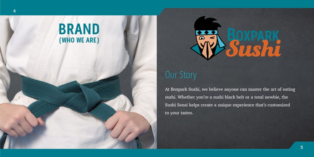
The Boxpark Sushi brand identity and several media asset deliverables were created as a multi-class project for the Media Design MFA program at Full Sail University. This paper examines and evaluates the effectiveness of those designs based on values delivered to both the client and the target audience. Measurable hard values like production costs are addressed as well as more qualitative soft values. The values that a design provides for the user can be categorized in a hierarchy of needs. Evaluation of the Boxpark Sushi deliverables indicates that all media assets meet the expected levels of functionality, reliability, and usability. Furthermore, the Sushi Sensei persona creates higher value by addressing the customer’s proficiency and creativity needs.
Design is about communication, and strong communication requires understanding of how different individuals respond to a design. Response is based on individual needs and desires that can be measured, providing valuable insight into consumer behavior. The success of a design can be measured in hard value and soft value. Evaluating the subjective benefits of a design as well as more measurable data gives the designer a wider perspective on the design problem, thus informing stronger solutions. Designers should consider the hierarchy of user needs presented by Lidwell et al (2009) to ensure the design delivers maximum value to the target audience. Formative research like surveys provide insight into the needs and opinions of the target audience. Surveys and questionnaires can be also used as summative research to measure the success of a design solution before it goes public (O’Grady & O’Grady, 2009). This provides the designer an opportunity to finesse the design or take an alternate path to a more effective solution.
When evaluating the effectiveness of a design, it is important to consider the values it delivers to both the client and the target audience. Value can be measured in two categories: hard value and soft value (O’Grady & O’Grady, 2013). Hard value includes measurable data such as production costs or the number of website visitors. Soft value is less measurable and more subjective. Does the design inspire brand loyalty? Does it promote a feeling of accomplishment in users? By understanding how their work creates value for a client and their target audience, the designer raises their own value and builds a stronger relationship with the client.
The Boxpark Sushi brand identity project includes many deliverables that define and reinforce the brand personality while providing hard and soft value. For example, the Boxpark Sushi takeout bag provides hard value in terms of measurable production costs. Single color printing on unbleached paper bags costs less than full color printing on cardboard containers. These savings can be easily calculated and measured. In addition, QR code links on the takeout bags drive traffic to the Boxpark Sushi website, social media, and Sushi Sensei app. Monthly analytics for these services can measure the number of new visitors and users who used the QR code links.
Soft value is created in several ways by the Boxpark Sushi deliverables. First, the takeout bags increase brand awareness as customers carry them to their home, school, or workplace. Witty sayings printed on the bags inspire and delight customers, reinforcing the brand’s wise and fun personality. The “Sushi Black Belt” magnet awarded to loyal customers provides a sense of accomplishment while promoting brand loyalty. Although these qualitative values are harder to measure, insight can be gained by examining which needs the design will address.
In the book Universal Principles of Design, Lidwell, Holden, and Butler (2009) introduce a hierarchy of user needs based on Maslow’s hierarchy of needs. Maslow’s hierarchy describes how the lowest human physiological needs like hunger must be addressed before moving to higher needs like esteem and self-actualization. Although based on Maslow’s hierarchy, the five-level pyramid model used by Lidwell et al describes user needs in terms of design value.
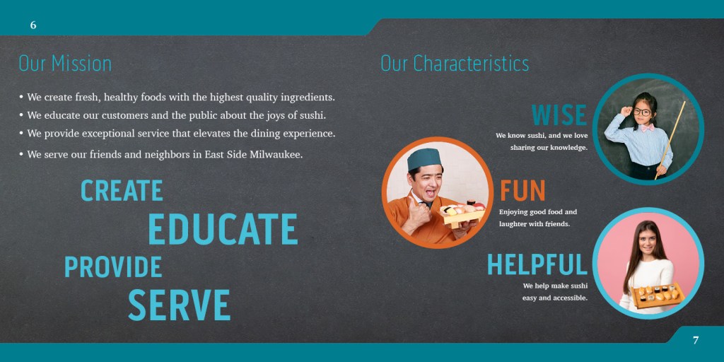
The lowest level of the pyramid is functionality. All designs, including the Boxpark Sushi deliverables, must serve the basic function of communication or else they have no value. (Creger, 2019). Each media asset serves a specific purpose, such as introducing the brand to new customers. Functionality is the foundation of the user needs pyramid and must be addressed before any other considerations.
The second level is reliability. The Boxpark Sushi deliverables utilize a consistent, reliable brand identity across a variety of media. Customers can expect to see the Sushi Sensei mascot on all Boxpark Sushi media assets, from the signage to takeout bags and brand merchandise. The typographic system, color palette, and imagery are consistent, adding to the perceived value of the designs.
Usability is the third level of the user needs hierarchy. Designs should be easy to use and understand. The Boxpark Sushi brand identity utilizes highly legible type, straight-forward language, and open space to ensure that designs are comfortable and present information to the customer in a way that is easy to process and recall. Although usability adds value to a design, it is expected. To attain higher value, designs must reach the upper hierarchy levels of proficiency and creativity (Bradley, 2010).
Proficiency empowers people to do things in a new and better way. For example, the Sushi Sensei app helps customers learn more about sushi while providing an easy way to customize their order. While the other Boxpark Sushi deliverables are not so innovative, the brand identity revolves around the idea of educating and empowering sushi eaters.
The final, highest level in the user needs hierarchy pyramid is creativity. Creativity in design goes beyond differentiation. It requires true innovation that inspires users to interact with the design in a novel way. All lower needs should be satisfied before seeking more creative ways to strengthen the design and extend its value. The Boxpark Sushi deliverables achieve the lower levels in the ways described above and utilizes the Sushi Sensei mascot in creative ways. The Sushi Sensei expresses the brand personality in all media categories to develop deeper connections with the target audience.
Understanding the needs of the market can help guide the design of additional media assets that support the brand and deliver maximum value to the target audience. Evaluation of the Boxpark Sushi deliverables indicates that all media assets meet the expected levels of functionality, reliability, and usability. In addition, the Sushi Sensei persona creates higher value when used to connect with users in creative ways. These soft values are not easily measured, but user surveys can provide deeper insight into how the designs address user needs.
Evaluative research can also be conducted through product testing. Testing can measure customer preferences as well as performance measures like how easily a menu is read. Boxpark Sushi continues to evolve as a brand, and regular evaluation of designs and deliverables will ensure that customers receive maximum value.
Design is crucial for communication, and good design helps a brand rise above competitors. By understanding how their work creates value for a client, the designer raises their own value and builds a stronger relationship with the client.
Value can be measured in two categories: hard value and soft value. Hard value includes measurable data such as production costs or the number of website visitors. Soft value is less measurable and more subjective. Does the design make users feel good? Does it inspire brand loyalty? When defining the value of a project, O’Grady and O’Grady (2013) recommend using a blended approach to frame the hard and soft values as well as the metrics for measurement. These considerations highlight the designer’s importance and also help guide design decisions. Carlsson (2019) notes that by considering both hard and soft values, the designer gains greater understanding of the market and the target audience.
Hard and soft value not only measures the success of a design, they can also help inform the designer early on in the process and lead to more effective solutions.
Hierarchy of User Needs
In the book Universal Principles of Design, Lidwell, Holden, and Butler (2009) introduce a hierarchy of user needs based on Maslow’s hierarchy of needs. Regarding Maslow’s hierarchy, Felton (2013) describes how the lowest human physiological needs like hunger must be addressed before moving to higher needs like esteem and self-actualization. Although based on Maslow’s hierarchy, the pyramid model used by Lidwell et al describes user needs in terms of design functions.
Functionality, the lowest level, is a requirement for any design just as physiological needs must be met first. Reliability is the next highest level, equated to safety because of the human need for stability and consistency. Designs that only meet the first two levels are perceived to have low value (Lidwell et al, 2009). Usability of a design is at the same pyramid level as the need for love and belonging. A design that meets Proficiency needs by empowering users is directly related to the human need for esteem. Creativity is the highest level in the hierarchy of user needs, but it cannot be successfully achieved without the foundations established by first meeting the lower needs.
The Design Staircase
The Design Staircase™ model, also called the “design ladder,” was developed by the Danish Design Centre (DDC) to evaluate how businesses use design and directly correlate that information to financial gains (O’Grady & O’Grady, 2013). The framework is divided into four stages.
Stage One: No Design. Design is not used systematically.
Stage Two: Design as Styling. Design is only used as superficial decoration.
Stage Three: Design as Process. Design in an integral part of the innovation process.
Stage Four: Design as Strategy. Design in an integral part of the business strategy.
A 2003 survey concluded that companies that work systematically with design have higher earnings and bigger exports than companies that do not use design (Danish Design Center, 2015). Sharing this information with clients can demonstrate the economic benefits of design as part of their overall business strategy.
Multi-platform Delivery, the ninth course in the Media Design MFA program from Full Sail University, continued the development of a brand identity for a fictional client: Boxpark Sushi, located in East Side Milwaukee.
My classmates and I used the design briefs and media delivery plans that we developed in the previous course to create final logos and media assets for the brand. Finally, we collected all the brand details and visual assets into a comprehensive brand guide.
Connecting / Synthesizing / Transforming
This month I was reminded of the importance of proximity and space in graphic design. In an early draft of the Boxpark Sushi logo, the logotype suffered because it was three degrees away from stasis. In other words, the Boxpark and Sushi type were separated by distance as well as font and color differences.
Boxpark Sushi draft logo
To better understand the design principles of proximity and space, I read an article by Matt Smith on graphic design education website Edgee.net and chapters from the book The Elements of Graphic Design: Space, Unity, Page Architecture, and Type by Alex White.
As noted by Smith (2014), close proximity of design elements indicates a relationship or connection between the elements. Things that are unrelated are not grouped together. White (2011) agrees that the proximity of related elements adds unity to a design.
I applied this knowledge to revise the Boxpark Sushi logo. Although the fonts and colors are still different, I shortened the x-height of the Sushi type and overlapped the Boxpark type. Joining the type in this way strengthened the connection between the two elements to form an effective logotype.
Boxpark Sushi revised logo
Problem Solving
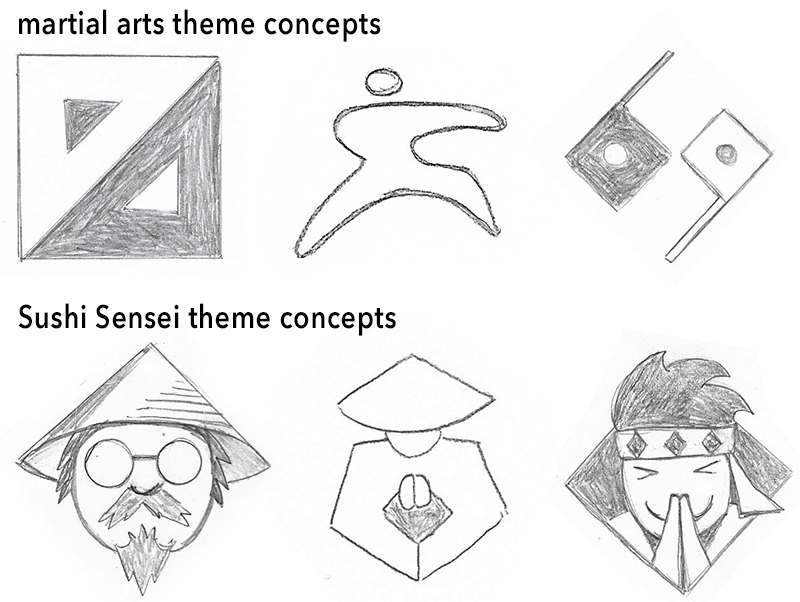
Creating a logo that stood out from other sushi brands was a daunting design problem. Sushi rolls and chopsticks are ubiquitous in the category, so differentiation required thinking of other elements that visually represent the characteristics of Boxpark Sushi.
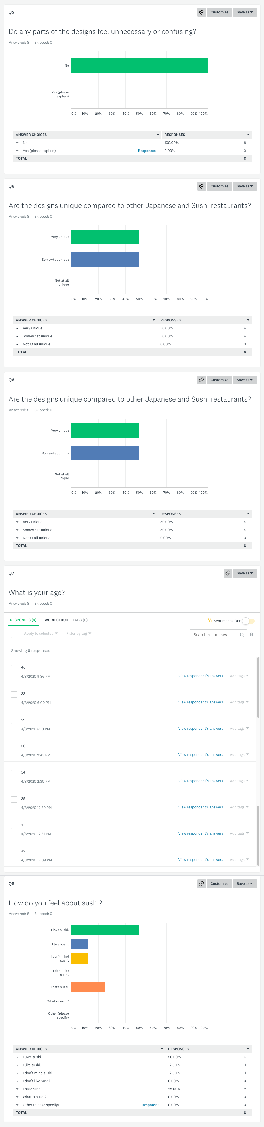
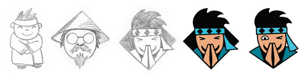
Having established the Sushi Sensei as the personality of the brand, I sketched many logo concepts based on Japanese martial arts or philosophy, such as the Yin-Yang symbol. I also sketched many versions of the Sushi Sensei as a brand mascot.
logo concept sketches
The solutions featuring a simplified Sushi Sensei were more successful because they literally put a face on the brand while also expressing the brand’s characteristics (Yalanska, 2019).
Innovative Thinking
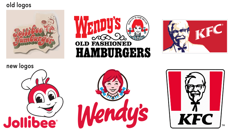
Restaurant mascots have become less illustrative over the years as designers recognize the importance of simplicity in logo design.
evolution of fast food mascot logos
My own work on the Sushi Sensei mascot followed a similar arc as the design evolved from illustrative concept sketches to an iconified design where every shape serves a communicative purpose.
Sushi Sensei concepts, draft logo, and final logo
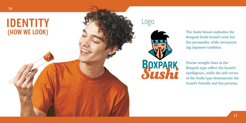
For example, the first rendered draft of the logo featured the sensei within a diamond shape that mirrored the headband diamonds. However, this design element was decorative rather than communicative, so it was removed. The bottom edge of the design now resembles an open book that reveals the sensei, expressing the brand’s educational aspect. The bowing expression with closed eyes was also changed to a friendly wink, expressing the brand’s fun side.
The final Sushi Sensei logo demonstrates innovative thinking by evolving quickly during the design process rather changing after years of public exposure. The simplified mascot also uses cool colors appropriate to sushi and wisdom rather that the bright red hues used by fast food brands to stimulate hunger.
Acquiring Competencies
The following are concepts, skills, or new resources learned in the Multi-platform Delivery course. They are categorized as Academic (pertaining to schoolwork) or Occupational (pertaining to work in the Media Design field), and Technical (pertaining to software or other design skills) or Conceptual (new terminology, procedures, or ideas).
Brand mascots are a powerful way to connect with a target audience. Mascots provide emotional triggers while supporting the voice of the brand. [occupational, conceptual]
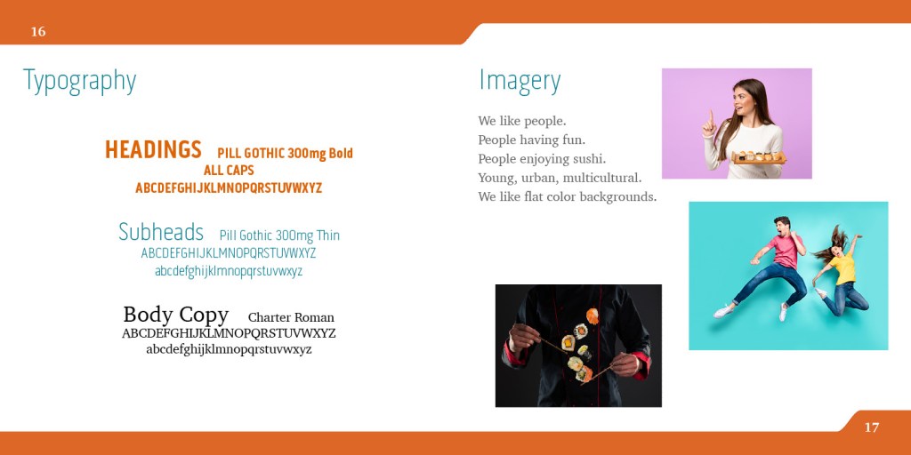
Designers must consider font personality when developing a brand’s typography. The shape, weight, and angles of letterforms all have psychological associations with characteristics like strength or compassion. [academic, conceptual]
A logomark is a simplified symbol that represents a brand but does not include the brand name or other written words. [occupational, conceptual]
A logotype (or word mark) is a brand name that has been visually styled to reflect the brand identity. [occupational, conceptual]
To deconstruct a design means to analyze its separate components in order to understand how it helps communicate a message. [academic, conceptual]
Visual space is used to connect and separate elements in a design. Space also creates hierarchy and improves legibility while conveying a variety of meanings. [occupational, conceptual]
Colors and other design elements have different cultural associations and meanings. When choosing design elements, it is important to research the target market and make appropriate cultural considerations. [occupational, conceptual]
Close proximity of design elements indicates a relationship or connection between the elements. Unrelated elements are space farther apart. [occupational, conceptual]
Carefully organized project file management makes it easier for designers to locate important files and maintain a catalogue of past work. [occupational, technical]
When using design mockups, it is important to consider transparency with clients, appropriateness and inclusivity of the image, and the usage rights. [occupational, conceptual]
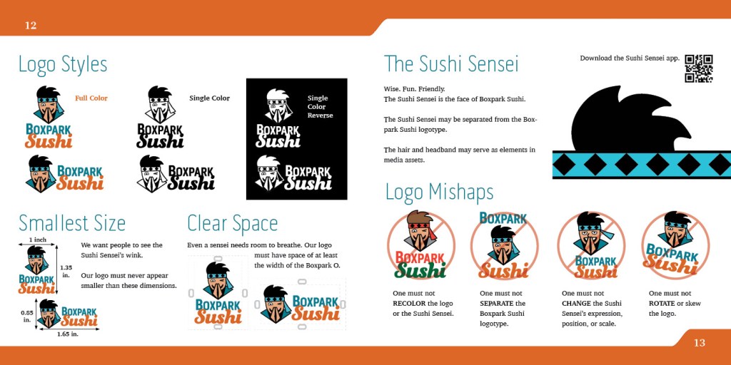
Clear space, also called free space or white space, is the minimum amount of space that a logo must have on each side. Without these guidelines, logo usage will be inconsistent and far less effective. [occupational, conceptual]
Adobe InDesign master pages keep layouts consistent across many pages in a publication. [occupational, technical]
A brand guide ensure that the successful brand identity solution continues to be used effectively and consistently in all all future designs and brand media. [occupational, conceptual]
The final project for the Multi-Platform Delivery course was designing a brand guide for Boxpark Sushi, a fictional brand we’ve been developing for several months.
Clear space, also called free space or white space, is the minimum amount of space that a logo must have on each side. Hardy (2011) says that defined clear space gives logos room to breathe and protects the integrity of the brand from nearby graphics and copy. Furthermore, clear space around a logo helps designs feel less cluttered or messy, characteristics that you don’t want associated with your brand (LabelValue Team, 2016). This is why it is important to define a logo’s clear space in a brand style guide that can be referenced by printers and designers working with the logo. Without these guidelines, logo usage will be inconsistent and far less effective.
Using Master Pages for Consistent Layouts
Adobe InDesign has many tools to help create professional looking documents and publications. Master pages are one of the most useful tools, especially for longer publications, because they keep layouts consistent across many pages. A master page is like a template that contains elements you may want to repeat on multiple pages such as a background, logo, page number, or guides to aid in design. Applying a master to a page saves time in the design process because the recurring elements only have to be placed once (Mohamed, 2019). This also makes layouts more consistent, requiring the designer to override master page elements that they want to change (Bernardi, 2018). Individually placing a page number on each page could lead to inconsistent positioning and a greater chance of incorrect numbering. Instead, placing a page number element on a master page means the page number will be consistent and accurate no matter how many pages are added or changed.
From Design Brief to Brand Guide
When creating a brand identity, design briefs and brand guides are both used as agreements between a client and designer. A creative design brief is an agreement between the client and the designer on the specifications that will lead to the most effective solution (Hardy, 2011). The brief includes information about the brand and its target audience that guides all design choices, leading to a successful solution to the design problem presented. After a successful brand identity has been created, a brand guide is used as an agreement between the designer and the client to ensure that the successful solution continues to be used effectively and consistently (Chan, 2019). The road map provided by the design brief leads to the solutions presented in the brand guide. In turn, the brand guide is a road map for all future designs and brand media.
What was the original Problem to be solved by creating new identity branding? Has the purpose of the brand been met in your materials?
The original problem identified in January for the Strategic Development course is that many American consumers are confused or intimidated by sushi and its ingredients. To address this issue, the Boxpark Sushi identity is built around the Sushi Sensei personality. All of the brand’s media assets utilize this wise but fun identity to make customers feel more comfortable about eating sushi. For example, the back of the Boxpark Sushi takeout bag features words of wisdom with a dash of humor. The education aspect of the brand could be further expressed by printing quotes and fun facts about sushi and Japanese culture on other media assets like napkins and in-store décor.
Will the brand identity and asset designs be perceived as appropriate to the brand attributes? What aspect(s) of the design, specifically, make it so?
Boxpark Sushi is wise, fun, friendly, and helpful. One way the brand identity reflects this is in the Sushi Sensei design. The sensei communicates wisdom and helpfulness with a bowing pose, demonstrating fun with a wink and friendliness with a smile. In addition, the logotype fuses the brand’s strong and precise side with its fun and organic side, like a well-trained sushi chef preparing a maki roll.
Does the design convey the intended message? If so, explain how. If not, how might this be corrected?
My biggest concern is that the Sushi Sensei will be mistaken for a sushi chef or just a random character used to make Boxpark seem like the KFC of sushi. After feedback from professor Argo, I tried to be sure that every shape and line in the logo served a communicative purpose. However, it’s difficult to know how successfully the logo conveys Boxpark Sushi’s message without any means of measuring the success. I’m hopeful that the next course in the Media Design MFA program will help in that area.
Are the media choices effective in sharing the community’s brand? Explain how the design leads to increased interest or better visibility.
East Side Milwaukee residents in the target audience are young and educated. They are open to new experiences, and Boxpark Sushi provides a stress-free way to learn while sharing a great meal. Assets like the “Official Sushi Black Belt” magnet help build the Boxpark Sushi tribe and expand brand awareness. Furthermore, street advertising like pole banners visually introduce the brand to the local community more effectively than radio, television, or internet ads.
Is the design expected or unexpected? Is that good or bad? Explain why.
Boxpark Sushi’s logo and media asset designs stand out from competitors because they are unexpected. After all, sushi restaurant logos are more likely to feature chopsticks and sushi rolls than brand mascots, which are normally associated with fast food. However, mascots are an effective way to literally put a face on a brand, making it easier to connect with the target audience. The Sushi Sensei mascot expresses the brand personality without cheapening it or making it seem too childish.
Is there anything about the design that should be finessed, adjusted, or reconsidered?
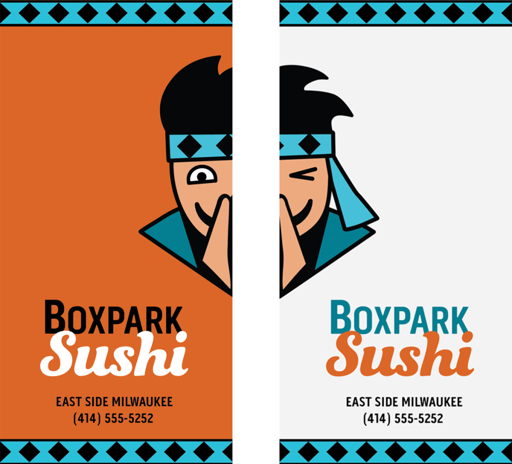
Even after researching color theory and the psychological associations of colors, I still don’t feel confident in my choice of color palette for the Boxpark Sushi logo. There is a strong rationale for using orange and blue to depict fun and wisdom, but something about the pairing or my choice of hues doesn’t feel right. Maybe I’m too dependent on tools like Coolors and Adobe Color. On future projects, I plan to use mood boards to find inspiration in colors from images that capture the brand characteristics.
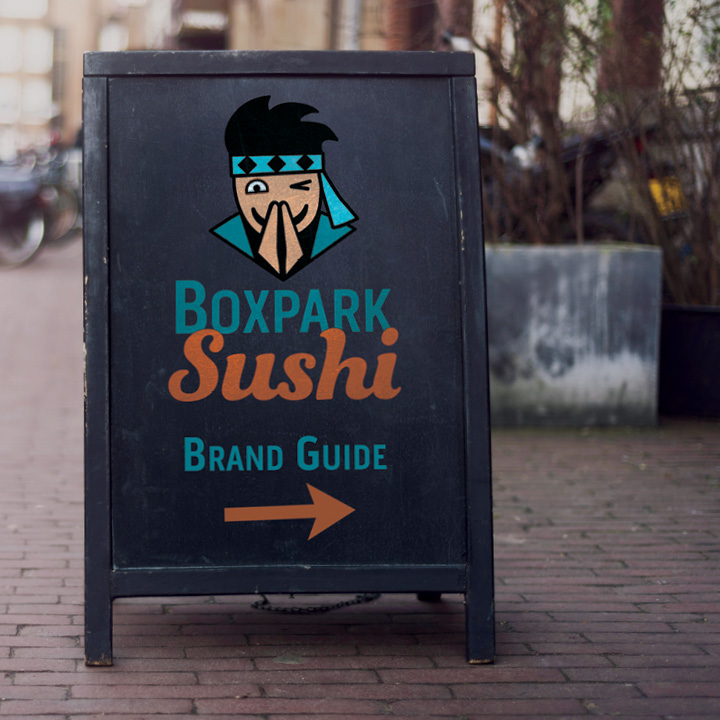
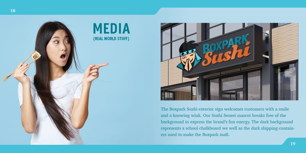
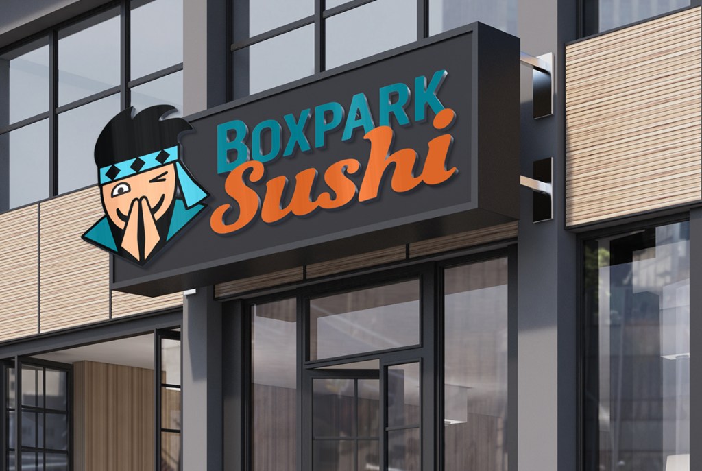
The strategic purpose of the Boxpark Sushi exterior sign is to capture the attention of shoppers and visually explain the brand. A dark gray background and its border represent a chalkboard, evoking the educational aspect of the brand. At the same time, the background mimics the dark shipping containers that constitute the architecture of the Boxpark mall.
The Sushi Sensei mascot breaks free of the background, demonstrating the brand’s fun energy and welcoming customers with a bow, a smile and a wink. This simplified facial expression communicates the wise yet friendly nature of Boxpark Sushi. Wisdom and competence are also expressed in the aqua blue colors in the headband and darker teal color of the Boxpark text and the Sensei’s karate gi (Kolenda, 2016).
In contrast, the orange color Sushi text communicates the brand’s warm, fun energy (Kolenda, 2016). Furthermore, studies show that warm reds and oranges can increase one’s appetite (Przybyla, n.d.). Because Boxpark shoppers already know where they are, the Boxpark text does not stand out on the sign as much as the bright orange Sushi text that tells them what the restaurant serves.
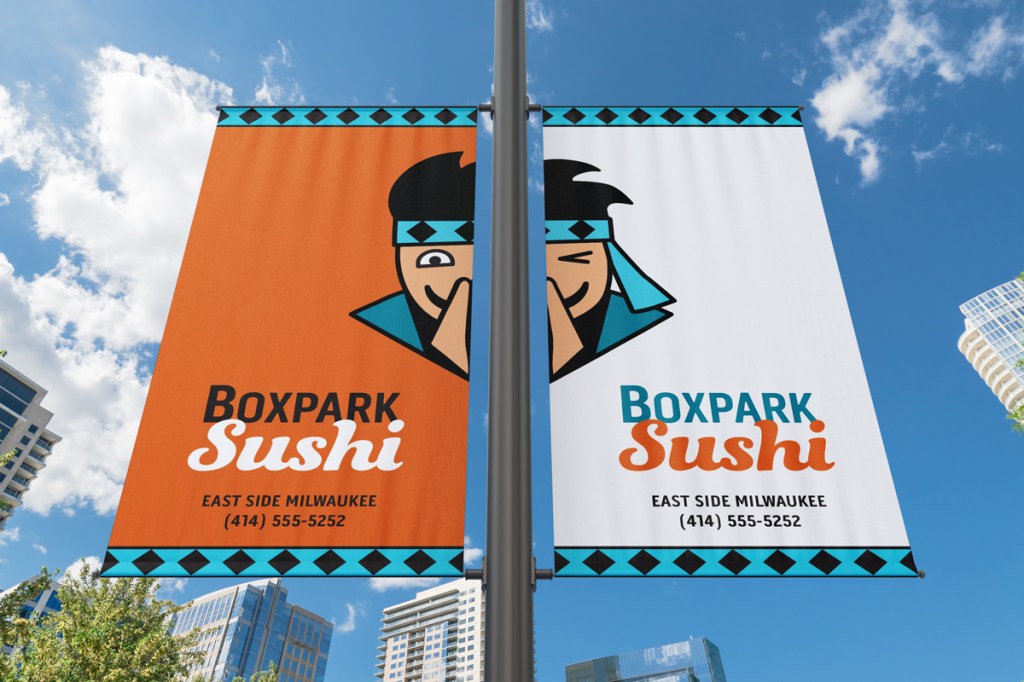
Pole Banners
Boxpark Sushi pole bannersBoxpark Sushi pole banners mockup
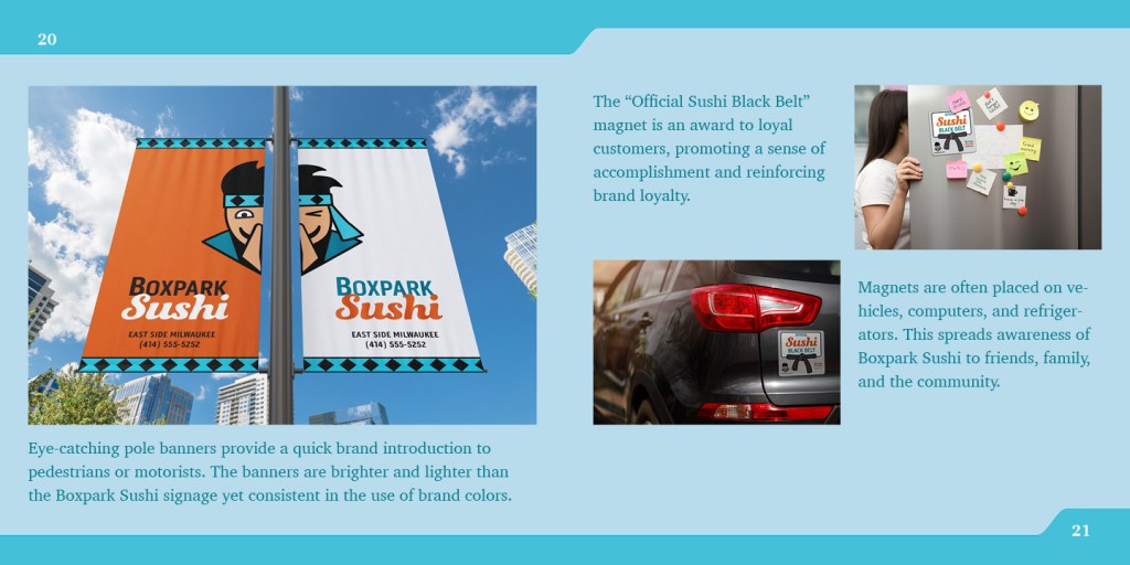
Eye-catching pole banners provide a quick brand introduction to passers-by, whether they are pedestrians or motorists. Demographic data shows that a large majority of East Side Milwaukee residents drive to work (Point2Homes, n.d.), so it is vital that the banners attract attention and communicate clearly to motorists who may have only seconds of attention to spare.
For that reason, the banners are brighter and lighter than the Boxpark Sushi signage while remaining consistent in the use of brand colors. The orange color stands out against the sky and other urban backgrounds as well as representing the brand’s association with “energy, ambition, and enthusiasm” (Cousins, 2012).
Paired side by side, the two banners have an abundance of negative space that communicates openness and freedom (White, 2011). The Sushi Sensei once again breaks free of the background, expressing the fun side of the brand.
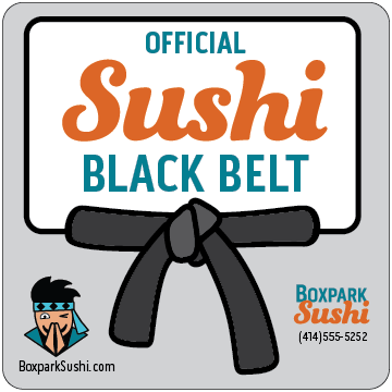
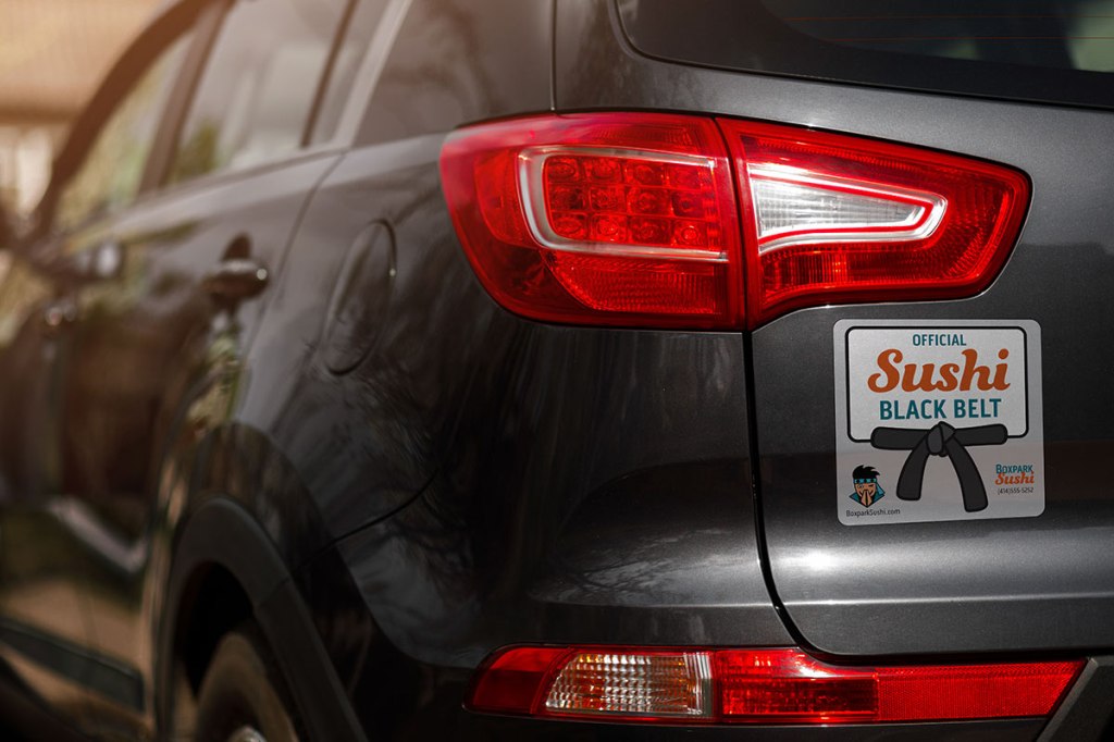
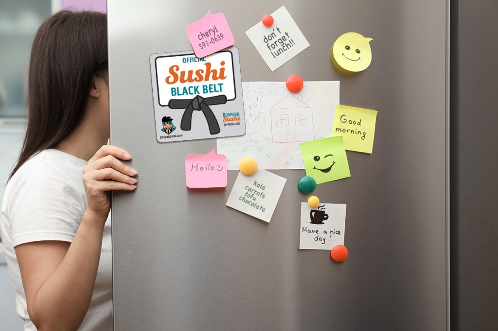
Magnet
Boxpark Sushi magnet
Boxpark Sushi magnet on carBoxpark Sushi magnet on refrigerator
Printed magnets are an inexpensive promotional item that reinforce loyalty to the Boxpark Sushi tribe and spread brand awareness. The “Official Sushi Black Belt” magnet is an award to loyal customers, promoting a sense of accomplishment and addressing self-actualization needs. Felton (2013, p. 22) lists self-actualization as the highest level in Maslow’s hierarchy of needs. This helps the brand rise above competitors who only address the lower needs.
Although magnets do not stick on the back of all vehicles, they are mobile advertisements when used to replace bumper stickers. Magnets are also popular decorations for laptops, spreading the brand message to the customer’s workplace and social hangouts.
In addition, magnets are often placed on a refrigerator. Zee (2017) refers to a Purdue University study which found that people open their refrigerators an average of ten to twelve times per day. Numerous visual impressions with a hungry audience can lead to more sushi orders from home.
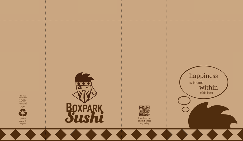
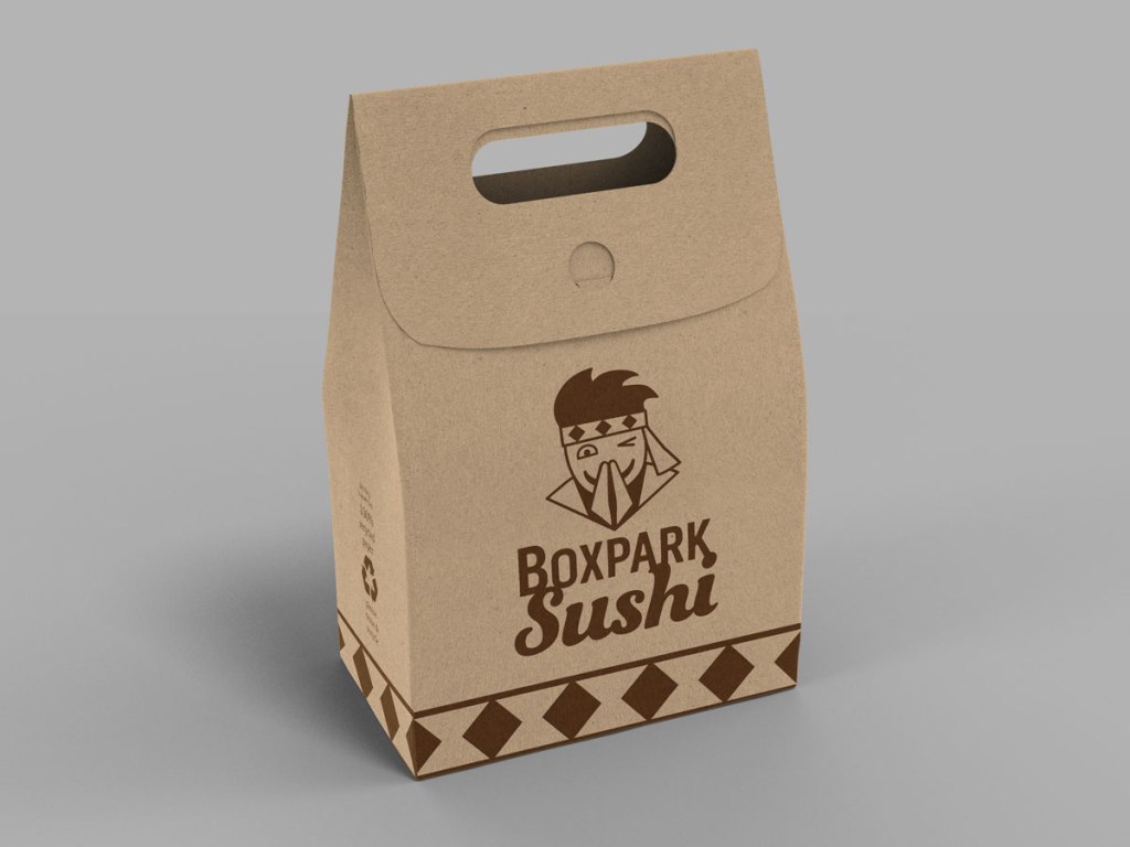
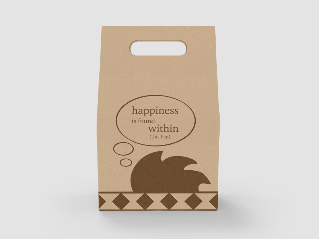
Takeout Bag
Boxpark Sushi takeout bag designBoxpark Sushi takeout bag mockup frontBoxpark Sushi takeout bag mockup back
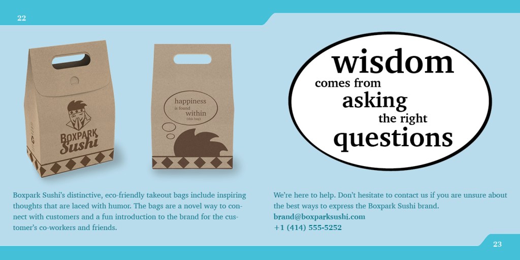
Boxpark Sushi’s distinctive, eco-friendly takeout bags have several strategic purposes. Branded packaging for take-out orders turn customers into walking advertisements as they carry their meal to work, school or home (McQuarrie, 2014). The bags include inspiring thoughts that are laced with humor, providing a novel way to connect with customers and a fun introduction to the brand for the customer’s co-workers and friends. New quotes can be added on a regular basis, adding to the novelty.
The Boxpark Sushi takeout bag also contains space to promote social media accounts, the Sushi Sensei app, and other ways of staying connected with customers. Plant-based ink on recycled unbleached paper give the packaging an organic feel while supporting the brand’s wise and conscientious nature. Multiple logo elements, like the diamond headband pattern, provide brand cohesion despite the lack of color. The quotes on the back of the bag reinforce the brand’s wise but fun personality.
When designing brand logos and media assets, it is important to consider the role of proximity in graphic design. As noted by Smith (2014), close proximity of design elements indicates a relationship or connection between the elements. Things that are unrelated are not grouped together.
The principle of Proximity in design is based on human psychological associations. For instance, if two people are walking down the street with distance between them, their relationship is unclear. If they are walking side by side holding hands, they obviously have a close personal connection (Williams, 2015, p. 33). For that reason, it is important to visually organize elements and information based on their relationship.
Project File Management
Modern media designers work with a massive number of digital files, so it is important to establish an organization system to manage those files. Vukovic (2013) lists several benefits of a good filing system. Searching for a file takes time and leads to frustration. However, knowing where everything is provides a feeling of control. High levels of organization can also help resolve client issues like “proving the amount of work that was put into a project or when a design was first created” (Hembree, 2006, p. 61). In the system recommended by Vukovic (2013), each client has its own folder with sub-folders for each project. For every project there are file folders:
Assets: photos, vectors, and other design elements used in the project.
Business: estimates, schedules, contracts, and other business files related to the project.
Client input: notes, documents, and other files received from the client.
Design: design files like Photoshop or InDesign documents with each version saved as a separate file.
Production: final delivery files for the client including PDFs and prepress files.
This kind of project file management makes it easier to locate important files and maintain a catalogue of past work.
Considerations for Using Mockups
Mockups are an important tool to help clients see what a design will look like in a real-world context. However, there are certain considerations to keep in mind when using design mockups. Ellison (2015) recommends that you always be clear with clients, letting them know which part of the mockup is the design as well as showing the actual deliverable design files separately.
If the mockup contains images of places or people, it is also important to consider the appropriateness and inclusivity of the image. For example, if all your mockups depict only one type of user such as a young white male, they can send a message that the brand is only for certain types of people and can make others feel excluded (Saucier & Shariat, 2017). Lastly, when using mockup templates created by other designers it is important to check the licensing and terms of use to be sure you can legally use the file for commercial projects.