The Mastery journey requires periodic self-analysis of one’s internal Strengths and Weaknesses as well as external Opportunities and Threats. Lisa Quast suggest starting with Threats then identifying Opportunities to overcome those threats (Quast, 2013).
THREATS
Peers with more experience present the greatest threat when
competing for future work. Other college professors already have graduate degrees,
and other designers already have strong portfolios and resumes. Another constant
threat is distraction. Non-career related side projects are fun but do nothing
to further my career or education.
OPPORTUNITIES
I will complete the Full Sail University Media Design MFA program
in June 2020. In the meantime, I will continue to develop my portfolio with
class projects. I will also utilize the Full Sail University online library and
education resources like Lynda.com and Safari books.
STRENGTHS
My years of design and media production experience have
given me a wide range of technical skills, from motion graphics to web design.
I’m also comfortable teaching and speaking to an audience. Most importantly, I’m
learning to combine my creativity with strategic thinking.
WEAKNESSES
Working mostly from home makes it harder to get peer
feedback. It also leads to distraction by side projects that take focus from my
career and education goals. I’m uncomfortable with self-promotion and
networking, which are necessary for growth and advancement.
I began the process of creating vision boards for each of my
three Kyoto brand concepts. At first, I did not understand the difference
between a mood board, a style sheet, and a brand vision board. Fortunately,
professor Kratz defined each tool in the Week 3 Live Session. The vision board
is primarily a presentation tool to explain how you intend to visualize the
brand personality (Kratz, 2019).
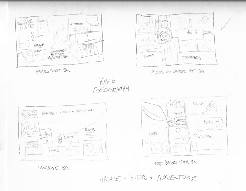
My board prototypes started with rough concept sketches that helped me narrow down ideas.
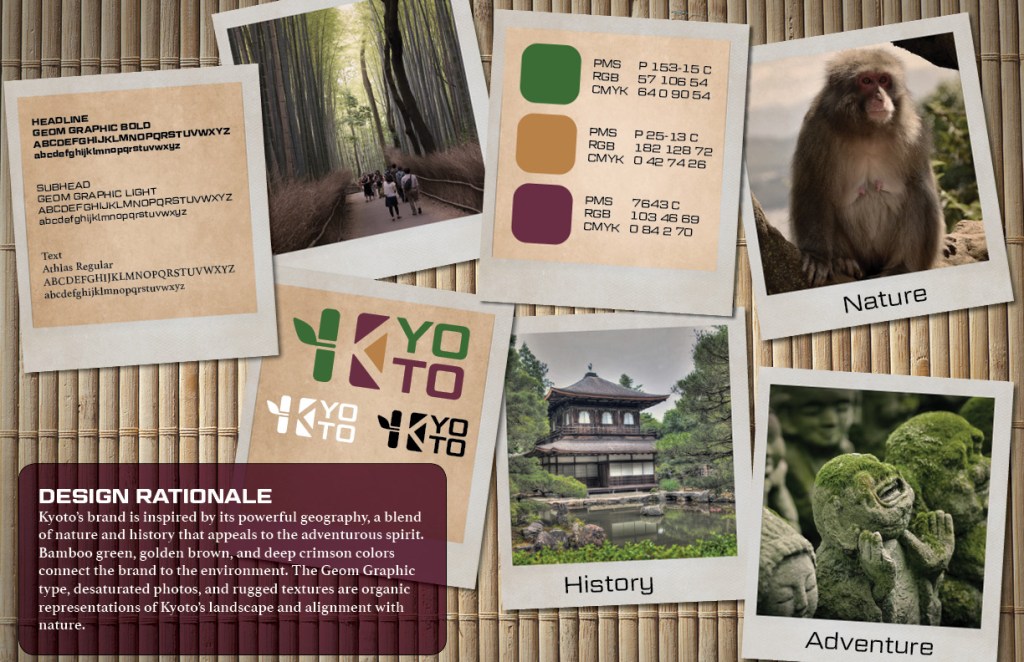
Kyoto’s brand is inspired by its powerful geography, a blend
of nature and history that appeals to the adventurous spirit. Bamboo green,
golden brown, and deep crimson colors connect the brand to the environment. The
Geom Graphic type, desaturated photos, and rugged textures are organic representations
of Kyoto’s landscape and alignment with nature.
Geography Brand Definition
Key Value 1: reverence for nature
Key Value 2: independence
Key Characteristic 1: adventurous
Key Characteristic 2: natural
Its Differentiation: historic temples surrounded by natural
beauty
Experience / Emotional connection: collecting shared
memories and photos
This brand appeals to adventurous visitors who want to take photos of Kyoto’s natural side. Old Polaroid photos provide an earthy, physical connection to memories. Each frame contains a photo that has been desaturated and lightly sepia toned to match the earth tones of the palette. Other frames contain grungy paper textures displaying the logos, color palette, and typography. The photos are scattered on a natural woven bamboo mat background in a way that leads the eye down toward the design rationale.
Kyoto geography brand vision board
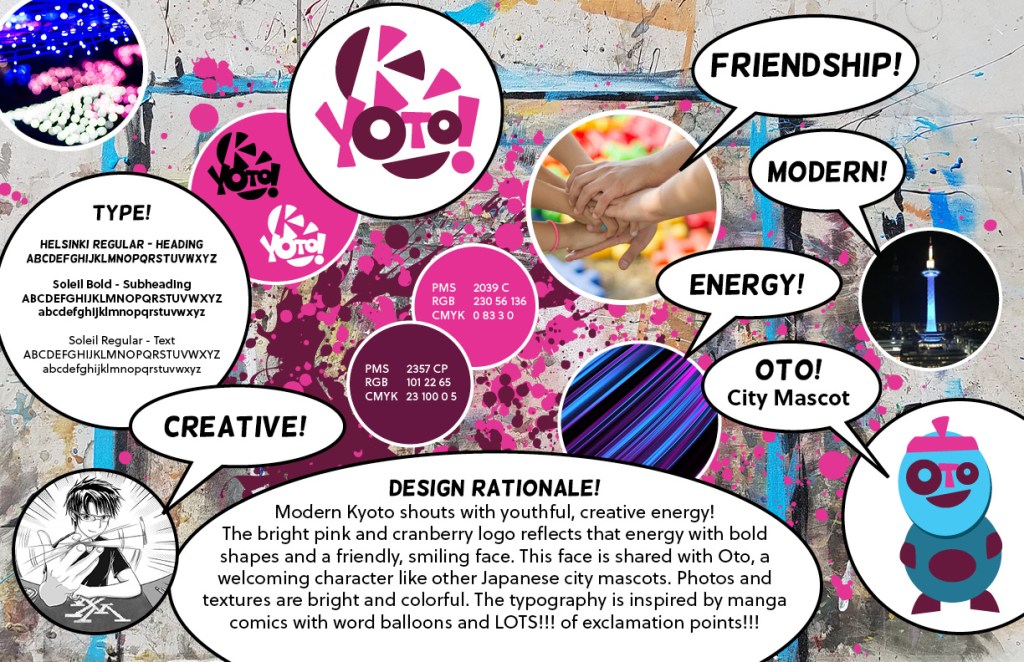
MODERN CULTURE
Creative Friendship Modern Energy
Design Rationale
Modern Kyoto shouts with youthful, creative energy! The
bright pink and cranberry logo reflects that energy with bold shapes and a
friendly, smiling face. This face is shared with Oto, a welcoming character
like other Japanese city mascots. Photos and textures are bright and colorful.
The typography is inspired by manga comics with word balloons and LOTS!!! of
exclamation points!!!
Modern Culture Brand Definition
Key Value 1: creativity
Key Value 2: energy
Key Characteristic 1: fun
Key Characteristic 2: friendly
Its Differentiation: International Manga Museum and other
art exhibits
Experience / Emotional connection: fun with friends
The Kyoto International Manga Museum draws many visitors
each year, and this brand appeals to those who appreciate the city’s young,
creative side (Outline of the Kyoto International Manga Museum, n.d.). I
started with a background photo of my own paint-splattered art table and added
splashes of the brand’s primary colors. The bright, colorful photos and
textures are juxtaposed with word bubbles in a way that appeals to fans of Japanese
fashion and manga.
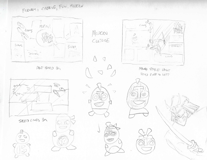
Yuru-kyara are the cute, adorable, and sometimes creepy
little mascots for Japanese cities and organizations (Niko, n.d.). While
drawing Kyoto modern culture concept sketches, I developed a new yuru-kyara
called “Oto.” The city mascot’s face uses elements from the brand logo, raising
brand recognition and awareness while appealing to modern visitors. The
character design needs refinement, but I wanted to include Oto on the vision
board.
Kyoto modern culture brand vision board
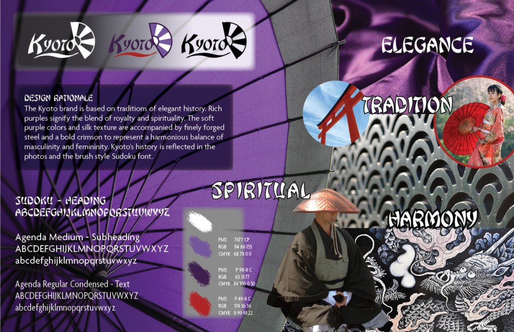
TRADITIONS
Elegance Harmony Spiritual
Design Rationale
The Kyoto brand is based on traditions of elegant history. Rich
purples signify the blend of royalty and spirituality. The soft purples and
silk texture are accompanied by finely forged steel and a bold crimson to represent
a harmonious balance of masculinity and femininity. Kyoto’s history is
reflected in the photos and the brush style Sudoku font.
Traditions Brand Definition
Key Value 1: respect
Key Value 2: harmony
Key Characteristic 1: spiritual
Key Characteristic 2: sophisticated
Its Differentiation: spiritual heart of Japan
Experience / Emotional connection: a spiritual connection to
Japanese history
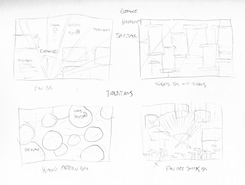
Most of my concept sketches for the Kyoto traditions were based on the folding fan motif, but while searching stock images I found a photo of a Japanese umbrella that more effectively conveyed elegance and sophistication. I changed the umbrella color from red to purple to reflect the brand color representing spirituality and royalty (Cross, n.d). The Japanese steel texture has a fan-like repeating pattern reminiscent of the fan in the brand logo, adding a refined strength that is balanced by the soft flowing silk.
I recently started the personal project of developing my brand, a personal brand completely distinct from Arcadian Entertainment.
Freehand sketches
JS logo sketch 1
This is the JS initials I’ve used for years to sign my painting and artwork. I think it’s too simplistic for a brand logo, but it’s a good starting point.
JS logo sketch 2
To modify the logo, I made the J into a single line and lined up the bottom line of the J with the top line of the S. Still too simple, but starting to look a little more dynamic.
JS logo sketches 3
First I tried a circle around the logo to make it pop from the background. The next sketch made the letters thicker and added additional lines and dashes. Part of me liked this design, but I decided that it was just a little too abstract and busy.
JS logo sketch 4
This last design uses a parallelogram behind the letters. Although the sketch is messy, I decided to move forward with this design.
Adobe Illustrator designs
The next step of my design process was to create basic line shapes in Adobe Illustrator
JS logo design 1
The design has energy, but needs more depth and precision.
JS logo design 2
The second version feels good to me. I changed the line weights, refined the angles, and made the letters a bit smoother with curved corners and rounded ends. I feel like it’s a clean design, but maybe it could be pushed further.
Feedback and critiques are welcome. Just leave a comment below!