The Mastery journey requires periodic self-analysis of one’s internal Strengths and Weaknesses as well as external Opportunities and Threats. Lisa Quast suggest starting with Threats then identifying Opportunities to overcome those threats (Quast, 2013).
THREATS
Peers with more experience present the greatest threat when
competing for future work. Other college professors already have graduate degrees,
and other designers already have strong portfolios and resumes. Another constant
threat is distraction. Non-career related side projects are fun but do nothing
to further my career or education.
OPPORTUNITIES
I will complete the Full Sail University Media Design MFA program
in June 2020. In the meantime, I will continue to develop my portfolio with
class projects. I will also utilize the Full Sail University online library and
education resources like Lynda.com and Safari books.
STRENGTHS
My years of design and media production experience have
given me a wide range of technical skills, from motion graphics to web design.
I’m also comfortable teaching and speaking to an audience. Most importantly, I’m
learning to combine my creativity with strategic thinking.
WEAKNESSES
Working mostly from home makes it harder to get peer
feedback. It also leads to distraction by side projects that take focus from my
career and education goals. I’m uncomfortable with self-promotion and
networking, which are necessary for growth and advancement.
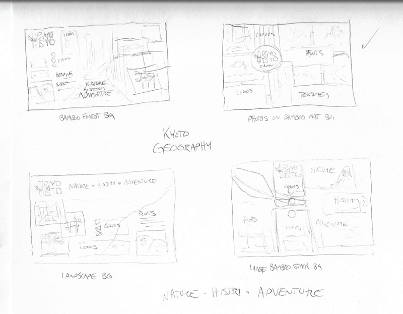
I began the process of creating vision boards for each of my
three Kyoto brand concepts. At first, I did not understand the difference
between a mood board, a style sheet, and a brand vision board. Fortunately,
professor Kratz defined each tool in the Week 3 Live Session. The vision board
is primarily a presentation tool to explain how you intend to visualize the
brand personality (Kratz, 2019).
My board prototypes started with rough concept sketches that helped me narrow down ideas.
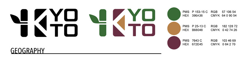
Kyoto’s brand is inspired by its powerful geography, a blend
of nature and history that appeals to the adventurous spirit. Bamboo green,
golden brown, and deep crimson colors connect the brand to the environment. The
Geom Graphic type, desaturated photos, and rugged textures are organic representations
of Kyoto’s landscape and alignment with nature.
Geography Brand Definition
Key Value 1: reverence for nature
Key Value 2: independence
Key Characteristic 1: adventurous
Key Characteristic 2: natural
Its Differentiation: historic temples surrounded by natural
beauty
Experience / Emotional connection: collecting shared
memories and photos
This brand appeals to adventurous visitors who want to take photos of Kyoto’s natural side. Old Polaroid photos provide an earthy, physical connection to memories. Each frame contains a photo that has been desaturated and lightly sepia toned to match the earth tones of the palette. Other frames contain grungy paper textures displaying the logos, color palette, and typography. The photos are scattered on a natural woven bamboo mat background in a way that leads the eye down toward the design rationale.
Kyoto geography brand vision board
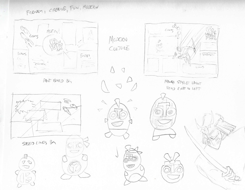
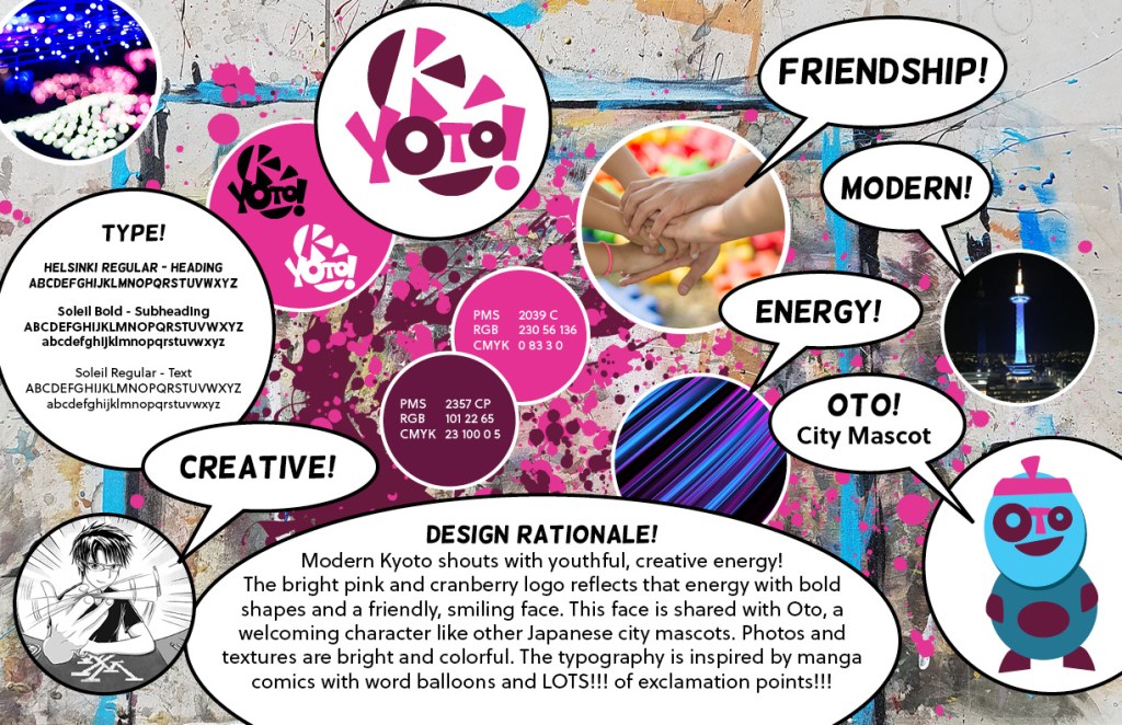
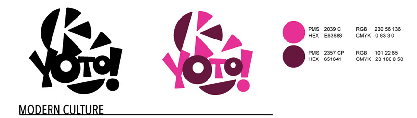
MODERN CULTURE
Creative Friendship Modern Energy
Design Rationale
Modern Kyoto shouts with youthful, creative energy! The
bright pink and cranberry logo reflects that energy with bold shapes and a
friendly, smiling face. This face is shared with Oto, a welcoming character
like other Japanese city mascots. Photos and textures are bright and colorful.
The typography is inspired by manga comics with word balloons and LOTS!!! of
exclamation points!!!
Modern Culture Brand Definition
Key Value 1: creativity
Key Value 2: energy
Key Characteristic 1: fun
Key Characteristic 2: friendly
Its Differentiation: International Manga Museum and other
art exhibits
Experience / Emotional connection: fun with friends
The Kyoto International Manga Museum draws many visitors
each year, and this brand appeals to those who appreciate the city’s young,
creative side (Outline of the Kyoto International Manga Museum, n.d.). I
started with a background photo of my own paint-splattered art table and added
splashes of the brand’s primary colors. The bright, colorful photos and
textures are juxtaposed with word bubbles in a way that appeals to fans of Japanese
fashion and manga.
Yuru-kyara are the cute, adorable, and sometimes creepy
little mascots for Japanese cities and organizations (Niko, n.d.). While
drawing Kyoto modern culture concept sketches, I developed a new yuru-kyara
called “Oto.” The city mascot’s face uses elements from the brand logo, raising
brand recognition and awareness while appealing to modern visitors. The
character design needs refinement, but I wanted to include Oto on the vision
board.
Kyoto modern culture brand vision board
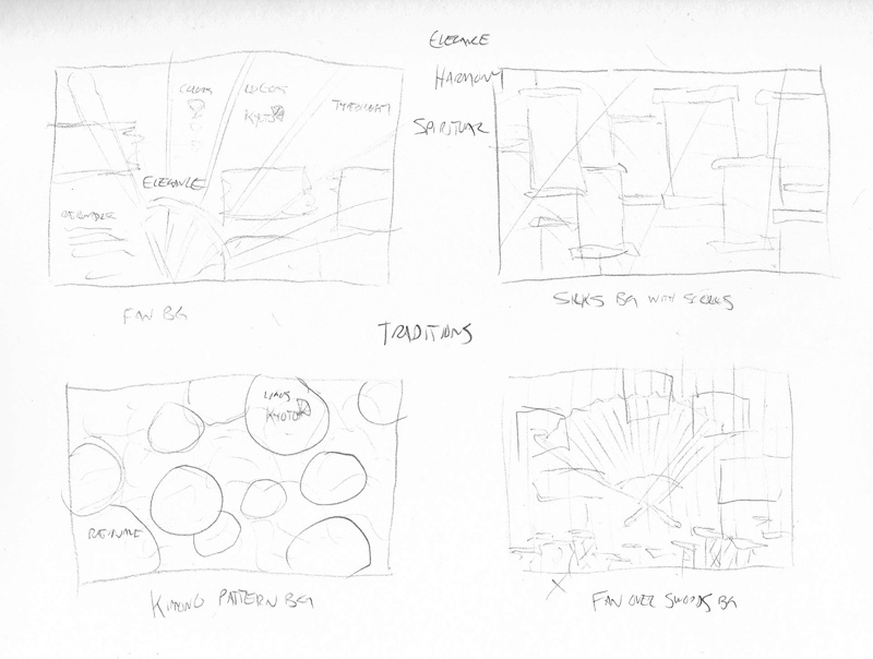
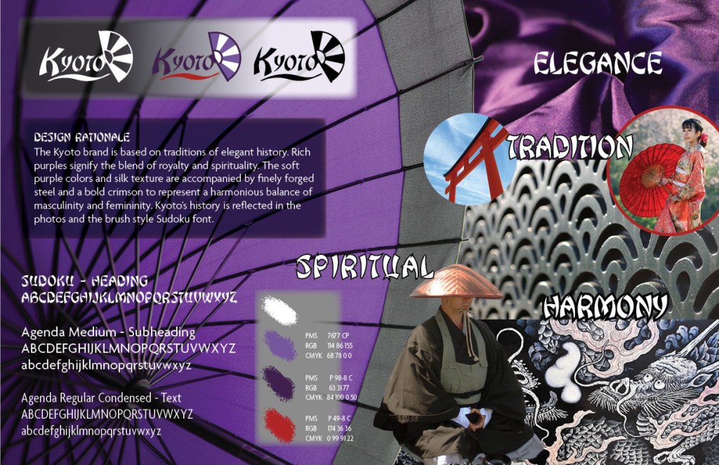
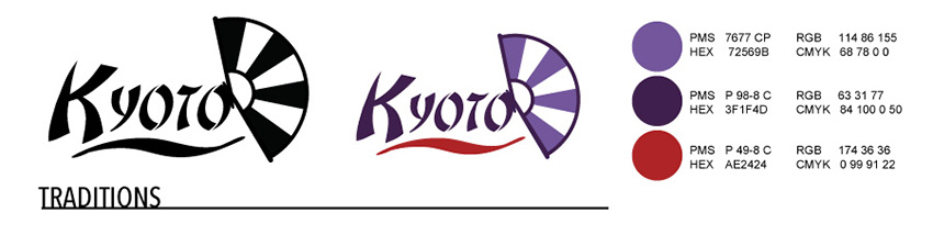
TRADITIONS
Elegance Harmony Spiritual
Design Rationale
The Kyoto brand is based on traditions of elegant history. Rich
purples signify the blend of royalty and spirituality. The soft purples and
silk texture are accompanied by finely forged steel and a bold crimson to represent
a harmonious balance of masculinity and femininity. Kyoto’s history is
reflected in the photos and the brush style Sudoku font.
Traditions Brand Definition
Key Value 1: respect
Key Value 2: harmony
Key Characteristic 1: spiritual
Key Characteristic 2: sophisticated
Its Differentiation: spiritual heart of Japan
Experience / Emotional connection: a spiritual connection to
Japanese history
Most of my concept sketches for the Kyoto traditions were based on the folding fan motif, but while searching stock images I found a photo of a Japanese umbrella that more effectively conveyed elegance and sophistication. I changed the umbrella color from red to purple to reflect the brand color representing spirituality and royalty (Cross, n.d). The Japanese steel texture has a fan-like repeating pattern reminiscent of the fan in the brand logo, adding a refined strength that is balanced by the soft flowing silk.
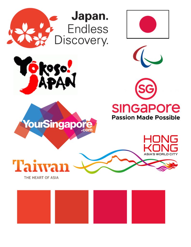
If color is the strongest and most proprietary part of a visual
system, how can you use it to differentiate the brand identity for the city
represented by your logo from the brand identities of other cities?
Sean Adams recommends doing a color study of the competition.
Find the primary colors that dominate the field, then go the opposite direction
to differentiate your brand from competitors (Adams, 2015).
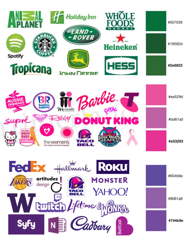
I researched the brand identities of Japan and other Asian countries. Red was the primary color used most often. I saved four swatches of red sampled from the logos and brought that image into Adobe Color.
competition logo colors study
The color wheel helped me find a hue of green that is opposite
the competition’s red color. I then used that green as a starting point for my
city logo color studies.
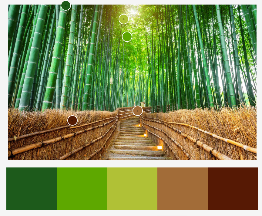
I collected mood photos for each of the three brand identities. For Geography, I used Adobe Color to sample colors from a photo of Arashiyama bamboo forest in Kyoto. The colors in this photo are natural and adventurous according to Steve Douglas, fitting the values and characteristics of the brand (Douglas, n.d.).
bamboo forest color palette
Harajuku fashion is a fun, creative representation of modern
Japan that originated in Tokyo but is popular in Kyoto, so I sampled some of
the most common colors to match the Modern Culture brand definition. After
experimentation with different unique colors, a magenta pink best captured the
friendly, creative spirit of Kyoto without being overtly feminine (Cross,
n.d.).
I repeated the process for the Traditions brand identity,
seeking colors that represent the spiritual sophistication of historic Kyoto.
Again, I consciously avoided bright red to differentiate the brand. Although
the color purple has be overused to represent royalty, it is still effective
for expressing elegance and harmony (Douglas, n.d.).
After picking a main color for each of the three brand identities, I made variations to compare with the colors of popular logos. This helped me find unique colors that weren’t immediately identified with another brand.
competition logos color study
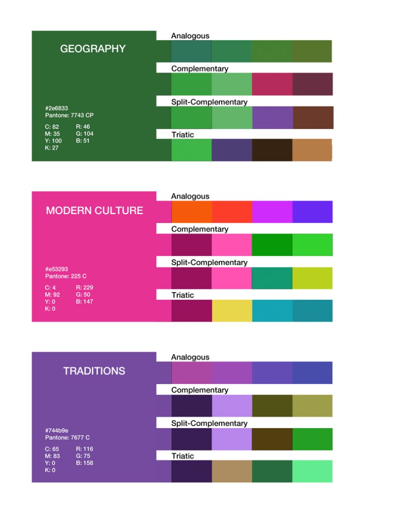
After finding the best variation of each main color, I used Adobe Color to create secondary palettes using the analogous, complementary, split-complementary, and triadic color harmony rules. I labeled the main colors with the hex code, Pantone number, CMYK, and RBG values.
Kyoto city logo colors
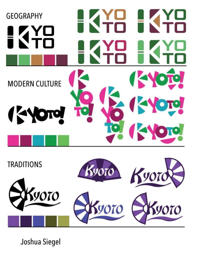
Using those color tests, I selected a secondary palette for each brand identity based on the values and characteristics of each brand. Then I started color tests with the previously designed logos.
Kyoto city logos color studies
Color Choice Rationale
Geography:
Steve Douglas describes green as a serene and peaceful color that represents
health and growth to many people (Douglas, n.d.). The green is complemented by
a dark magenta and earth tones that are adventurous yet simple and comforting
(Cross, n.d). The top right logo is currently the strongest, but much more
exploration is needed.
Modern Culture:
The color choices for this palette are fun and modern without being too
feminine or using overly bright colors that may be difficult to read or
reproduce (Adams, 2015). After exploration in both horizontal and vertical
layouts, the color combinations still don’t feel natural. I will have to
reconsider the two green colors in further development. Although visually
complementary to the pink, green is a peaceful, serene color (Douglas, n.d).
That does not fit with the youthful energy of this brand identity.
Traditions: The purple, its darker shade, and dark blue express the elegant history (Douglas, n.d), but the complementary greens are more appropriate to a nature inspired design (Cross, n.d.). In my efforts to find distinction from competitors, I’ve avoided bright red. However, a deep shade of red may be appropriate as a secondary color in this palette.
Color Logo Revisions
This week I received peer feedback from Krystal Awai, Jorge
Cainas, and Misty Francis. All three gave excellent suggestions on how the city
logo designs and color choices could be improved.
Kyoto geography
Cainas suggested adding a small detail to the geography logo to make the bamboo icon more recognizable. After trying variations on the bamboo stalk, I found that adding a single leaf was effective way to make the design more distinctive while keeping it simple. The leaf also makes the boxy shaped logo more natural and freer from constraints, keeping with the brand definition.
Geography Brand Definition
Key Value 1: reverence for nature Key Value 2: independence Key Characteristic 1: adventurous Key Characteristic 2: natural Its Differentiation: historic temples surrounded by natural beauty Experience / Emotional connection: collecting shared memories and photos
For the colors, I kept only the primary green and two strongest earth tones.
Kyoto geography revised color logo
Primary Color: Dark Green PMS P 153-15 C RGB 57 106 54 HEX 396A36 CMYK 64 0 90 54
Secondary Colors: Golden Brown PMS P 25-13 C RGB 182 128 72 HEX B68048 CMYK 0 42 74 26
Dark Magenta PMS 7643 C RGB 103 46 69 HEX 672E45 CMYK 0 84 2 70
Kyoto modern culture
The modern culture logo and color palette both needed improvements
based on feedback from Cainas and Francis. Multiple colors led to color
pollution, so I simplified the palette to two colors. Milano Kate Valihura notes that ninety-five
percent of brands use no more than two colors in their logos (Valihura, 2018).
When rearranging the logo, I used the wedges and circle
segment that form the negative space K as accents to the wordmark. Cainas found
the logo more engaging with the newly formed face.
Modern Culture Brand Definition
Key Value 1: creativity Key Value 2: individuality Key Characteristic 1: fun Key Characteristic 2: friendly Its Differentiation: modern but historic Experience / Emotional connection: fun with friends
The bright pink sampled from modern Japanese fashion is a strong fit for the brand, but I chose a slightly different shade that had an exact Pantone match. The dark purple secondary color is more gender-neutral than pink and provides strong contrast.
The traditions brand palette needed more development, so I looked to the traditional Japanese color chart for inspiration. Based on suggestions by Awai, I sampled a dark red from a photo of Romon gate in Kyoto. I then followed Sean Adams’s advice and compared that red to competitor logos, making it slightly more crimson to differentiate (Adams, 2015).
Traditions Brand Definition
Key Value 1: respect Key Value 2: harmony Key Characteristic 1: spiritual Key Characteristic 2: sophisticated Its Differentiation: spiritual heart of Japan Experience / Emotional connection: a spiritual connection to Japanese history
In traditional Japan, purple represented virtue and
spirituality (Tofugu, 2013). Western society also associates purple with
spirituality, royalty, and luxury (Valhura, 2018). A soft light purple fit the
traditions brand, and a much darker violet added depth.
I also included the unique crimson red that evokes Kyoto’s historic shrine gates. In Japanese society, red is a symbol of power with strong connections to religion (Tofugu, 2013).
Valihura, M. (2018, July 24). A Cheat Sheet for Choosing the
Best Logo Colors That Will Grab Your Audience’s Eye. Retrieved from https://foundr.com/best-logo-colors/
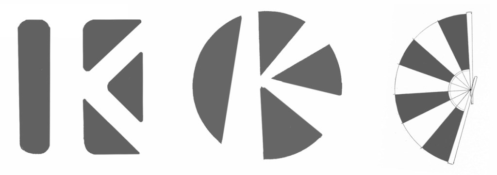
The logo design process that we started last month continued with the creation of vector graphics. At the end of the last stage we selected the three strongest designs guided by peer critique and self-critique based on David Airey’s seven elements of iconic design (Airey, 2014).
I designed the following logos to represent the city of
Kyoto, Japan.
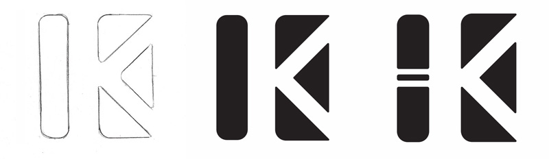
Kyoto Geography
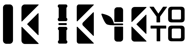
Kyoto geography logo
The rounded column and triangles represent the bamboo
forests and gently sloped mountains around Kyoto. A letter K is formed by the
negative space. The concept sketch and first vector graphic were not
distinctive enough, so I added lines to represent a joint in the bamboo stalk. I
also followed Von Glitchka’s advice from Logo Design: Illustrating Logo
Marks and adjusted spacing for visual continuity (Glitchka, 2016).
Kyoto Modern Culture
Kyoto modern culture logo
This design captures the energy and style of today’s people
in Kyoto. The negative space letter K is inspired by manga comics while evoking
the narrow streets of Kyoto’s historic Gion district. After creating a vector
graphic based on the sketch, I added gentle curves to the sharp edges. These
subtle rounds are another of Glitchka’s recommendations for making a design
stand out (Glitchka, 2016).
Kyoto Traditions
Kyoto traditions logo
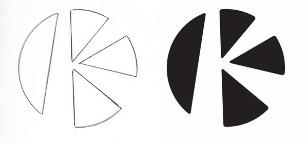
The fan design is a simplified icon based on the folding
fans carried by Kyoto’s geisha. The alternating dark and light panels evoke
Japan’s historic flag, but I must be careful to choose a color other than red
for the primary palette to avoid offense (Taylor, 2015).
After creating a vector graphic based on the sketch, I
realized the design was still not simple enough to be effective at small sizes.
The removal of just a few elements made the design stronger according to Airey’s
elements of iconic design (Airey, 2014).
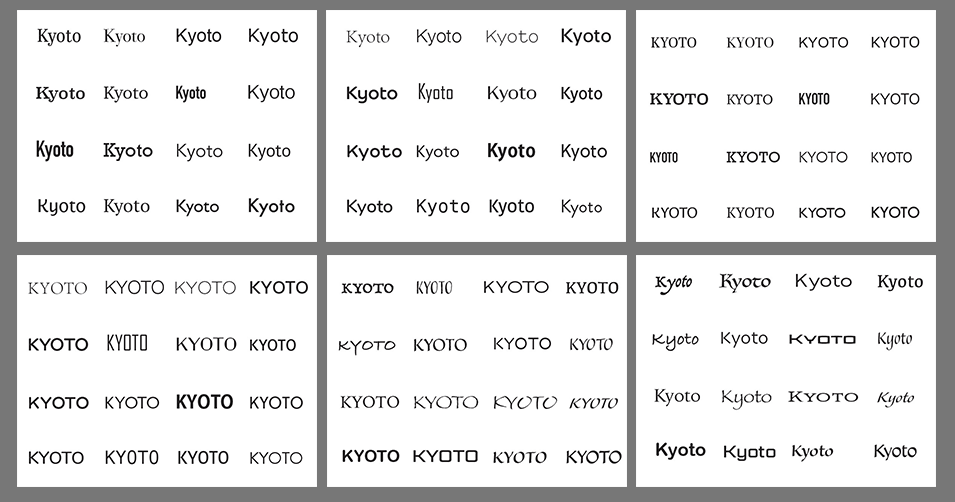
Font Selection
The next step was to choose fonts with the most potential to
be effective wordmarks. In Adobe Illustrator, I created a file with six
artboards. On each artboard, I placed type and used Adobe Fonts to find at
least 32 wordmarks for each of the three logos. This follows the example set by
Sean Adams in Branding for Designers (Adams, 2015).
I looked for typefaces that met the following qualities:
Geography: steady, solid, regular edges
Modern Culture: energy, fun, rounded shapes
Traditions: elegant, respect, calligraphic
Kyoto logo type tests
After printing and cutting out the logos and wordmarks, I
compared each of them by hand to find complementary shapes and angles. Following
Janie Kliever’s advice, I made choices based on what was appropriate for the
design concept, not my personal tastes (Kliever, N.D.).
I eventually settled on two font choices to pair with each
logo icon in Adobe Illustrator.
With multiple variations to choose from, I selected the
strongest option for each of the three logos.
Mastery Journal
In the Week 4 Live Session video for Defining Client Needs, Ryan McClung explained
why a Mastery Journal is an important part of the learning journey. We are
presented with so much information through research and class assignments that
it is important to keep that information filed somewhere for future reference.
The Mastery Journal is a permanent repository of data, insights, strategies and
reflections gathered during the Media Design MFA program. (McClung, 2019)
This personal catalog of resources will not only come in
handy for future professional work, it is an essential part of preparing for
the Media Design Mastery Thesis in Month 11 of the MFA program. McClung notes
that design is not a linear process. Design is a cyclical journey that goes
back to the research phase again and again. (McClung, 2019) This description of
the cyclical design process is supported by Jennifer Visocky O’Grady and Ken
O’Grady in A Designer’s Research Manual. (O’Grady & O’Grady, 2009)
Effective Critique
O’Grady and Ken O’Grady also state that the design process should have an
assessment phase to help the designer make better informed decisions about the
work. (O’Grady & O’Grady, 2009). We are using peer critiques as a means of
assessment for the Logo Design Workshop city logo sketches. In the Week 4 Live
Session, McClung offers advice for giving better, more productive critiques. He
notes that critique is a life skill that requires balance, truthfulness, and
effective communication. (McClung, 2019)
Kate Lawless and Shannon Crabill suggest the “Love Sandwich”
approach, where negative but constructive criticism is sandwiched between what
is good about the work. (O’Grady & O’Grady, 2009) I have applied this
approach in my own classroom, and I encourage my students to consider the
sandwich when giving peer critiques. Honesty is also important to helping peers
grow as designers. Negative critique, presented in a positive way, helps
determine the most effective solutions. McClung notes that flattery provides a
temporary ego boost but is otherwise a waste of time. (McClung, 2019)
Logo Prototypes
While developing the city logo prototypes, I have tried to adhere to David
Airey’s seven elements of iconic design but found it difficult to resist my
tendency to over-illustrate. In the future, I will continually remind myself to
follow Airey’s advice and “Keep it simple.” (Airey, 2014).
Critiquing my peers’ sketches helped remind me of the
weaknesses in my own work. McClung also offers several questions to consider
when critiquing prototypes. Why are you doing it? Is it well researched? Is it
cohesive with the brand? (McClung, 2019) Questions like theses should be
considered when critiquing your own work as well as your peer’s.
Overall, the information I learned this week will very
useful for my media design career. It will also improve my teaching,
specifically my student critiques. I look forward to the next step of the
mastery journey.
For Part 2 of the Logo Design Workshop, we gave and received
peer critique of our rough concept sketches. Jose Caceres and Krystle Awai
offered valuable feedback that informed my choices of the strongest nine concepts
to take to the next stage. Each reminded me to follow David Airey’s seven
elements of iconic design and pointed out the designs they felt were most
successful. (Airey, 2014)
Kyoto Geography inspired designs
Kyoto geography sketches 1
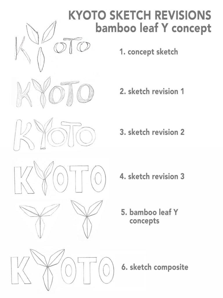
Bamboo leaf Y concept
Concept sketch: Three bamboo leaves replace the
letter Y.
Caceres noted that this design was successful because the simple, symmetrical
shapes are easy to commit to memory as well as providing information about
Kyoto’s natural features.
Sketch revision 1: I kept the style of the
original sketch but adjusted the scale of the leaves in relation to the
letters.
Sketch revision 2: Instead of three bamboo
leaves, I used two leaves atop a bamboo stalk to replace the letter Y. My lettering was cleaner on this revision, but
the hand-drawn type seems cramped and hard to read at a distance.
Sketch revision 3: Using a ruler and oval
templates, I drew sharper modern type to contrast with the soft organic leaves.
This is the strongest revision so far because it is recognizable at any size.
Bamboo leaf Y concepts: I drew and cut out a
single leaf that I used as a guide to create a more symmetrical leaf Y. The
perfect symmetry of the first design was too similar to an upside-down
Mitsubishi logo, so I adjusted the angles on the second design to make it more
distinct as a letter Y.
Sketch composite: After scanning the sketch
revisions, I combined the lettering of revision 3 with the second Y concept
sketch. This composite is a distinctive, modern design but it lacks the organic
quality of the original concept sketch.
Kyoto geography sketches 2
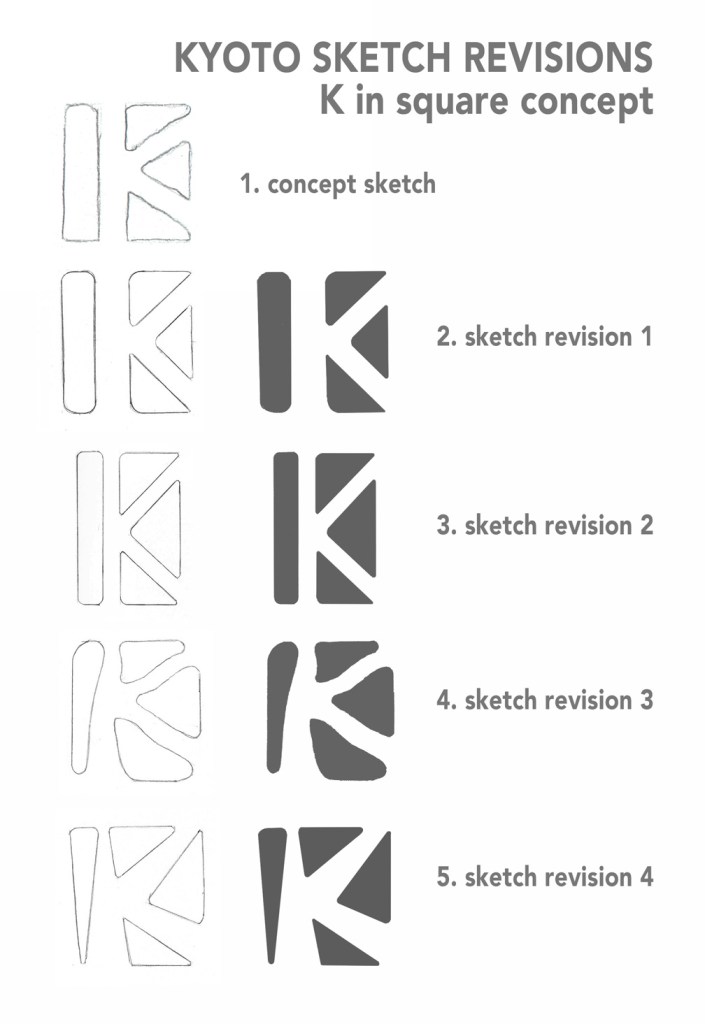
K in square concept
Concept sketch: Three triangles and column form
a K in the negative space.
Both Awai and Caceres found this to be an effective concept because of the
simplicity of the shapes. Awai also noted that the negative space evokes
Kyoto’s scenic walkways as well as the letter K. The triangles represent the
mountains around Kyoto.
Sketch revision 1: I redrew the original concept
with straight lines and refined angles., keeping the rounded edges to soften
the design. I filled in the dark areas after scanning for consistency.
Sketch revision 2: This revision uses symmetrical
shapes and less negative space for a compressed design. The first two revisions
both represent a recognizable pattern that can be used with a Kyoto wordmark,
as an icon, or as a repeating motif in a variety of ways.
Sketch revision 3: There are many recognizable
logos featuring the letter K, such as K-Mart, Circle K, and Special K cereal.
To find distinction as well as incorporate tradition, I rounded the shapes in
the design to make the negative space K resemble the meandering paths in
Kyoto’s Zen gardens.
Sketch revision 4: The fourth revision returned
to straight lined rectangles but kept the energy and historical tradition of
the previous design.
Kyoto geography sketches 3
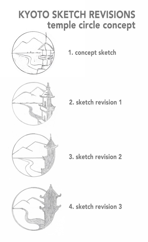
Temple circle concept
Concept sketch: A circle holds a view of a
river, mountains, and a Kyoto temple.
Awai felt that this sketch incorporated tradition with the natural beauty of
Kyoto in a relevant way.
Sketch revision 1: I illustrated the design,
trying to simplify the details. The temple breaks free of the circle, helping
the balance.
Sketch revision 2: The first revision was too
detailed to work at a small scale, so I made the temple into a silhouette. The
curve of the river looks more natural, but this design can be simplified even
more.
Sketch revision 3: The thicker line weight and
modified temple make this design less illustrative and more iconic while
retaining its historic relevance.
Kyoto Modern Culture inspired designs
Kyoto modern culture sketches 1
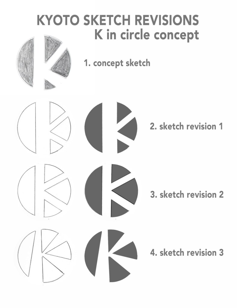
K in circle concept
Concept sketch: A negative space K is made by
shapes that form a circle evocative of the rising sun.
Caceres stated that this design was successful because of its simplicity. Like
the “K in square” concept, it aims for distinction and is easy to commit to
memory.
Sketch revision 1: I tried to closely recreate
the original concept with cleaner lines. Again, I filled in the dark areas
after scanning for consistency.
Sketch revision 2: My unfortunate fondness for
symmetry influenced this revision. Although the design feels more balanced, it
actually becomes less distinctive than the original concept.
Sketch revision 3: This design sheds the
balanced symmetry and becomes more energetic. It remains distinctive and
incorporates tradition by making the negative space resemble rays of the rising
sun.
Kyoto modern culture sketches 2
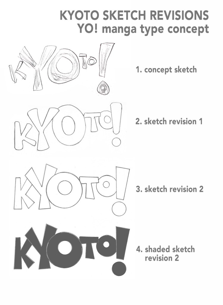
YO! Manga type concept
Concept sketch: Kyoto spelled out with
manga-style comic type, emphasizing the letters Y and O.
Awai said this design captures the young, vibrant energy of Kyoto.
Sketch revision 1: The first revision uses soft,
rounded type to match the concept sketch. I kept the large size of the Y, O,
and exclamation mark but also increased the size of the other letters.
Sketch revision 2: By straightening the lines,
the design became much cleaner and distinctive. The type closely mimics comic
type without using a particular typeface.
Sketch revision 3: After scanning, I filled in
the design too see how it would look. This concept has youthful energy but
might not appeal to older visitors.
Kyoto modern culture sketches 3
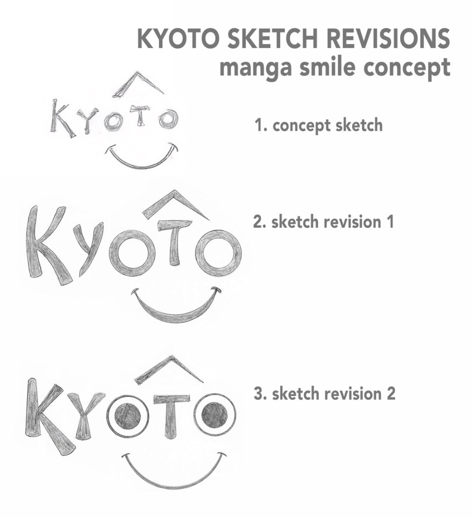
Manga smile concept
Concept sketch: The two letter O’s in Kyoto form
the eyes of manga-inspired smiling face.
This is the only design that I selected without input from peers. I chose it
because it is simple and distinctive.
Sketch revision 1: The first revision is simply
a cleaner, more refined version of the original sketch. The type is reminiscent
of Japanese calligraphy, but simple enough to be read at any size.
Sketch revision 2: I tried a different style of
eyes and thinner smile to make it distinctive from the smile shape in the
Amazon.com logo. This version feels more child-like and less appropriate than
Revision 1.
Kyoto Traditions inspired designs
Kyoto traditions sketches 1
Fan concept
Concept sketch: A folding fan replaces the spine
of the letter K in Kyoto.
Both Awai and Caceres appreciated the simplicity of this logo.
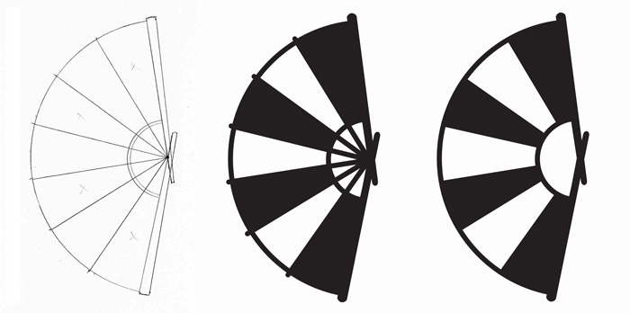
Fan icon concepts: The folding fan in the
concept sketch is very rough, so I first worked on developing a simplified icon
that could be paired with a typeface chosen later.
Sketch revision 1: The first version uses six
dark sections with white dividers. Again, I filled in dark areas after
scanning.
Sketch revision 2: The second revision uses
seven alternating dark and white panels. This simplified fan will be an
effective icon once I thicken the line weights.
Kyoto traditions sketches 2
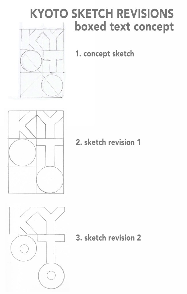
Boxed text concept
Concept sketch: Letters spelling Kyoto are
arranged in boxes.
Caceres said this was one of the strongest designs because it is simple, different,
and traditional.
Sketch revision 1: The first revision in a
cleaner version of the original sketch. I left out the diagonal line that runs
through the O’s because it was reminiscent of “no smoking” signs and other
negative images.
Sketch revision 2: I removed the bounding boxes
from the letters and added center circles to the O’s. This design is not as
effective because it is less distinctive and does not feel as relevant to
Kyoto’s traditions.
Kyoto traditions sketches 3
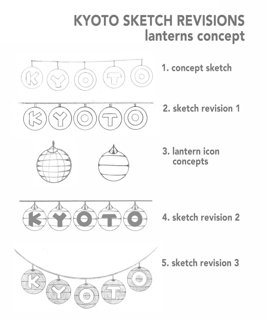
Lanterns concept
Concept sketch: Hanging paper lanterns spell out
Kyoto. Awai appreciated the tradition and symbolic meaning of the lanterns in
Japanese culture.
Sketch revision 1: I tightened the spacing of
the lanterns and tried to make the type clearer than in the concept sketch.
Lantern icon concepts: My next step was to draw
simplified icons to represent the paper lanterns. The first illustration was
too busy, but the second was simple enough to use in the design.
Sketch revision 2: I replaced the empty circles
of the first design with the lantern icons and made the overlying text dark.
Sketch revision 3: For the final revision, I
curved the line that the lanterns hang from and made the letters white over
dark. While not as simple as many of the other designs, this logo captures the
history and culture of Kyoto.
The feedback from Jose Caceres and Krystle Awai helped
improve my work by reminding me to follow David Airey’s seven elements of
iconic design. Their recommendations helped remove my personal preferences and allowed
me to focus on why a particular design was effective. The most common note was
that many of the concept sketches were too illustrative, so I payed extra
attention to keeping designs simple.
I did not move forward with one of Awai’s preferred designs
because it felt too similar to another of the top choices. Otherwise, I tried
to implement all the feedback from both peer critiques. Both were constructive
and well thought out, following the advice from Lawless and Crabill in How
to Give and Receive a Good Design Critique. (Lawless & Crabill, 2015).
Top 3 Designs
Kyoto logos – top 3 designs
Geography: Although I tried several revisions, the “K in square” design closest to the original concept sketch is the strongest. It meets most of the seven criteria, and it can become more distinctive with minor revisions and when paired with text.
Modern Culture: Inspired by Japan’s rising sun flag, the “K in circle” design is very similar to the first due to its use of negative space. The third sketch revision is strongest because it shares the positive qualities of the “K in square” design but is more distinctive and culturally relevant.
Tradition: The original concept sketch was a very quick doodle inspired by Geisha. It was one of my least favorite designs personally, but the peer critique helped me see past the roughness of the drawing and understand why it worked as an appropriate design. The simplified fan icon focuses on one thing associated with Kyoto, is easy to commit to memory, and incorporates tradition.
This month for the Logo Design Workshop, I developed ninety
sketches inspired by the geography, modern culture, and traditions of Kyoto,
Japan.
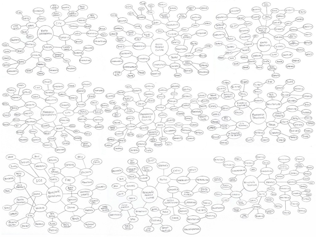
The process began with the commission of the assignment. I
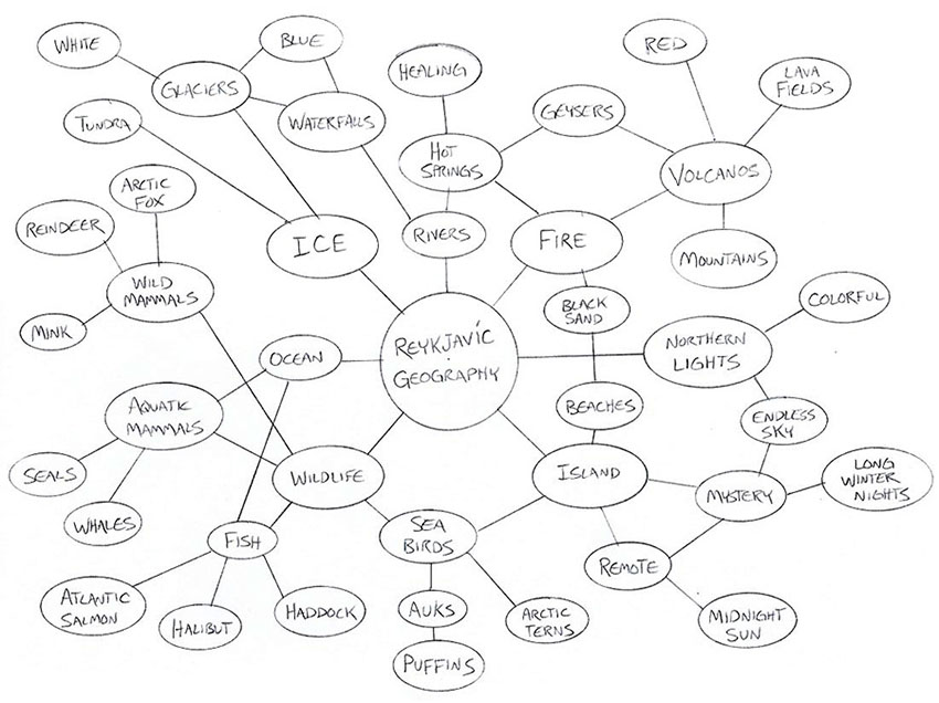
started the research process by creating a total of nine mind maps for Reykjavík,
Marrakesh, and Kyoto. In Logo Design Love, David Airey says that Mind
Mapping is an important step before sketching ideas for a design. (Airey, 2014)
Finding keywords for the geography, modern culture, and traditions of each city
involved internet searches as well as discussions with a family member who had
recently traveled to both Reykjavík and Marrakesh.
city mind maps
The three mind maps for Kyoto included enough keywords that
I felt comfortable moving into the concept development phase for that city. I
started sketching ideas, but after a while the ideas stopped coming, so I had
to go back to the mind maps to find more connections and themes I overlooked
during the initial research.
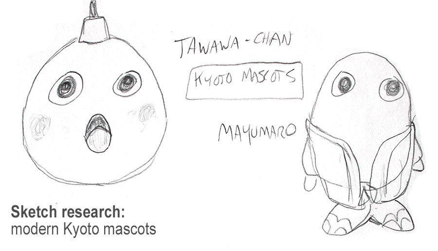
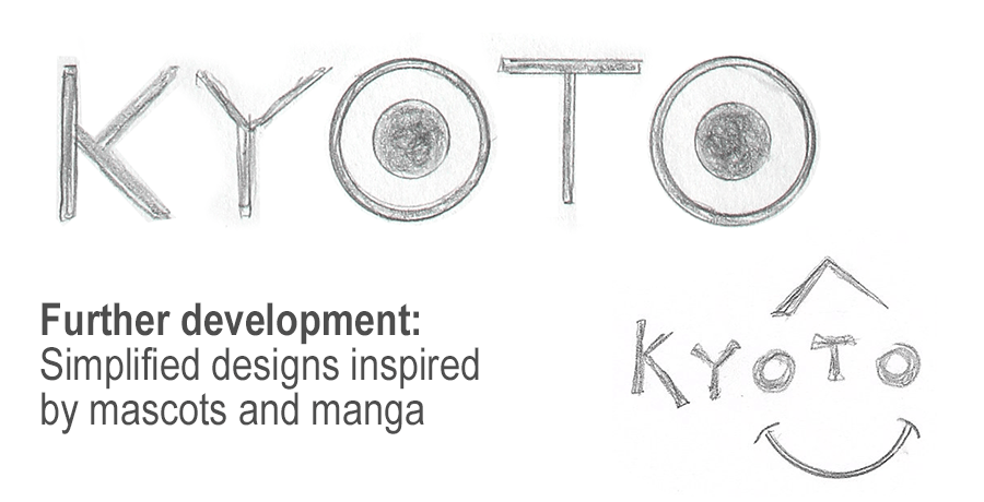
For example, one of my modern culture keywords was “manga” but these comic books are made in many parts of Japan, not just Kyoto. To find distinction, I searched for manga characters associate directly with Kyoto. During this search I discovered the popularity of Yuru-kyara, cute mascots used to promote cities, events and organizations. (JoJo, 2018) I sketched two of Kyoto’s mascots as part of the research.
sketch research – modern Kyoto mascots
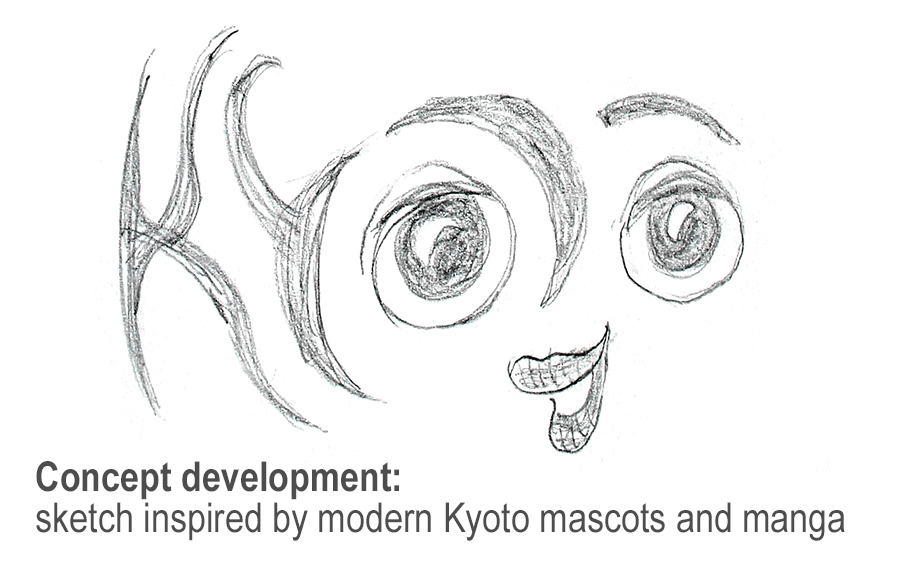
Drawing Tawawa-chan and Mayumaro helped me find connections between them and other popular manga characters. Large, expressive eyes with minimal other facial features are a common element, so I used those characteristics to develop the design below.
concept development – logo sketch
This sketch worked as an exploratory exercise but did not meet all of David Airey’s elements of iconic design. For the sketches below, I tried to “think small” and make the logos easier to commit to memory by keeping them simple. (Airey, 2014)
further development – simple logo sketches
After completing the ninety rough sketches, they were submitted for peer review. The critiques I receive will be essential moving ahead to the Prototyping phase. I will analyze the feedback and utilize further research and self-critique to choose the designs with the most potential. I will also find ways of variating that design based on peer recommendations.
In a critique of this assignment, Dennis Pulido mentioned that manga inspired designs might seem childish to older visitors. However, the simplified designs offer friendly but more “expensive” feel that appeals to some travelers. I will continue thinking of the target audience for each design.
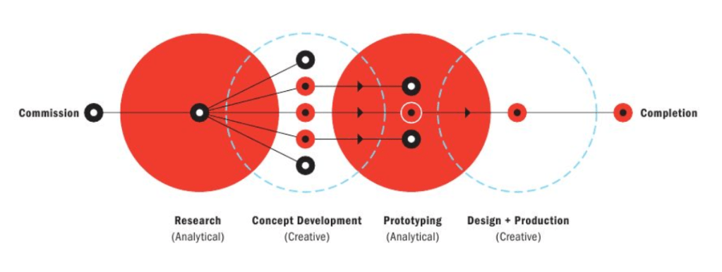
My current design process most closely matches the top illustration on page 68 of A Designer’s Research Manual. (OGrady & OGrady, 2009).
design process diagram
In the Week 4 Live Session video, Ryan McClung says that
design is not a linear process. It is a cyclical journey that returns to the
research phase at many points. (McClung, 2019). The second illustration on page
68 of A Designer’s Research Manual adds the assessment phase to help the
designer make better informed decisions. (OGrady & OGrady, 2009). Although I
would like to add an assessment phase to my own design process, I haven’t yet
had the opportunity. Peer critiques are helpful in the concept development and
prototyping stages, but once the design is finalized further assessment is
needed to track its success. I look forward to the Media Design MFA course Measuring
Design Effectiveness and learning more ways to analyze my design solutions.
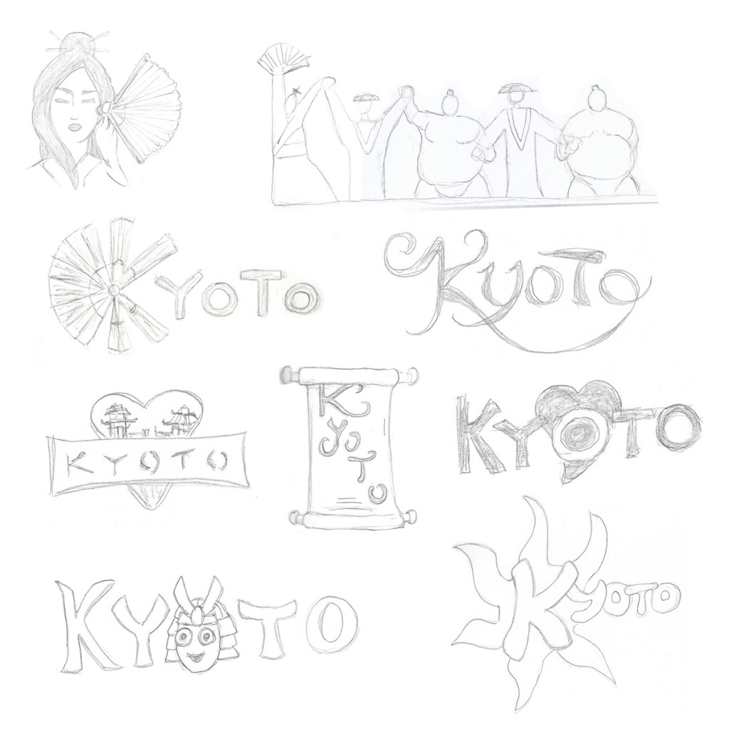
In the third week of Defining Client Needs, we were asked to create at least 75 rough sketches for a city logo using the mind maps we created in week two.
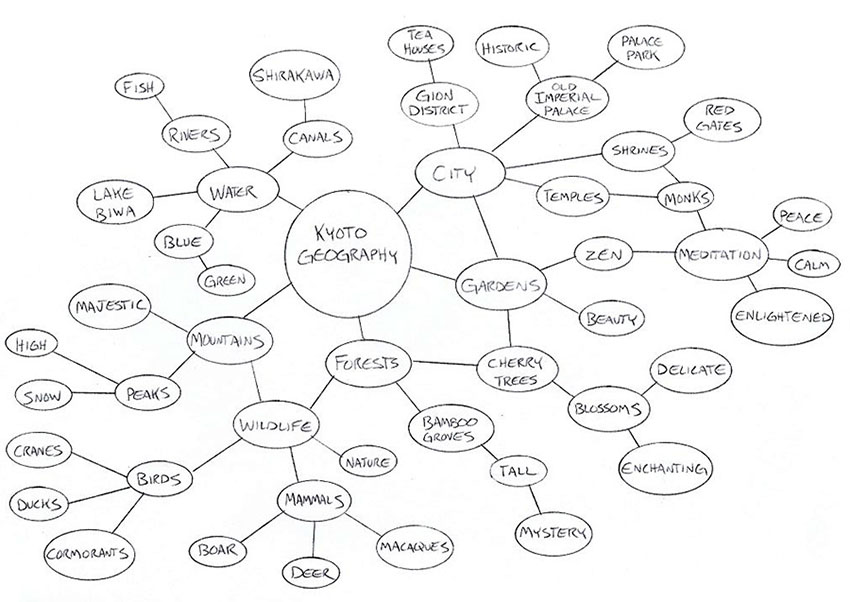
I chose to create designs for Kyoto, Japan because of my affinity for Asian culture. I started with sketches inspired by Kyoto’s geography, using keywords from the previous mind mapping assignment.
These rough concept sketches will be reviewed by my peers. Using their input, I will move ahead with the strongest ideas.
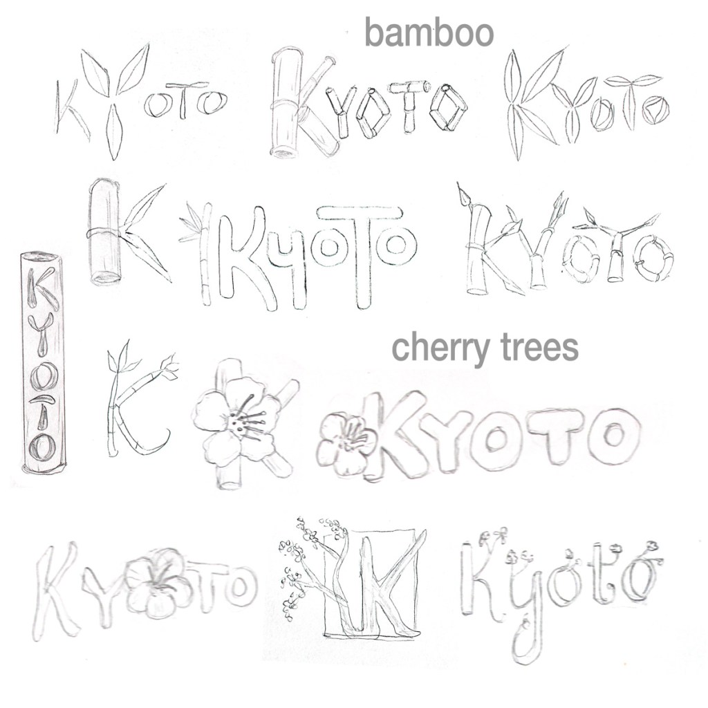
Kyoto geography inspired sketches
Bamboo groves and cherry trees are
part of Kyoto’s natural beauty. The first few sketches use bamboo leaves and stalks
as part of the wordmark. The rest use cherry branches and blossoms.
Kyoto logo sketches 1
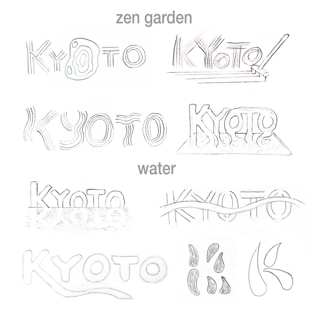
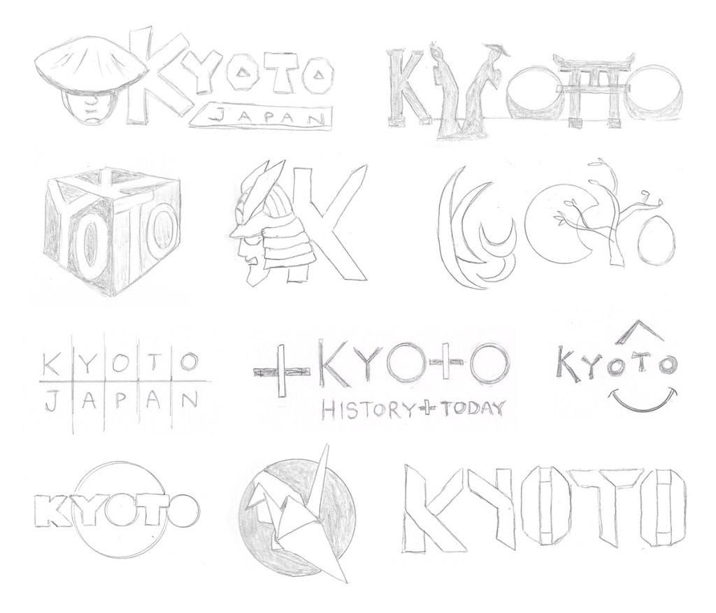
Kyoto is famous for Zen gardens, lakes, and rivers. The top four sketches are inspired by raked sand in the gardens. The first water inspired sketch is a reflection of Kyoto in a lake. Next to it, a river flows through the type. A stream flows form the K in the bottom left sketch. To the right, I make sketches that formed a K with water drops and negative space.
Kyoto logo sketches 2
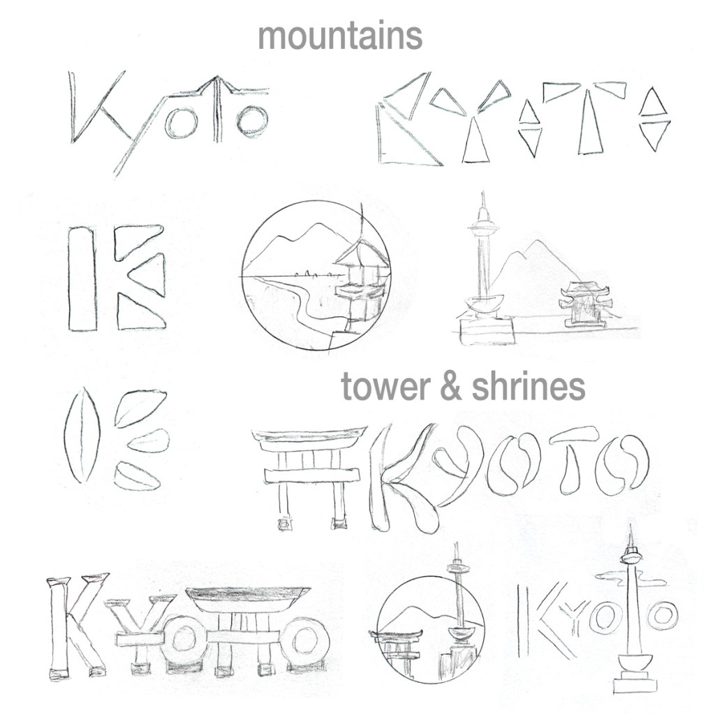
Lush green mountains surround Kyoto, contrasting with the red and gold shrines that draw so many to the city. The top left sketch uses diagonal lines to signify the mountains. Next to it, I used triangles as the most basic 2-dimensional representations of mountains. I continued exploring the motif by using three triangles and a pillar to form a K in the negative space. Below that, I tried something similar with bamboo leaves. The rest of the sketches below are inspired by Kyoto tower, Nijo castle, and the Fushimi Inari-taisha shrine gates.
Kyoto logo sketches 3
What I learned making these designs.
I had to find photo references for Kyoto landmarks and for natural elements like cherry blossoms that I could not draw from memory. Reducing these elaborate and complex structures into simple icons was creatively and technically challenging. I didn’t post the many exploratory sketches that looked like nothing but random scribbles and shapes.
I looked for keywords that stood out on my Kyoto geography mind map and selected ones that would be attractive to tourists, rejecting words that were too vague or easily associated with other cities. I avoided subjects that might be considered cliché or unlucky by the Japanese people.
During my searches, I found that many of today’s city logos are very colorful and modern. Kyoto is very traditional and historic, so I tried to avoid the overlapping colors trend seen in so many city logos. Instead, I tried to find shapes inspired by the history and natural beauty of Kyoto.
I’m still learning about typography, especially creating hand-drawn fonts. This project has made me better at drawing consistent characters that match a style. It has also been good practice using lines, basic shapes, and negative space to represent a letter or landmark.
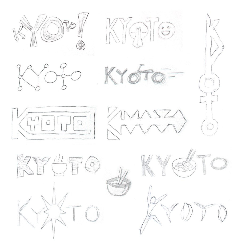
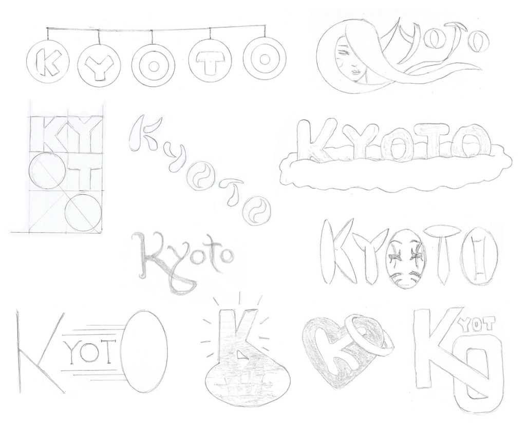
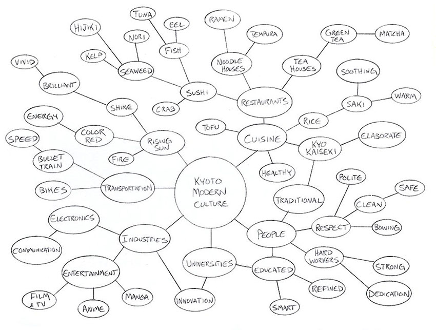
Kyoto modern culture inspired sketches
For the second batch of sketches, I worked with ideas inspired by Kyoto’s modern culture. The mind map was helpful, but further research was needed to find visual inspiration for some of the keywords like “brilliant”.
Kyoto logo sketches 4Kyoto logo sketches 5Kyoto logo sketches 6
What I learned making these designs.
I delved deeper into Kyoto’s modern sports teams and city mascots, examining their shared motifs and styles. Several designs inspired were by manga, including a simple logo using the wide eyes of Mayumaro, Kyoto’s friendly egg-like mascot.
I drew a few sketches integrating food or tea but resisted the urge to do more because they seemed more appropriate for a restaurant than a city’s logo. Several designs were inspired by the rising sun of Japan’s flag, but are intentionally not too similar to avoid offense.
I tried to express energy and movement in several of the designs. Many city logos express vibrancy through color choices. I want Kyoto’s logo to have energy even without color. I’m also trying to keep my designs simple… to find ways to “iconify” a concept like respect. Most of my sketches are still way too complex, but the best ideas can always be simplified later.
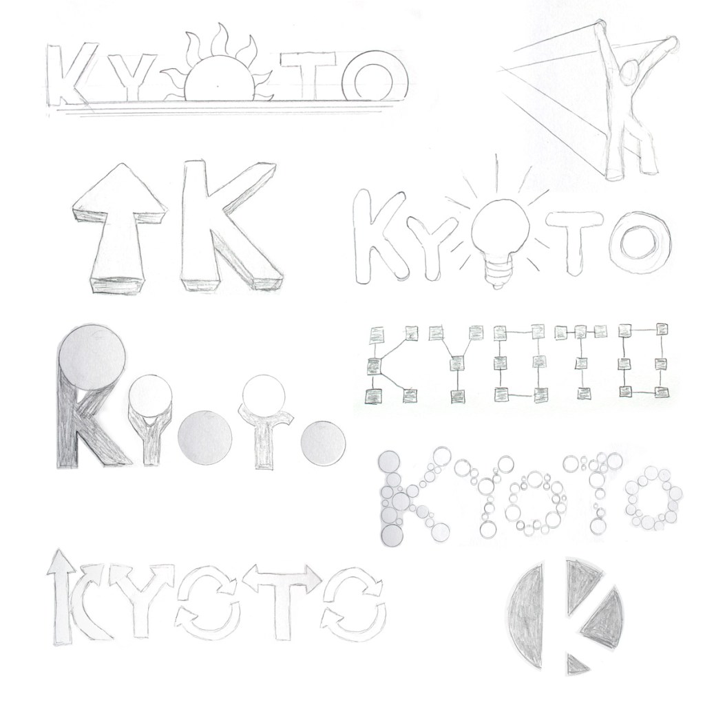
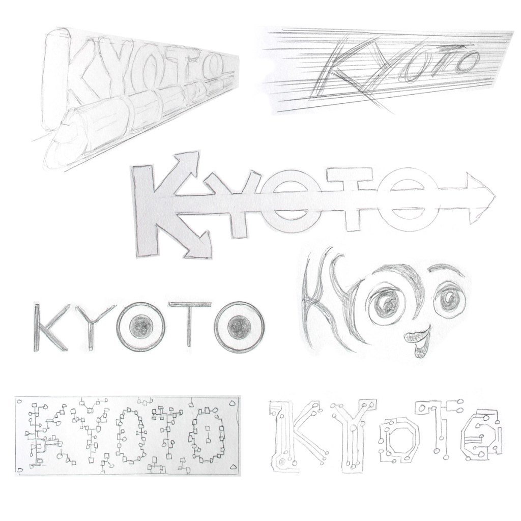
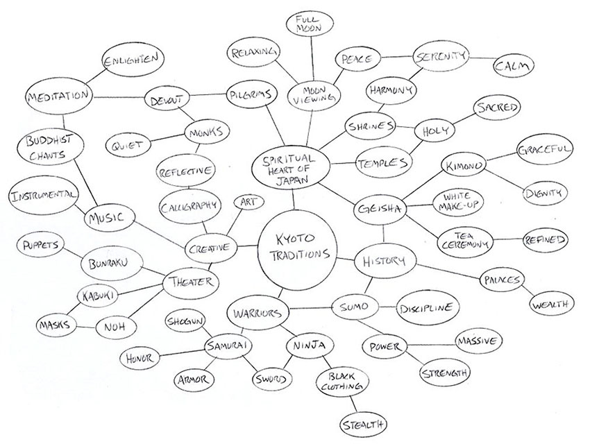
Kyoto traditions and history inspired sketches
For the last batch of sketches, I drew inspiration from Kyoto’s traditions and history. Because Kyoto is considered to be the spiritual heart of Japan, many of the sketches are inspired by monks, temples, and the western heart shape.
Kyoto logo sketches 7Kyoto logo sketches 8Kyoto logo sketches 9
What I learned making these designs.
I researched samurai, geisha, and kabuki to find motifs to carry over to the designs. Some of the shapes I turned into silhouettes to simplify them. I also researched origami for the folded crane icon and folded paper typography.
I looked at calligraphic type for inspiration but tried not to mimic existing fonts. Not being a calligrapher, I simplified the brush strokes as much as possible.
Many other city logos have modern typography. Using hand drawn or calligraphic type seems more appropriate when emphasizing Kyoto’s history and culture.
My hand drawing skills are improving and I’m getting better at making designs simple. Some are still too complex or busy, but I can refine the best designs later. I’m also learning to use tools like a French curve when drawing.
Which logo concept is strongest?
Does one or more of the designs above stand out to you? Let me know in the comments below!
Simplicity In the Week 3 Live Session video for Defining Client Needs, Ryan McClung discusses logo development and what makes a great logo. He emphasizes that simple logos are more memorable and effective. (McClung, 2019). David Airy supports the “keep it simple” concept with his seven elements of iconic design. (Airy, 2014)
Distinction McClung notes that the logo is not about you, the designer. It is also not about the client’s personal tastes. Both the designer and client should understand that the logo is being designed for the brand’s target audience. Distinction from competitors should be a main element of the logo design. Innovation requires avoiding clichés and imitation. (McClung, 2019)
Use of Logo A logo can be used on anything from a pen to the side of a building, so it should be legible at any size. Good typography and simplicity of design are important. An icon and wordmark pairing can be used in a variety of layouts at different sizes. A designer should also consider all color modes that may be used in future reproduction. Choosing an incompatible color can lead to higher reproduction costs and inconsistencies in how the brand is presented. (McClung, 2019)
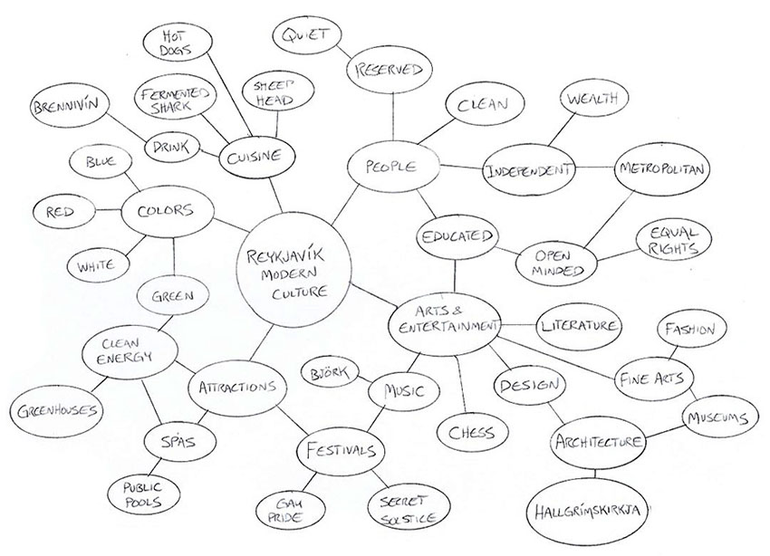
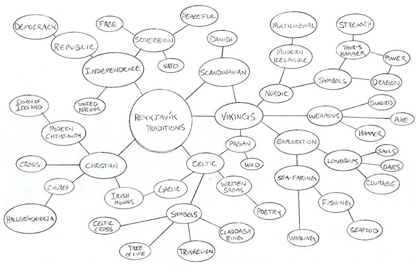
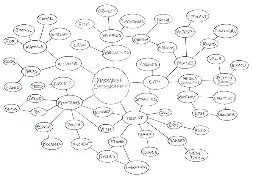
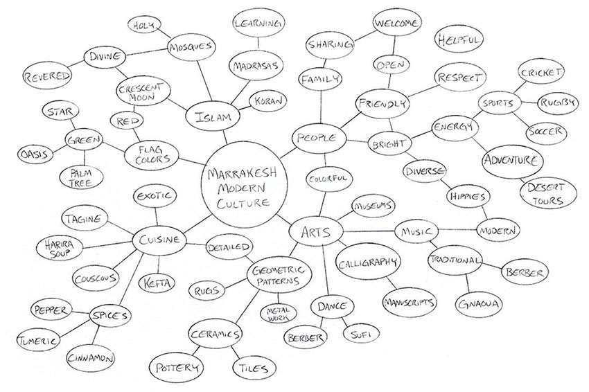
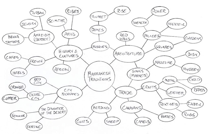
In the second week of Defining Client Needs, we were assigned three cities:
Reykjavík, Iceland
Marrakesh, Morocco
Kyoto, Japan
We learned how to use Mind Mapping to generate and connect ideas that could be used to create logos for each city. I created nine mind maps to cover each city’s geography, modern culture, and traditions.
Reykjavík
Reykjavík geography mind mapReykjavík modern culture mind mapReykjavík traditions mind map
Marrakesh
Marrakesh geography mind map Marrakesh modern culture mind map Marrakesh traditions mind map
Kyoto
Kyoto geography mind mapKyoto modern culture mind mapKyoto traditions mind map
In what ways did you connect and synthesize the research?
The Lonely Planet websites for each city were a good
starting point, and other travel websites provided branches of research. I also
looked at satellite maps and used image searches to find colors and motifs for
each city. Using my collected notes, I created lists of keywords that I
organized into the three categories for each city.
How did you employ multiple approaches to problem-solving
through your research?
In addition to internet research, I also interviewed my
mother, who has recently visited both Iceland and Morocco. Her impressions of Reykjavík
and Marrakesh as a tourist helped inform my ideas of which attractions the
cities would want to promote. Having no personal connection to Kyoto, I
searched for online testimonials from recent visitors.
In what ways did you find unique, or innovative, ideas to
work with by comparison to existing logos found through research that represent
other cities?
I found that city logos often use basic elements like a
mountain that can be very generic unless you focus on specific details. If you
are going to use a mosque to represent Marrakesh or a shrine to represent
Kyoto, what makes that mosque or shrine distinct from others in the region? A
city logo should be an instantly recognizable image that represents the city
identity.
What research competencies did you display through this
work?
This week I focused on in-depth research to answer specific questions about each of the three cities. This research generated keywords that I organized by city and categories. I visually mind mapped each category for the cities, finding connections and brainstorming new words to fit the concepts.
What’s Next?
Our next step is to choose one of the cities and start sketching rough designs based on ideas discovered through the word maps.