
The eleventh month of Full Sail University’s Media Design MFA program was focused on presenting our thesis as a website. First, abstracts were written for each of the four learning outcomes. Then four possible layouts were designed. Peer critiques helped define the best layout, which was then used as a template for a WIX website.
Joshua Siegel MFA Thesis Presentation
Class Takeaways
Below are three of the main takeaways from this course and why they are important to me as a media designer.
Designing Layouts
Page layouts should communicate a design’s message and be easily understood by the reader. Hampton-Smith (2018) suggests using a grid system to connect a page’s elements and provide a clear structure for readers. Jura and Graver note that “a controlling grid system can order and systematize the page layout process by providing consistency and regularity, even when organically constructed” (Jura & Graver, 2012, p.54).
Scale, color, and contrast are also used to establish hierarchy in a layout. Jura and Graver note, “Hierarchy is one method of moving readers through content in a dynamic, systematic way” (Jura & Graver, 2012, p.68). These principles guided the design of the four thesis presentation pages and will continue to inform future designs.
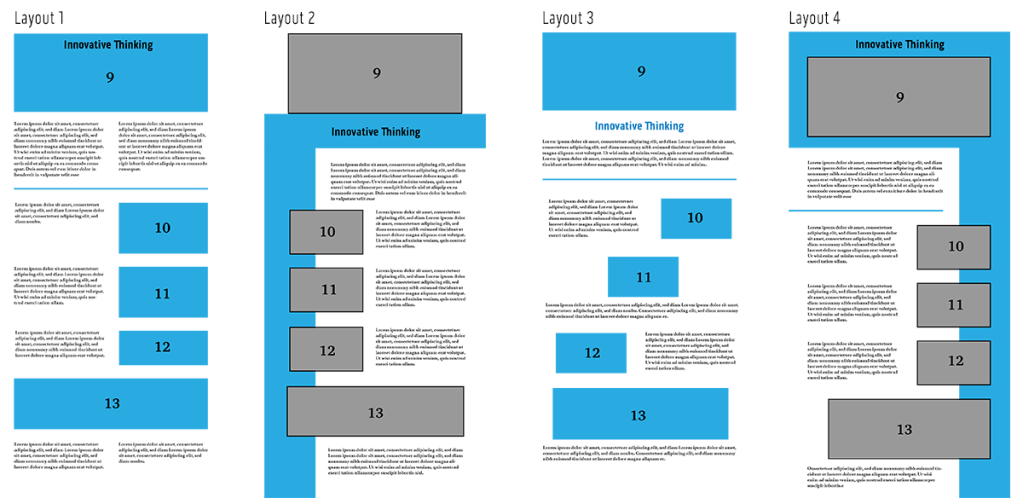
Layouts of Web Presentation
I designed the layouts in a vertical format because they are viewed online. Kapoor (2019) notes that web users are accustomed to scrolling vertically for more information on websites and social media feeds. Still, it’s important to put the most eye-catching and informative elements at the top of the page.
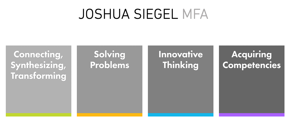
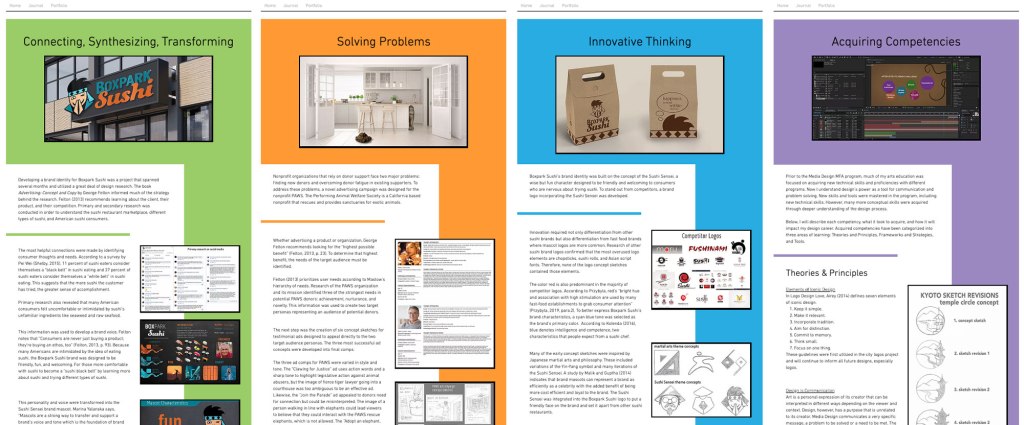
In web design, “above the fold” refers to content that appears to the viewer without having to scroll down. Pigott (2019) notes that a majority of website visitors won’t scroll down if their attention and interest aren’t immediately hooked. The title and hero image for each page are placed in a colored header that is coded to the learning outcome. The color continues as a sidebar, leading the viewer’s eye down the page.
I will continue to use visual hierarchy for blog posts and other web-based designs.
Visual Storytelling
Storytelling is an important tool for designers. Huber says, “Being able to understand your client, garner their attention, and leave them with a message that is clear, purposeful, and inspiring has never been more critical” (Huber, 2017, preface). Strong knowledge of storytelling concepts and processes helps develop more effective design solutions.
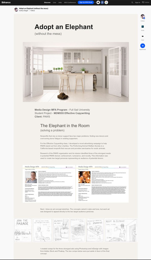
Visual storytelling elevates a design into a powerful form of communication. According to Sykes et al, visual storytelling “combines storytelling techniques with visual design to communicate a message that has been fine-tuned for your specific audience” (Sykes et al, 2012). I utilized visual storytelling in the development of my online design portfolio. Instead of simply displaying images, I explained the project in the same voice and tone as the ads. This demonstrates my communication skills, increasing my value to prospective employers.
References:
Hampton-Smith, S. (2018, September 26). How to create balanced page layouts. Creative Bloq. https://www.creativebloq.com/netmag/create-balanced-page-layouts-7-pro-tips-121310009
Huber, A. (2017). Telling the Design Story. Focal Press. Routledge.
Jura, B. & Graver, A. (2012). Best Practices for Graphic Designers, Grids and Page Layouts. Rockport Publishers.
Kapoor, M. (2019, February 8). The dilemma of horizontal and vertical scroll in UX design! Medium. https://blog.prototypr.io/the-dilemma-of-horizontal-and-vertical-scroll-in-ux-design-6b3158bad461
Pigott, T. (2019, June 3). What does above the fold mean? And why is it important? Lone Fir Creative. https://www.lonefircreative.com/blog/what-does-above-the-fold-mean
Sykes, M., Malik, N., & West, M. D. (2012). Stories that Move Mountains: Storytelling and Visual Design for Persuasive Presentations. John Wiley & Sons.
