
APA 7th Edition Updates
In late 2019, the seventh edition of the APA style manual was updated to reflect changes in the way researchers and students use information. As noted by Streefkerk (2020), online materials are now more commonly cited, and language has become more inclusive and bias-free since the sixth edition was published in 2009. Below are a few ways citations and references have changed:
- A website name is now included in references unless it’s the same as the author.
- Web page titles are now italicized in references.
- URLs are no longer preceded by “Retrieved from,” unless a retrieval date is needed.
- If works with three or more authors are cited, in-text citations only include the first author’s name and “et al.”.
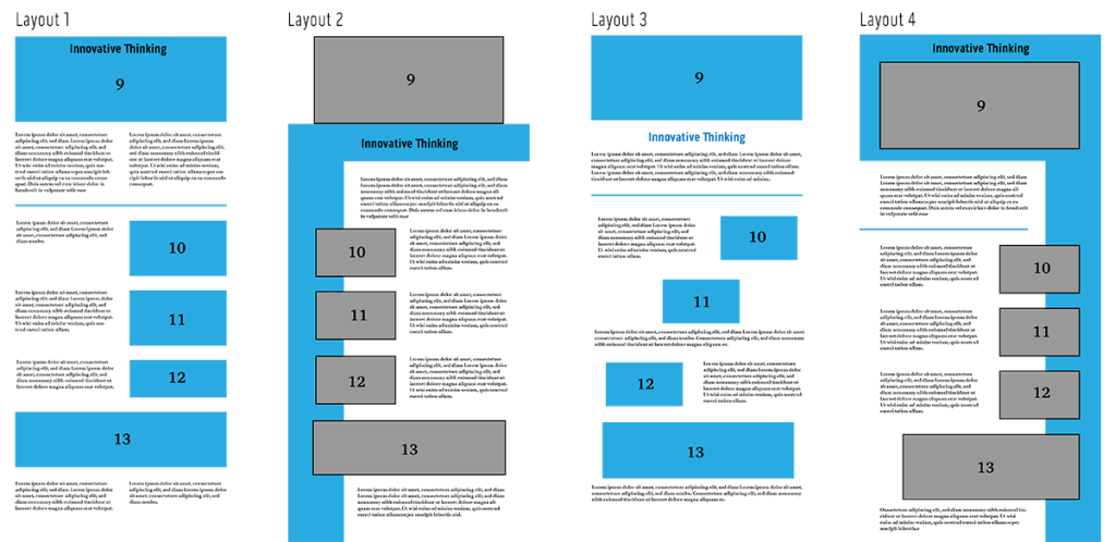
Using Grid Systems for Layouts
Page layouts should communicate a design’s message and be easily understood by the reader. Hampton-Smith (2018) suggests using a grid system to connect a page’s elements and provide a clear structure for readers. Jura and Graver note that “a controlling grid system can order and systematize the page layout process by providing consistency and regularity, even when organically constructed” (Jura & Graver, 2012, p.54).
Jura and Graver also point out that “a grid with many divisions will offer greater flexibility but will offer less support and structure” (Jura & Graver, 2012, p.64). For example, a twelve-column layout is extremely versatile because columns can be merged to make two columns of six, three columns of four, and so on.
Grabbing Attention Above the Fold
In the digital age, the term “above the fold” no longer applies exclusively to the catchy headlines and photos displayed on the top half of a newspaper. In web design, “above the fold” refers to content that appears to the viewer without having to scroll down. Pigott (2019) notes that a majority of website visitors won’t scroll down if their attention and interest aren’t immediately hooked. Where the “fold” occurs on a responsive web page depends on the device on which it is being viewed, but designers should always strive to put the most eye-catching and informative elements at the top of the page.
- Hero Images should give a positive, informative view of the content. Stock photos are overused and not always relevant.
- Header Copy should be a clear and concise introduction of the content.
- Avoid unnecessary navigation or links that encourage readers to click away.
References:
Hampton-Smith, S. (2018, September 26). How to create balanced page layouts. Creative Bloq. https://www.creativebloq.com/netmag/create-balanced-page-layouts-7-pro-tips-121310009
Jura, B. & Graver, A. (2012). Best Practices for Graphic Designers, Grids and Page Layouts. Rockport Publishers.
Pigott, T. (2019, June 3). What does above the fold mean? And why is it important? Lone Fir Creative. https://www.lonefircreative.com/blog/what-does-above-the-fold-mean
Streefkerk, R. (2020, May 8). APA Manual 7th edition: The most notable changes. Scribbr. https://www.scribbr.com/apa-style/apa-seventh-edition-changes/
 Joshua Siegel's Mastery Journal