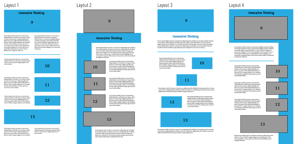
The eleventh month of Full Sail University’s Media Design MFA program was focused on presenting our thesis as a website. First, abstracts were written for each of the four learning outcomes. Then four possible layouts were designed. Peer critiques helped define the best layout, which was then used as a template for a WIX website.
Below are three of the main takeaways from this course and why they are important to me as a media designer.
Designing Layouts
Page layouts should communicate a design’s message and be easily understood by the reader. Hampton-Smith (2018) suggests using a grid system to connect a page’s elements and provide a clear structure for readers. Jura and Graver note that “a controlling grid system can order and systematize the page layout process by providing consistency and regularity, even when organically constructed” (Jura & Graver, 2012, p.54).
Scale, color, and contrast are also used to establish hierarchy in a layout. Jura and Graver note, “Hierarchy is one method of moving readers through content in a dynamic, systematic way” (Jura & Graver, 2012, p.68). These principles guided the design of the four thesis presentation pages and will continue to inform future designs.
thesis layout concepts
Layouts of Web Presentation
I designed the layouts in a vertical format because they are viewed online. Kapoor (2019) notes that web users are accustomed to scrolling vertically for more information on websites and social media feeds. Still, it’s important to put the most eye-catching and informative elements at the top of the page.
In web design, “above the fold” refers to content that appears to the viewer without having to scroll down. Pigott (2019) notes that a majority of website visitors won’t scroll down if their attention and interest aren’t immediately hooked. The title and hero image for each page are placed in a colored header that is coded to the learning outcome. The color continues as a sidebar, leading the viewer’s eye down the page.
I will continue to use visual hierarchy for blog posts and other web-based designs.
thesis website layouts
Visual Storytelling
Storytelling is an important tool for designers. Huber says, “Being able to understand your client, garner their attention, and leave them with a message that is clear, purposeful, and inspiring has never been more critical” (Huber, 2017, preface). Strong knowledge of storytelling concepts and processes helps develop more effective design solutions.
Visual storytelling elevates a design into a powerful form of communication. According to Sykes et al, visual storytelling “combines storytelling techniques with visual design to communicate a message that has been fine-tuned for your specific audience” (Sykes et al, 2012). I utilized visual storytelling in the development of my online design portfolio. Instead of simply displaying images, I explained the project in the same voice and tone as the ads. This demonstrates my communication skills, increasing my value to prospective employers.
Sykes, M., Malik, N., & West, M. D. (2012). Stories that Move Mountains: Storytelling and Visual Design for PersuasivePresentations. John Wiley & Sons.
A designer’s portfolio is often used to determine if they are right for a particular job or position. Therefore, the portfolio must demonstrate the designer’s organizational skills as well as their artistic and technical abilities. Myers (2013) suggests making it easy for prospective employer to examine your work. A strong portfolio isn’t just a collection of images. It should tell a story. On the 99designs blog, Meg Reid says that a portfolio “should provide a narrative arc with a beginning, middle and end, with your strongest work serving as bookends at the start and conclusion” (Reid, 2018). A well designed portfolio demonstrates the designer’s communication skills, making them more attractive to employers.
Layout and Design Evaluation
A design portfolio should showcase an artist’s best work. But how does one evaluate pieces to include? Myers (2013) recommends using the guide below to evaluate layouts and designs.
Design Elements
Average
Good
Excellent
Does the project use visually interesting typography?
The type supports the piece, but it is safe and simple.
The type supports the message and offers some variation and innovation.
The type uses original color and different styles to enhance the design.
Does the project use the visual principles of design effectively?
The images and additional design elements support the piece but need improvement.
The images and additional design elements are appropriate.
The choice of images and additional design elements clearly enhance the final design.
Does the project communicate the intent of the design?
There is no clear focus or concept to the piece.
The project has a good concept, but it needs additional refinement.
The final project demonstrates an advanced knowledge of unique or high-concept design.
Is the project a good design piece?
Decent technical execution, but target market and call to action are not addressed.
Good technical execution; only minor adjustments are needed.
Flawless technical execution. It is “the best” and should be included first.
evaluation table
Testing a Story’s Focus
Crafting a visual story is not easy. A well-told story may seem effortless to an audience, but it requires carefully eliminating anything that might confuse the audience or lead to a wrong decision. Sykes et al. (2012) identify six tests to ensure a story’s focus.
Validity of Data: Check the validity and credibility of data and sources.
Integration of Evidence: Be clear on the relationships and integration of data.
Clear Causality: Be sure to have a clearly defined causal relationship from each part of the story to the next.
Path to Decision: Check that the visual story leads to a clearly defined decision or request for the audience to act.
Alignment of Goals: Look for compromises or messages for specific audience members that may lead to different outcomes.
Unintended Consequences: Consider the potential unintended consequences of the change or decision you are proposing.
References:
Myers, D. (2013). The Graphic Designer’s Guide to Portfolio Design, 3rd Edition. John Wiley & Sons.
Sykes, M., Malik, N., & West, M. D. (2012). Stories that Move Mountains: Storytelling and Visual Design for PersuasivePresentations. John Wiley & Sons.
Gestalt occurs when something is perceived as more than the sum of its individual parts. Regarding visual design, Sykes, Malik, and West say, “Gestalt is how all the relevant pieces of the content come together to equal or create something much more than the simple sum of the parts… your intended message” (Sykes et al, 2012). Crafting an effective overall message requires visual and tonal consistency. Every element of the design should be necessary and follow a coding system that solidifies the message.
Hampton-Smith (2018) summarizes six principles of Gestalt in design:
Similarity: Similar objects appear to be part of a group or pattern.
Continuation: The eye is drawn along paths even if the path is broken up.
Closure: The human eye tends to fill in missing information.
Proximity (aka Grouping): Similar objects tend to be perceived as a single whole even if they are separate.
Figure / Ground: The eye tends to separate objects from their surrounding background.
Symmetry and Order: Compositions that are balance and ordered let the viewer focus on the message rather than trying to figure it out.
Used thoughtfully, these principles can make designs more coherent and communicative.
Color in Layouts
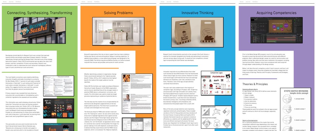
The human eye is attracted to color, which stimulates visual interest and is aesthetically pleasing (Kolenda, 2016). Color can also add structure to a layout design. “Color defines space as well as helps to organize elements within a space” (Tondreau, 2019). Color was used in the four thesis page layouts to organize the example images and categorize each of the four DLOs. The four colors (green, orange, blue, and purple) were determined by the home page graphics, associating each color with a DLO. The color background for the page title and header image establishes a visual connection between the color and topic, while the sidebar ties the supporting images and provides a visual reminder of the topic.
Inclusive Language in Writing
As society evolves to be more accepting of diverse groups of people, the way we speak and write must also evolve. Inclusive language is free from words, phrases or tones that reflect prejudiced, stereotyped or discriminatory views of particular people or groups” (Graduate Writing Center, n.d.). This is reflected in the seventh edition of the APA style manual. As noted by Streefkerk (2020), language has become more inclusive and bias-free since the sixth edition was published in 2009. Guidelines provided by APA help authors reduce bias and avoid labeling individuals. For example:
The singular “they” or “their” is endorsed as a gender-neutral pronoun. Example: “An artist depends on their tools.” NOT “An artist depends on his tools.”
Descriptive phrases are used instead of adjectives as nouns to label people. Example: “People who are homeless need help.” NOT “The homeless need help.”
Sykes, M., Malik, N., & West, M. D. (2012). Stories that Move Mountains: Storytelling and Visual Design for PersuasivePresentations. John Wiley & Sons.
In late 2019, the seventh edition of the APA style manual was updated to reflect changes in the way researchers and students use information. As noted by Streefkerk (2020), online materials are now more commonly cited, and language has become more inclusive and bias-free since the sixth edition was published in 2009. Below are a few ways citations and references have changed:
A website name is now included in references unless it’s the same as the author.
Web page titles are now italicized in references.
URLs are no longer preceded by “Retrieved from,” unless a retrieval date is needed.
If works with three or more authors are cited, in-text citations only include the first author’s name and “et al.”.
Using Grid Systems for Layouts
Page layouts should communicate a design’s message and be easily understood by the reader. Hampton-Smith (2018) suggests using a grid system to connect a page’s elements and provide a clear structure for readers. Jura and Graver note that “a controlling grid system can order and systematize the page layout process by providing consistency and regularity, even when organically constructed” (Jura & Graver, 2012, p.54).
Jura and Graver also point out that “a grid with many divisions will offer greater flexibility but will offer less support and structure” (Jura & Graver, 2012, p.64). For example, a twelve-column layout is extremely versatile because columns can be merged to make two columns of six, three columns of four, and so on.
grid-based page layouts
Grabbing Attention Above the Fold
In the digital age, the term “above the fold” no longer applies exclusively to the catchy headlines and photos displayed on the top half of a newspaper. In web design, “above the fold” refers to content that appears to the viewer without having to scroll down. Pigott (2019) notes that a majority of website visitors won’t scroll down if their attention and interest aren’t immediately hooked. Where the “fold” occurs on a responsive web page depends on the device on which it is being viewed, but designers should always strive to put the most eye-catching and informative elements at the top of the page.
Hero Images should give a positive, informative view of the content. Stock photos are overused and not always relevant.
Header Copy should be a clear and concise introduction of the content.
Avoid unnecessary navigation or links that encourage readers to click away.
In the eleventh month of the Media Design MFA program, we are developing and presenting our final thesis project. The first live session covered the best ways to prepare for this presentation.
CAST and the Visual Story Map
There is a science to how presentations can more effectively connect with an audience in order to CONVINCE, EDUCATE, or REPORT. In the book Stories that Move Mountains: Storytelling and Visual Design for Persuasive Presentations, Martin Sykes, A. Nicklas Malik, and Mark D. West present a Visual Story Map developed to illustrate the process for creating a visual story (Sykes, Malik, & West, 2012). The process is called CAST because the diagram is divided into four sections: Content, Audience, Story, and Tell. Stories that Move Mountains details each step of CAST to help designers present a clearer, more effective story.
CONTENT
Why
What
How
What If
AUDIENCE
Who
Learning & Decision Styles
STORY
Structure
Character
Sense of Urgency
Delivery Plan
TELL
Design
Test
CAST visual story map
Intentional Design
Sykes, Malik, and West (2012) also discuss how a presentation’s design should directly and intentionally contribute to the understanding of the story. They break the design process into five steps:
Format: Whether it’s a poster, a web page, or a Powerpoint presentation, the format should fit your delivery plan.
Ideation: Create many ideas and compare them side by side to find the most effective.
Composition: Decide which content to include. If it doesn’t contribute to the story, leave it out.
Content Coding: Colors, typography, and other design choices all convey meaning. Make sure that meaning supports your message.
Writing: Language, like visual elements, conveys meaning. How something is said (or written) is just as important as what is being said.
Innovative Thinking
It’s said that everything is a remix, but innovation can be proven through comparison to similar, competing solutions in the same market. Innovative thinking in design is demonstrated by doing something in an unexpected or different way. Innovation does not have to be revolutionary so long as it demonstrates an improvement on existing solutions. It could be a novel idea or a new use of media.
Differentiation is essential in competitive markets. “To stay competitive, much less lead the market, organizations must foster innovative thinking in the workplace and individuals must remain open to new ideas, processes, and opportunities” (Parashar, n.d.). For these reasons, innovative thinking is more important than ever for today’s media designers in order to develop solutions that rise above competitors.
Sykes, M., Malik, N., & West, M. D. (2012). Stories that Move Mountains: Storytelling and Visual Design for PersuasivePresentations. John Wiley & Sons.
Design is about communication. In the information age, vast amounts of data are available but not easily understood. Therefore, designers must find ways of communicating abstract ideas and data through visuals that connect with the target audience. This connection is stronger when storytelling is used to engage the audience.
Crooks, et al. (2012) note that infographics are used to communicate a specific message using data visualization. Telling a story makes the visualization more interesting and engaging. Durcevic (2018) adds that a well-told story makes data easier for the audience to understand.
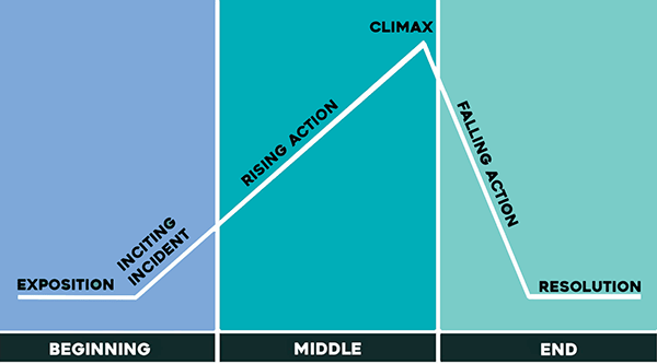
I connected this information to what I already knew about storytelling as a writer and filmmaker. Many stories follow a familiar dramatic structure known as Freytag’s pyramid. Nineteenth century German author Gustav Freytag described the dramatic structure of a story as a pyramid shape containing five dramatic elements: exposition (introduction), rising action that often begins with an inciting incident, the climax, falling action, and resolution.
Freytag’s Pyramid
Every story arc has a beginning, middle, and end. For a data visualization like an infographic, the story arc could take the form of a presented design problem (the conflict or inciting incident), responses to possible solutions (rising action), and the final conclusion that led to a design solution (the resolution).
I applied this knowledge when developing my survey results infographic. The introduction sets up the design problem. Do the Boxpark Media assets communicate the brand’s characteristics and values? Each section of the infographic adds information in the brand voice (see below) with rising action. The climax, while not very exciting as stories go, identifies a potential stereotypes issue that is addressed in the conclusion.
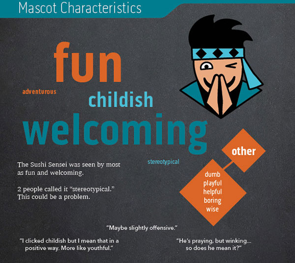
Mascot Characteristics infographic
Problem Solving
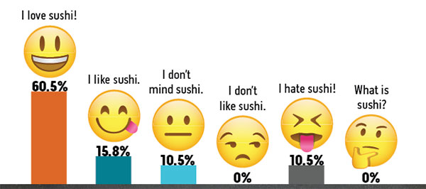
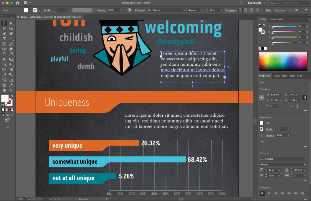
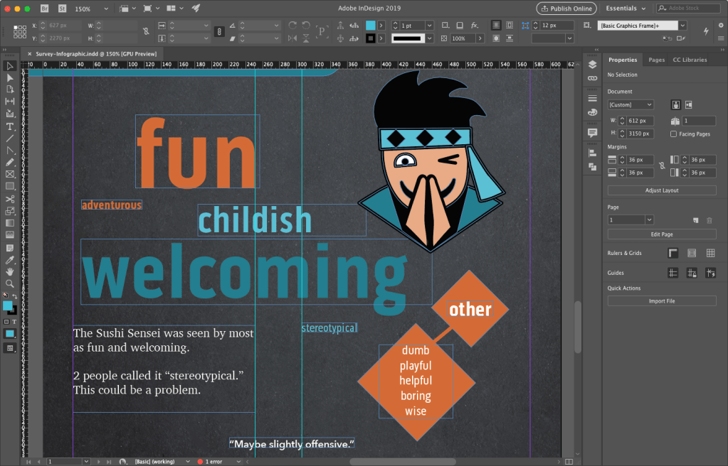
To tell the story of how survey respondents described Boxpark Sushi, I needed to utilize the brand voice and visual elements of the brand, including the Sushi Sensei, in the infographic. A chalkboard background helped communicate the brand’s educational characteristic. However, communicating the brand’s fun side was an enlightening design problem.
The infographic first draft utilized vector emojis downloaded from Adobe stock to demonstrate respondent opinions of sushi. A peer review of the infographic draft noted that the emojis are witty and fun, but they are a concept that is not used in other brand designs. This creates a disconnect from the overall brand.
infographic emojis first draft
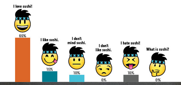
To correct this issue, the second solution modified the emojis by adding the Sushi Sensei headband and hair. This customized visual styling makes a closer connection to the brand while reinforcing the fun aspect. It also adds to the storytelling by tying the Sushi Sensei voice to the visual style.
infographic emojis final draft
Innovative Thinking
Adobe Illustrator is a powerful tool for designing vector graphic. I have used Illustrator to create infographics for previous assignments, and it appears to be the preferred tool for most infographic designers. For example, a search for “infographics” on LinkedIn Learning showed many courses focused on Illustrator as the primary software used. Although Illustrator is powerful and easy to use, I discovered its limitations when designing the Boxpark Sushi survey results infographic.
Normally, Illustrator files are small and load quickly. But the first draft of the infographic had a very large file size (110 MB) and look several seconds to save or open. The most likely reason for this was the chalkboard background which was a bitmap image rather than a vector graphic. I also found placing images and text to be more difficult than necessary.
As a result, I decided to use Adobe InDesign to create the infographic final draft. While InDesign is more commonly used to design multi-page documents, I found it to be the perfect tool for laying out this infographic. Most of the design elements like the charts and brand assets were already created in Illustrator and Photoshop, so they only needed to be placed and arranged with InDesign. The result was a small file size (only 4 MB) that saved and loaded quickly. InDesign is also better than Illustrator for adding and controlling text.
This project helped me discover a more effective workflow for designing infographics:
Analyze the data and determine the story you want to tell.
Sketch out possible layouts and choose the most effective design.
Wireframe the layout with placeholder text using InDesign.
Create vector assets in Illustrator and bitmap assets in Photoshop.
Place visual assets and final copy into InDesign.
designing the infographic draft 1 in Adobe Illustrator
designing the infographic draft 2 in Adobe InDesign
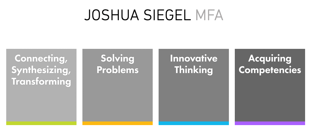
Acquiring Competencies
Hard value includes measurable data such as production costs or the number of website visitors. Soft value is less measurable and more subjective. (Occupational, Conceptual)
The Design Staircase™ model, also called the “design ladder,” was developed by the Danish Design Centre (DDC) to evaluate how businesses use design and directly correlate that information to financial gains.
Stage One: No Design. Design is not used systematically.
Stage Two: Design as Styling. Design is only used as superficial decoration.
Stage Three: Design as Process. Design is an integral part of the innovation process.
Stage Four: Design as Strategy. Design is an integral part of the business strategy.(Occupational, Conceptual)
In the book Universal Principles of Design, Lidwell, Holden, and Butler (2009) introduced a hierarchy of user needs based on Maslow’s hierarchy of needs. The model describes user needs in terms of design functions. (Academic, Conceptual)
Evaluative research on a design ensures that visual elements like colors and fonts not only create a usable experience, but also express complex brand traits like friendliness. (Occupational, Conceptual)
An evaluation matrix measures levels of success for each criterion of a design, such as an idea’s potential impact and its expected shareholders. This provides deeper insight than pass-fail (yes or no) evaluations.
Modern designers are no longer just hired to create artifacts like posters. Today, they create ideas and develop novel ways to communicate a message. (Occupational, Conceptual)
Data Visualization communicates data through visuals that connect with the target audience. (Occupational, Conceptual)
The objectives of an infographic (academic/scientific, marketing, or editorial) decide if the designer should emphasize appeal, comprehension, or mental retention. (Occupational, Conceptual)
Data visualization can be organized and presented as a story arc with conflict, rising action, and resolution. (Occupational, Conceptual)
Chart Legends should be avoided because they require the reader to work harder to interpret the chart. Instead, the same information can be more effectively presented by labelling data sets directly on the chart. (Occupational, Technical)
Motion Infographics elevate data visualization in four ways:
Movement attracts the viewer’s eye.
Animation engages the audience.
Sound and imagery communicate the intended message.
Music and voiceovers connect with viewers on an emotional level. (Occupational, Conceptual)
Infographic Sizes for online publication are typically 800 pixels wide and as long as necessary to tell the story. (Occupational, Technical)
Infographics are an effective visualization tool used to communicate a message to an intended audience. (Occupational, Conceptual)
References:
Crooks, R., Ritchie, J., & Lankow, J. (2012). Infographics: The Power of Visual Storytelling. John Wiley & Sons.