
Infographics as a Visualization Tool
Data is the results of research. Raw data in the form of numbers and hard figures can be difficult to mentally process, so it is important to present some sort of visual representations of the data. Effective data visualization should be informative, efficient, appealing, and in some cases interactive and predictive (Pittenturf, n.d.). Automatically generated charts and graphs may be informative, efficient, and in some cases interactive but they are not necessarily appealing.
An infographic is a simplified visual communication device. Most utilize text to explain the graphics and data visualizations like graphs and charts, helping the human brain process and retain the information. Krum (2013) notes that creating an infographic is not about making data visualizations look good. It’s about telling a story that includes data. Therefore, infographics are an effective way to visually communicate a message to an intended audience.
Telling a Story with Data Visualization
Media Design and Data Visualization are ways of communicating abstract ideas or data through visuals that connect with the target audience. Wilke (2019) notes that data visualization conveys insight about a dataset to the audience. Telling a story makes the visualization more interesting and engaging. Durcevic (2018) adds that a well-told story makes data easier to understand. Information can be organized and presented as a story arc with conflict, rising action, and resolution. For a data visualization like an infographic, the story arc could take the form of a presented design problem (the conflict), responses to possible solutions (rising action), and the final conclusion that led to a design solution (the resolution).
Audience and Objectives for Infographics
When designing an infographic, it is important to consider the intended audience. Is it intended for business minded executives or the general public? Understanding the audience needs can guide effective design choices. Sheikh (n.d.) notes that knowing your audience also helps you find the right tone when writing compelling copy for your infographic.
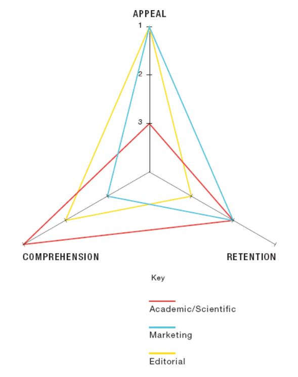
Knowing your audience ties closely with knowing your objectives. The diagram below from Crooks, et al. (2012) illustrates the priorities of an infographic by application. For example, an infographic intended for a marketing campaign should emphasize appeal before comprehension and retention. In contrast, an infographic used in an academic paper places comprehension before retention and appeal.
References:
Crooks, R., Ritchie, J., & Lankow, J. (2012). Infographics: The Power of Visual Storytelling. John Wiley & Sons.
Durcevic, S. (2018, October 8). 10 Essential Data Visualization Techniques, Concepts & Methods To Improve Your Business – Fast. https://www.datapine.com/blog/data-visualization-techniques-concepts-and-methods/
Krum, R. (2013). Cool Infographics: Effective Communication with Data Visualization and Design. John Wiley & Sons.
Pittenturf, C. (N.D.). What is Data Visualization and Why is it Important? https://data-visualization.cioreview.com/cxoinsight/what-is-data-visualization-and-why-is-it-important-nid-11806-cid-163.html
Sheikh, M. (N.D.). What is an Infographic? (Examples, Tips and Templates). https://visme.co/blog/what-is-an-infographic/
Wilke, C. (2019). Fundamentals of Data Visualization. O’Reilly Media, Inc.
