Measuring Design Effectiveness Week 4 Live Session

Why Chart Legends Should Be Avoided

Legends are frequently used in data visualization to tell viewers which colors or other graphic elements represent which data series in a chart. Unfortunately, chart legends can actually make data more difficult to understand. Krum notes that “chart legends make readers work twice as hard to understand a particular chart because they have to look back and forth between the chart and the color key multiple times to understand the different sets of data represented in the chart” (Krum, 2013). The same information can be more effectively presented by labelling data sets directly on the chart. Nediger states “By placing labels as close as possible to their respective data points, you can reduce the work required of your reader to interpret your chart” (Nediger, 2018). Replacing the text in legends with a graphic icon also reduces reading and makes the chart easier to understand.

Optimal Sizes for Infographics

The majority of infographics are designed with a vertical layout because viewers have become accustomed with scrolling up and down rather than side to side. But what is the optimal size? Krum states “As a general rule of thumb, the original full-size version of an infographic is published online at an image size that is 800 pixels wide and as long as necessary to tell the story” (Krum, 2013). This size fits the window width of most web browsers. McCready (2017) agrees on the 800 pixels width, adding that text should still be legible even at smaller resolutions. An infographic that uses vector graphics and strong visual hierarchy will look good at any size, from posters to social media posts.

Motion in Infographics

Infographics elevate data visualization by telling a story with the information in a way that is visually appealing to the viewer. Motion can elevate the story further. Travers states “By enhancing your image with motion, it will naturally draw the attention of the human eye” (Travers, 2020). Once the animation has attracted the audience, it should keep them engaged with informative content. Crooks, et al. (2012) add that motion infographics can also use music, voiceovers, and imagery that communicate the intended message and connect with viewers on an emotional level that is difficult to achieve with a static image.


References:

Crooks, R., Ritchie, J., & Lankow, J. (2012). Infographics: The Power of Visual Storytelling. John Wiley & Sons.

Krum, R. (2013). Cool Infographics: Effective Communication with Data Visualization and Design. John Wiley & Sons.

McCready, R. (2017, June 20). How to Pick the Right Infographic Size For Your Blog Post. https://venngage.com/blog/infographic-size/

Nediger, M. (2018, May 14). 10 Do’s and Don’ts of Infographic & Chart Design. https://venngage.com/blog/chart-design/

Travers, D. (2020, January 29). 25 Best Animated Infographic Examples Online. https://www.spielcreative.com/blog/animated-infographics/

Measuring Design Effectiveness Week 3 Live Session

Infographics as a Visualization Tool

Data is the results of research. Raw data in the form of numbers and hard figures can be difficult to mentally process, so it is important to present some sort of visual representations of the data. Effective data visualization should be informative, efficient, appealing, and in some cases interactive and predictive (Pittenturf, n.d.). Automatically generated charts and graphs may be informative, efficient, and in some cases interactive but they are not necessarily appealing.

An infographic is a simplified visual communication device. Most utilize text to explain the graphics and data visualizations like graphs and charts, helping the human brain process and retain the information. Krum (2013) notes that creating an infographic is not about making data visualizations look good. It’s about telling a story that includes data. Therefore, infographics are an effective way to visually communicate a message to an intended audience.

Telling a Story with Data Visualization

Media Design and Data Visualization are ways of communicating abstract ideas or data through visuals that connect with the target audience. Wilke (2019) notes that data visualization conveys insight about a dataset to the audience. Telling a story makes the visualization more interesting and engaging. Durcevic (2018) adds that a well-told story makes data easier to understand. Information can be organized and presented as a story arc with conflict, rising action, and resolution. For a data visualization like an infographic, the story arc could take the form of a presented design problem (the conflict), responses to possible solutions (rising action), and the final conclusion that led to a design solution (the resolution).

Audience and Objectives for Infographics

When designing an infographic, it is important to consider the intended audience. Is it intended for business minded executives or the general public? Understanding the audience needs can guide effective design choices. Sheikh (n.d.) notes that knowing your audience also helps you find the right tone when writing compelling copy for your infographic.

Knowing your audience ties closely with knowing your objectives. The diagram below from Crooks, et al. (2012) illustrates the priorities of an infographic by application. For example, an infographic intended for a marketing campaign should emphasize appeal before comprehension and retention. In contrast, an infographic used in an academic paper places comprehension before retention and appeal.

infographics priorities diagram
Image via Infographics: The Power of Visual Storytelling

References:

Crooks, R., Ritchie, J., & Lankow, J. (2012). Infographics: The Power of Visual Storytelling. John Wiley & Sons.

Durcevic, S. (2018, October 8). 10 Essential Data Visualization Techniques, Concepts & Methods To Improve Your Business – Fast. https://www.datapine.com/blog/data-visualization-techniques-concepts-and-methods/

Krum, R. (2013). Cool Infographics: Effective Communication with Data Visualization and Design. John Wiley & Sons.

Pittenturf, C. (N.D.). What is Data Visualization and Why is it Important? https://data-visualization.cioreview.com/cxoinsight/what-is-data-visualization-and-why-is-it-important-nid-11806-cid-163.html

Sheikh, M. (N.D.). What is an Infographic? (Examples, Tips and Templates). https://visme.co/blog/what-is-an-infographic/

Wilke, C. (2019). Fundamentals of Data Visualization. O’Reilly Media, Inc.

Design Evaluation Survey Results and Summary

Survey Summary

The Boxpark Sushi design evaluation survey could potentially provide insight into which aspects of the brand identity successfully communicated the brand’s characteristics. However, the extremely low of respondents between Wednesday, April 8th and Sunday, April 12th, 2020 make the data from this date range statistically invalid.

Respondents

Links to the survey were posted to Facebook, LinkedIn, and Twitter on April 8th and 10th. Links were also emailed and posted to the Full Sail project discussion. By April 12th, only eight people had completed the survey. Respondents were between the ages of 29 to 54, will only two (age 29 and 33) falling in the 18 to 35-year-old target audience. The younger of these two reported liking sushi, while the other one hates it.

Expectations

I expected more respondents, but the majority of the responses were largely as expected. Differentiation from other Japanese and Sushi restaurants was evenly split between Very Unique and Somewhat Unique. The top three words chosen to describe the designs were Fun, Modern, and Wise. It was unexpected that only one respondent chose Helpful, which is a primary characteristic that the brand is supposed to express. Also, a respondent wondered if anyone would be “offended by the stereotype” of the Sushi Sensei. I had not considered the possibility that the brand mascot might be racially or culturally insensitive.

Design Effectiveness

Responses indicate that the brand’s characteristics were largely communicated through the designs. Desired responses like Fun and Welcoming were common. Conversely, none of the respondents chose undesired responses like Childish, Cheap, or Boring. No parts of the design were deemed unnecessary or confusing in question five. However, one respondent chose Confusing to describe the designs in question two. They either checked the wrong box in question two or did not want to elaborate in question five. Respondents found the color palette to be Happy and Energetic, suggesting that the orange color is more powerful than blue in the designs.

Survey Techniques

I learned a great deal about creating a survey. However, I still have much to learn about sharing and promoting surveys. The questions were crafted to determine if the designs communicated the brand’s qualities and message, using radio buttons and checkboxes rather than open ended text fields to maximize ease of use. Respondents each completed the survey in under three minutes, so usability was not an issue. Promoting the survey was the biggest issue. I am not active on social media, so the reach of my campaign was extremely limited. I will have to research how and where other brands promote their surveys before starting another project like the Boxpark Sushi brand identity.

Design Evolution

Despite the low number of respondents, the survey provided new insights regarding design effectiveness as well as raising potential issues. Further qualitative studies with a culturally diverse testing group can find ways to ensure that the Sushi Sensei is inoffensive and welcoming to all. I will also examine whether the Boxpark Sushi logotype would be more effective using only the orange color instead of blue and orange.

survey results questions 1-4
survey results questions 5-8

Measuring Design Effectiveness Week 2 Live Session

Evaluative Research

Evaluating the subjective benefits of a design as well as more measurable data gives the designer a wider perspective on the design problem, thus informing stronger solutions. Hanington and Martin (2010) recommend that testing should measure performance variables like ergonomics and usability as well as preference measures like aesthetic response and emotional resonance. Evaluative testing ensures that visual elements like colors and fonts not only create a usable experience, but also “express the complex brand traits such as friendliness, reliability, or innovation” (Whitenton, 2018). Although personal tastes are subjective, evaluative research helps confirm that the designer has accurately predicted users’ reactions to the design.

Using an Evaluation Matrix

Evaluating the effectiveness of a design is a tricky science, and some evaluation methods are more useful than others. An Iowa State University study compared the efficacy of structured and non-structured methods for the evaluation of graphic design projects (Yen, 1995). The study found that a structured method using an evaluation matrix provided more actionable insight than an unstructured method like a simple evaluation form. Elmansy (2015) recommends using an evaluation matrix to score a number of criteria for a design, such as an idea’s potential impact and its expected shareholders. This measures levels of success for each criterion, providing deeper insight than pass-fail (yes or no) evaluations.

 0123score
Clarity of MessageMessage is absent or contradictory.Message is slightly confusing.Message is clear but not compelling.Message is clear and compelling. 
Color ChoicesColor choices weaken the work.Color choices are not brand appropriate.Color choices are brand appropriate.Color choices enhance the meaning of the work. 
Example of a design evaluation matrix.

Role of the Modern Designer

In the past, designers were considered technicians hired to create artifacts like posters for events or brochures for products. The modern designer creates ideas and develops novel ways to communicate a message. “Designers are project champions, guiding messages and influencing culture” (O’Grady & O’Grady, 2013, p. 5). More importantly, designers are problem solvers. A designer who can solve a business problem with a creative solution is positioned as more than just a production artist (Rosebrook, 2017). They are a partner in the decision-making process. The integration of design into business strategy has proven financial benefits for companies, making the role of the modern designer more important than ever.


References:

Elmansy, R. (2015, January 8). How to Evaluate Design Ideas. https://www.designorate.com/how-to-evaluate-design-ideas/

Harrington, B. & Martin, B. (2012). Universal Methods of Design. Rockport Publishers. https://learning.oreilly.com/library/view/universal-methods-of/9781592537563/

O’Grady, J. V., & O’Grady, K. V. (2013). Design Currency: Understand, Define, and Promote the Value of your Design Work. New Riders. https://learning.oreilly.com/library/view/design-currency-understand/9780133052862/

Rosebrook, D. (2017) What is Design Strategy? https://read.compassofdesign.com/what-is-design-strategy-497453c9d83a

Whitenton, K. (2018, June 17). How to Test Visual Design.  https://www.nngroup.com/articles/testing-visual-design/

Yen, J. (1995). A comparison of structured and non-structured methods for the evaluation of graphic design projects. Retrospective Theses and Dissertations. https://doi.org/10.31274/rtd-180813-9991

Evaluation of Boxpark Sushi Deliverables

Abstract

The Boxpark Sushi brand identity and several media asset deliverables were created as a multi-class project for the Media Design MFA program at Full Sail University. This paper examines and evaluates the effectiveness of those designs based on values delivered to both the client and the target audience. Measurable hard values like production costs are addressed as well as more qualitative soft values. The values that a design provides for the user can be categorized in a hierarchy of needs. Evaluation of the Boxpark Sushi deliverables indicates that all media assets meet the expected levels of functionality, reliability, and usability. Furthermore, the Sushi Sensei persona creates higher value by addressing the customer’s proficiency and creativity needs.  


Design is about communication, and strong communication requires understanding of how different individuals respond to a design. Response is based on individual needs and desires that can be measured, providing valuable insight into consumer behavior. The success of a design can be measured in hard value and soft value. Evaluating the subjective benefits of a design as well as more measurable data gives the designer a wider perspective on the design problem, thus informing stronger solutions. Designers should consider the hierarchy of user needs presented by Lidwell et al (2009) to ensure the design delivers maximum value to the target audience. Formative research like surveys provide insight into the needs and opinions of the target audience. Surveys and questionnaires can be also used as summative research to measure the success of a design solution before it goes public (O’Grady & O’Grady, 2009). This provides the designer an opportunity to finesse the design or take an alternate path to a more effective solution.

When evaluating the effectiveness of a design, it is important to consider the values it delivers to both the client and the target audience. Value can be measured in two categories: hard value and soft value (O’Grady & O’Grady, 2013). Hard value includes measurable data such as production costs or the number of website visitors. Soft value is less measurable and more subjective. Does the design inspire brand loyalty? Does it promote a feeling of accomplishment in users? By understanding how their work creates value for a client and their target audience, the designer raises their own value and builds a stronger relationship with the client.

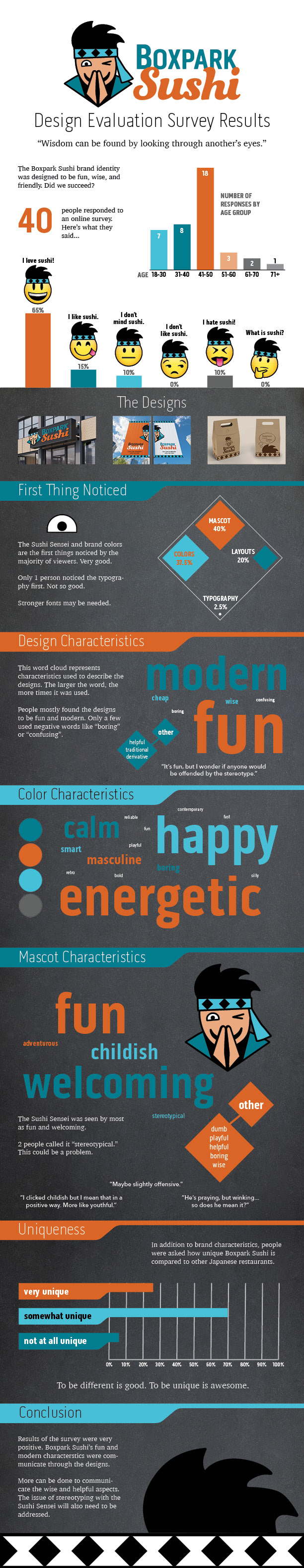
The Boxpark Sushi brand identity project includes many deliverables that define and reinforce the brand personality while providing hard and soft value. For example, the Boxpark Sushi takeout bag provides hard value in terms of measurable production costs. Single color printing on unbleached paper bags costs less than full color printing on cardboard containers. These savings can be easily calculated and measured. In addition, QR code links on the takeout bags drive traffic to the Boxpark Sushi website, social media, and Sushi Sensei app. Monthly analytics for these services can measure the number of new visitors and users who used the QR code links.

Soft value is created in several ways by the Boxpark Sushi deliverables. First, the takeout bags increase brand awareness as customers carry them to their home, school, or workplace. Witty sayings printed on the bags inspire and delight customers, reinforcing the brand’s wise and fun personality. The “Sushi Black Belt” magnet awarded to loyal customers provides a sense of accomplishment while promoting brand loyalty. Although these qualitative values are harder to measure, insight can be gained by examining which needs the design will address.

In the book Universal Principles of Design, Lidwell, Holden, and Butler (2009) introduce a hierarchy of user needs based on Maslow’s hierarchy of needs. Maslow’s hierarchy describes how the lowest human physiological needs like hunger must be addressed before moving to higher needs like esteem and self-actualization. Although based on Maslow’s hierarchy, the five-level pyramid model used by Lidwell et al describes user needs in terms of design value.

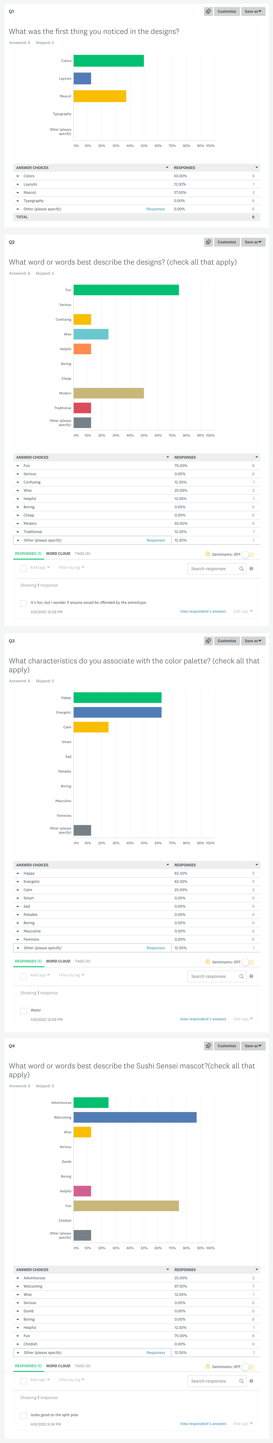
The lowest level of the pyramid is functionality. All designs, including the Boxpark Sushi deliverables, must serve the basic function of communication or else they have no value. (Creger, 2019). Each media asset serves a specific purpose, such as introducing the brand to new customers. Functionality is the foundation of the user needs pyramid and must be addressed before any other considerations.

The second level is reliability. The Boxpark Sushi deliverables utilize a consistent, reliable brand identity across a variety of media. Customers can expect to see the Sushi Sensei mascot on all Boxpark Sushi media assets, from the signage to takeout bags and brand merchandise. The typographic system, color palette, and imagery are consistent, adding to the perceived value of the designs.

Usability is the third level of the user needs hierarchy. Designs should be easy to use and understand. The Boxpark Sushi brand identity utilizes highly legible type, straight-forward language, and open space to ensure that designs are comfortable and present information to the customer in a way that is easy to process and recall. Although usability adds value to a design, it is expected. To attain higher value, designs must reach the upper hierarchy levels of proficiency and creativity (Bradley, 2010).

Proficiency empowers people to do things in a new and better way. For example, the Sushi Sensei app helps customers learn more about sushi while providing an easy way to customize their order. While the other Boxpark Sushi deliverables are not so innovative, the brand identity revolves around the idea of educating and empowering sushi eaters.

The final, highest level in the user needs hierarchy pyramid is creativity. Creativity in design goes beyond differentiation. It requires true innovation that inspires users to interact with the design in a novel way. All lower needs should be satisfied before seeking more creative ways to strengthen the design and extend its value. The Boxpark Sushi deliverables achieve the lower levels in the ways described above and utilizes the Sushi Sensei mascot in creative ways. The Sushi Sensei expresses the brand personality in all media categories to develop deeper connections with the target audience.

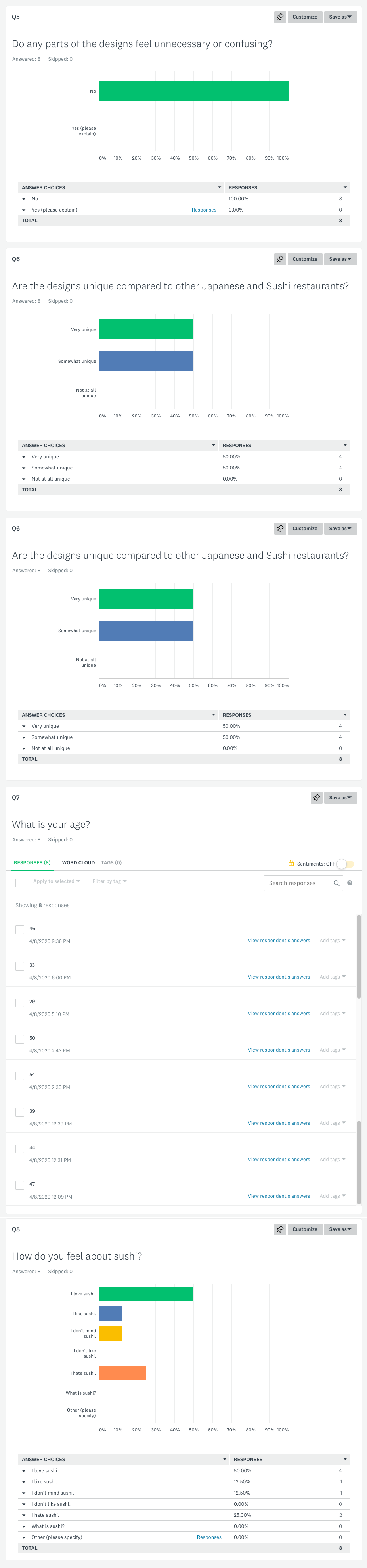
Understanding the needs of the market can help guide the design of additional media assets that support the brand and deliver maximum value to the target audience. Evaluation of the Boxpark Sushi deliverables indicates that all media assets meet the expected levels of functionality, reliability, and usability. In addition, the Sushi Sensei persona creates higher value when used to connect with users in creative ways. These soft values are not easily measured, but user surveys can provide deeper insight into how the designs address user needs.

Evaluative research can also be conducted through product testing. Testing can measure customer preferences as well as performance measures like how easily a menu is read. Boxpark Sushi continues to evolve as a brand, and regular evaluation of designs and deliverables will ensure that customers receive maximum value.


References:

* Bradley, S. (2010, April 26). Designing For A Hierarchy Of Needs. https://www.smashingmagazine.com/2010/04/designing-for-a-hierarchy-of-needs/

* Creger, R. (2019). How to evaluate the quality of your design. https://99designs.com/blog/tips/evaluate-design-quality/

* Lidwell, W., Holden, K., & Butler, J. (2009). Universal Principles of Design, Revised and Updated. Rockport Publishers. https://learning.oreilly.com/library/view/universal-principles-of/9781592535873/

O’Grady, J. V., & O’Grady, K. V. (2009) A Designer’s Research Manual. Rockport Publishers. https://learning.oreilly.com/library/view/a-designers-research/9781592535576/

O’Grady, J. V., & O’Grady, K. V. (2013). Design Currency: Understand, Define, and Promote the Value of your Design Work. New Riders. https://learning.oreilly.com/library/view/design-currency-understand/9780133052862/

Measuring Design Effectiveness Week 1 Live Session

Hard and Soft Values

Design is crucial for communication, and good design helps a brand rise above competitors. By understanding how their work creates value for a client, the designer raises their own value and builds a stronger relationship with the client.

Value can be measured in two categories: hard value and soft value. Hard value includes measurable data such as production costs or the number of website visitors. Soft value is less measurable and more subjective. Does the design make users feel good? Does it inspire brand loyalty? When defining the value of a project, O’Grady and O’Grady (2013) recommend using a blended approach to frame the hard and soft values as well as the metrics for measurement. These considerations highlight the designer’s importance and also help guide design decisions. Carlsson (2019) notes that by considering both hard and soft values, the designer gains greater understanding of the market and the target audience.

Hard and soft value not only measures the success of a design, they can also help inform the designer early on in the process and lead to more effective solutions.

Hierarchy of User Needs

In the book Universal Principles of Design, Lidwell, Holden, and Butler (2009) introduce a hierarchy of user needs based on Maslow’s hierarchy of needs. Regarding Maslow’s hierarchy, Felton (2013) describes how the lowest human physiological needs like hunger must be addressed before moving to higher needs like esteem and self-actualization. Although based on Maslow’s hierarchy, the pyramid model used by Lidwell et al describes user needs in terms of design functions.

Functionality, the lowest level, is a requirement for any design just as physiological needs must be met first. Reliability is the next highest level, equated to safety because of the human need for stability and consistency. Designs that only meet the first two levels are perceived to have low value (Lidwell et al, 2009). Usability of a design is at the same pyramid level as the need for love and belonging. A design that meets Proficiency needs by empowering users is directly related to the human need for esteem. Creativity is the highest level in the hierarchy of user needs, but it cannot be successfully achieved without the foundations established by first meeting the lower needs.

The Design Staircase

The Design Staircase™ model, also called the “design ladder,” was developed by the Danish Design Centre (DDC) to evaluate how businesses use design and directly correlate that information to financial gains (O’Grady & O’Grady, 2013). The framework is divided into four stages.

Stage One: No Design. Design is not used systematically.

Stage Two: Design as Styling. Design is only used as superficial decoration.

Stage Three: Design as Process. Design in an integral part of the innovation process.

Stage Four: Design as Strategy. Design in an integral part of the business strategy.

A 2003 survey concluded that companies that work systematically with design have higher earnings and bigger exports than companies that do not use design (Danish Design Center, 2015). Sharing this information with clients can demonstrate the economic benefits of design as part of their overall business strategy.


References:

Carlsson, F. (2019, December 2). Designing for “what we don’t know”. The tangible impact of design, Pt 1. https://medium.com/a-view-from-above/designing-for-what-we-dont-know-6b0e3ea50aef

Danish Design Centre. (2015, May 6). The Design Ladder: Four steps of design use. https://danskdesigncenter.dk/en/design-ladder-four-steps-design-use

Felton, G. (2013). Advertising: Concept and Copy (Third). W.W. Norton.

Lidwell, W., Holden, K., & Butler, J. (2009). Universal Principles of Design, Revised and Updated. Rockport Publishers. https://learning.oreilly.com/library/view/universal-principles-of/9781592535873/

O’Grady, J. V., & O’Grady, K. V. (2013). Design Currency: Understand, Define, and Promote the Value of your Design Work. New Riders. https://learning.oreilly.com/library/view/design-currency-understand/9780133052862/