
Signage
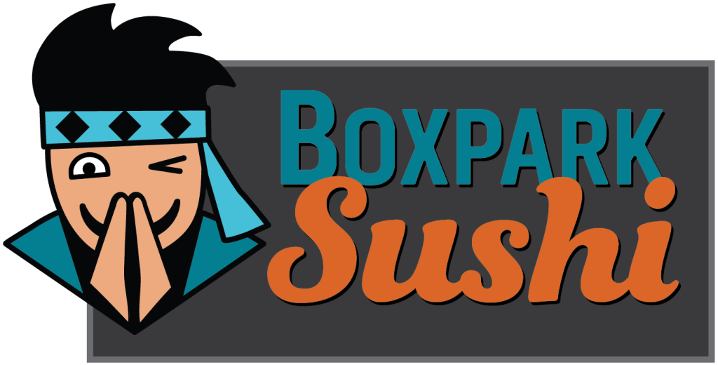
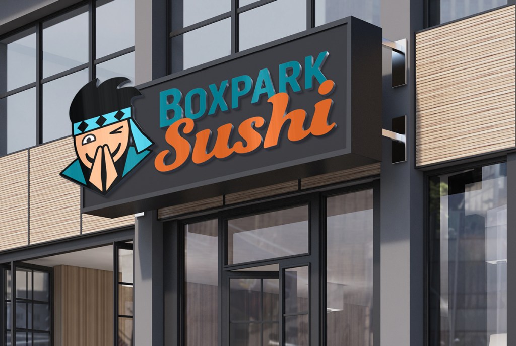
The strategic purpose of the Boxpark Sushi exterior sign is to capture the attention of shoppers and visually explain the brand. A dark gray background and its border represent a chalkboard, evoking the educational aspect of the brand. At the same time, the background mimics the dark shipping containers that constitute the architecture of the Boxpark mall.
The Sushi Sensei mascot breaks free of the background, demonstrating the brand’s fun energy and welcoming customers with a bow, a smile and a wink. This simplified facial expression communicates the wise yet friendly nature of Boxpark Sushi. Wisdom and competence are also expressed in the aqua blue colors in the headband and darker teal color of the Boxpark text and the Sensei’s karate gi (Kolenda, 2016).
In contrast, the orange color Sushi text communicates the brand’s warm, fun energy (Kolenda, 2016). Furthermore, studies show that warm reds and oranges can increase one’s appetite (Przybyla, n.d.). Because Boxpark shoppers already know where they are, the Boxpark text does not stand out on the sign as much as the bright orange Sushi text that tells them what the restaurant serves.
Pole Banners
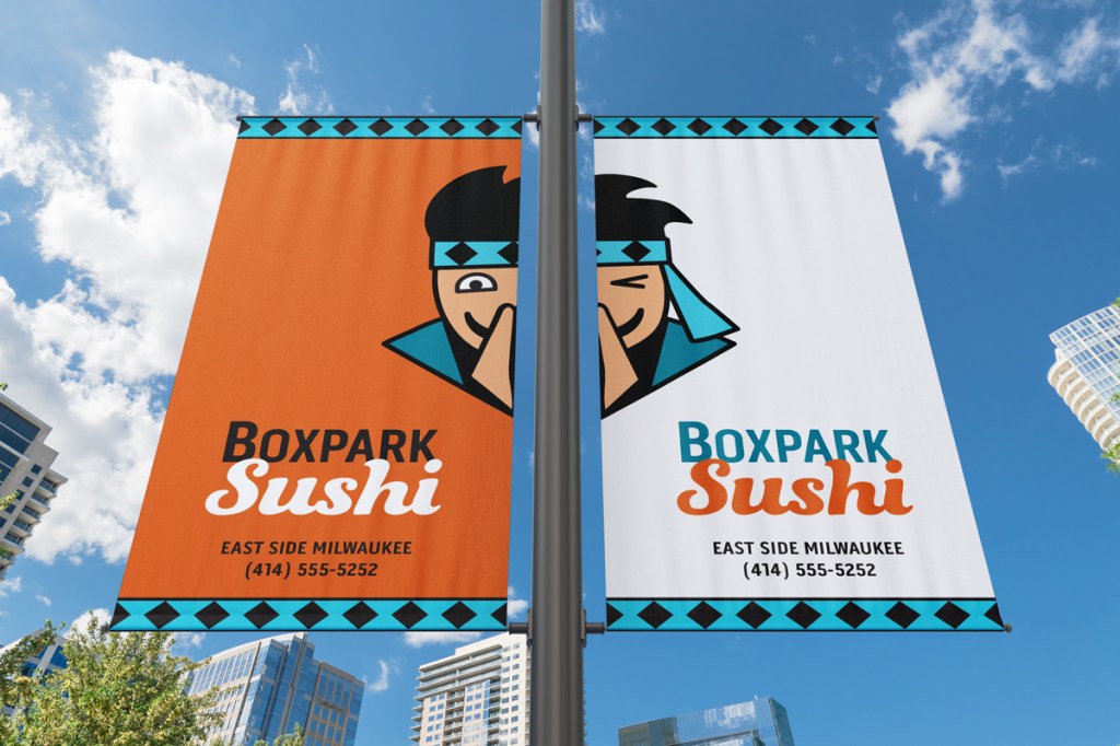
Eye-catching pole banners provide a quick brand introduction to passers-by, whether they are pedestrians or motorists. Demographic data shows that a large majority of East Side Milwaukee residents drive to work (Point2Homes, n.d.), so it is vital that the banners attract attention and communicate clearly to motorists who may have only seconds of attention to spare.
For that reason, the banners are brighter and lighter than the Boxpark Sushi signage while remaining consistent in the use of brand colors. The orange color stands out against the sky and other urban backgrounds as well as representing the brand’s association with “energy, ambition, and enthusiasm” (Cousins, 2012).
Paired side by side, the two banners have an abundance of negative space that communicates openness and freedom (White, 2011). The Sushi Sensei once again breaks free of the background, expressing the fun side of the brand.
Magnet
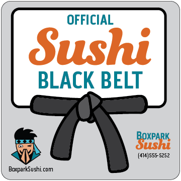
Printed magnets are an inexpensive promotional item that reinforce loyalty to the Boxpark Sushi tribe and spread brand awareness. The “Official Sushi Black Belt” magnet is an award to loyal customers, promoting a sense of accomplishment and addressing self-actualization needs. Felton (2013, p. 22) lists self-actualization as the highest level in Maslow’s hierarchy of needs. This helps the brand rise above competitors who only address the lower needs.
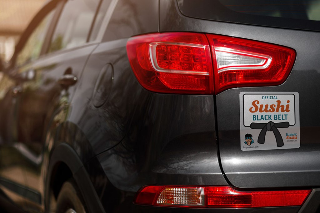
Although magnets do not stick on the back of all vehicles, they are mobile advertisements when used to replace bumper stickers. Magnets are also popular decorations for laptops, spreading the brand message to the customer’s workplace and social hangouts.
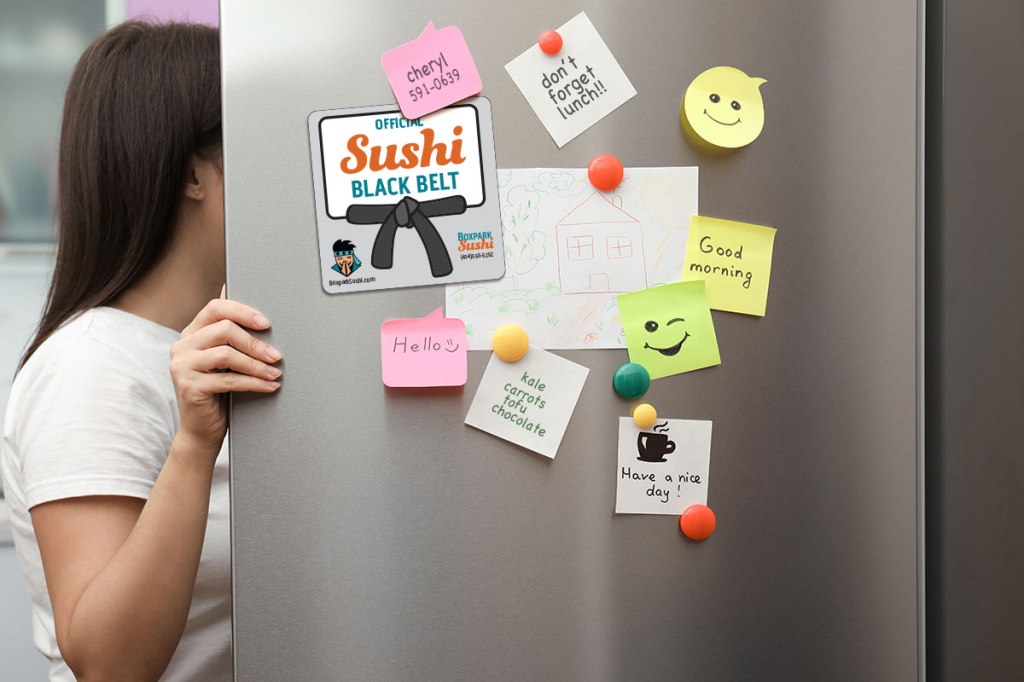
In addition, magnets are often placed on a refrigerator. Zee (2017) refers to a Purdue University study which found that people open their refrigerators an average of ten to twelve times per day. Numerous visual impressions with a hungry audience can lead to more sushi orders from home.
Takeout Bag
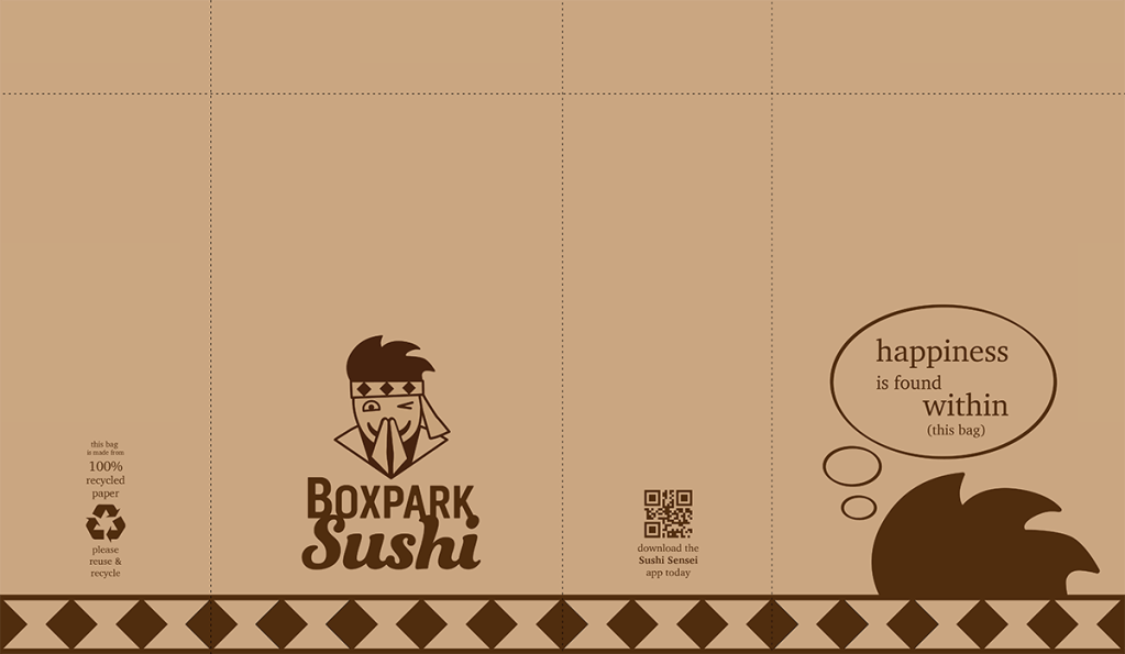
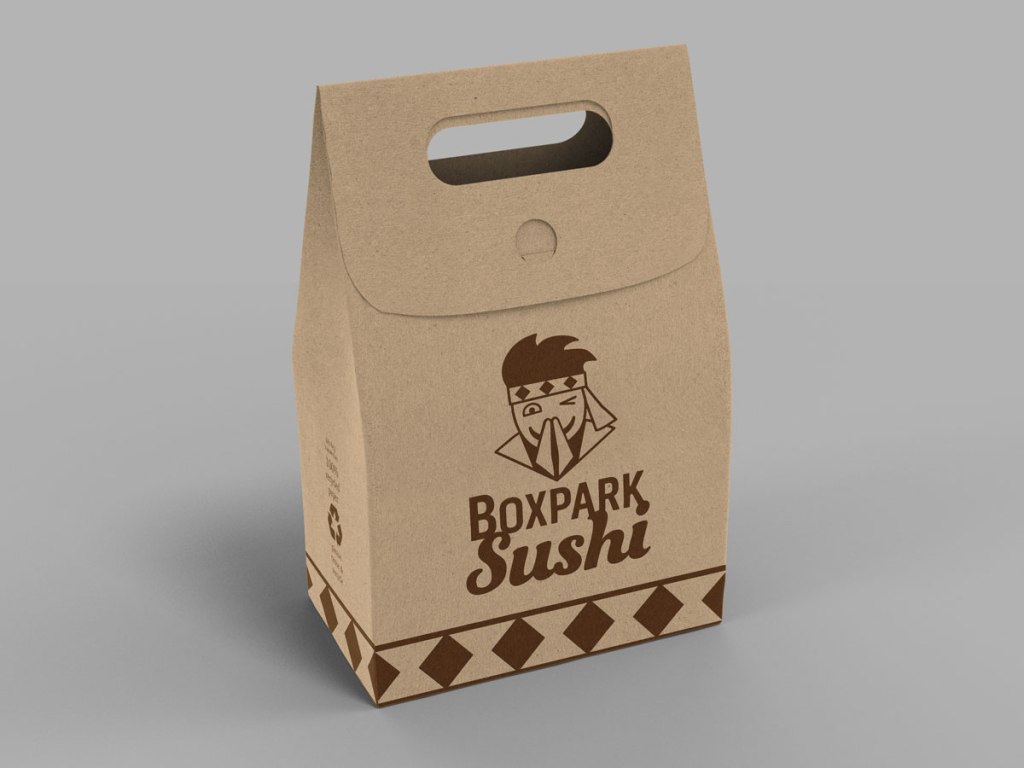
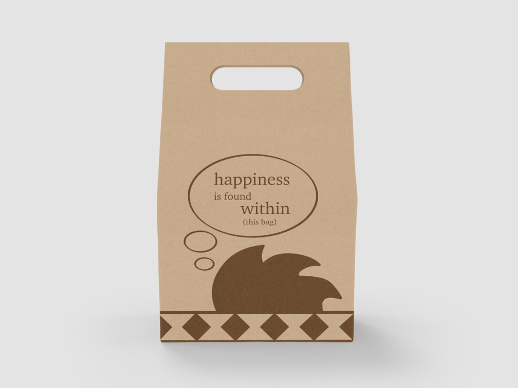
Boxpark Sushi’s distinctive, eco-friendly takeout bags have several strategic purposes. Branded packaging for take-out orders turn customers into walking advertisements as they carry their meal to work, school or home (McQuarrie, 2014). The bags include inspiring thoughts that are laced with humor, providing a novel way to connect with customers and a fun introduction to the brand for the customer’s co-workers and friends. New quotes can be added on a regular basis, adding to the novelty.
The Boxpark Sushi takeout bag also contains space to promote social media accounts, the Sushi Sensei app, and other ways of staying connected with customers. Plant-based ink on recycled unbleached paper give the packaging an organic feel while supporting the brand’s wise and conscientious nature. Multiple logo elements, like the diamond headband pattern, provide brand cohesion despite the lack of color. The quotes on the back of the bag reinforce the brand’s wise but fun personality.
References:
Cousins, C. (2015, February 12). How Color, Type and Space Can Impact Mood. https://designshack.net/articles/graphics/how-color-type-and-space-can-impact-mood/
Felton, G. (2013). Advertising: Concept and Copy (Third). W.W. Norton.
Kolenda, N. (2016). The Psychology of Color. https://www.nickkolenda.com/color-psychology/
McQuarrie, L. (2014, July 11). 38 Take-Out Packaging Designs. https://www.trendhunter.com/slideshow/take-out-packaging
Point2Homes. (n.d.). East Side Milwaukee Demographics. Retrieved from: https://www.point2homes.com/US/Neighborhood/WI/Milwaukee/East-Side-Milwaukee-Demographics.html
Przybyla, D. (n.d.). How Color Affects Appetite in Marketing. https://www.colorpsychology.org/color-appetite/
White, A. W. (2011). The elements of graphic design: space, unity, page architecture, and type. Allworth Press.
Zee, B. (2017, July 21). Discover Why You Should Be Using Magnets to Promote Your Brand. https://stickerbeat.com/discover-why-you-should-be-using-magnets-to-promote-your-brand/
