
Signage
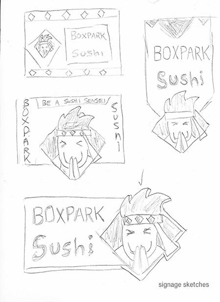
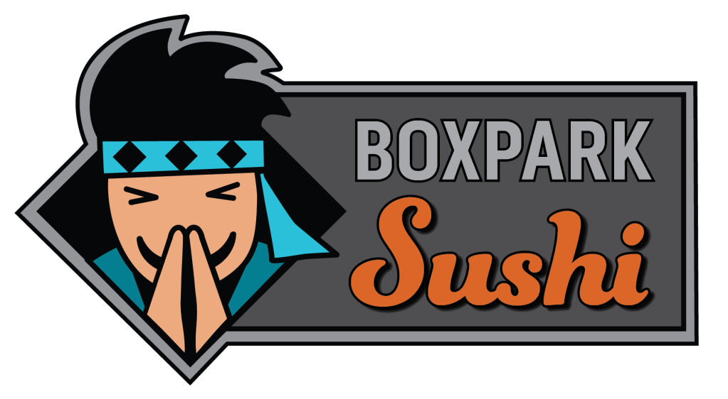
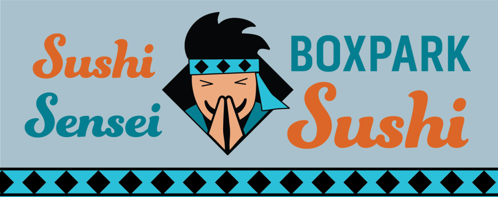
Boxpark Sushi’s exterior signage is appropriate for the Boxpark container mall, yet distinctive enough to draw the attention of busy shoppers. The Sushi Sensei mascot logo welcomes people with a friendly smile. The orange color of the sushi text communicates the brand’s warm, fun energy and the secondary teal blue color of the sensei headband denotes intelligence and competence (Kolenda, 2016).
This asset utilizes more grays than the brand logo for several reasons. The neutral gray background and Boxpark text are reminiscent of a chalkboard, representing the brand’s intelligent aspect as well as tying with the dark container architecture of the Boxpark mall. The border and neutral background also help the brand colors stand out.
A study quoted by Designhill (2019) says “A majority of people notice a local business by seeing its signage while passing by.” Therefore, the strategic purpose of the sign is to capture the attention of shoppers and visually explain the brand. Because Boxpark shoppers already know where they are, the Boxpark text is not as important on the sign as the bright orange Sushi text that tells them what the restaurant serves.
Pole Banners
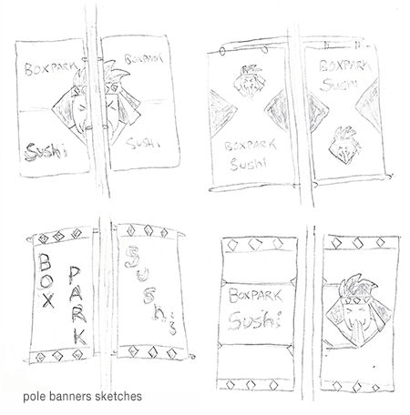
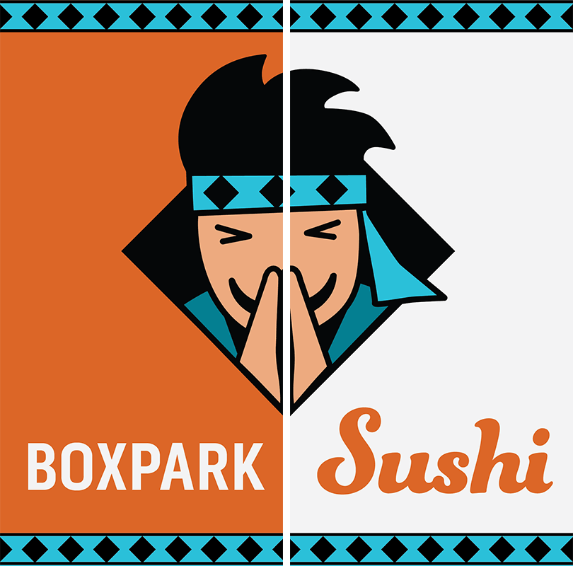
Strategically placed pole banners can effectively increase Boxpark Sushi’s visibility in the community. However, Commerce Color (n.d.) notes that most drivers will look at a pole banner for only two to four seconds. For that reason, the Boxpark Sushi banners are bold and easy to read with no unnecessary elements. Depending on where the banners are located, additional information like an address or website can be added.
The two banners are meant to be paired side by side, providing more visual space and openness to the design. Spreading the Sushi Sensei mascot logo across both banners adds cohesion to the design, as do the repeated headband pattern borders on the top and bottom.
To capture the brief attention of drivers, the banners are brighter and lighter than the Boxpark Sushi signage while remaining consistent in the use of brand colors. The orange color stands out against the sky and other urban backgrounds as well as representing the brand’s association with “energy, ambition, and enthusiasm” (Cousins, 2012).
Sticker / Magnet
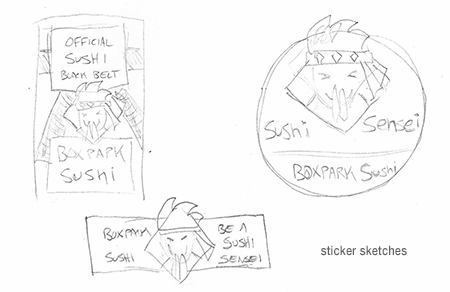
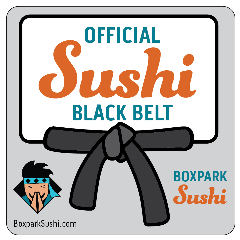
Printed stickers and magnets are relatively inexpensive promotional items that can reinforce loyalty to the Boxpark Sushi tribe and spread brand awareness. Watson (n.d.) notes that sticker marketing helps turn customers into brand advocates by building a personal relationship with the product. The “Official Sushi Black Belt” magnet is a reward for loyal customers, promoting a sense of accomplishment and addressing self-actualization needs.
Felton (2013, p. 22) lists self-actualization as the highest level in Maslow’s hierarchy of needs. This helps the brand rise above competitors who only address the lower needs. Other sticker designs were considered (see above), but a slightly higher cost magnet that is exclusive to frequent Boxpark Sushi diners adds the higher level of prestige.
In addition, magnets last longer than stickers and are often placed on a refrigerator. Zee (2017) refers to a Purdue University study which found that people open their refrigerators an average of ten to twelve times per day. Numerous visual impressions with a hungry audience can lead to more sushi orders.
Takeout Bag
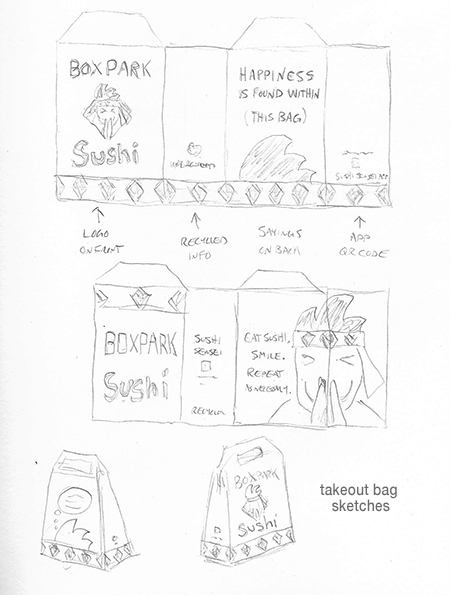
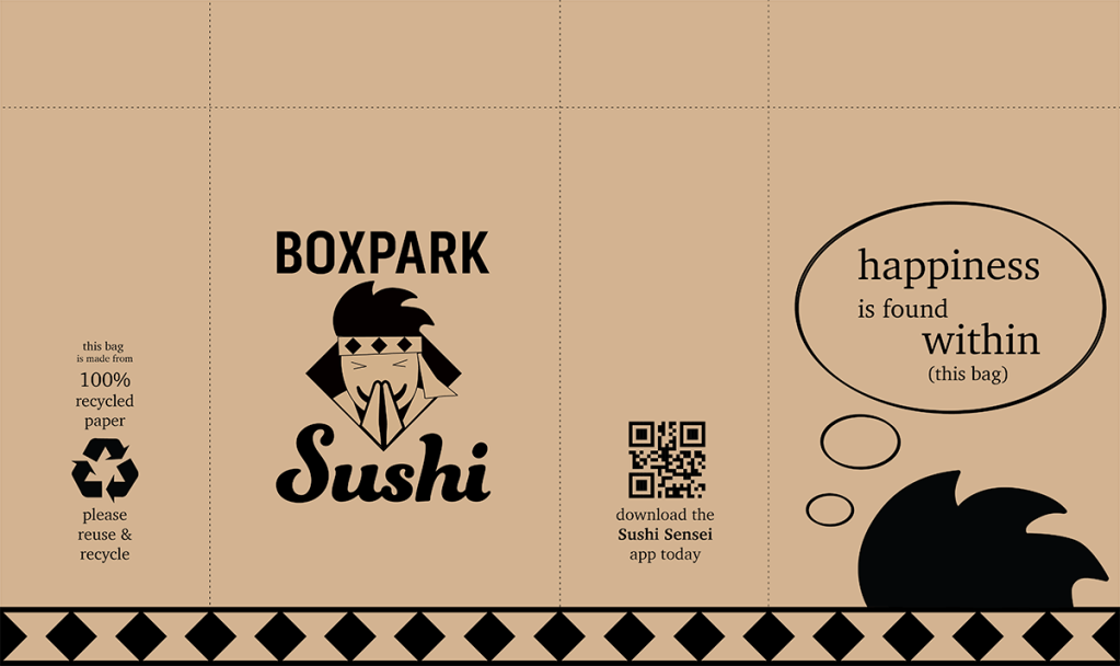
All restaurants need take-out packaging, so it only makes sense to use that packaging as a media asset. Branded packaging for take-out orders turn customers into walking advertisements as they carry their meal to work, school or home (McQuarrie, 2014). Boxpark Sushi’s distinctive, eco-friendly takeout bags include inspiring thoughts that are laced with humor. The quotes on the back of the bag reinforce the brand’s wise but fun personality.
Plant-based ink on recycled unbleached paper give the packaging an organic feel while supporting the brand’s wise and conscientious nature. Multiple logo elements, like the diamond headband pattern, provide brand cohesion despite the lack of color.
In addition to being a cost effective way of marketing, the Boxpark Sushi takeout bag design contains space to promote social media accounts, the Sushi Sensei app, and other ways of staying connected with customers. Instead of a plain white box or blank paper bag, Boxpark Sushi’s take-out bag is a novel way to connect with customers and a fun introduction to the brand for the customer’s co-workers and friends.
References:
Commerce Color. (n.d.). 5 Ways You Can Supercharge Your Pole Banner Promotions. https://www.commercecolor.com/blog/5-ways-you-can-supercharge-your-pole-banner-promotions
Cousins, C. (2015, February 12). How Color, Type and Space Can Impact Mood. https://designshack.net/articles/graphics/how-color-type-and-space-can-impact-mood/
Designhill. (2019, December 12). 3 Tips to Design Memorable Signage to Attract Customers in 2020. https://www.designhill.com/design-blog/design-memorable-signage/
Felton, G. (2013). Advertising: Concept and Copy (Third). W.W. Norton.
Kolenda, N. (2016). The Psychology of Color. https://www.nickkolenda.com/color-psychology/
McQuarrie, L. (2014, July 11). 38 Take-Out Packaging Designs. https://www.trendhunter.com/slideshow/take-out-packaging
Watson, H. (n.d.). The Forgotten Advantages of Sticker Marketing. https://thefridgeagency.com/blog/discover-the-stickiest-method-of-advertising/
Zee, B. (2017, July 21). Discover Why You Should Be Using Magnets to Promote Your Brand. https://stickerbeat.com/discover-why-you-should-be-using-magnets-to-promote-your-brand/
