
This vision board was created for the fictional Boxpark Sushi brand as an assignment for the Design Integration course.
Static Vision Board rationale
NOTE: Many design choices for this project follow the advice of psychologist Nick Kolenda, who compiled information from hundreds of academic studies into easy to read marketing guides about the psychology of colors, fonts, and more.
Typography
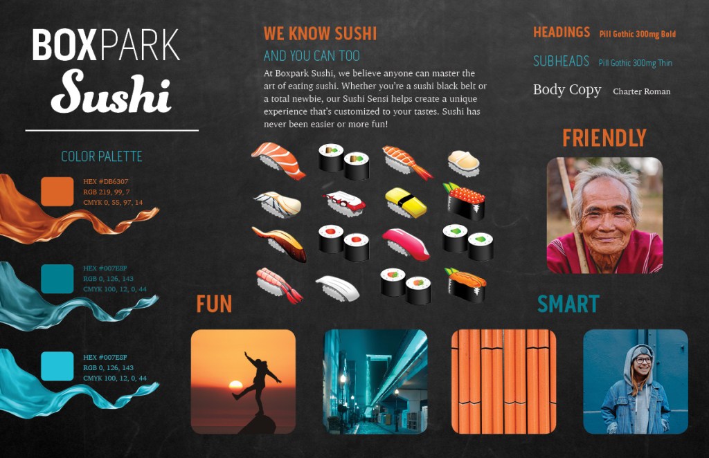
Boxpark Sushi’s primary font is Pill Gothic 300mg using a combination of the Bold and Thin font weights. This strong, modern typeface was selected from a group of sans-serif fonts available with Adobe Creative Cloud.
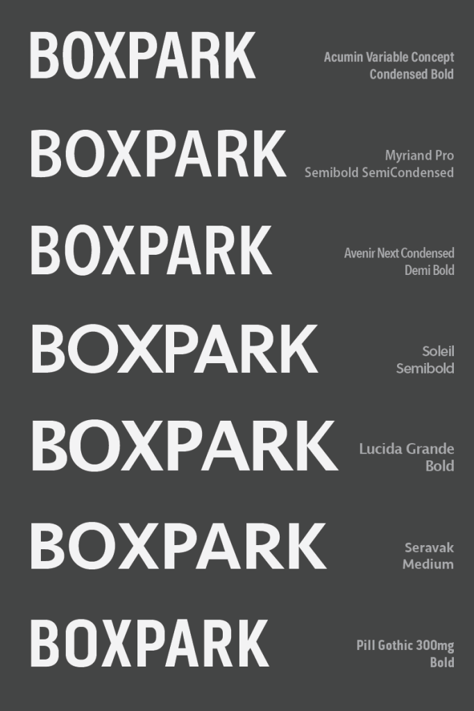
Pill Gothic 300mg was chosen because it is both strong and condensed. According to Kolenda (2016), condensed fonts convey tightness and precision, traits that are valued in sushi preparation. The combination of the font’s bold and thin weights implies a balance of power and sophistication.
Charter Roman is used for body copy because it is a highly legible serif font that has an academic feel.
Textures
The smart, educated personality is also reflected in the black chalkboard background and orange pencils pattern. The dark slate provides contrast to light text and the brand’s primary colors. The colors are presented as swatches and as blowing waves of fabric that have fun energy and a satin texture.
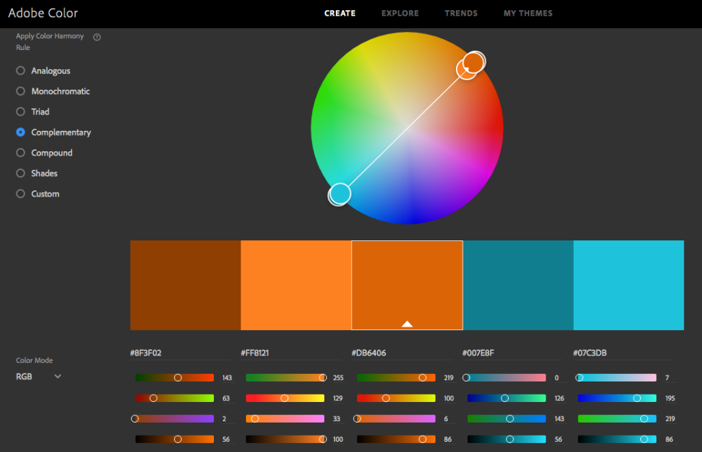
Color Palette
The brand’s primary color, a reddish orange, was selected because it shares that warm, fun energy. Przybyla (n.d.) also notes that warm reds and oranges can increase one’s appetite. The secondary teal blue color denotes intelligence and competence (Kolenda, 2016) as well as being complementary to the primary orange.’
Photos and Illustrations
Photos are either very warm or very cool colored to match the contrast of the brand’s primary color palette. Photos include a geometric pattern (orange pencils), an urban environment (blue cityscape), and happy people who express the brand personality traits of fun, smart, and friendly.
There are no photos of raw fish that may turn off consumers who are new to sushi. Instead, the product is presented as cute illustrations that are realistic enough to be identified by sushi eaters.
References:
Kolenda, N. (2016). The Psychology of Color. Retrieved from https://www.nickkolenda.com/color-psychology/
Kolenda, N. (2016). The Psychology of Fonts. Retrieved from https://www.nickkolenda.com/font-psychology/
Przybyla, D. (n.d.). How Color Affects Appetite in Marketing. Retrieved from https://www.colorpsychology.org/color-appetite/
