
Case Studies Comparison
Millennial consumers are the primary audience for many of today’s advertising campaigns, so I sought out case studies of designs that successfully targeted this market segment.
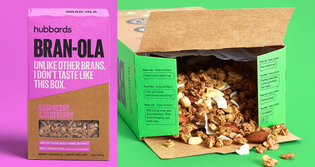
Onfire Design created packaging and advertising for Hubbards cereal brand’s Bran-ola product, using bright colors and a distinctive voice to differentiate from competing bran products (Sanchez, 2019). Copy like “This ain’t your grandma’s bran,” and “They made me wear this box,” gives the brand a sassy personality. The gut health benefits of bran are explained with a whimsical exchange that reads like a text message with a friend. The bright neon colors of the packaging and ads stand out in a category dominated by earth tones.
Designer Leo Franchi oversaw the brand designs and animation for the Cine a la Vista international film festival in Argentina. All elements of the designs were cut out from papers of different colors and thicknesses. Franchi used this process to find “the beauty of the texture imperfections in the only way the analog process can provide” (Airey, n.d.).
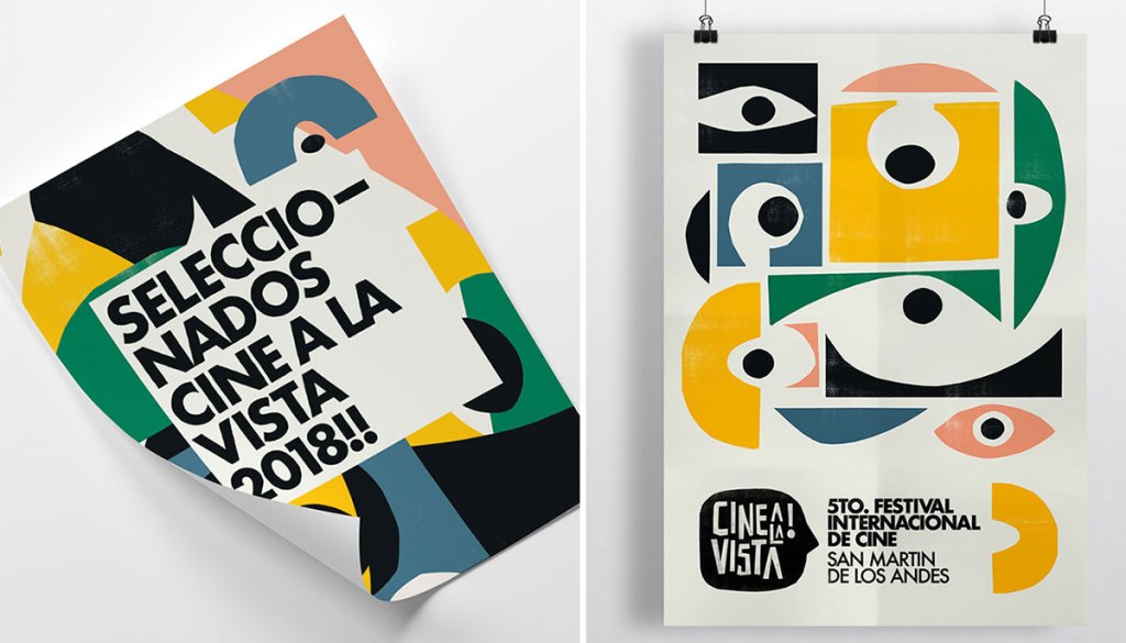
Graphic design is usually displayed on flat, smooth surfaces like screens and paper. However, designs can create the illusion of texture. Even if there is no physical tactile sensation from touching an object, the human brain still reacts and creates meaning from visual textures. Real life textures make a design feel more natural and organic. Textures can be used to create contrast in a design, drawing the eyes to important elements. Theodor (n.d.) notes that textures can also add depth to a design.
The Purpose of Vision Boards
Designers often struggle when trying to describe their ideas and concepts to clients. WDD Staff (2008) notes that “visuals communicate things that words cannot,” and vision boards can help do just that. Vision boards, also called mood boards or inspiration boards, serve several important purposes in the design process:
- Faster mockup production: Time is money, and a few hours spent developing the look and feel of a project in a vision board can save many hours later. The visual prototyping process becomes smoother as there a no surprises when presenting design mockups based on previously approved vision boards.
- Smoother client buy-in: Vision boards demonstrate the thinking behind your design ideas. Clients feel involved with the process and are less likely to suggest design changes based on personal preferences like a favorite color.
- Less frustration, more fun: Vision boards are a creative way to explore design concepts and styles with fewer limitations.
Designing Visual Hierarchy
Artists of all visual media use many techniques to draw attention and move the viewer’s eyes through a design. According to Lundgren (n.d.), “Visual hierarchy is the ordering of content in a composition so that you effectively communicate information and create meaning.” This is especially important in marketing and advertising design, where viewer attention is a precious commodity. We can use the following principles of design to create visual hierarchy:
- Proportion (or Scale) is the size relationship of the design elements to each other and the entire design. The largest elements, like headlines, are usually the most important.
- Position is where the elements are located within the design. The Gutenberg Principle describes the general movement of the eyes when looking at a design in which elements are evenly distributed (Lundgren, n.d.). The principle states that viewer attention generally starts at the upper left of a design and moves toward the lower right.
- Direction. If most elements, like type, are in the horizontal direction, vertical or diagonal elements will be noticed first.
- Contrast between light and dark colors makes visual elements stand out and improves readability.
References:
Airey, D. (n.d.) Cine a la Vista. Retrieved from https://identitydesigned.com/cine-a-la-vista/
Lundgren, A. (n.d.). Applying the Gutenberg Principle in Print and Web Design. Retrieved from https://alvalyn.com/applying-gutenberg-principle-print-web-design/
Lundgren, A. (n.d.). Capture Attention with Visual Hierarchy. Retrieved from https://alvalyn.com/capture-attention-with-visual-hierarchy/
Sanchez, R. (2019, December 4). Onfire Design Uses Bold Colors, Type And Sassy Copy To Make Bran-ola Stand Out. Retrieved from https://thedieline.com/blog/2019/12/4/onfire-design-uses-bold-colors-type-and-sassy-copy-to-make-bran-ola-stand-out
Theodor, V. (n.d.). The role of textures in contemporary graphic design. Retrieved from https://www.canva.com/learn/texture/
WDD Staff. (2008, December 30). Why Mood Boards Matter. Retrieved from https://www.webdesignerdepot.com/2008/12/why-mood-boards-matter/
