
Board Revisions
This week Jose Caceres and professor Andrea Kratz offered valuable feedback to help improve my Kyoto brand vision boards. Only minor adjustments were needed for each board, but the changes strengthened the brand connections.
Geography
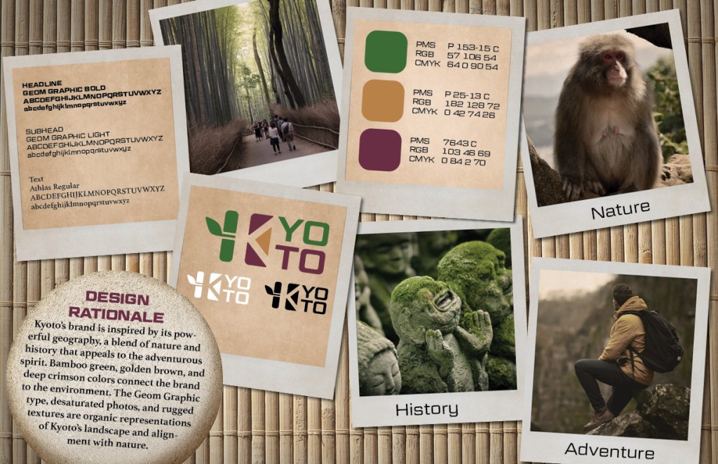
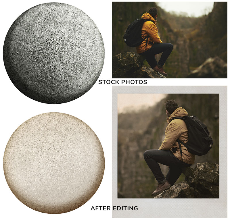
Caceres suggested adding a photo more suggestive of “adventure”, so I found a stock photo that fit the keyword then cropped it, flipped it, and adjusted the colors to more closely match the brand style. I also replaced the “history” temple photo with the moss-covered statues photo that blends both history and nature. Kratz suggested tying the Design Rationale more closely to the design, so I found a round stone image on Adobe Stock and used it as a background with minor hue and brightness adjustments.
On the Freepik.com blog, Orana Velarde offers fifteen ways to customize stock photos to better fit your brand (Velarde, 2017). The image below shows two of the stock images I used, before and after customization.
Modern Culture
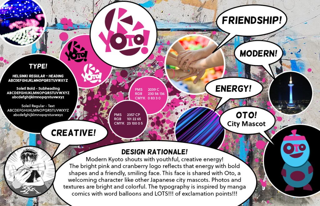
The modern Kyoto brand vision board needed the fewest changes. In the Week 4 Live Session video professor Andrea Kratz suggested changing the background color of some of the bubbles (Kratz, 2019), so I gave Oto and the typography bubble colorful but dark backgrounds with a white stroke. This minor change gave the design more contrast and balance.
Traditions
Before updating the traditions brand vision board, I revised the fan logo. The wavy lines on the fan are now more harmonious with the curviness of the wordmark.

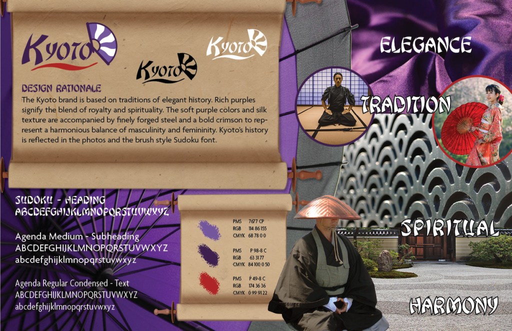
Following Kratz’s advice to de-blockify the Design Rationale, I created a scroll background in Photoshop using elements of clip art and textured paper. This background worked well for the logos and rationale, tying more closely to tradition than the previous color backgrounds. Because it was so effective, I made a second scroll background for the color palette. This texture can be part of the brand style guide if further developed.
Caceres suggested adding a photo more closely connected to “spirituality”. The design was already crowded, so I swapped out the dragons print for a photo of a Zen garden. I also replaced ambiguous Torii gate photo with a photo of a samurai. I added the purple background and adjusted the floor color to match the parchment. The design now feels more cohesive and connected to Kyoto’s history and traditions. My scroll backgrounds can be adjusted so the shadows are more consistent with the rest of the design, but that’s a minor change.
References:
Kratz, A. (2019, September 24). MDM530 Live Session Archives – Week 4. Retrieved from https://online.fullsail.edu/class_sections/46757/modules/180381/activities/1127121
Velarde, O. (2017). 15 Creative Ways to Customize Stock Photography to fit your brand. Retrieved from https://www.freepik.com/blog/15-creative-ways-customize-stock-photography-fit-your-brand/
