
I began the process of creating vision boards for each of my three Kyoto brand concepts. At first, I did not understand the difference between a mood board, a style sheet, and a brand vision board. Fortunately, professor Kratz defined each tool in the Week 3 Live Session. The vision board is primarily a presentation tool to explain how you intend to visualize the brand personality (Kratz, 2019).
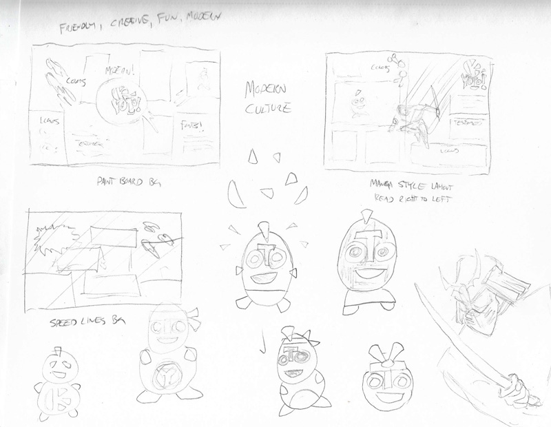
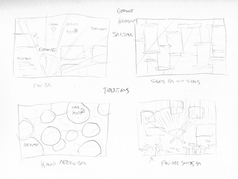
My board prototypes started with rough concept sketches that helped me narrow down ideas.
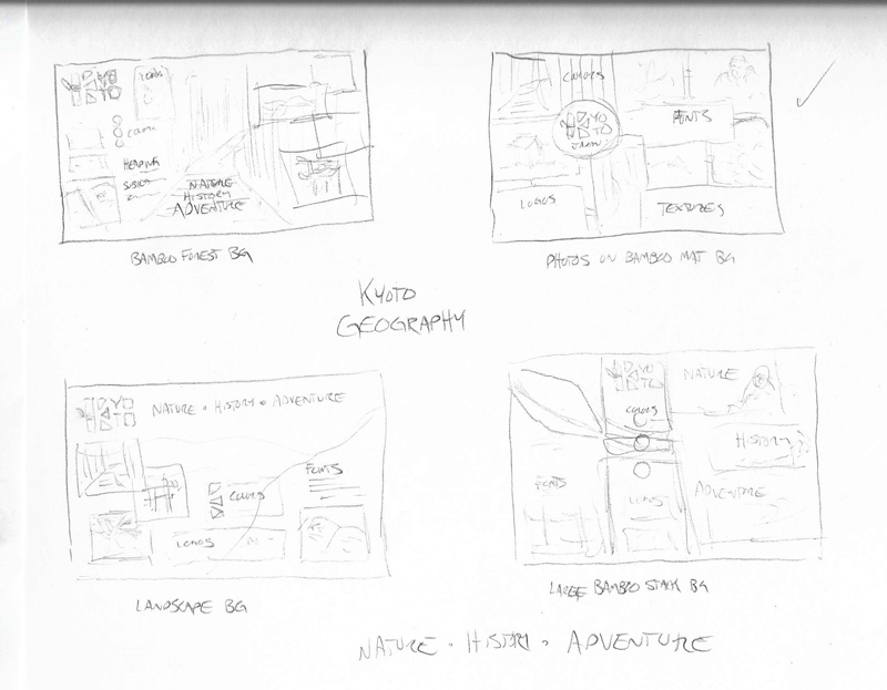
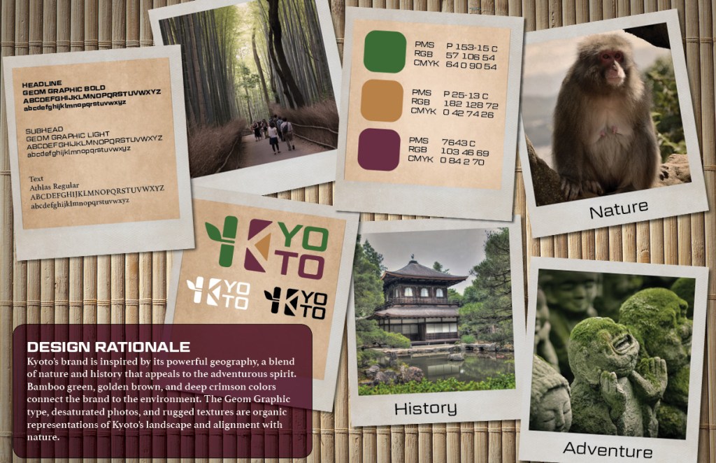
GEOGRAPHY
History Nature Adventure
Design Rationale
Kyoto’s brand is inspired by its powerful geography, a blend of nature and history that appeals to the adventurous spirit. Bamboo green, golden brown, and deep crimson colors connect the brand to the environment. The Geom Graphic type, desaturated photos, and rugged textures are organic representations of Kyoto’s landscape and alignment with nature.
Geography Brand Definition
Key Value 1: reverence for nature
Key Value 2: independence
Key Characteristic 1: adventurous
Key Characteristic 2: natural
Its Differentiation: historic temples surrounded by natural beauty
Experience / Emotional connection: collecting shared memories and photos
This brand appeals to adventurous visitors who want to take photos of Kyoto’s natural side. Old Polaroid photos provide an earthy, physical connection to memories. Each frame contains a photo that has been desaturated and lightly sepia toned to match the earth tones of the palette. Other frames contain grungy paper textures displaying the logos, color palette, and typography. The photos are scattered on a natural woven bamboo mat background in a way that leads the eye down toward the design rationale.
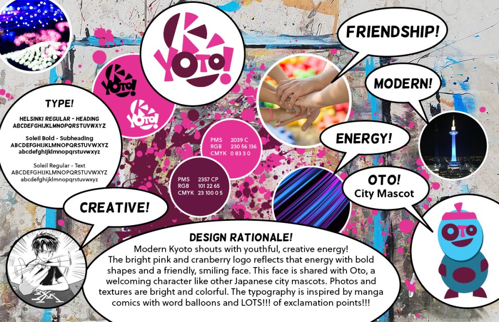
MODERN CULTURE
Creative Friendship Modern Energy
Design Rationale
Modern Kyoto shouts with youthful, creative energy! The bright pink and cranberry logo reflects that energy with bold shapes and a friendly, smiling face. This face is shared with Oto, a welcoming character like other Japanese city mascots. Photos and textures are bright and colorful. The typography is inspired by manga comics with word balloons and LOTS!!! of exclamation points!!!
Modern Culture Brand Definition
Key Value 1: creativity
Key Value 2: energy
Key Characteristic 1: fun
Key Characteristic 2: friendly
Its Differentiation: International Manga Museum and other art exhibits
Experience / Emotional connection: fun with friends
The Kyoto International Manga Museum draws many visitors each year, and this brand appeals to those who appreciate the city’s young, creative side (Outline of the Kyoto International Manga Museum, n.d.). I started with a background photo of my own paint-splattered art table and added splashes of the brand’s primary colors. The bright, colorful photos and textures are juxtaposed with word bubbles in a way that appeals to fans of Japanese fashion and manga.
Yuru-kyara are the cute, adorable, and sometimes creepy little mascots for Japanese cities and organizations (Niko, n.d.). While drawing Kyoto modern culture concept sketches, I developed a new yuru-kyara called “Oto.” The city mascot’s face uses elements from the brand logo, raising brand recognition and awareness while appealing to modern visitors. The character design needs refinement, but I wanted to include Oto on the vision board.
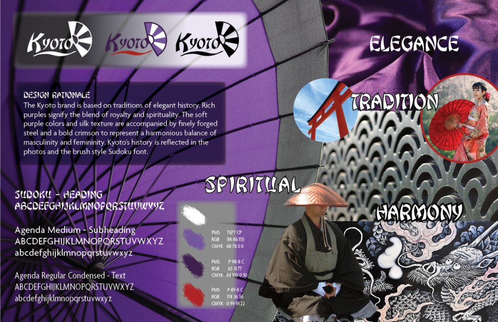
TRADITIONS
Elegance Harmony Spiritual
Design Rationale
The Kyoto brand is based on traditions of elegant history. Rich purples signify the blend of royalty and spirituality. The soft purples and silk texture are accompanied by finely forged steel and a bold crimson to represent a harmonious balance of masculinity and femininity. Kyoto’s history is reflected in the photos and the brush style Sudoku font.
Traditions Brand Definition
Key Value 1: respect
Key Value 2: harmony
Key Characteristic 1: spiritual
Key Characteristic 2: sophisticated
Its Differentiation: spiritual heart of Japan
Experience / Emotional connection: a spiritual connection to Japanese history
Most of my concept sketches for the Kyoto traditions were based on the folding fan motif, but while searching stock images I found a photo of a Japanese umbrella that more effectively conveyed elegance and sophistication. I changed the umbrella color from red to purple to reflect the brand color representing spirituality and royalty (Cross, n.d). The Japanese steel texture has a fan-like repeating pattern reminiscent of the fan in the brand logo, adding a refined strength that is balanced by the soft flowing silk.
References:
Cross, R. (n.d.). Color meaning and symbolism: How to use the power of color in your branding. Canva. Retrieved from https://www.canva.com/learn/color-meanings-symbolism/
Kratz, A. (2019, Sept. 17) MDM530 Live Session Archives – Week 3. Retrieved from https://online.fullsail.edu/class_sections/46757/modules/180381/activities/1127121
Niko. (n.d.) The Essential Guide to Understanding Japan’s National Mascot Obsession. Retrieved from https://www.fluentu.com/blog/japanese/japanese-culture-mascots/
Outline of the Kyoto International Manga Museum. (n.d.). Retrieved from https://www.kyotomm.jp/en/about/summary/
