
The logo design process that we started last month continued with the creation of vector graphics. At the end of the last stage we selected the three strongest designs guided by peer critique and self-critique based on David Airey’s seven elements of iconic design (Airey, 2014).
I designed the following logos to represent the city of Kyoto, Japan.
Kyoto Geography
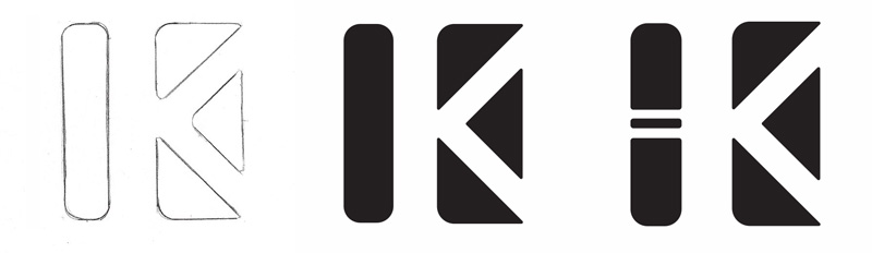
The rounded column and triangles represent the bamboo forests and gently sloped mountains around Kyoto. A letter K is formed by the negative space. The concept sketch and first vector graphic were not distinctive enough, so I added lines to represent a joint in the bamboo stalk. I also followed Von Glitchka’s advice from Logo Design: Illustrating Logo Marks and adjusted spacing for visual continuity (Glitchka, 2016).
Kyoto Modern Culture
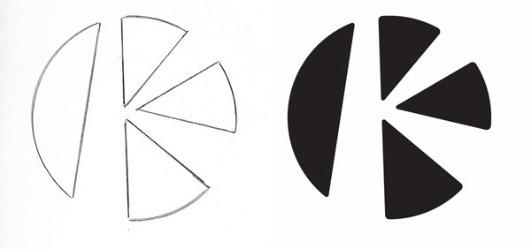
This design captures the energy and style of today’s people in Kyoto. The negative space letter K is inspired by manga comics while evoking the narrow streets of Kyoto’s historic Gion district. After creating a vector graphic based on the sketch, I added gentle curves to the sharp edges. These subtle rounds are another of Glitchka’s recommendations for making a design stand out (Glitchka, 2016).
Kyoto Traditions
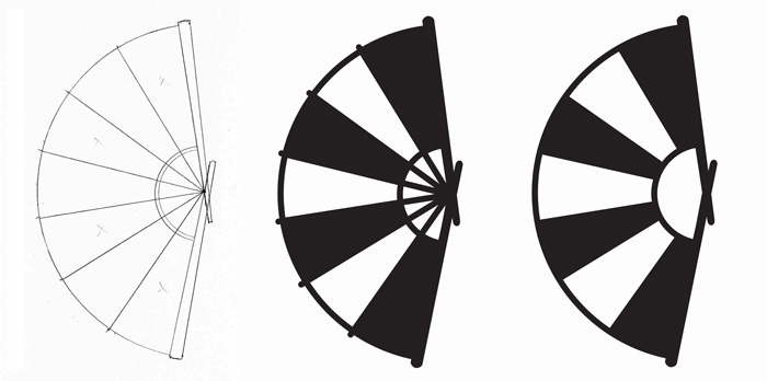
The fan design is a simplified icon based on the folding fans carried by Kyoto’s geisha. The alternating dark and light panels evoke Japan’s historic flag, but I must be careful to choose a color other than red for the primary palette to avoid offense (Taylor, 2015).
After creating a vector graphic based on the sketch, I realized the design was still not simple enough to be effective at small sizes. The removal of just a few elements made the design stronger according to Airey’s elements of iconic design (Airey, 2014).
Font Selection
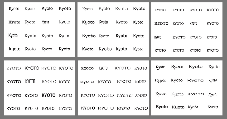
The next step was to choose fonts with the most potential to be effective wordmarks. In Adobe Illustrator, I created a file with six artboards. On each artboard, I placed type and used Adobe Fonts to find at least 32 wordmarks for each of the three logos. This follows the example set by Sean Adams in Branding for Designers (Adams, 2015).
I looked for typefaces that met the following qualities:
- Geography: steady, solid, regular edges
- Modern Culture: energy, fun, rounded shapes
- Traditions: elegant, respect, calligraphic
After printing and cutting out the logos and wordmarks, I compared each of them by hand to find complementary shapes and angles. Following Janie Kliever’s advice, I made choices based on what was appropriate for the design concept, not my personal tastes (Kliever, N.D.).
I eventually settled on two font choices to pair with each logo icon in Adobe Illustrator.
With multiple variations to choose from, I selected the strongest option for each of the three logos.
References:
Adams, S. (2015, March 27) Branding for Designers. Retrieved from https://www.lynda.com/Design-Color-tutorials/Foundations-Branding-Designers/363131-2.html
Airey, D. (2014, August 20). Logo Design Love, Annotated and Expanded Edition, Second Edition. Retrieved from https://ce.safaribooksonline.com/book/branding/9780133812589
Glitschka, V. (2016, August 10) Logo Design: Illustrating Logo Marks. Retrieved from https://www.lynda.com/Illustrator-tutorials/Foundations-Logo-Design-Illustrating-Logo-Marks/475455-2.html
Kliever, J. (n.d.). How designers choose fonts. Retrieved from https://www.canva.com/learn/font-design/
Taylor, A. (2015, June 27). Japan has a flag problem, too. The Washington Post. Retrieved from https://www.washingtonpost.com/news/worldviews/wp/2015/06/27/japan-has-a-flag-problem-too/
