
Task 2
For Part 2 of the Logo Design Workshop, we gave and received peer critique of our rough concept sketches. Jose Caceres and Krystle Awai offered valuable feedback that informed my choices of the strongest nine concepts to take to the next stage. Each reminded me to follow David Airey’s seven elements of iconic design and pointed out the designs they felt were most successful. (Airey, 2014)
Kyoto Geography inspired designs
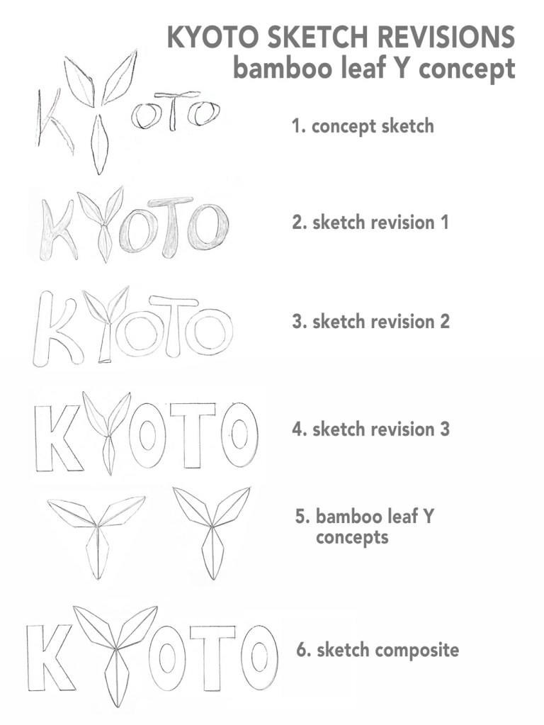
Bamboo leaf Y concept
- Concept sketch: Three bamboo leaves replace the
letter Y.
Caceres noted that this design was successful because the simple, symmetrical shapes are easy to commit to memory as well as providing information about Kyoto’s natural features. - Sketch revision 1: I kept the style of the original sketch but adjusted the scale of the leaves in relation to the letters.
- Sketch revision 2: Instead of three bamboo leaves, I used two leaves atop a bamboo stalk to replace the letter Y. My lettering was cleaner on this revision, but the hand-drawn type seems cramped and hard to read at a distance.
- Sketch revision 3: Using a ruler and oval templates, I drew sharper modern type to contrast with the soft organic leaves. This is the strongest revision so far because it is recognizable at any size.
- Bamboo leaf Y concepts: I drew and cut out a single leaf that I used as a guide to create a more symmetrical leaf Y. The perfect symmetry of the first design was too similar to an upside-down Mitsubishi logo, so I adjusted the angles on the second design to make it more distinct as a letter Y.
- Sketch composite: After scanning the sketch revisions, I combined the lettering of revision 3 with the second Y concept sketch. This composite is a distinctive, modern design but it lacks the organic quality of the original concept sketch.
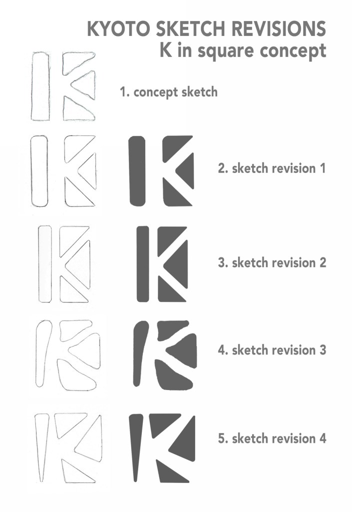
K in square concept
- Concept sketch: Three triangles and column form
a K in the negative space.
Both Awai and Caceres found this to be an effective concept because of the simplicity of the shapes. Awai also noted that the negative space evokes Kyoto’s scenic walkways as well as the letter K. The triangles represent the mountains around Kyoto. - Sketch revision 1: I redrew the original concept with straight lines and refined angles., keeping the rounded edges to soften the design. I filled in the dark areas after scanning for consistency.
- Sketch revision 2: This revision uses symmetrical shapes and less negative space for a compressed design. The first two revisions both represent a recognizable pattern that can be used with a Kyoto wordmark, as an icon, or as a repeating motif in a variety of ways.
- Sketch revision 3: There are many recognizable logos featuring the letter K, such as K-Mart, Circle K, and Special K cereal. To find distinction as well as incorporate tradition, I rounded the shapes in the design to make the negative space K resemble the meandering paths in Kyoto’s Zen gardens.
- Sketch revision 4: The fourth revision returned to straight lined rectangles but kept the energy and historical tradition of the previous design.
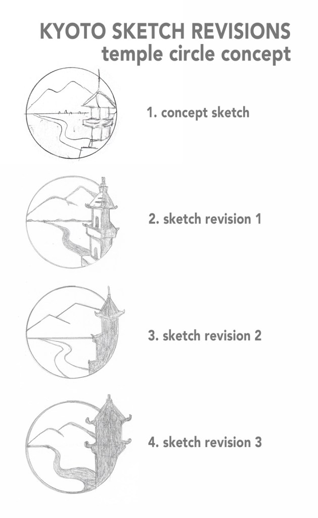
Temple circle concept
- Concept sketch: A circle holds a view of a
river, mountains, and a Kyoto temple.
Awai felt that this sketch incorporated tradition with the natural beauty of Kyoto in a relevant way. - Sketch revision 1: I illustrated the design, trying to simplify the details. The temple breaks free of the circle, helping the balance.
- Sketch revision 2: The first revision was too detailed to work at a small scale, so I made the temple into a silhouette. The curve of the river looks more natural, but this design can be simplified even more.
- Sketch revision 3: The thicker line weight and modified temple make this design less illustrative and more iconic while retaining its historic relevance.
Kyoto Modern Culture inspired designs
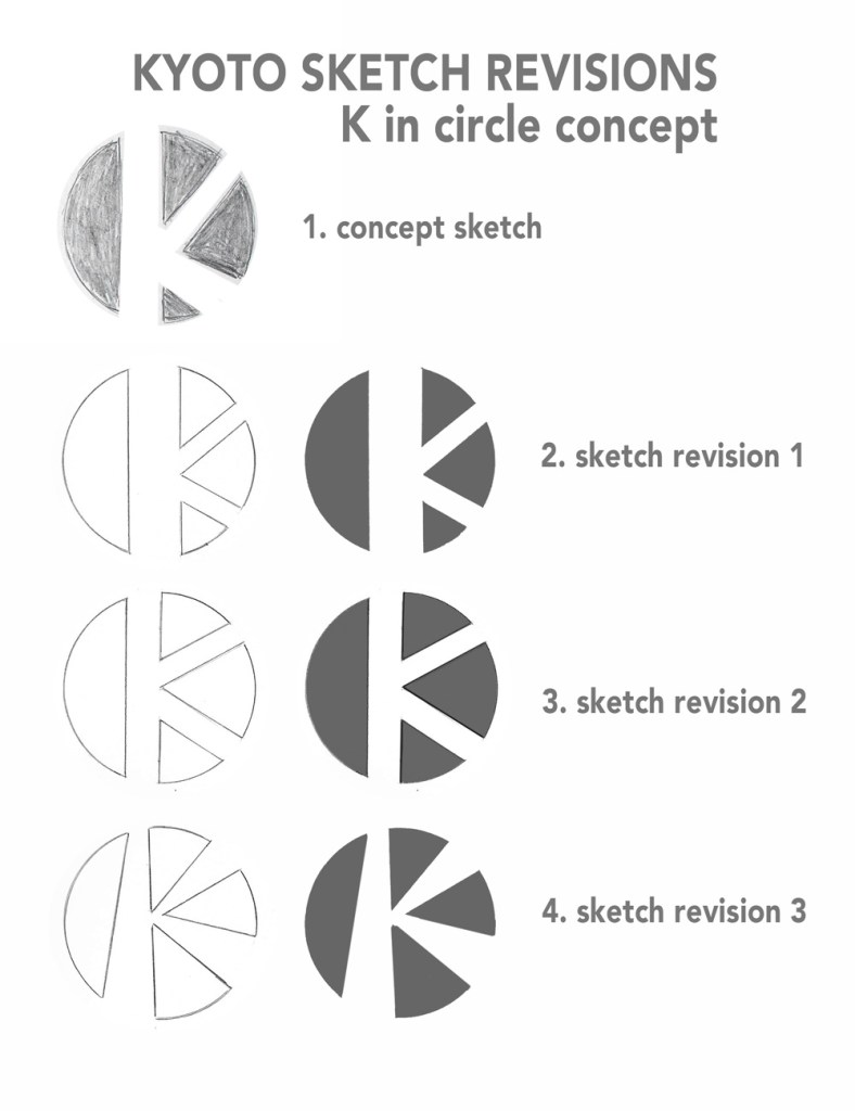
K in circle concept
- Concept sketch: A negative space K is made by
shapes that form a circle evocative of the rising sun.
Caceres stated that this design was successful because of its simplicity. Like the “K in square” concept, it aims for distinction and is easy to commit to memory. - Sketch revision 1: I tried to closely recreate the original concept with cleaner lines. Again, I filled in the dark areas after scanning for consistency.
- Sketch revision 2: My unfortunate fondness for symmetry influenced this revision. Although the design feels more balanced, it actually becomes less distinctive than the original concept.
- Sketch revision 3: This design sheds the balanced symmetry and becomes more energetic. It remains distinctive and incorporates tradition by making the negative space resemble rays of the rising sun.
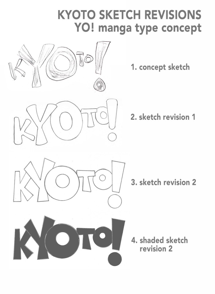
YO! Manga type concept
- Concept sketch: Kyoto spelled out with
manga-style comic type, emphasizing the letters Y and O.
Awai said this design captures the young, vibrant energy of Kyoto. - Sketch revision 1: The first revision uses soft, rounded type to match the concept sketch. I kept the large size of the Y, O, and exclamation mark but also increased the size of the other letters.
- Sketch revision 2: By straightening the lines, the design became much cleaner and distinctive. The type closely mimics comic type without using a particular typeface.
- Sketch revision 3: After scanning, I filled in the design too see how it would look. This concept has youthful energy but might not appeal to older visitors.
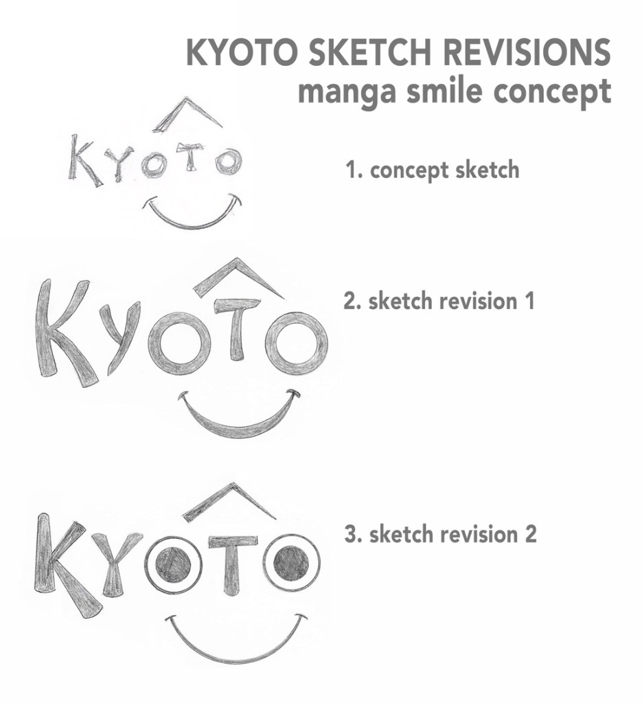
Manga smile concept
- Concept sketch: The two letter O’s in Kyoto form
the eyes of manga-inspired smiling face.
This is the only design that I selected without input from peers. I chose it because it is simple and distinctive. - Sketch revision 1: The first revision is simply a cleaner, more refined version of the original sketch. The type is reminiscent of Japanese calligraphy, but simple enough to be read at any size.
- Sketch revision 2: I tried a different style of eyes and thinner smile to make it distinctive from the smile shape in the Amazon.com logo. This version feels more child-like and less appropriate than Revision 1.
Kyoto Traditions inspired designs
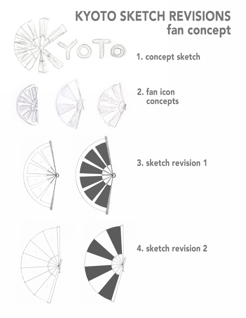
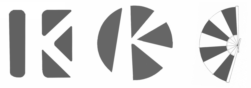
Fan concept
- Concept sketch: A folding fan replaces the spine
of the letter K in Kyoto.
Both Awai and Caceres appreciated the simplicity of this logo. - Fan icon concepts: The folding fan in the concept sketch is very rough, so I first worked on developing a simplified icon that could be paired with a typeface chosen later.
- Sketch revision 1: The first version uses six dark sections with white dividers. Again, I filled in dark areas after scanning.
- Sketch revision 2: The second revision uses seven alternating dark and white panels. This simplified fan will be an effective icon once I thicken the line weights.
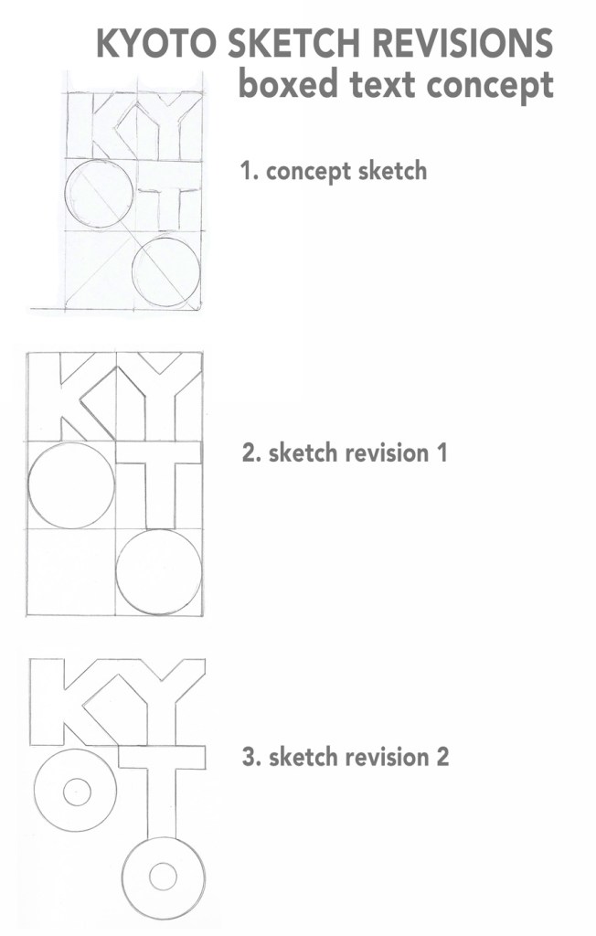
Boxed text concept
- Concept sketch: Letters spelling Kyoto are
arranged in boxes.
Caceres said this was one of the strongest designs because it is simple, different, and traditional. - Sketch revision 1: The first revision in a cleaner version of the original sketch. I left out the diagonal line that runs through the O’s because it was reminiscent of “no smoking” signs and other negative images.
- Sketch revision 2: I removed the bounding boxes from the letters and added center circles to the O’s. This design is not as effective because it is less distinctive and does not feel as relevant to Kyoto’s traditions.
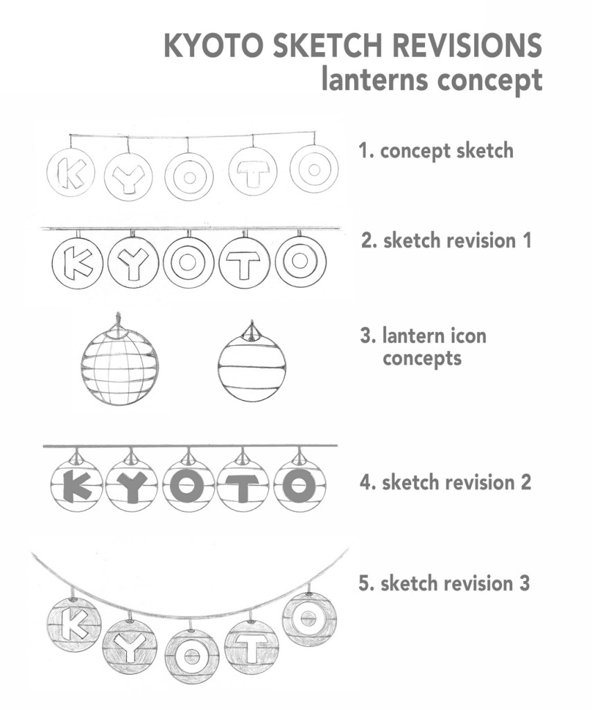
Lanterns concept
- Concept sketch: Hanging paper lanterns spell out Kyoto. Awai appreciated the tradition and symbolic meaning of the lanterns in Japanese culture.
- Sketch revision 1: I tightened the spacing of the lanterns and tried to make the type clearer than in the concept sketch.
- Lantern icon concepts: My next step was to draw simplified icons to represent the paper lanterns. The first illustration was too busy, but the second was simple enough to use in the design.
- Sketch revision 2: I replaced the empty circles of the first design with the lantern icons and made the overlying text dark.
- Sketch revision 3: For the final revision, I curved the line that the lanterns hang from and made the letters white over dark. While not as simple as many of the other designs, this logo captures the history and culture of Kyoto.
The feedback from Jose Caceres and Krystle Awai helped improve my work by reminding me to follow David Airey’s seven elements of iconic design. Their recommendations helped remove my personal preferences and allowed me to focus on why a particular design was effective. The most common note was that many of the concept sketches were too illustrative, so I payed extra attention to keeping designs simple.
I did not move forward with one of Awai’s preferred designs because it felt too similar to another of the top choices. Otherwise, I tried to implement all the feedback from both peer critiques. Both were constructive and well thought out, following the advice from Lawless and Crabill in How to Give and Receive a Good Design Critique. (Lawless & Crabill, 2015).
Top 3 Designs
Geography: Although I tried several revisions, the “K in square” design closest to the original concept sketch is the strongest. It meets most of the seven criteria, and it can become more distinctive with minor revisions and when paired with text.
Modern Culture: Inspired by Japan’s rising sun flag, the “K in circle” design is very similar to the first due to its use of negative space. The third sketch revision is strongest because it shares the positive qualities of the “K in square” design but is more distinctive and culturally relevant.
Tradition: The original concept sketch was a very quick doodle inspired by Geisha. It was one of my least favorite designs personally, but the peer critique helped me see past the roughness of the drawing and understand why it worked as an appropriate design. The simplified fan icon focuses on one thing associated with Kyoto, is easy to commit to memory, and incorporates tradition.
References:
Airey, D. (2014, August 20). Logo Design Love, Annotated and Expanded Edition, Second Edition. Retrieved from https://ce.safaribooksonline.com/book/branding/9780133812589
Lawless, K., & Crabill, S. (2015, March 27). How to Give and Receive a Good Design Critique. Retrieved from https://baltimore.aiga.org/how-to-give-and-receive-a-good-design-critique/
