
In the third week of Defining Client Needs, we were asked to create at least 75 rough sketches for a city logo using the mind maps we created in week two.
I chose to create designs for Kyoto, Japan because of my affinity for Asian culture. I started with sketches inspired by Kyoto’s geography, using keywords from the previous mind mapping assignment.
These rough concept sketches will be reviewed by my peers. Using their input, I will move ahead with the strongest ideas.
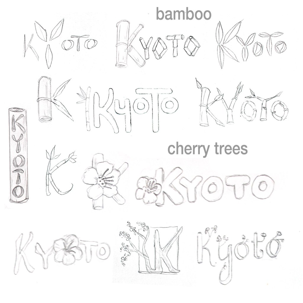
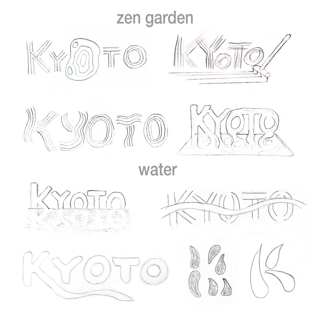
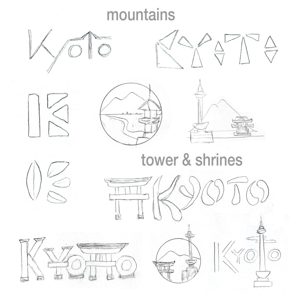
Kyoto geography inspired sketches
Bamboo groves and cherry trees are part of Kyoto’s natural beauty. The first few sketches use bamboo leaves and stalks as part of the wordmark. The rest use cherry branches and blossoms.
Kyoto is famous for Zen gardens, lakes, and rivers. The top four sketches are inspired by raked sand in the gardens. The first water inspired sketch is a reflection of Kyoto in a lake. Next to it, a river flows through the type. A stream flows form the K in the bottom left sketch. To the right, I make sketches that formed a K with water drops and negative space.
Lush green mountains surround Kyoto, contrasting with the red and gold shrines that draw so many to the city. The top left sketch uses diagonal lines to signify the mountains. Next to it, I used triangles as the most basic 2-dimensional representations of mountains. I continued exploring the motif by using three triangles and a pillar to form a K in the negative space. Below that, I tried something similar with bamboo leaves. The rest of the sketches below are inspired by Kyoto tower, Nijo castle, and the Fushimi Inari-taisha shrine gates.
What I learned making these designs.
I had to find photo references for Kyoto landmarks and for natural elements like cherry blossoms that I could not draw from memory. Reducing these elaborate and complex structures into simple icons was creatively and technically challenging. I didn’t post the many exploratory sketches that looked like nothing but random scribbles and shapes.
I looked for keywords that stood out on my Kyoto geography mind map and selected ones that would be attractive to tourists, rejecting words that were too vague or easily associated with other cities. I avoided subjects that might be considered cliché or unlucky by the Japanese people.
During my searches, I found that many of today’s city logos are very colorful and modern. Kyoto is very traditional and historic, so I tried to avoid the overlapping colors trend seen in so many city logos. Instead, I tried to find shapes inspired by the history and natural beauty of Kyoto.
I’m still learning about typography, especially creating hand-drawn fonts. This project has made me better at drawing consistent characters that match a style. It has also been good practice using lines, basic shapes, and negative space to represent a letter or landmark.
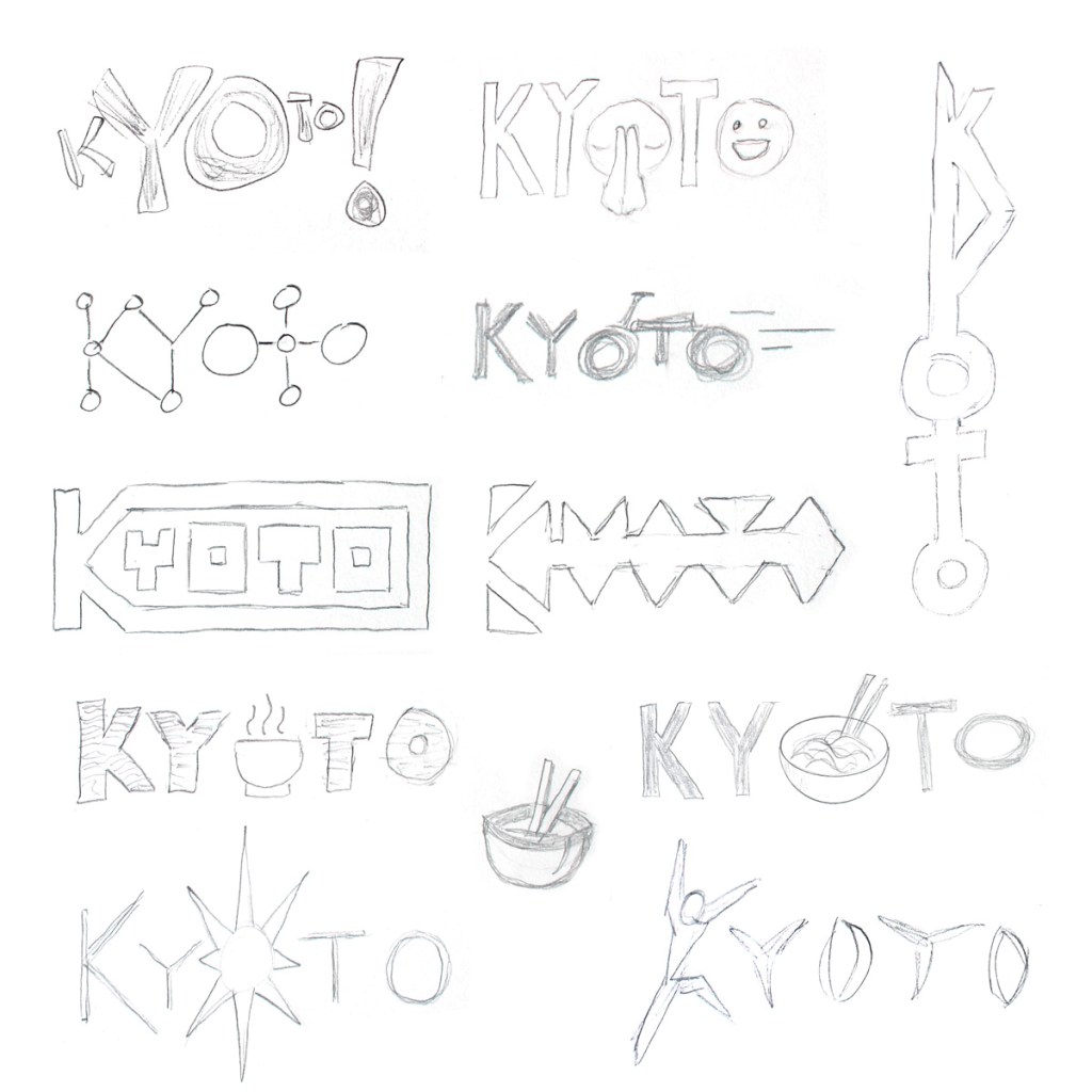
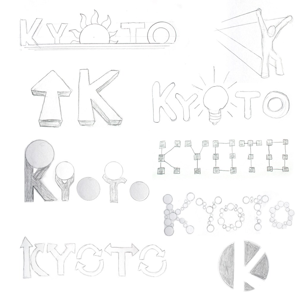
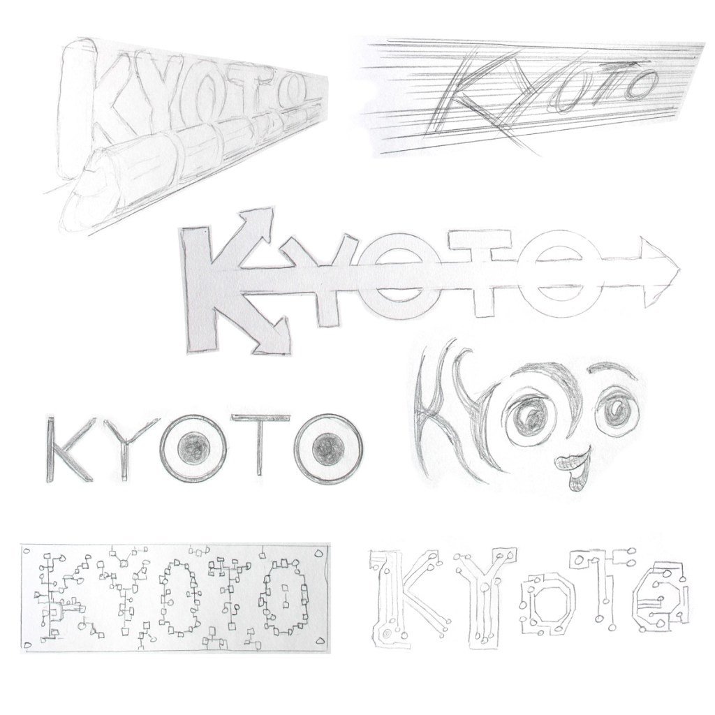
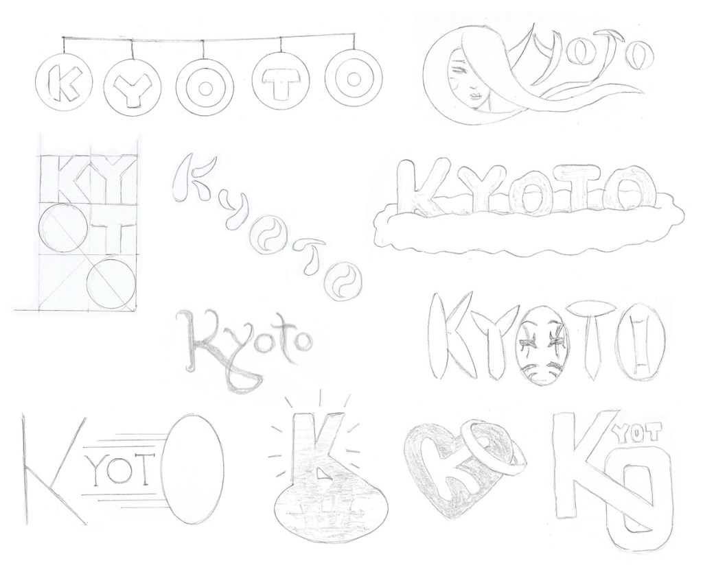
Kyoto modern culture inspired sketches
For the second batch of sketches, I worked with ideas inspired by Kyoto’s modern culture. The mind map was helpful, but further research was needed to find visual inspiration for some of the keywords like “brilliant”.
What I learned making these designs.
I delved deeper into Kyoto’s modern sports teams and city mascots, examining their shared motifs and styles. Several designs inspired were by manga, including a simple logo using the wide eyes of Mayumaro, Kyoto’s friendly egg-like mascot.
I drew a few sketches integrating food or tea but resisted the urge to do more because they seemed more appropriate for a restaurant than a city’s logo. Several designs were inspired by the rising sun of Japan’s flag, but are intentionally not too similar to avoid offense.
I tried to express energy and movement in several of the designs. Many city logos express vibrancy through color choices. I want Kyoto’s logo to have energy even without color. I’m also trying to keep my designs simple… to find ways to “iconify” a concept like respect. Most of my sketches are still way too complex, but the best ideas can always be simplified later.
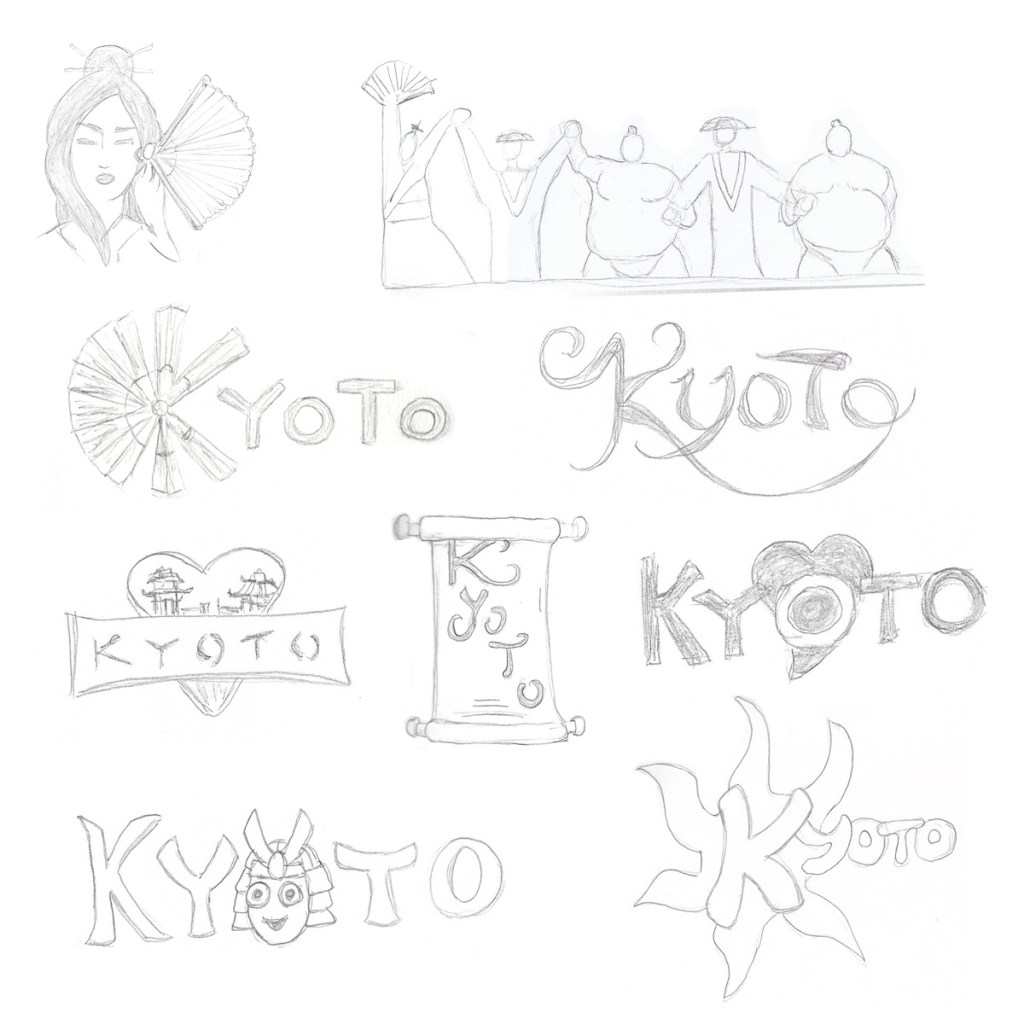
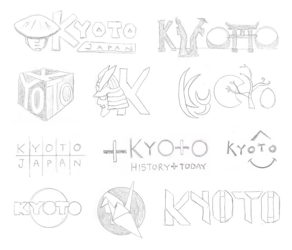
Kyoto traditions and history inspired sketches
For the last batch of sketches, I drew inspiration from Kyoto’s traditions and history. Because Kyoto is considered to be the spiritual heart of Japan, many of the sketches are inspired by monks, temples, and the western heart shape.
What I learned making these designs.
I researched samurai, geisha, and kabuki to find motifs to carry over to the designs. Some of the shapes I turned into silhouettes to simplify them. I also researched origami for the folded crane icon and folded paper typography.
I looked at calligraphic type for inspiration but tried not to mimic existing fonts. Not being a calligrapher, I simplified the brush strokes as much as possible.
Many other city logos have modern typography. Using hand drawn or calligraphic type seems more appropriate when emphasizing Kyoto’s history and culture.
My hand drawing skills are improving and I’m getting better at making designs simple. Some are still too complex or busy, but I can refine the best designs later. I’m also learning to use tools like a French curve when drawing.
Which logo concept is strongest?
Does one or more of the designs above stand out to you? Let me know in the comments below!
