My Design Process for Developing Logos.

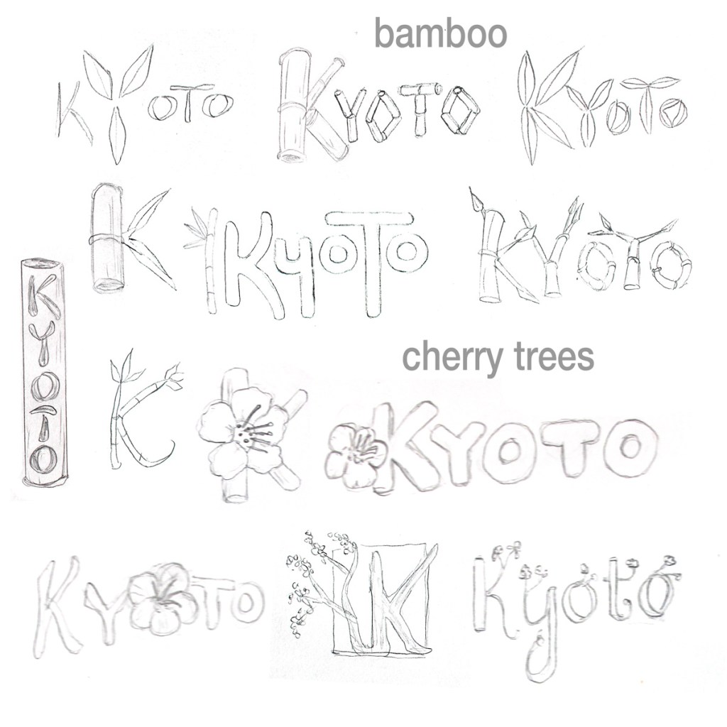
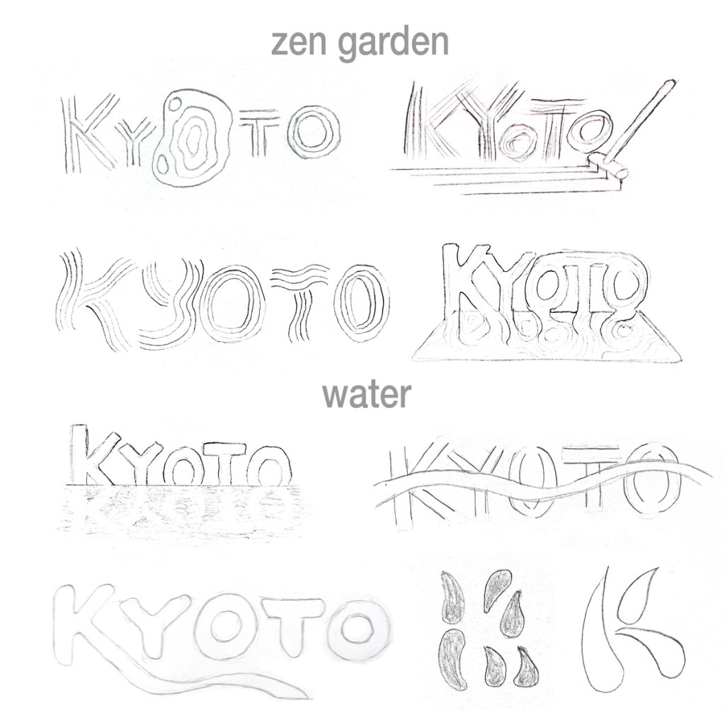
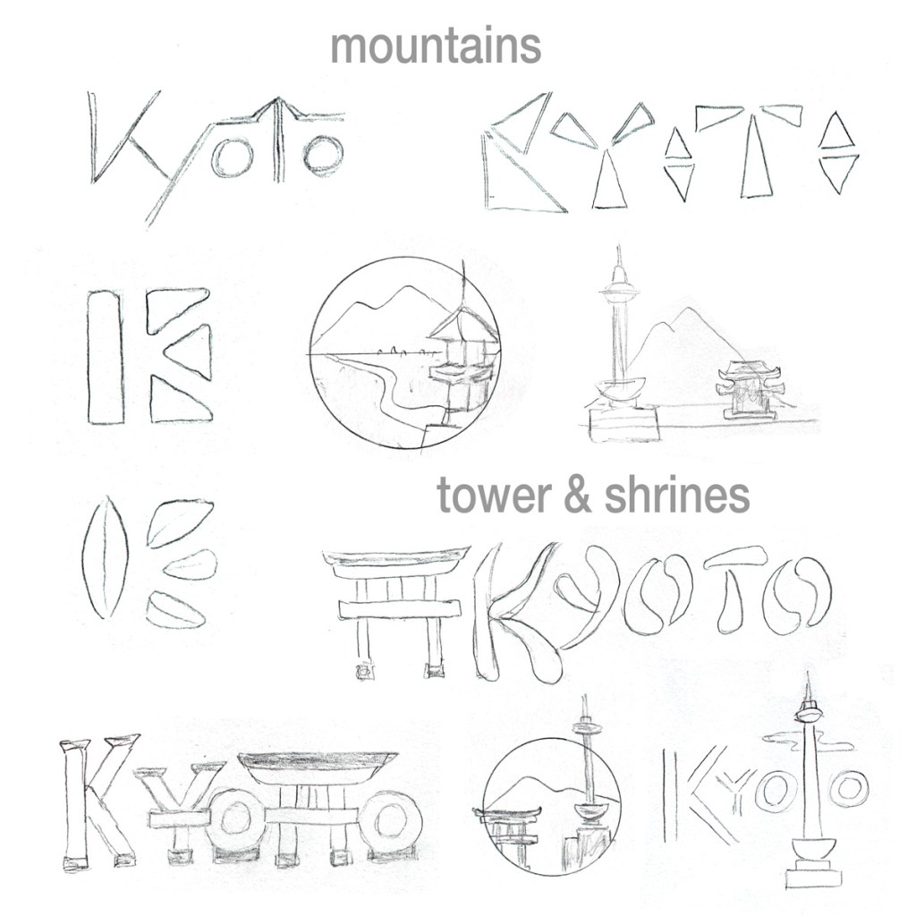
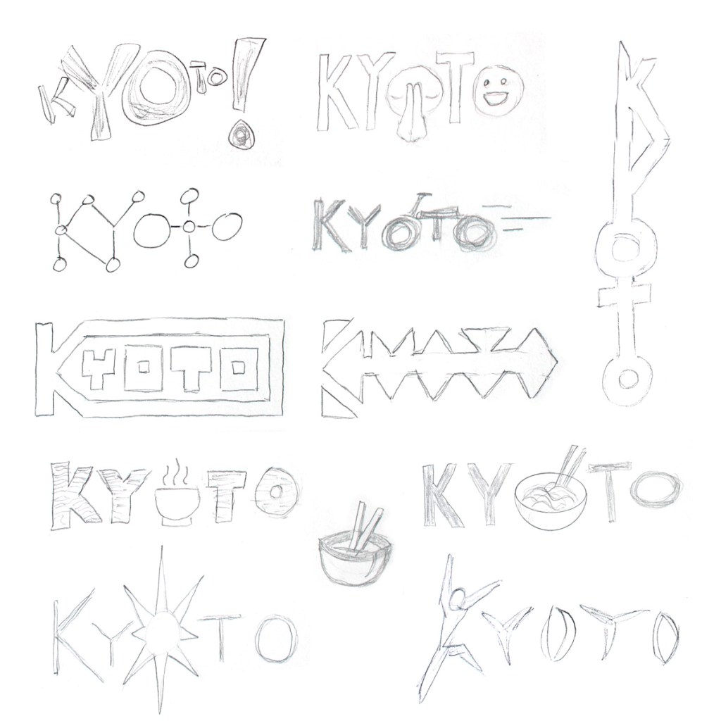
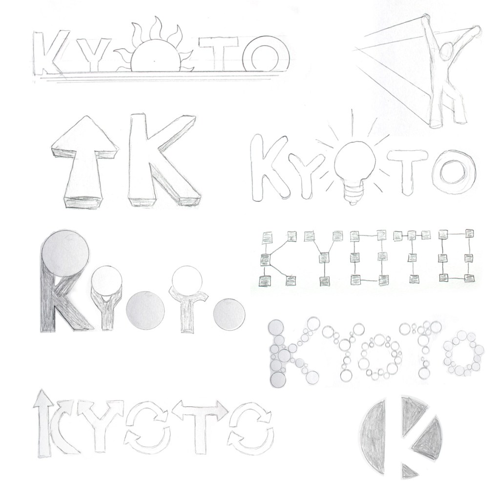
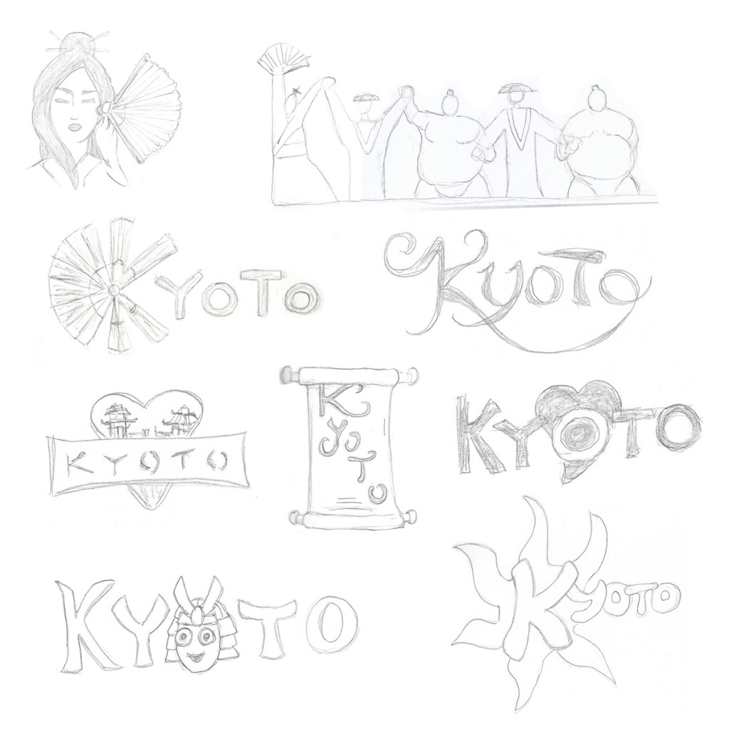
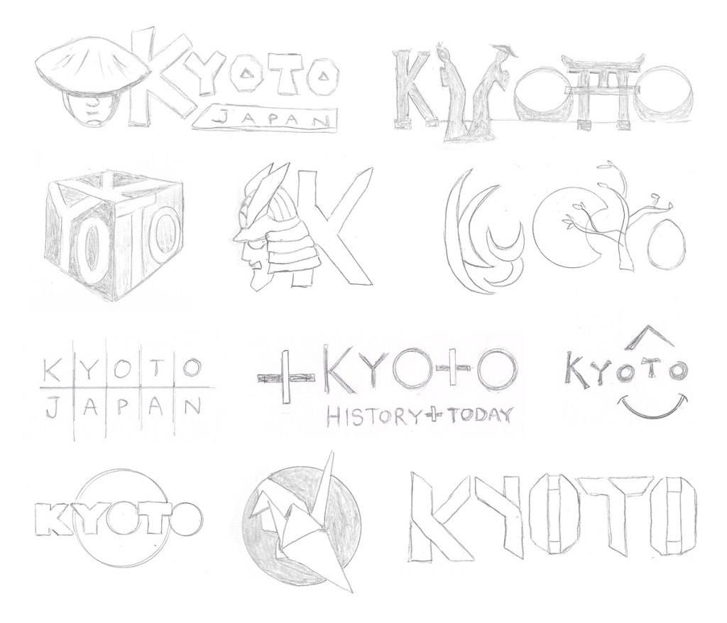
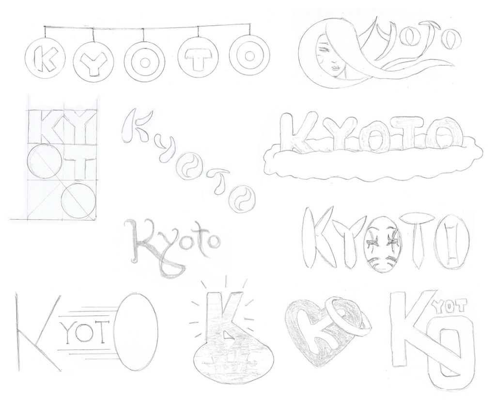
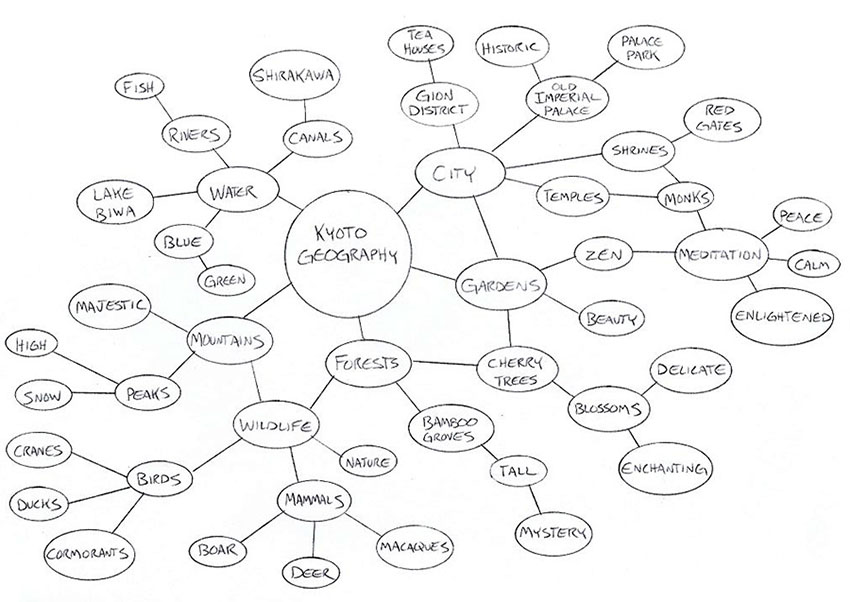
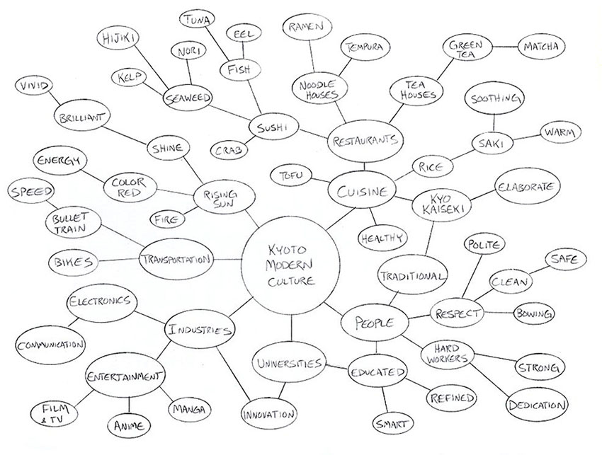
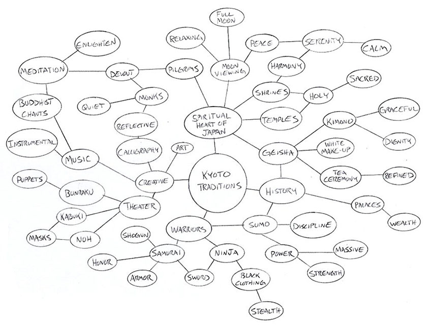
This month for the Logo Design Workshop, I developed ninety sketches inspired by the geography, modern culture, and traditions of Kyoto, Japan.

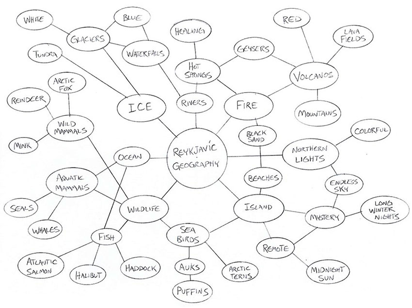
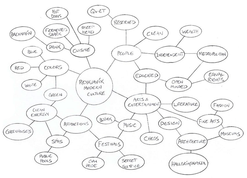
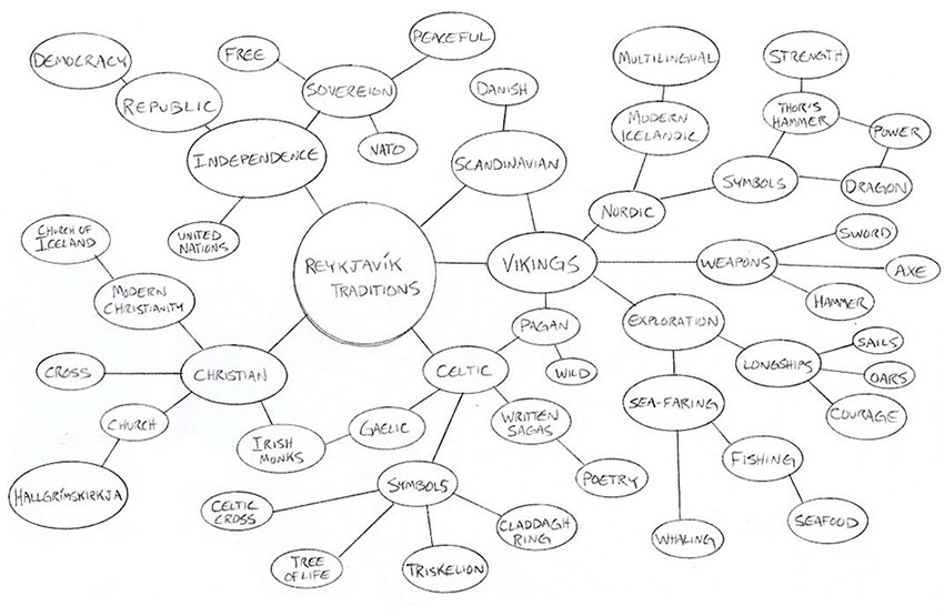
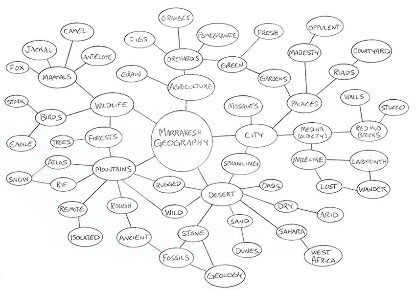
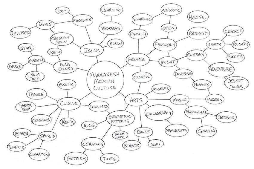
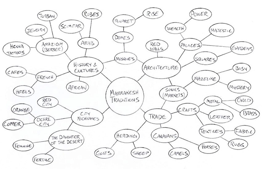
The process began with the commission of the assignment. I started the research process by creating a total of nine mind maps for Reykjavík, Marrakesh, and Kyoto. In Logo Design Love, David Airey says that Mind Mapping is an important step before sketching ideas for a design. (Airey, 2014) Finding keywords for the geography, modern culture, and traditions of each city involved internet searches as well as discussions with a family member who had recently traveled to both Reykjavík and Marrakesh.

city mind maps

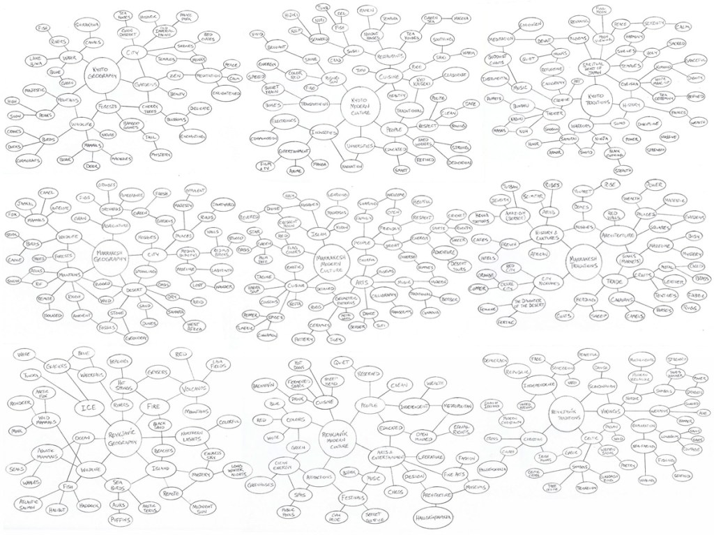
The three mind maps for Kyoto included enough keywords that I felt comfortable moving into the concept development phase for that city. I started sketching ideas, but after a while the ideas stopped coming, so I had to go back to the mind maps to find more connections and themes I overlooked during the initial research.

For example, one of my modern culture keywords was “manga” but these comic books are made in many parts of Japan, not just Kyoto. To find distinction, I searched for manga characters associate directly with Kyoto. During this search I discovered the popularity of Yuru-kyara, cute mascots used to promote cities, events and organizations. (JoJo, 2018) I sketched two of Kyoto’s mascots as part of the research.

sketch research – modern Kyoto mascots

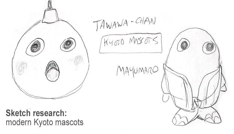
Drawing Tawawa-chan and Mayumaro helped me find connections between them and other popular manga characters. Large, expressive eyes with minimal other facial features are a common element, so I used those characteristics to develop the design below.

concept development – logo sketch

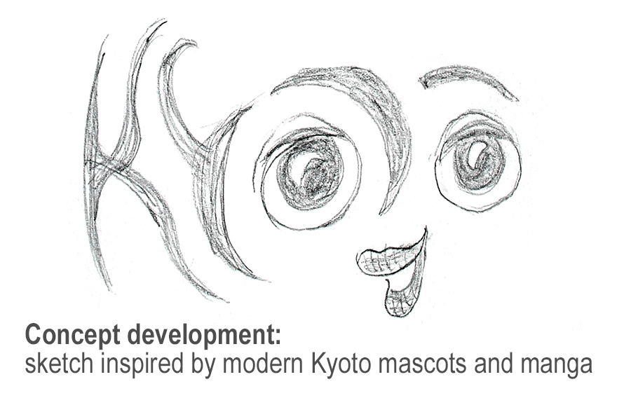
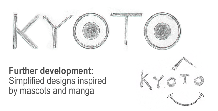
This sketch worked as an exploratory exercise but did not meet all of David Airey’s elements of iconic design. For the sketches below, I tried to “think small” and make the logos easier to commit to memory by keeping them simple. (Airey, 2014)

further development – simple logo sketches

After completing the ninety rough sketches, they were submitted for peer review. The critiques I receive will be essential moving ahead to the Prototyping phase. I will analyze the feedback and utilize further research and self-critique to choose the designs with the most potential. I will also find ways of variating that design based on peer recommendations.

In a critique of this assignment, Dennis Pulido mentioned that manga inspired designs might seem childish to older visitors. However, the simplified designs offer friendly but more “expensive” feel that appeals to some travelers. I will continue thinking of the target audience for each design.

My current design process most closely matches the top illustration on page 68 of A Designer’s Research Manual. (OGrady & OGrady, 2009).

design process diagram

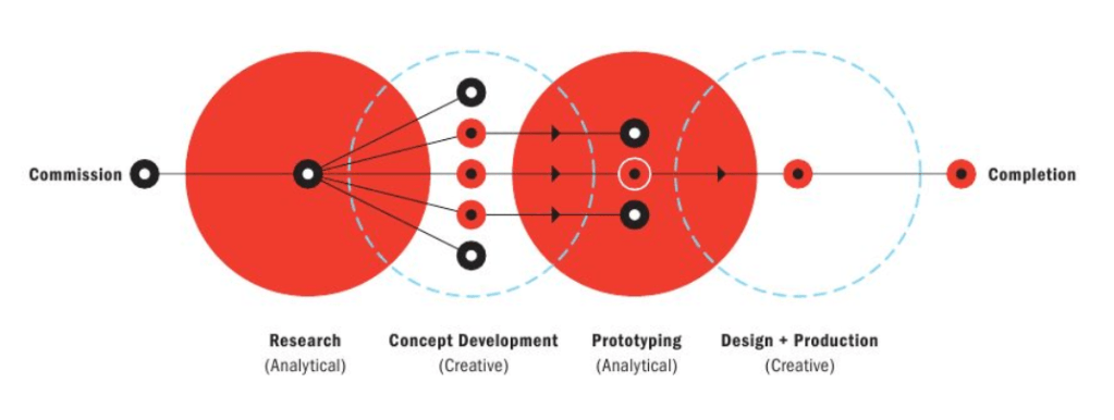
In the Week 4 Live Session video, Ryan McClung says that design is not a linear process. It is a cyclical journey that returns to the research phase at many points. (McClung, 2019). The second illustration on page 68 of A Designer’s Research Manual adds the assessment phase to help the designer make better informed decisions. (OGrady & OGrady, 2009). Although I would like to add an assessment phase to my own design process, I haven’t yet had the opportunity. Peer critiques are helpful in the concept development and prototyping stages, but once the design is finalized further assessment is needed to track its success. I look forward to the Media Design MFA course Measuring Design Effectiveness and learning more ways to analyze my design solutions.

References:

Airey, D. (2014, August 20). Logo Design Love, Annotated and Expanded Edition, Second Edition. Retrieved from https://ce.safaribooksonline.com/book/branding/9780133812589

JoJo. (2018, July 25). Japan’s mascot obsession. Retrieved from https://tokyotreat.com/news/japans-mascot-obsession-cute-kawaii-crazy-japan

McClung, R. (2019, August 27). Week 4 Live Session. Retrieved August 27, 2019, from https://online.fullsail.edu/class_sections/46722/modules/173179/activities/1087782

OGrady, J. V., & OGrady, K. V. (2009, February 1). A designer’s research manual: succeed in design by knowing your clients and what they really need. Gloucester, MA: Rockport Publishers. Retrieved from http://ce.safaribooksonline.com/book/graphic-design/9781592535576/chapter-2-practicing-research-driven-design/68

Logo Design Workshop, part 1 – concept sketches

In the third week of Defining Client Needs, we were asked to create at least 75 rough sketches for a city logo using the mind maps we created in week two.

I chose to create designs for Kyoto, Japan because of my affinity for Asian culture. I started with sketches inspired by Kyoto’s geography, using keywords from the previous mind mapping assignment.

These rough concept sketches will be reviewed by my peers. Using their input, I will move ahead with the strongest ideas.

Kyoto geography inspired sketches

Bamboo groves and cherry trees are part of Kyoto’s natural beauty. The first few sketches use bamboo leaves and stalks as part of the wordmark. The rest use cherry branches and blossoms.

Kyoto logo sketches 1

Kyoto is famous for Zen gardens, lakes, and rivers. The top four sketches are inspired by raked sand in the gardens. The first water inspired sketch is a reflection of Kyoto in a lake. Next to it, a river flows through the type. A stream flows form the K in the bottom left sketch. To the right, I make sketches that formed a K with water drops and negative space.

Kyoto logo sketches 2

Lush green mountains surround Kyoto, contrasting with the red and gold shrines that draw so many to the city. The top left sketch uses diagonal lines to signify the mountains. Next to it, I used triangles as the most basic 2-dimensional representations of mountains. I continued exploring the motif by using three triangles and a pillar to form a K in the negative space. Below that, I tried something similar with bamboo leaves. The rest of the sketches below are inspired by Kyoto tower, Nijo castle, and the Fushimi Inari-taisha shrine gates.

Kyoto logo sketches
Kyoto logo sketches 3

What I learned making these designs.

I had to find photo references for Kyoto landmarks and for natural elements like cherry blossoms that I could not draw from memory. Reducing these elaborate and complex structures into simple icons was creatively and technically challenging. I didn’t post the many exploratory sketches that looked like nothing but random scribbles and shapes.

I looked for keywords that stood out on my Kyoto geography mind map and selected ones that would be attractive to tourists, rejecting words that were too vague or easily associated with other cities. I avoided subjects that might be considered cliché or unlucky by the Japanese people.

During my searches, I found that many of today’s city logos are very colorful and modern. Kyoto is very traditional and historic, so I tried to avoid the overlapping colors trend seen in so many city logos. Instead, I tried to find shapes inspired by the history and natural beauty of Kyoto.

I’m still learning about typography, especially creating hand-drawn fonts. This project has made me better at drawing consistent characters that match a style. It has also been good practice using lines, basic shapes, and negative space to represent a letter or landmark.

Kyoto modern culture inspired sketches

For the second batch of sketches, I worked with ideas inspired by Kyoto’s modern culture. The mind map was helpful, but further research was needed to find visual inspiration for some of the keywords like “brilliant”.

Kyoto logo sketches 4
Kyoto logo sketches 5
Kyoto logo sketches 6

What I learned making these designs.

I delved deeper into Kyoto’s modern sports teams and city mascots, examining their shared motifs and styles. Several designs inspired were by manga, including a simple logo using the wide eyes of Mayumaro, Kyoto’s friendly egg-like mascot.

I drew a few sketches integrating food or tea but resisted the urge to do more because they seemed more appropriate for a restaurant than a city’s logo. Several designs were inspired by the rising sun of Japan’s flag, but are intentionally not too similar to avoid offense.

I tried to express energy and movement in several of the designs. Many city logos express vibrancy through color choices. I want Kyoto’s logo to have energy even without color. I’m also trying to keep my designs simple… to find ways to “iconify” a concept like respect. Most of my sketches are still way too complex, but the best ideas can always be simplified later.

Kyoto traditions and history inspired sketches

For the last batch of sketches, I drew inspiration from Kyoto’s traditions and history. Because Kyoto is considered to be the spiritual heart of Japan, many of the sketches are inspired by monks, temples, and the western heart shape.

Kyoto logo sketches 7
Kyoto logo sketches 8
Kyoto logo sketches 9

What I learned making these designs.

I researched samurai, geisha, and kabuki to find motifs to carry over to the designs. Some of the shapes I turned into silhouettes to simplify them. I also researched origami for the folded crane icon and folded paper typography.

I looked at calligraphic type for inspiration but tried not to mimic existing fonts. Not being a calligrapher, I simplified the brush strokes as much as possible.

Many other city logos have modern typography. Using hand drawn or calligraphic type seems more appropriate when emphasizing Kyoto’s history and culture.

My hand drawing skills are improving and I’m getting better at making designs simple. Some are still too complex or busy, but I can refine the best designs later. I’m also learning to use tools like a French curve when drawing.

Which logo concept is strongest?

Does one or more of the designs above stand out to you? Let me know in the comments below!

Defining Client Needs – Week 3 Reflection

3 Takeaways

Simplicity
In the Week 3 Live Session video for Defining Client Needs, Ryan McClung discusses logo development and what makes a great logo. He emphasizes that simple logos are more memorable and effective. (McClung, 2019). David Airy supports the “keep it simple” concept with his seven elements of iconic design. (Airy, 2014)

Distinction
McClung notes that the logo is not about you, the designer. It is also not about the client’s personal tastes. Both the designer and client should understand that the logo is being designed for the brand’s target audience. Distinction from competitors should be a main element of the logo design. Innovation requires avoiding clichés and imitation. (McClung, 2019)

Use of Logo
A logo can be used on anything from a pen to the side of a building, so it should be legible at any size. Good typography and simplicity of design are important. An icon and wordmark pairing can be used in a variety of layouts at different sizes. A designer should also consider all color modes that may be used in future reproduction. Choosing an incompatible color can lead to higher reproduction costs and inconsistencies in how the brand is presented. (McClung, 2019)

References:

Airey, D. (2014, August 20). Logo Design Love, Annotated and Expanded Edition, Second Edition. Retrieved from https://ce.safaribooksonline.com/book/branding/9780133812589

McClung, R. (2019, August 20). Week 3 Live Session. Retrieved August 22, 2019, from https://online.fullsail.edu/class_sections/46722/modules/173179/activities/1087781

Mind Mapping for City Logos

In the second week of Defining Client Needs, we were assigned three cities:

  • Reykjavík, Iceland
  • Marrakesh, Morocco
  • Kyoto, Japan

We learned how to use Mind Mapping to generate and connect ideas that could be used to create logos for each city. I created nine mind maps to cover each city’s geography, modern culture, and traditions.

Reykjavík

Reykjavík geography mind map
Reykjavík modern culture mind map
Reykjavík traditions mind map

Marrakesh

Marrakesh geography mind map
Marrakesh modern culture mind map
Marrakesh traditions mind map

Kyoto

Kyoto geography mind map
Kyoto modern culture mind map
Kyoto traditions mind map

In what ways did you connect and synthesize the research?

The Lonely Planet websites for each city were a good starting point, and other travel websites provided branches of research. I also looked at satellite maps and used image searches to find colors and motifs for each city. Using my collected notes, I created lists of keywords that I organized into the three categories for each city.

How did you employ multiple approaches to problem-solving through your research?

In addition to internet research, I also interviewed my mother, who has recently visited both Iceland and Morocco. Her impressions of Reykjavík and Marrakesh as a tourist helped inform my ideas of which attractions the cities would want to promote. Having no personal connection to Kyoto, I searched for online testimonials from recent visitors.

In what ways did you find unique, or innovative, ideas to work with by comparison to existing logos found through research that represent other cities?

I found that city logos often use basic elements like a mountain that can be very generic unless you focus on specific details. If you are going to use a mosque to represent Marrakesh or a shrine to represent Kyoto, what makes that mosque or shrine distinct from others in the region? A city logo should be an instantly recognizable image that represents the city identity.

What research competencies did you display through this work?

This week I focused on in-depth research to answer specific questions about each of the three cities. This research generated keywords that I organized by city and categories. I visually mind mapped each category for the cities, finding connections and brainstorming new words to fit the concepts.

What’s Next?

Our next step is to choose one of the cities and start sketching rough designs based on ideas discovered through the word maps.

Stay tuned for more…

Defining Client Needs – Week 2 Reflection

In the Week 2 Live Session video for Defining Client Needs, Ryan McClung discusses the role of the Media Designer, their relationship with clients and stakeholders, and the importance of research in the design process. He states that the Media Designer is responsible for planning and developing information material that effectively communicates a message across the many types of media available today. (McClung, 2019)

The Media Designer must make their ideas palatable and comprehensible to not only the client, but to all external and internal stakeholders. It is important to understand the needs, problems, and objectives of each of these stakeholders. This can be achieved by researching the client, their competitors, and the issues that need to be solved.

Thorough research provides insight, direction, and value. It assures the client that the designer’s services are worth the investment and helps identify unacknowledged issues. Research provides validation of the designer’s ideas and helps sell those ideas. McClung states that 80% of design is selling your ideas and your worth as a designer. (McClung, 2019)

Mind Mapping is one important research tool that helps the designer generate and connect ideas. Mind maps help the designer narrow options and find strong directions to pursue. McClung notes that having infinite options gives zero solutions (McClung, 2019), so it is important to define and focus on solutions that will best address the issue that needs to be solved. David Airey notes that Mind Mapping is an important step before concept sketching and further development of the design solution. (Airey, 2014)

References:

Airey, D. (2014, August 20). Logo Design Love, Annotated and Expanded Edition, Second Edition. Retrieved from https://ce.safaribooksonline.com/book/branding/9780133812589

McClung, R. (2019). Week 2 Live Session. Retrieved August 13, 2019, from https://online.fullsail.edu/class_sections/46722/modules/173179/activities/1087780

Inspirational Quote

“Do the one thing you think you cannot do. Fail at it. Try again. Do better the second time. The only people who never tumble are those who never mount the high wire. This is your moment. Own it.”
Oprah Winfrey

I’m pretty experienced with failure. We all are. Failure is part of life, and part of the creative process. Fear of failure and disappointing people is a psychological hurdle that I’m still overcoming. Still, I’ve come to accept that my failures as opportunities to learn and grow.

So don’t be afraid to make the leap. If you fall, get up and jump again.

References:
Oprah Winfrey quote found on BrainyQuote
Photo by Kid Circus on Unsplash

Defining Client Needs – Week 1 Reflection

Summary

In the Week 1 Live Meeting video for Defining Client Needs, professor Ryan McClung states that the Media Design MFA program is a lot like the Media Design industry. (McClung, 2019) Both are about solving problems and finding solutions. This requires strong research, critical thinking, time management, and communication skills. My research skills need improvement, but every assignment is practice.

The Design industry and this MFA program also both require critique of your work, by professionals and peers. (McClung, 2019) I look forward to this opportunity to improve my designs, as I have often operated in a bubble without much feedback from anyone but my client or boss. In the video What is Graphic Design, Sean Adams says that graphic design is about ideas. (Adams, 2017) Sharing ideas with peers can transform those ideas into design solutions.

In regard to Academic Writing, McClung states that opinions don’t matter. (McClung, 2019) I’m used to writing magazine articles, blogs, and lectures that are often based on personal experience and opinions. It’s an adjustment, but I appreciate how research-based writing forces me to dig deeper and find real knowledge to support my ideas.

Action Plan

By the end of the Media Design MFA program, I should show improvement in my research and writing skills in addition to wider knowledge of the methodologies of design. I will apply these skills to find more design clients and create better lessons for my students.

Juggling school, work, and family requires efficient time management. I’ve created the following weekly study schedule to keep me on track.

Monday

  • Read/watch materials for weekly assignments, prepare notes – 4 hours.
  • Read design or motion graphics book on Safari Books – 2 hours.

Tuesday

  • Write and submit discussion, research weekly assignment – 4 hours.
  • Watch design or motion graphics courses on Lynda.com – 2 hours.

Wednesday

  • Reply to discussion, work on weekly assignment – 4 hours.
  • Read design blogs on Feedly and browse Behance for inspiration – 2 hours.

Thursday

  • Work on weekly assignment – 4 hours.
  • Watch design or motion graphics courses on Lynda.com – 2 hours.

Friday

  • Try to finish weekly assignment – 4 hours.
  • Read design or motion graphics book on Safari Books – 2 hours.

Saturday

  • Edit and submit weekly assignment, write and submit blog. – 4 hours.
  • Watch design or motion graphics courses on Lynda.com – 2 hours.

I have reserved Sunday for family time, rest, and reflection. Even then, I try to keep a sketchbook handy. Every night before bed I spend a few minutes sketching out random ideas. This “twilight time” between consciousness and sleep is when some of my best concepts emerge in a raw form. All my old sketchbooks were destroyed in the 2018 fire, but my sketching habit is still a vital part of the design process as described by Sean Adams. (Adams, 2017)

References:

Adams, S. (2017, May 31). What is graphic design? Retrieved August 9, 2019, from https://www.lynda.com/Graphic-Design-tutorials/What-graphic-design/614734/625796-4.html?org=fullsail.edu

McClung, R. (2019, August 6). Week 1 Live Session. Retrieved August 9, 2019, from https://online.fullsail.edu/class_sections/46722/modules/173179/activities/1087779

Mastery Journey Timeline

The final assignment for the Mastery: Personal Development and Leadership course at Full Sail University is a visual presentation of our Mastery Journey Timeline.

This was the first presentation I’ve created with Keynote. It’s a pretty simple program to use and not much different from PowerPoint.

Below are 12 slides from the presentation, one for each month of classes at Full Sail University.

Month 1 - Mastery: Personal Development and Leadership
Month 1 – Mastery: Personal Development and Leadership

Month 2 - Defining Client Needs
Month 2 – Defining Client Needs

Month 3 - Brand Development
Month 3 – Brand Development

Month 4 - Effective Copywriting
Month 4 – Effective Copywriting

Month 5 - Design Research
Month 5 – Design Research

Month 6 - Organizational Structures
Month 6 – Organizational Structures

Month 7 - Design Strategies and Motivation
Month 7 – Design Strategies and Motivation

Month 8 - Design Integration
Month 8 – Design Integration

Month 9 - Multi-Platform Delivery
Month 9 – Multi-Platform Delivery

Month 10 - Measuring Design Effectiveness
Month 10 – Measuring Design Effectiveness

Month 11 - Thesis: Presentation of Design Solution
Month 11 – Thesis: Presentation of Design Solution

Month 12 - Professional Practice
Month 12 – Professional Practice

If you’d like to view the entire presentation, you can find it on SlideShare.

Have you done something like this? Have questions or comments? I’d love to hear from you!

Inspiration – Cinema 4D Lite in After Effect CC

I’ve been making the most out of my Lynda.com subscription, watching tutorial videos for at least an hour every day. One of the great “Weekly” courses is Motion Graphics Weekly. If you want to learn more about creating 3D graphics in After Effects and Cinema 4D, it’s worth checking out.
https://www.lynda.com/After-Effects-tutorials/Motion-Graphics-Weekly/548716-2.html

The coolest thing I’ve discovered there is that a free version of Cinema 4D is included with my Adobe Creative Cloud subscription. I plan to learn more about creating 3D graphics over the next few months and using Cinema 4D Lite will make the learning curve easier. It will also save some money.

If you have a Lynda.com subscription, watch this video:

https://www.lynda.com/After-Effects-tutorials/Free-version-Cinema-4D-included-After-Effects/548716/800073-4.html

If not, here are the basic steps to find and open Cinema 4D Lite.

  1. Open After Effects
  2. File > New > Maxon Cinema 4D File
  3. Name the file and click OK
  4. Cinema 4D Lite will launch

It’s that easy. Time to play!